Room of the Day: Ranch House Refresh
http://decor-ideas.org 08/10/2015 20:13 Decor Ideas
Florida interior designer Andrew Howard understands the good and bad points of a larger room. The positive is obvious — you have a lot of space. But there are negatives, too. Big rooms can be hard to furnish and make comfortable. The combined living room-dining room in this classic ranch house was spacious, but Howard says the 8-foot-high ceiling made the long room feel like a bowling alley. His goal was to define the areas and thereby make them livable. Once that was done, he came up with a genius idea for making the dated fireplace look fantastic, without even lifting a hammer.

Living-Dining Room at a Glance
Who lives here: A couple, 3 kids and 3 big dogs
Location: Ponte Vedra Beach, Florida
Size: 600 square feet (55.7 square meters)
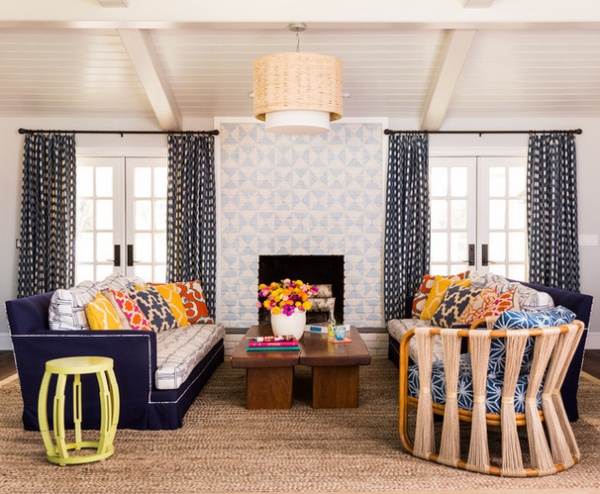
Howard started by defining the areas through seating and rugs, keeping the room from seeming overwhelming. To make the room feel (and look) better, he took out the flat ceiling. Now the ceiling line follows the roofline, going from 8 feet to 12 feet high. The ceiling also got a new look through tongue-and-groove paneling and beams. “If you have a larger room, it helps to have high ceilings,” Howard says. “The ceiling details add a lot of architectural interest in a room that really lacked that.”
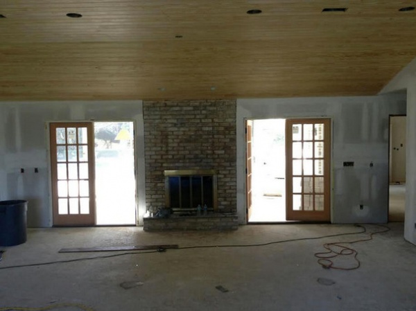
The really bright idea is the fireplace treatment. Before, it was a flat surface composed of the weathered brick that was everyone’s favorite back in the late 1970s, when John Travolta was dancing across movie screens in Saturday Night Fever. For many people, taking it out would be a given. Howard had a different view.
“I understand the impulse to tear it out,” he says. “But I wanted to keep some of the character of the old house.” He notes that taking out the brick would have been hard on the bottom line and construction logistics.
Instead, he hired a decorative painter to paint the bricks. His inspiration was images of encaustic tile. “I didn’t want it to appear shiny and new, so I had the painter whitewash the pattern to weather it a bit,” he says. When asked about the difficulty of painting a pattern on brick, he says that “a lot of tape was involved.”

BEFORE: This in-process shot tells the fireplace story. “This is the focal point in the room,” Howard says. “We decided to make it an art piece.”

AFTER: Howard furnished the room with a pair of deep, oversized sofas that bookend the fireplace. He used two outdoor fabrics on the sofas, which illustrate his no-matching philosophy. “I like to vary the wood tones, colors and patterns in a room,” he says. “Besides, if I made the big sofas all navy blue, they would have looked like two big blocks sitting in the middle of the room.”
As for the vibrant pattern mix, Howard says he made it all work by varying the sizes and shapes for a rich, layered look.
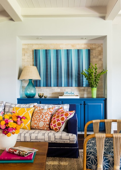
The travertine tile-lined niche was an existing feature, and Howard considered it problematic. He made sense of it by turning it into a bar area, painting the cabinets blue and topping the tile with blue striped art.
The chair with the string back looks vintage, but it’s new. “I hate looking at the backs of upholstered pieces,” the designer says. “In this case, the back of the chair is as attractive as the front.”
Strings Attached lounge chair: Palecek

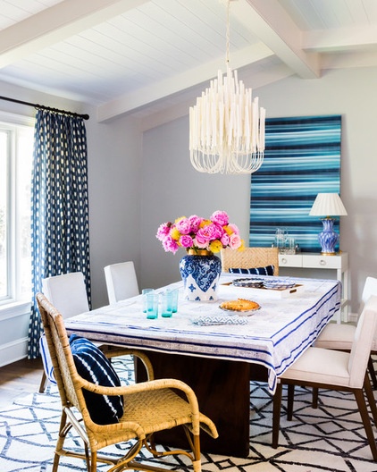
Despite his commitment to eclecticism, Howard says he feels that a room should have one curtain pattern. He tied the dining area and living area together with curtains that he describes as a gingham print mixed with an ikat pattern. “The checks are a little ‘fuzzy,’” he says.
The real goal of the room was ease and comfort. “This is a place where the whole family — kids, dogs, everybody — comes to lounge and relax,” Howard says. “Comfort and fun are key.”
See more Rooms of the Day
Related Articles Recommended


