New This Week: 3 Sunrooms Straight Out of Our Dreams
http://decor-ideas.org 08/08/2015 03:13 Decor Ideas
What’s not to love about a sunroom? It’s bright, open, inviting and yet secure from pesky bugs and other elements of nature. If we’re talking top dream additions most homeowners would add, the sunroom has to be near the top. And the following three sunrooms — uploaded recently to Houzz by their respective designers — seem to come straight out of a sun-drenched dream world. With things like heated floors, comfy furniture, walls of windows and casual decor, it’s no wonder these spaces have become the most frequented by their homeowners.
Here, the designers dish on their plans of attack, “uh-oh” moments and more.

1. Cool Patio Conversion
Designer: Carly Callahan
Location: Birmingham, Michigan
Size: 12 by 17 feet (3.6 by 5.1 meters); 204 square feet (18.9 square meters)
Homeowners’ request: “The homeowners wanted to be able to spend time in this space more often than just in the spring and summer, and also have it screened in to protect from the elements and make it more usable,” designer Carly Callahan says. “It is right off the living room, so we didn’t want it to feel like just another living room. It definitely has the feel of being outdoors, without the worry of bugs.”
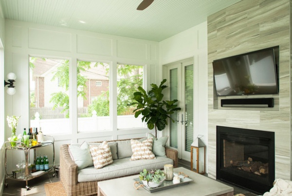
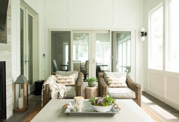
Plan of attack: “We converted an open, covered patio off the back of the house into a screened-in sunroom that is the perfect place to unwind all year round. Although it is not heated, it does have a fireplace and heated floors. We removed the house siding and paneled the walls to give a sophisticated feel. This room now truly feels like an extension of the house. The paneled walls are painted white, but the ceiling is painted a pale sky blue. Overscale windows provide tons of natural light and give a view of the backyard.
“We first selected a really fabulous antiqued limestone for the floors. They are large 16-by-24-inch pieces in the most beautiful warm gray-taupe color. That, along with the fireplace tile, really sets the tone for the space. We wanted the room to feel really soothing, so we stuck with neutrals, both cool and warm, to really give that vibe. The furniture is all outdoor furniture, but it is also super comfortable and stylish. This way, the room doesn’t feel like just another living room. The rug is also an outdoor polypropylene rug that looks like sisal but can stand up to kids running in from the backyard with muddy feet. The last, and my favorite, design decision was to paint the beadboard ceiling a pale sky blue.”
Why the design works: “This room once had no walls and was completely open to the backyard, and we wanted to keep that feeling. We did that by putting in overscale windows on the two walls that are not doors into the house. This still preserves the feeling of being outdoors and provides incredible natural light. It’s the family’s new favorite spot to hang out.”
What wasn’t working: “We struggled with furniture placement, because the homeowner really wanted a sofa to face the TV, but the dimensions of the room were not conducive to that. We would have really had to squish the sofa in a very awkward position, and it would have taken away from the room’s flow. At the end of the day, they agreed that it did not need to be the focal point. Having the sofa and chairs face each other is a great setup for conversation.”

What goes on here: “This room is really an amazing gathering spot to spend time and talk with family and friends. It is intimate, but still feels expansive because of the ceiling height and the openness that the windows create. It is also the perfect spot to sit down with a good book and spend a Sunday afternoon. The light in this room during the day is magical.”
Who uses it: “This family of five uses this room as a hangout spot, a spot to put feet up and relax, a thoroughfare from the backyard into the house, and a spot to sit down and catch up with visitors and friends.”
Designer secret: “I love mixing warm and cool grays and neutrals. I think it makes a space feel more balanced. Even though the floors were a taupey grey, we still went with cool gray on the furniture. We could have just gone with the sandy-tone fabric option, but the room would have felt flat. I also love how the color on the ceiling adds a little surprise. Ceilings are the forgotten surface, and they should be given some attention too.”
“Uh-oh” moment: “The original tile we selected for the fireplace was supposed to be installed in the near future, and we did not find out until the last minute that it had been discontinued. We had to quickly come up with an alternative, and I think it turned out better than the original. It was a happy accident.”
Splurges and savings: “We really splurged on the floor tile and were able to save a bit on the fireplace tile. However, they worked perfectly together, so I do not feel it was a sacrifice.”
Take-away: “That a small space can still feel expansive when designed correctly and that an unused space is just an opportunity.”
The nitty-gritty: Floor tile: Artistic Tile; furniture and ceiling fan: Restoration Hardware; rug: Surface Design; bar cart and lanterns: West Elm; pillows: custom — dragonfly fabric is Duralee and light aqua fabric is Jim Thompon with Samuel & Sons leather cord trim; sconces: Rejuventation; wall paint: White Dove, Benjamin Moore; ceiling paint: Window Pane, Sherwin-Williams
Team involved: Templeton Building Co. (general contractor)
See more photos of this sunroom

2. Beach-Side Beauty
Designer: Erin O’Connor
Location: Union Pier, Michigan
Size: 13 by 7 feet (3.9 by 2.1 meters); 91 square feet (8.4 square meters)
Year built: Around 1930
Homeowners’ request: “I designed this room in our beach cottage, designer Erin O’Connor says. “This is a tiny cottage on a bluff overlooking the shores of Lake Michigan. I wanted the space to be bright and beachy with soothing colors and a nod to the location.”
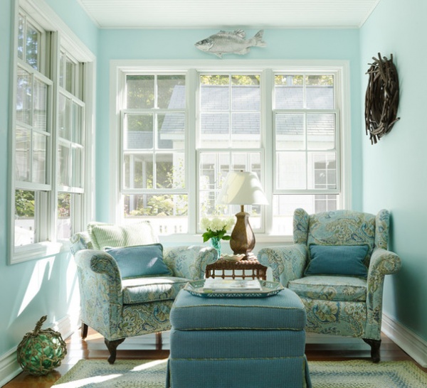
Plan of attack: “I found the paisley fabric first. It’s indoor-outdoor fabric. That made sense for a beach cottage. I pulled all of the colors for the cottage from the fabric. I used it in the main living area too, as well as for a shower curtain in the bathroom. The paint color is Bubble by Sherwin-Williams.”
Why the design works: “The room feels light and airy and summery — perfect for the beach setting.”
What wasn’t working: “This room has one door, 10 windows and a 4-foot arched opening to the rest of the cottage. Not a lot of wall space. Every inch of space needed to be used wisely. There is storage for blankets and games in another ottoman, not pictured, and there’s a pullout couch. Guests love to sleep in this room because it has a lake view and tons of windows to enjoy the lake breezes.”
What goes on here: “Reading and relaxing. It’s also a guest room.”
Who uses it: “The family — me; my husband, Chris; and children Brian and Bridget — uses this room regularly for a cup of coffee, glass of wine and visits with friends.”
Designer secret: “The silver fish platter was a garage sale score. My husband spotted it, and I liked it so much, I hung it up.”
“Uh-oh” moment: “It’s a very tiny room with tons of windows, and it was a challenge to find a sleeper sofa that fit the space. It needed to be comfortable and practical.”
Splurges and savings: “The chairs were given to me by a friend who no longer needed them. Their diminutive size made them perfect for this small space. I found the twig mirror when looking for mirrors for a bedroom, and I bought an extra for the beach cottage.”
Take-away: “Tiny houses are like boats. Every inch has to be used wisely.”
The nitty-gritty: Paisley fabric: Sausalito in Spa, Calico Corners
See more of this house

3. Old Meets New
Designer: Mary Maloney and Carol Mokler of Bee’s Knees Design
Location: Hopkinton, Massachusetts
Size: 14 by 14 feet (4.2 by 4.2 meters); 196 square feet (18 square meters)
Year built: 1998
Homeowners’ request: “The homeowners wanted a fun place to hang out as a family and entertain while also maximizing outdoor time in the ever-changing New England environment,” designer Mary Maloney says.
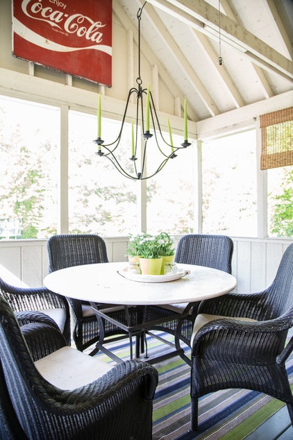
Plan of attack: “We put together a floor plan to maximize the use of space. The family wanted a dining and entertaining area to double as a cozy reading and napping nook. By creating an eating area centered around the table and a relaxation space with a daybed, the space serves the dual vision of the homeowners.”
Why the design works: “Simple, cozy and casual elements come together to create a functional and family-friendly environment.”
What wasn’t working: “Our clients previously had antique rocking chairs in the space. The chairs looked lovely; however, they were lacking in comfort and caused the room to remain underutilized. Instead of replacing the chairs with a sofa and comfy seating, the homeowners opted for a multipurpose dining and lounging area. Now the homeowners enjoy unhurried meals in their beautiful backyard, minus a few unwelcome guests: pesky mosquitoes.”
What goes on here: “Family members inhabit the space during all hours of the day. They read the newspaper and enjoy a cup of coffee, they entertain friends with games during the day, and they enjoy family dinners or the company of friends in the evening.”
Who uses it: “Friends, family, kids, pets and other welcome guests use the space daily.”
Designer secret: “A vintage Coca-Cola sign blends with a fresh and functional indoor-outdoor rug — an unexpected mixture of old and new. The travertine tabletop with its distressed and worry-free patina stands up perfectly against the tough New England weather.”
“Uh-oh” moment: “The antique rocking chairs were near and dear. It was very difficult to edit them out, but they were not working in the space.”
Splurges and savings: “The couple saved money using the existing whitewashed walls as a fresh backdrop while splurging on the stone-surfaced table and comfortable seating.”
Take-away: “We learned that you have to spend a bit more to save in the long run. Higher-end items will endure New England weather challenges. Great finds in consignment stores helped keep the budget in check.”
The nitty-gritty: Chairs, table and chandelier: Crate & Barrel; striped rug: Dash & Albert
See more of this house
New This Week features designs from projects most recently uploaded to Houzz. Have a great project? Here’s how to share your photos on Houzz.
More: 11 Elements of the Perfect Sunroom
Related Articles Recommended


