My Houzz: Breaking Down the Walls in Amsterdam
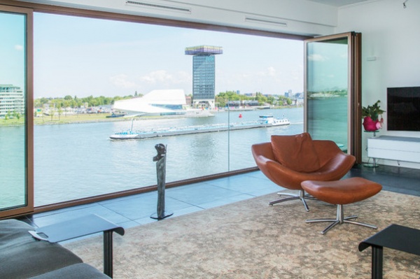
When an Amsterdam couple rode their bikes by the new Palace of Justice, they saw an apartment building under construction that seemed perfect for them on the same human-made peninsula. The location in the city center and the wide view of the water were the biggest draws, but other advantages included an apartment with a single-level living space that was easy to get to by car, features that their current city-center apartment was missing.
After they purchased the unit, Cynthia Sombogaard of CS interiordesign helped them turn the empty rooms into a home. The L-shaped space had a series of walls that divided the apartment into small rooms, including a living room, a closed kitchen and three bedrooms. Sombogaard suggested they take take down walls in two of the bedrooms to turn the closed-off rooms into a continuous space with a circular floor plan. Now the couple has a bright, open home with a spectacular view of the Ij River and the Amsterdam skyline.
Houzz at a Glance
Who lives here: A couple
Location: Amsterdam
Size: 2,150 square feet (200 square meters); 1 bedroom, 1½ bathrooms
Year built: 2012
For the couple, who plan to live here as long as they can, it made more sense to devote the apartment’s square footage to areas they would use regularly rather than having extra bedrooms. Removing the walls opened up the apartment but still allowed for distinct living room, kitchen, dining room and sitting areas.
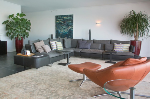
“You usually will see a new-build apartment with a lot of rooms but not laid out in the most effective, clever way,” Sombogaard says. “Sometimes people are afraid of taking out walls, but [these homeowners] understood very well that it would bring more balance in their apartment.”
Along with removing walls, Sombogaard also considered how the rooms would connect and be proportionate to one another, such as making sure the bathroom would not be too small compared with the large living room. “I redesigned the layout of this apartment so the routing would be clear and clever, and so there would be a balance between the spaces,” Sombogaard says. “I think this is really an essential point. Otherwise you will keep struggling further in the design process.”
Sofa: Opus, Natuzzi chair: Gigi, Label
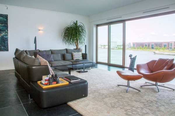
The homeowners also wanted a view and to be connected to people, a major reason they were drawn to the apartment when they first saw it. The windows that look out to the river are made up of large sliding-glass panels that open fully. The owners can read and watch boats go by at the same time.
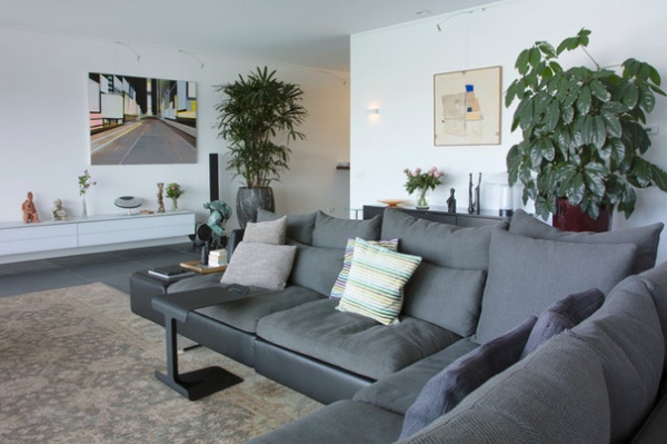
Both owners love contemporary interiors and have strong ideas about style. Sombogaard used their input to choose furniture and fabrics.
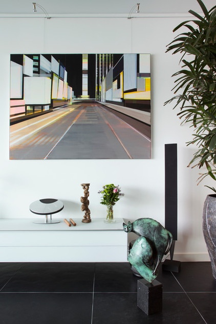
The remaining walls provide ample space and clean white surfaces to display the couple’s eclectic art collection.
Painting: Cécile van Hanja
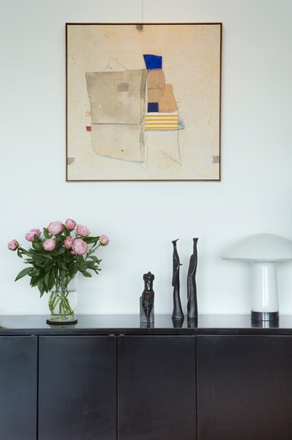
“If there is a balance in the home’s layout, you can continue adding other elements, like colors, materials and lights,” Sombogaard says.
Artwork: Galerie BMB
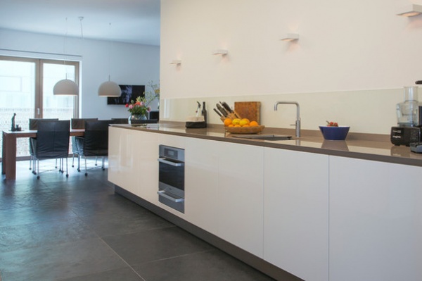
“Most Dutch kitchens are behind closed doors,” Sombogaard says. Not this galley-style one. One entrance is just off the living room; the other is from the dining room.
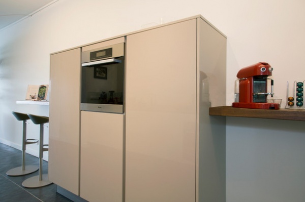
Tall cabinets hold an extra oven and a refrigerator and offer extra storage.
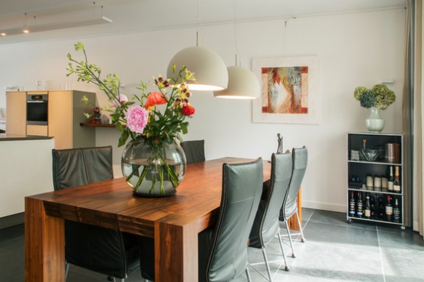
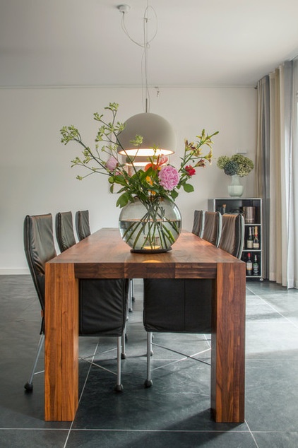
One of the original small bedrooms became the new dining room, with a view across the skyline.
Pendant lamps: Biluna, Prandina; dining chairs: Chaplin, Montis
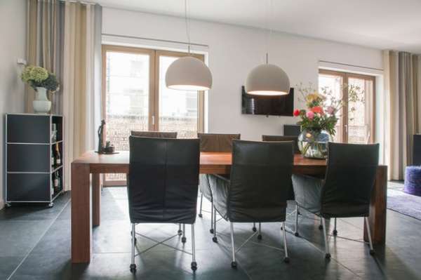
Small balconies outside the windows add square footage.
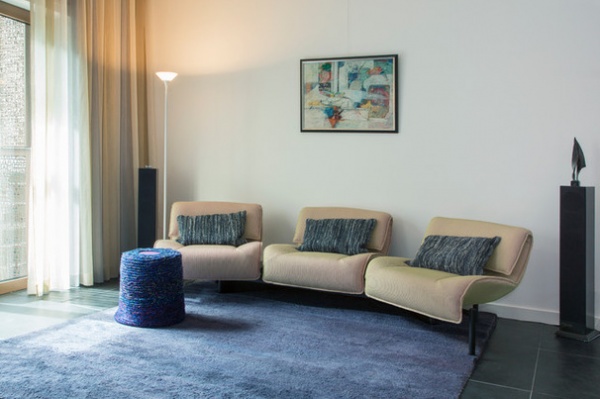
The dining room is open to the sitting room-television area, once the location of a second small bedroom. The office and master bedroom are on the other side of the wall behind the sofa.
Sofa: re-covered in Chicago fabric by Kvadrat
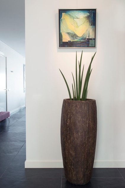
The view toward the interior of the apartment from the sitting room includes the hallway that leads past the bathroom and powder room to the entry and the living room, completing the circuit of the public space.

The couple’s office and master bedroom are located off the main living area. A glass wall and open shelves provide some privacy in the office. The bank of sliding doors hides generous storage.
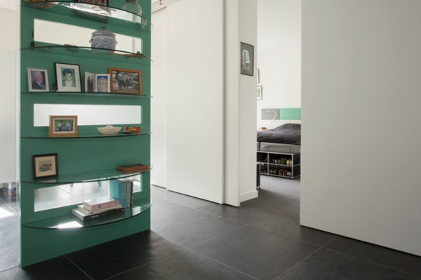
One sliding door also hides the bedroom.
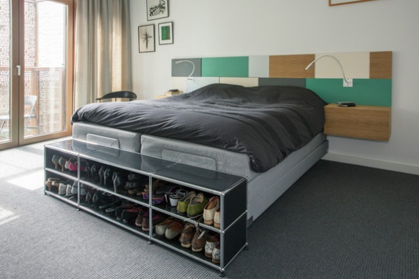
The bedroom is tucked into the back corner of the apartment and has its own small balcony as well. There’s a hotel across the street for overnight guests.

A large four-piece bathroom and a small powder room sit next to each other in an enclosed area in the center of the apartment. “The smallest space in the house is a great place to create something unexpected,” Sombogaar says.
Vanity top: Silestone; faucets: Vola; cabinets: custom
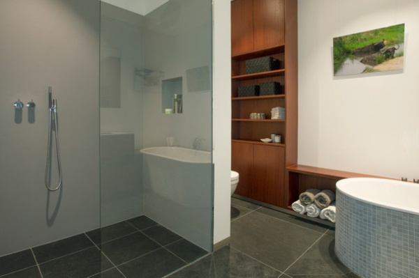
Sombogaard also made the larger bathroom about 40 percent larger, which created enough space to fit in a spacious shower stall.
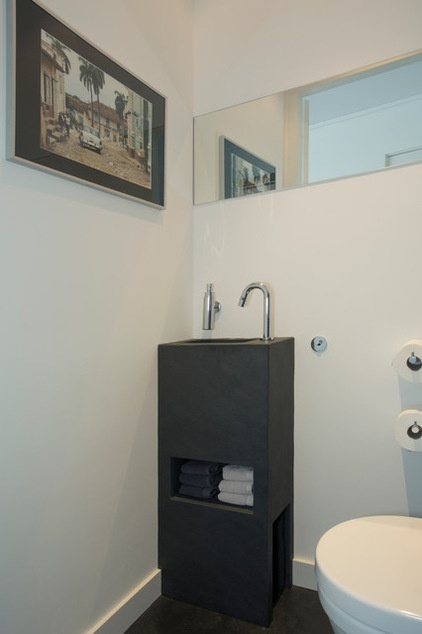
The sink in the small powder room was custom-made using Mustang black slate.
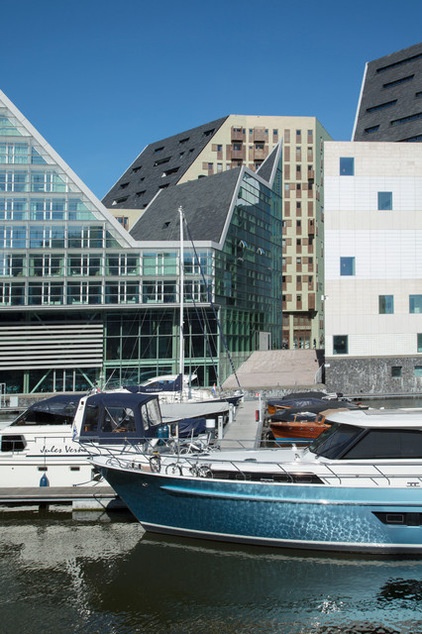
The condo complex is tucked in behind the Palace of Justice (the building on the right with the small square windows) and the Room Mate hotel on the left.
My Houzz is a series in which we visit and photograph creative, personality-filled homes and the people who inhabit them. Share your home with us and see more projects.
Browse more homes by style:
Small Homes | Apartments | Barn Homes | Colorful Homes | Contemporary Homes | Eclectic Homes | Farmhouses | Floating Homes | Guesthouses | Lofts | Midcentury Homes | Modern Homes | Ranch Homes | Townhouses | Traditional Homes | Transitional Homes | Vacation Homes | Homes Around the World


