Houzz Tour: When Two Houses Are Better Than One
http://decor-ideas.org 08/05/2015 22:13 Decor Ideas
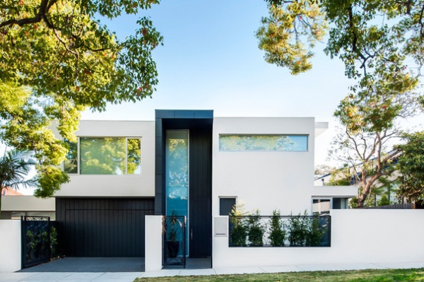
A young Melbourne, Australia, couple needed more living space for their growing family and found the solution in their dilapidated and underutilized backyard. Instead of renovating their home and redeveloping the entire property, they refurbished the house slightly, subdivided their lot and built a contemporary townhouse for their family in the old backyard. The family then rented out the original house. Because the lot is on a corner, the new townhouse has its own street access and parking.
Houzz at a Glance
Who lives here: A couple and their daughter, and their 2 cocker spaniels
Location: Melbourne, Australia
Year built: 2013
Size: 3,670 square feet (341 square meters)
Architect: Robert Schulberg
The couple wanted a contemporary design that would be sympathetic to the scale and character of the adjoining properties. The plan would include a selection of interesting exterior materials to assist in breaking down the mass of the building’s elevations while marking the new residence as an independent entity.
The design solution worked around the permissible building envelope, with setbacks minimized and building heights maximized to provide the building form. Architect Robert Schulberg avoided building walls on boundaries, which could have had a negative impact on the adjoining properties. The result is a townhouse that radiates a feeling of spaciousness through numerous glazed connections to the exterior and interior features, such as an open glass fireplace and a slatted staircase.
Entry portico paint: Industrial Lustre in Nautilus, Porter’s Original Paints; aluminium panel: Diversaclad in Anthracite; exterior paint: AcraTex in Stowe White, Dulux
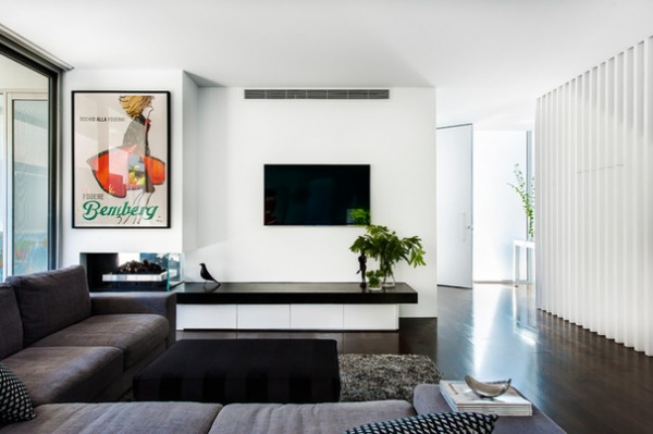
Stepping though the front door and down a short hall, visitors first encounter a spacious living area. A black and white theme throughout the house creates a dramatic backdrop for the warmer tones of the furnishings.
“The monochromatic black and white color scheme for the house was a challenge,” Schulberg says. “But we managed to add warmth and comfort by introducing different textures and materials to complement the color choices of our clients.”
Wall paint: White on White, Dulux; flooring: unfinished European oak in charcoal gray, Be Floored; seating: Natuzzi; ottoman: Keekï
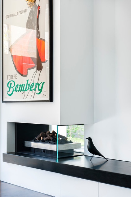
The fireplace, a feature in the living room, connects the study and living area. It has an open front, a glass side and double-paned glass facing the study. This design allows for function and aesthetics in both rooms, but its beauty lies in the double glazing, which limits drafts and noise transference to the study.
Fireplace: Real Flame; original vintage poster: Letitia Morris
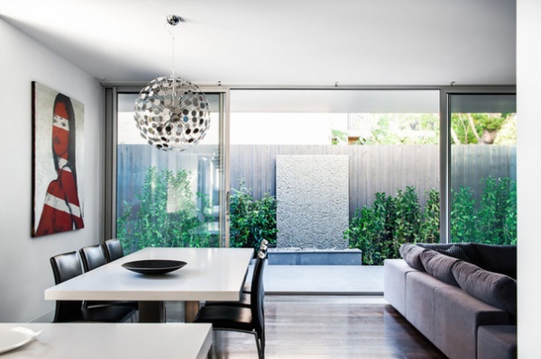
The living area is generously sized and open, and leads to a small but versatile outdoor space. An easement determined the orientation of the house and where this outdoor area could be positioned. The dogs use this unbuildable space.
The orientation of the house, with the extended veranda roof to the west and the eaves above, allows for extensive glass. This provides abundant natural light to the interior, while the generous eaves protect the interior from direct sun.
Asteroid pendant: Home of Lights; artwork: David Bromley; water feature: custom, Dean Durrant Design
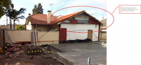
BEFORE: This image shows the foundation of the new home next to the original old house. To make the older home a little more sympathetic to the design of the new build, the architect replaced its gable roof (circled in red) with a flat one.
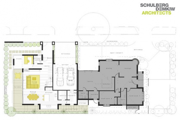
Here is the plan of the new house, showing how it is positioned in relation to the original home, marked in gray.
On the ground floor of the new home, the couple envisioned a large, open-plan living area with kitchen, laundry, powder room and study, opening to a small garden area and with car parking spaces for both houses.
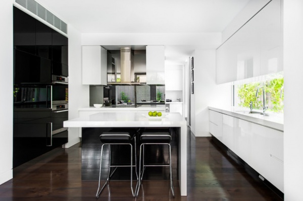
The open-plan living and dining area flows into the kitchen. Vertical storage space is maximized through floor-to-ceiling cabinets on the left side, overhead cupboards on the right side and additional storage under the kitchen island. The contrasting color scheme and clean lines — including a limited use of handles and a flush range — create a modern look. A mirrored backsplash in the kitchen reinforces the sense of spaciousness.
Countertop: Caesarstone in Pure White; paint on kitchen island and full-height cabinets: black, Dulux; kitchen cabinet paint: White on White, Dulux; backsplash: Mirrortex Tough in Smoke, The Splashback Co.; wall-mounted range hood and wall ovens: Miele; integrated refrigerator: Fisher & Paykel; integrated dishwasher: Siemens, E&S Trading
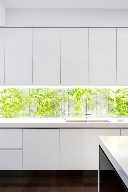
The window along the entire side wall of the kitchen enables plenty of natural light to penetrate the space and connects the owners to the outdoors, where a vertical garden attracts the eye.
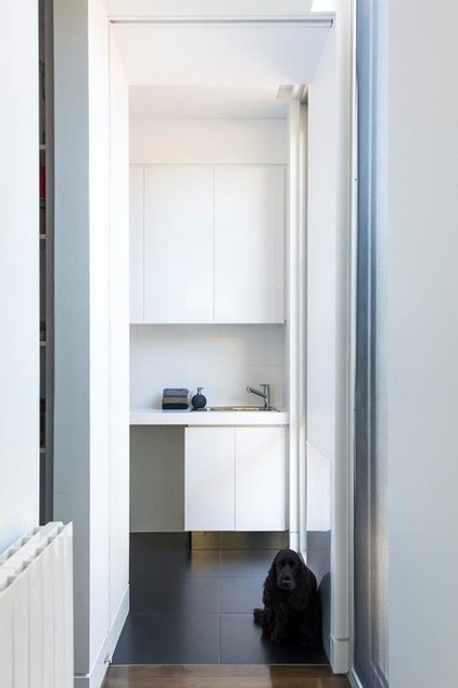
Walking through the kitchen and passing the pantry, you reach the laundry, seen here being watched over by cocker spaniel Cleo. Like the kitchen, the laundry is a showcase of optimized vertical storage, including an internal drying cabinet. Cabinets overhead and under the countertop feature recessed finger grips for a sleek and modern look. An integrated chute channels dirty clothes from upstairs to the laundry. The laundry is connected to the garage, which makes it easy for the owners to access the adjacent pantry without having to carry their shopping bags through the house.
Cabinets: Laminex in Polar White; Extreme White wall tiles and Extreme Black floor tiles: G-Lux
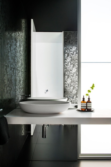
Also on the ground floor, next to the entrance, is the powder room, which has abundant natural light. The mirror behind the sink reflects the beautiful black feature tiles. The floral, feminine motif embellishes this small space and works with the black and white color scheme effectively.
Composition wall feature tiles: Nero, Classic Ceramics; vanity top: Diamond White stone, Apaiser; sink: Sanctum in Diamond White: Apaiser; faucet: Logic, Rogerseller
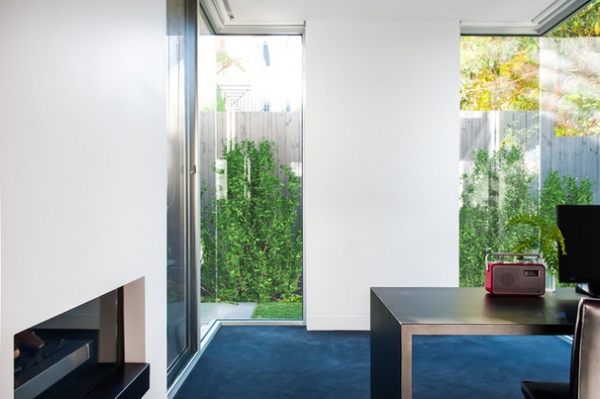
Next to the powder room, the light-filled study offers peace and quiet for working from home. With the floor-to-ceiling corner windows, opening the view to the greenery outdoors, this work area radiates calmness and relaxation. It is a private space but is still linked to the main living area through the glazed fireplace.
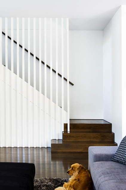
The slatted staircase leads to the upper floor. The handrail was stained to match the color of the floorboards. Zuri the golden cocker spaniel has found the ideal place to relax on a comfortable shag rug.
Shag rug: Bayliss
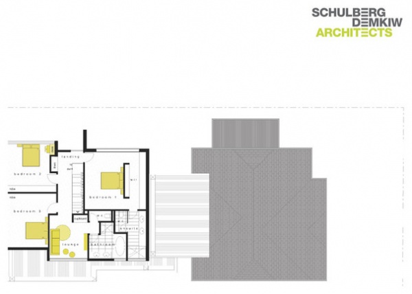
Upstairs, the couple wanted a master bedroom suite with walk-in closet and bath, two additional bedrooms, another bathroom and an open landing area. As the floor plan shows, the three large bedrooms upstairs offer ample room for a growing family.
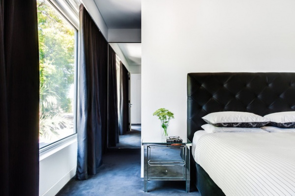
The master bedroom features a large window and includes a walk-in closet behind a dividing wall in the middle of the room.
Headboard: Keekï; nightstands: Shadow, Domayne
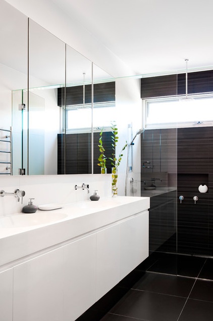
Adjacent to the master bedroom, the master bath has a wall-hung vanity with double oval sinks and undersink storage, a mirror above with LED lighting strips, a large shower with two shower heads (one wall-mounted, one ceiling-mounted), and a separate toilet.
Vanity with integrated sinks: Apaiser; feature wall tiles: Signorino; LED strip lights: World of Thought
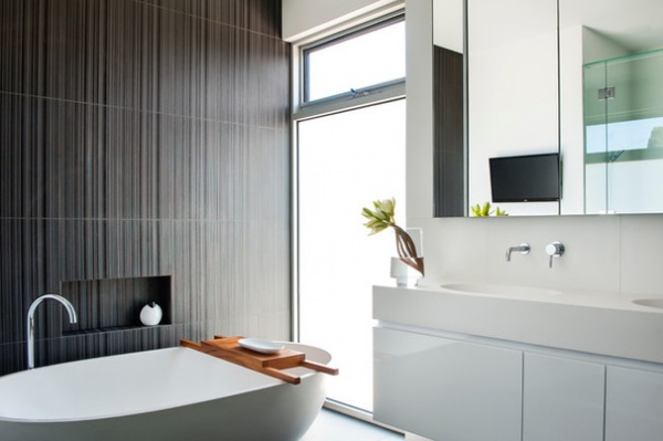
The main bathroom is accessible from the upstairs lounge area and radiates a sense of serenity and calmness. The free-standing stone bathtub takes center stage. The tiled feature wall with vertical stripes suggests an increased ceiling height. As in the en suite, the architect installed a wall-hung vanity with double sinks and undersink storage, and a mirror above with LED lighting strips. An abundance of natural light comes through the floor-to-ceiling frosted glass window, reinforcing the feeling of spaciousness.
Haven stone bathtub in Diamond White: Apaiser; Luna bath faucet and floor-mounted bath outlet: Rogerseller
Browse more homes by style:
Small Homes | Apartments | Barn Homes | Colorful Homes | Contemporary Homes | Eclectic Homes | Farmhouses | Floating Homes | Guesthouses | Lofts | Midcentury Homes | Modern Homes | Ranch Homes | Townhouses | Traditional Homes | Transitional Homes | Vacation Homes | Homes Around the World
Related Articles Recommended


