Room of the Day: Soft, Inviting Decor Suits an Ocean View
http://decor-ideas.org 08/04/2015 23:13 Decor Ideas
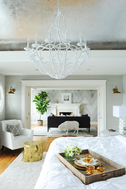
Houzzers, brace yourselves — this master bedroom is downright massive. In fact, it’s larger than a lot of our homes. But as designer Ben Leavitt points out, it is filled with design ideas you can apply to a bedroom of any size, including how to make a room more inviting by using layers of texture, scaling pieces properly and adding whimsical touches.
Before, the room’s decor certainly wasn’t bad; it just didn’t look well thought out or done. “I always say that a design is made or broken during the last 10 percent of the project,” Leavitt says. “Here the architectural features and the view were superb, but the unfinished decorating took away from them both.”
Photos by Tracey Ayton
Room at a Glance
Who lives here: A couple
Location: West Vancouver
Size: 1,000 square feet (93 square meters)
The former homeowners, who had the home custom built, were retired without any kids, so they had made the entire ocean-facing side of the top floor a very long master suite. This suited these new owners just fine. At the far end in the photo is a separate sitting area; the master bathroom occupies the opposite end. “It’s really about going upstairs at night to get cozy and having everything you need up here,” Leavitt says. There’s even a small gym off the master suite.
To address the extended length of the room, the designer came up with a bold chevron pattern in shades of gray painted on the far wall. It stands up to the large scale of the space and creates a focal point that’s noticable from all the way across the room.
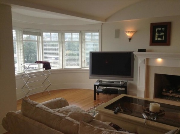
BEFORE: The decor in the master suite was not overly welcoming, nor was it complete. However, you can see some of the wonderful architectural features, including the curved ceiling, curved bay and beautiful trim and windows.
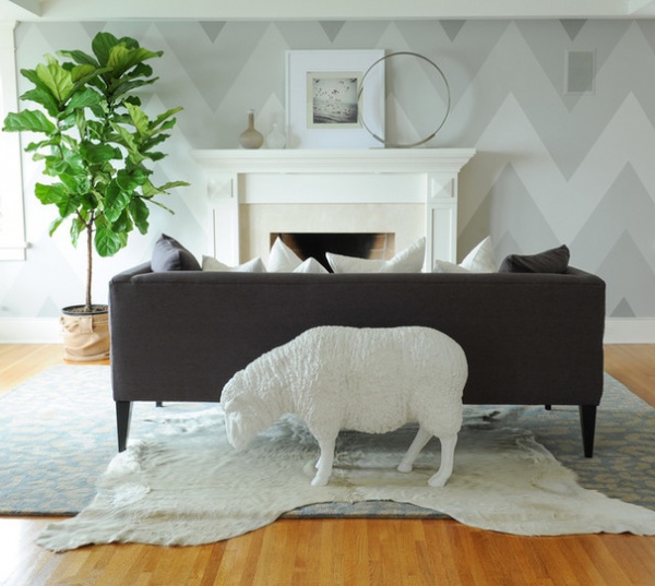
AFTER: Let’s take a look at the sitting area first. One of the clients is a veterinarian, and they both love animals, so Leavitt placed whimsical animal figures around the house. The sweet resin creature here also winks to the notion of counting sheep to fall asleep.
“The clients wanted to use this room to simply sit and enjoy the fireplace, so we didn’t clutter it up with side tables and lamps,” Leavitt says. They did cozy it up with lots of inexpensive throw pillows, and a cowhide layered atop a blue- and sand-colored leopard-print rug. A fiddle leaf fig adds life to the space.
In a vast search for the right combination of grays, Leavitt tried many different hues together. The ones he landed on are now his go-to grays. He mounted the photograph on top of a mirror to add reflection, and it nods to the tradition of placing a mirror over a mantel.
Also, if you look closely at the photo, you’ll see how meticulously the chevrons were painted. The diagonals line up perfectly with the diagonals on the fireplace surround.
Baca the resin sheep, cowhide rug and sofa: Plaid Fox; throw pillows: West Elm and Ikea; mantel accessories: HomeGoods and West Elm

With views like this, the bedroom’s decor needed to take a backseat to what the homeowners could see through the windows. At the same time it had to feel warm, comfortable and enticing.
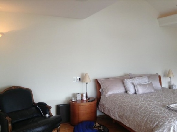
BEFORE: This photo illustrates the importance of the last 10 percent of work that Leavitt mentioned. While it had perfectly fine furniture and bedding, the room was not well-scaled or put-together, which kept it from being enticing like a bedroom should be.
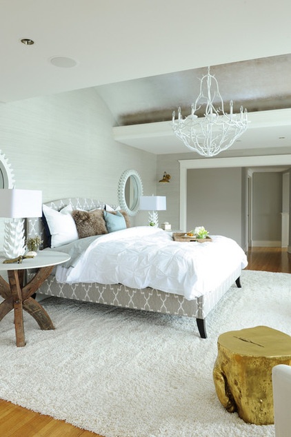
AFTER: While they splurged on a custom-made upholstered bed, they kept the bedscape simple and affordable. “The bedscape is very unpretentious. Keeping it casual made it more inviting,” Leavitt says. “We used a mix of textures and a duvet cover that didn’t need to be perfectly ironed.”
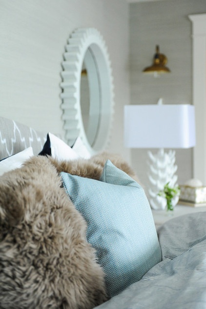
Sheepskin pillows add fluffy and alluring texture and play off the sheep in the sitting room. All of the bedding and throw pillows are from Ikea and West Elm.
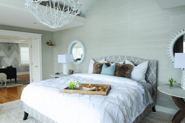
The designer also saved on the carpeting. Instead of spending a lot of money on a large custom shag rug, he simply lined up two rugs from Costco. They are held together via the grip pad underneath. The total cost was around $600.
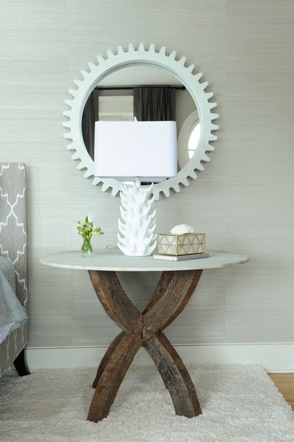
To stand up to the scale of the large room, high ceilings and bed, Leavitt designed a pair of large side tables with bases crafted from antique wagon wheels and tops of sandblasted marble. The tabletops are 36 inches in diameter, and the large size is functional too. “People tend to go too small with nightstand surfaces. I like to have a place to chuck everything, even a laptop,” Leavitt says. He recommends looking beyond a store’s nightstand section for larger tables, such as tables made for entryways.
The ceramic lamps are based on a 1950s design, with bases that resemble barnacles or coral, tying the room to the sea without being overly nautical. Leavitt then added an industrial touch with the mirrors, but lightened them with white paint.
Foley mirrors, side tables and custom bed: Plaid Fox
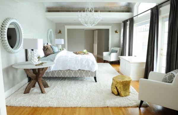
“I love mixing different styles,” Leavitt says. There are industrial mirrors, a branch chandelier that’s more country, rustic side tables, Moroccan fabric on the bed and midcentury modern armchairs all tied together by the neutral color scheme and metallic touches. The result is that the room can’t be pegged as any one particular style. “I think avoiding a theme is another thing that makes the room so inviting,” the designer says.
To balance the room, he chose dark charcoal linen for the window treatments. “We kept in mind that both a woman and a man would be sleeping in here,” he says. He added the bedside tables, the tree stump table, the industrial mirrors and the dark drapes to keep the look from feeling too light and frilly. “Also, it’s important to ground a room,” he says. “The dark color makes it feel more dramatic.”
The large bench box in front of the window was existing and houses a large TV. It can be tucked away when not in use so as not to obstruct the view.
Tree stump side table: Plaid Fox
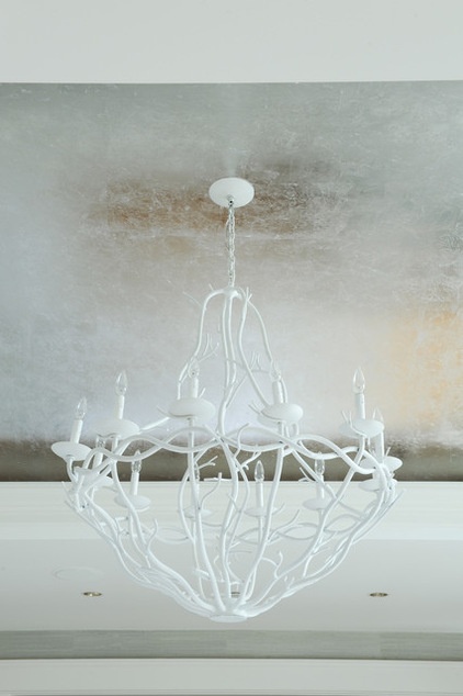
Here you can see the beautiful curved ceiling over the bed. It is made of metal that extends to the exterior. “The people who built the house wanted to be able to hear the rain on the roof at night, which is an element of a cozy cabin,” Leavitt says. He covered the ceiling in a silver-leafed wallcovering to draw the eye up. “This is an inexpensive wallcovering that looks expensive,” he says. The branch-like chandelier adds a country touch and helps bring the ceiling down visually.
Silver-leaf wallcovering: L.A. Gold Leaf
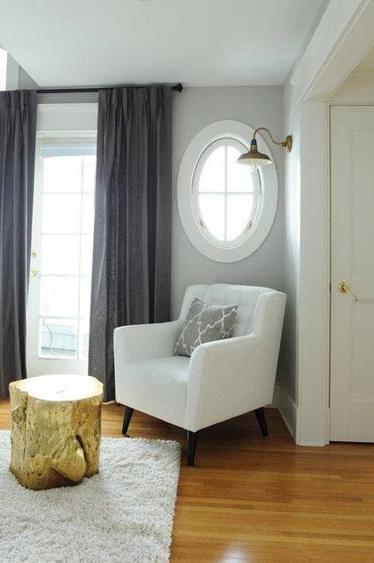
In addition to the curved ceiling, one of Leavitt’s other favorite things about the existing architecture is the oval windows, which lend subtle coastal style. The French doors lead to a dramatic balcony, as this is the highest floor on a house that is perched on the edge of a cliff.
Another interesting feature of the room is that the clients put a full-length mirror behind the door on the right. They wanted one in the room without having it as part of the decor.
Chairs and window treatments: Plaid Fox; sconces: Restoration Hardware
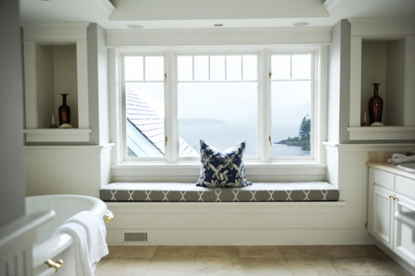
A window seat in the master bath offers big views of the water.
Throughout the room, Leavitt invested more money in just a few custom-made pieces, like the bed, but they mix beautifully with lots of items picked up at HomeGoods, Costco, West Elm and Ikea. “You really don’t have to be rich to pull this off,” Levitt says. By keeping the color palette neutral, avoiding a theme and layering lots of textures, you can make any size bedroom just as inviting.
See more Rooms of the Day
Related Articles Recommended


