Houzz Tour: Geometric Patterns Shine in a Cambridge Home
These young homeowners, a pair of Harvard Medical School alums with a 10-month-old son, were full of ideas and ambitions for their 1850 Cambridge, Massachusetts, home. Under the skilled hand of interior designer Melissa Hammond, the ideas began to coalesce. “The theme that runs through the house was dubbed ‘Moroccan mathematical’ by the homeowners,” Hammond says, “and it is a perfect description of their style.” Using as starting points a collection of intricately patterned silk rugs the couple had purchased on a vacation in Turkey, strong geometric patterns, and a touch of bling courtesy of crystal and glass chandeliers and polished chrome, Hammond brought the complex design together in a dramatic fashion. “There’s cohesion,” she says, “not confusion.”
Houzz at a Glance
Who lives here: A young couple with a 10-month-old son
Location: Cambridge, Massachusetts
Size: 3,500 square feet (325 square meters), 3 bedrooms, 3½ bathrooms
Designer: Melissa Hammond of Hammond Design
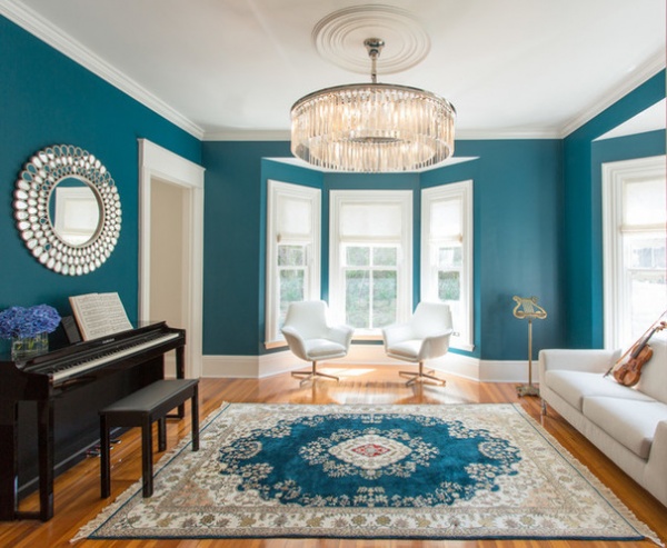
An explosion of teal greets visitors who enter the house. Once the living room, the front room is now a music room. The homeowners love to play music and host guests for impromptu concerts. “We used a bold turquoise on the walls to play off the color in the rug that the clients had purchased while on vacation in Turkey,” Hammond says. It set the palette for the first-floor rooms, with lighter tones of the same color employed in the rest of the public rooms. The crystal bling begins here as well, with the dramatic chandelier adding glamour.
Swan chairs: City Collection; Rhys glass prism large chandelier: Restoration Hardware; wall paint: Galapagos Turquoise 2057-20, Benjamin Moore
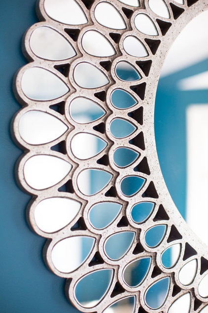
The music room’s dynamic 35-inch mirror reflects the strong teal wall paint.
Teardrop silver and glass mirror: Kichler
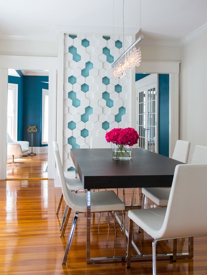
The dining room, which has a two-point view into the music room, introduces the geometric pattern play and crystal accents that inform much of the house’s interior design. The hexagonal honeycomb-patterned wall used to house back-to-back fireplaces, which were covered long ago.
Hammond had the wall reframed and painted a lighter shade of the same blue as in the music room. From there the visual interest grows. Hammond used a series of interlocking 3-D wall tiles made from a plaster-like substance, spray-painting them the basic white used throughout the house. The blocks were then assembled and installed over the painted wall.
Since her clients do not like paintings on walls, but do love anything three-dimensional, the pattern wall “gives focus to the dining room. Otherwise it would have been kind of blah,” Hammond says. “It didn’t have the wow factor of the music room or family room. It needed a little something.” Keeping the furnishings palette quiet let the pattern wall take center stage. The linear crystal chandelier “adds that sparkle the clients love,” Hammond says.
Modular Arts Interlocking Blocks: Hive; Broadway Linear chandelier with Spectra large glass: James R. Moder; Parentesi super extendable table with veneer graphite top and chrome legs: Calligaris; dining chairs: Cruiser in chrome and leather, Calligaris; paint by Benjamin Moore: Silver Satin OC-26 (walls), Spring Rain 723 (accents) and Maritime White OC-5 (trim)
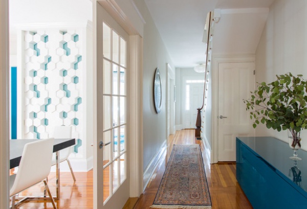
The couple wanted to respect the old bones of the original house while modernizing its layout and materials. Hammond simply refinished the original fir flooring and kept the original millwork. A view to the front door shows the original entry and 1850 staircase newel post, with the dining and music rooms off to the left. Light from large windows in both of those rooms helps illuminate the central hall, with help from recessed lighting. With brilliant turquoise as the first-floor accent color, Hammond could not pass up the 87-inch-long high-gloss teal sideboard when she saw it. The hall leads to the step-down kitchen and family room, part of a later two-story addition at the back of the house.
Groove sideboard with co-planar doors in gloss teal: San Giacomo
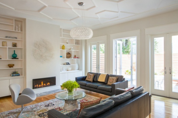
The heart of the home is the family room, part of the newer two-story addition, which also functions as a casual living room with French-door access to the patio. It is a cozy place, with two leather couches, a wall-hung television, a gas fireplace and custom built-in shelving that flanks the fireplace. To see the geometric showstopper in this room, however, you just need to look up and appreciate the new hexagonal honeycomb plaster tracery ceiling. “The wife sent me a photo and asked, ‘What about doing that?’” Hammond says. “I told her, ‘Are you kidding? I’d love to do that.’”
Hammond contacted a company that usually does work in public historic properties such as the Massachusetts State House. “That was a big challenge,” she recalls. “Very big, huge. It is very labor-intensive.” Working from scaffolds, with laser levels set all over the ceiling, the artisans had to first ensure that the surface was perfectly level. “I had to come up with a design,” Hammond says, “and we had to tweak it a bit.” Once the hexagonal design had been set, the company made special molds. It took two months to complete the work, which extends across the adjoining kitchen as well. This nod to the past was given a touch of the modern with the crystal chandelier. The tracery ceiling was a splurge, Hammond says, adding that “it was totally worth it. Most people have a plain ceiling. But why not?”
Tracery ceiling: Boston Ornamental; chandelier: Caboche Suspension, Foscarini
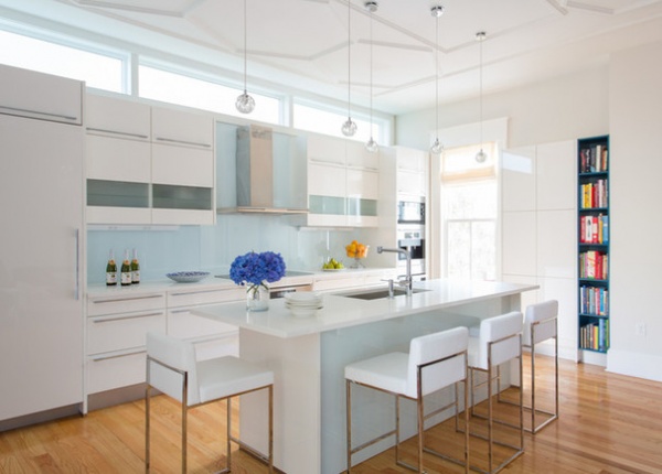
The kitchen, which is adjacent to the family room and part of the newer two-story addition, shares the beauty of the tracery ceiling. To keep the focus on the plasterwork, and as a counterpoint to the room’s traditional look, Hammond opted for high-gloss white cabinets and white quartz composite countertops for a clean, modern take. The barest hint of color comes from the plate-glass counter backsplash and glass island front, both back-painted in the lightest shade of the first floor’s signature teal without going white. Since glass can read as green, Hammond chose low-iron glass that has the least green in it so it would not fight the blue tone of the paint.
The strongest color in the space comes from the column of turquoise bookshelves at edge of the pantry wall. “They have tons of books and absolutely love cookbooks,” Hammond says. “They wanted a space for them.” To keep the atmosphere light and airy, she added a run of narrow transom windows where the wall meets the ceiling. Hammond went with a Miele appliance suite with a built-in espresso machine to complete the high-tech look.
Refrigerator, induction cooktop, oven, hood and dishwasher: Miele; sink: UrbanEdge collection, Luien; Elio single-lever faucet with pull-out spray: Dornbracht; countertops: 3-centimeter Super White polished Pental quartz; counter stools: EvenPlus, Calligaris; cabinetry: high-gloss white, Your German Kitchen; pendant lighting: Sunlight S1 in polished chrome, Aureliano Toso; bookcase: Petrol Blue, Your German Kitchen; paint by Benjamin Moore: Silver Satin OC-26 (walls) and White Heron OC-57 (trim)
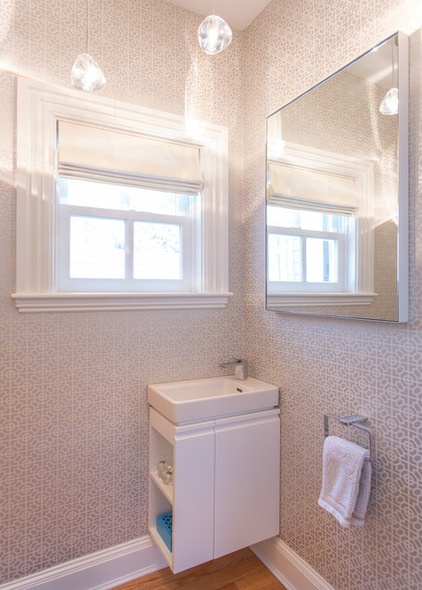
The small first-floor powder room is illuminated by light from several sources, such as the window, large mirror and pendant lights. But it is the white-on-silver wallpaper in a repeating Moorish-style geometric pattern that gives the room its soft glow. The wall-mounted sink and cabinet are tucked in the corner and off the floor, giving the petite room a larger feel. The hand-blown glass pendants are all individual — no two are alike. “The ethereal light they cast on the walls,” Hammond says, “is so cool.”
Pro small white basin: Laugen; Kiwami Renesse single-handle faucet in chrome: Toto; pendant lights: Mizu, Terzaniltem; mirror: Infinity, Room & Board
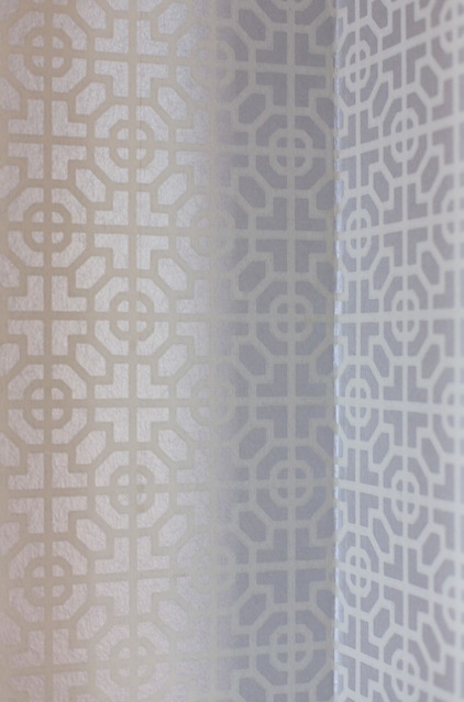
Wallpaper: Sussex P535-12, Designers Guild
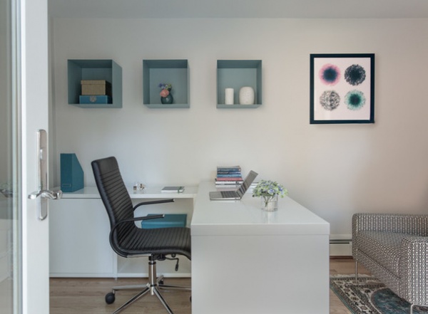
The first floor’s signature teal is picked up in the wife’s office in a series of square 3-D display shelves and a rug. The hanging artwork is “the only exception in the entire house, and only there because her brother is an artist and he made that piece especially for her,” Hammond says. The office, which shares a wall with the garage, sits at the back of the lot and has access to the patio.
Desk, chair and shelf cubes: BoConcept; paint by Benjamin Moore: Silver Satin OC-26 (walls) and White Heron OC-57 (trim)
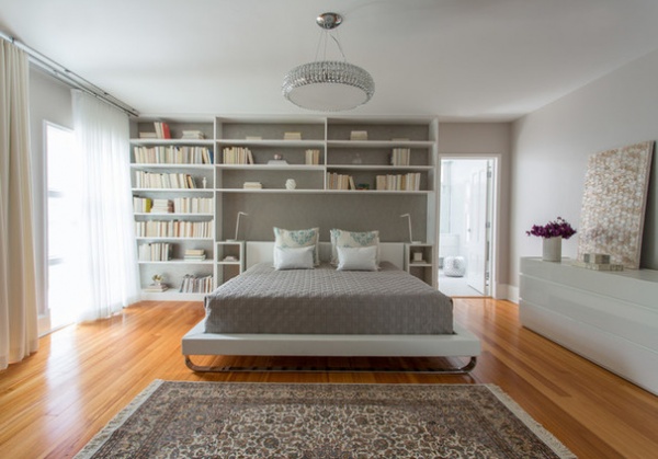
The homeowners wanted their master bedroom to be serene and quiet. With color palette cues taken again from a Turkish silk rug, the neutral hues signal a peaceful sanctuary, but not one without stimulation. The custom built-in book shelving system and nightstands around the bed — “very straight and rectilinear and calm, Hammond says” — were essential because both of them do a lot of reading for work and love to read for pleasure. She gave them lots of space, she says, “because they want plenty of space to be able to add more books.” The bit of necessary bling is found — not surprisingly — in an crystal chandelier.
Wallpaper: faux shagreen in silver on gray, Osborne & Little; Chelsea upholstered platform bed in white leather, Modloft; dresser: Cidori in gloss white, San Giacomo; chandelier: Bijou Suspension, ET2 Lighting;paint by Benjamin Moore: Picket Fence CSP-370 (walls) and White Heron OC-57 (trim)
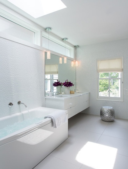
“The whole room just sparkles,” says Hammond of the all-white master bath. Light floods in from transoms and a skylight, and then is picked up and bounced around by the jewel-like faceted high-gloss white tiles that cover the walls from floor to ceiling. Crystal pendants over the custom vanity, a continuing theme from the first floor, add to the luster. The floor’s porcelain ceramic tile has been carried into the curbed shower.
Tile by Porcelanosa: Helsinky White (walls) and Town Niquel Nature POTC (floor); bathtub: PuraVida Whirltub Combi-System with lighting, Duravit; sink faucets: Series 17 in polished chrome, Ammara Designs; wall-mounted tub filler: MB511-P in polished chrome, MGS Faucets; Tempo vanity: Furniture Guild; countertop: 3-centimeter Thassos Pental quartz; sinks: Vero, Duravit; pendant lighting: Matrix, Spectra crystal, Schonbek lighting; trim paint: White Heron OC-57, Benjamin Moore
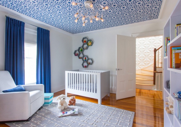
If geometry accents the other rooms, it is employed full bore in the baby’s nursery. While the walls are quiet white, the ceiling fairly explodes with a blue and white Moroccan floral-pattern wallpaper — all the better for the baby to gaze at. “We picked wallpaper all day,” Hammond recalls. “Newborns love high contrast with shapes. He loved it from day one. He stares at it.” Fluttering against the revolving blue-sky ceiling is a visually delightful light fixture, Ingo Maurer’s Birdie’s Nest, featuring feather-winged incandescent bulbs that twirl out from the center. “It was a natural choice for a nursery. It was so whimsical,” Hammond says. “It’s that softness against the strong geometry — it all works together.”
More pattern appears in the pale rug, the geometry of the bookcase and in the honeycomb hexagonal shelving above the crib, which echoes the hexagonal elements in the dining and family rooms. Custom blackout draperies and Roman shades control the light.
Rug: Dawson in gray, Pottery Barn; chandelier: Birdie’s Nest, Ingo Maurer; wall and trim paint: White Heron OC-57, Benjamin Moore
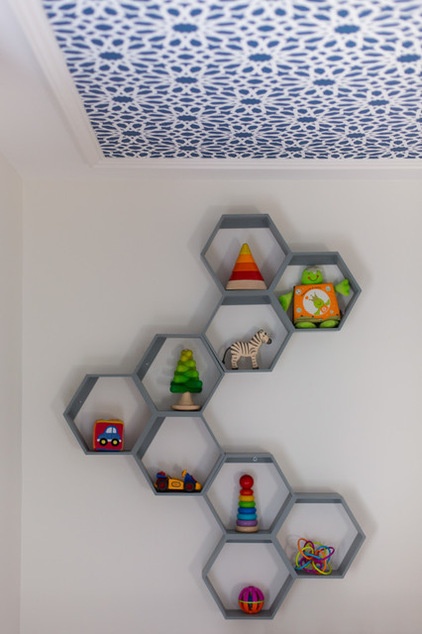
Honeycomb wall shelf in gray: Land of Nod
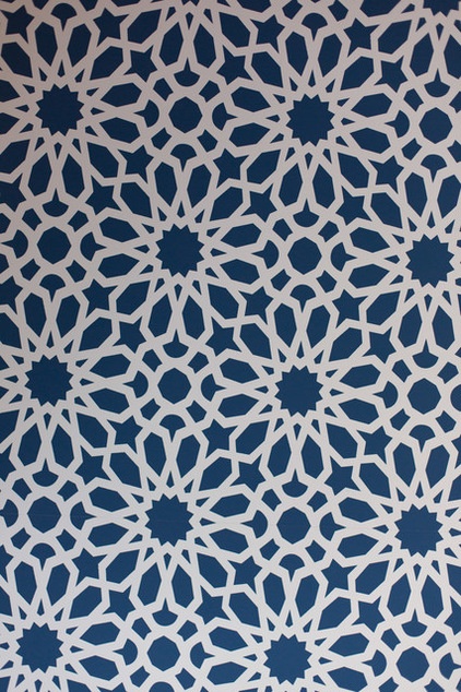
Wallpaper: Martin Lawrence Bullard for Schumacher, Moorish Moroccan No. 5006640 in star pattern
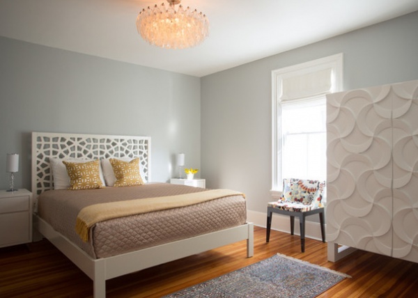
The second-floor guest bedroom is similar to the master bedroom in its quiet tone. But pattern play and texture make a welcome appearance here, too, in the bed’s Moroccan-style pierced headboard and, most strikingly, in the undulating interlocking half-moons of the armoire. While the armoire pattern’s shape is organic, not sharp-sided, “it’s very ordered,” Hammond says, “and the same spirit.” Once again, a crystal light fixture dresses up the room with an animating sparkle.
Headboard: Morocco, West Elm; armoire: Istanbul Cabinet Shine, SHO Studio; chandelier: Vintage Carol Scarpa Venini Polyhedral Murano glass; paint by Benjamin Moore: Silver Satin OC-26 (walls) and White Heron OC-57 (trim)
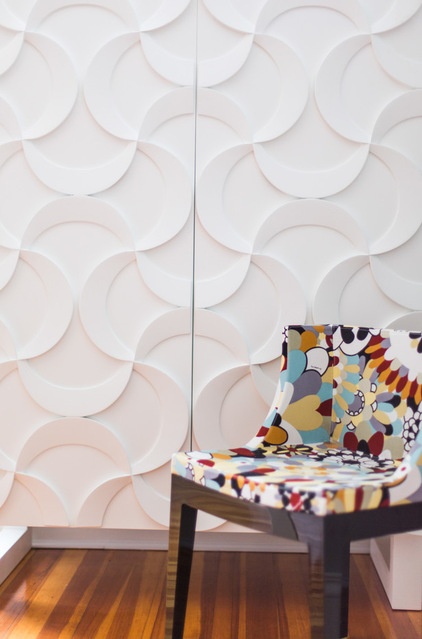
If there is an outlier in the house, it may be the guest room’s cheeky little chair clad in an exploding Missoni print, a refugee from the couple’s old condominium. “Why not?” Hammond says with a shrug. “It’s fun and unexpected — a little sense of humor.”
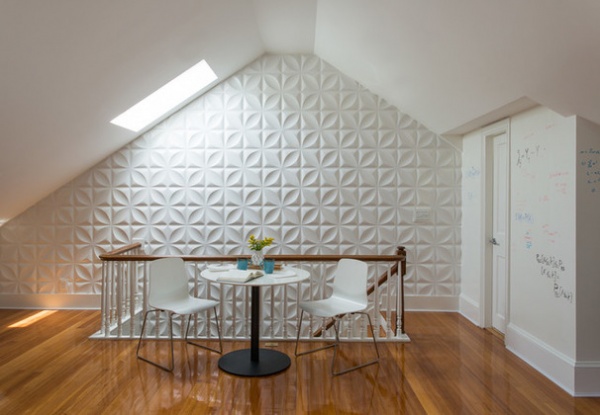
The third floor houses the husband’s sizable office and library. “He wanted a place where he could sit and work,” Hammond says. “He does a lot of collaborating with colleagues — they sit and talk and work out mathematical equations. Math is kind of a hobby for him. He likes to doodle and come up with things.” The cafe set offers a convivial work surface, but his work surface extends, quirkily, to the wall. He had brought to Hammond the idea of using the wall at the top of the stairs as a large whiteboard — he had seen a photo of something like it — so she covered the wall with whiteboard paint. Now he and his colleagues happily doodle with dry-erase markers, and the wall can be wiped clean for future formulas.
On the wall leading up to the third-floor library are high-gloss white wall tiles for a graphic pop.
Bonn table and London chairs: BoConcept.com; whiteboard paint: Sherwin-Williams
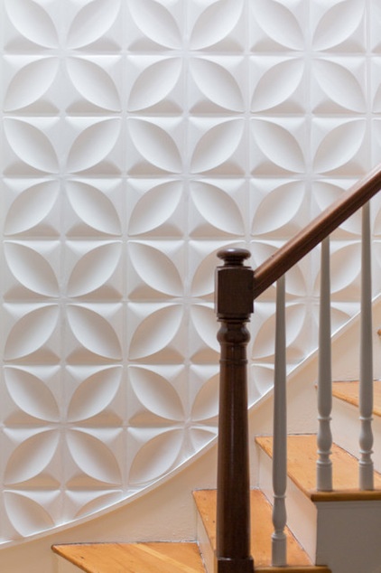
The staircase up to the third floor, part of the original house, could easily have been nondescript. “The husband really wanted something that had some impact as you were coming up the stairs,” Hammond says. She decided to cover the whole wall with 3-D paper tiles. The sizable 18-by-18-inch fiberboard-like tiles come unfinished. Hammond mounted them to the wall to establish the patterns, caulked the seams and spray-painted them in high-gloss white. “They are fairly simple,” she says, “but they have a strong graphic pop.”
Wall tiles: Chrysalis CHYWF, Inhabit; paint: White Heron OC-57, Benjamin Moore
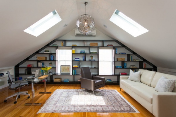
“This room was a mess, all chopped up into different rooms,” Hammond says of the third-floor space. It was completely re-engineered during the remodel, including the addition of a structural beam in the ceiling and a pair of skylights, plus new flooring to match the downstairs original fir.
Key to the space is the significant book shelving. The custom-built shelving, constructed in a strong geometric pattern, incorporate original side windows. Once the husband and Hammond decided to install it across the entire side wall and around the window frames, the two “had a lot of back and forth on the design, how they were to be spaced, where the vertical dividers would be located,” Hammond says. After several drafts, she hit upon a design he really liked.
She had assumed that the shelving would be painted white, but he had seen a photo of some done in black. “I said, ‘I really like this,’” she recalls. “I thought it was a good idea.” Covered in high-gloss black, which pops against the white walls, they give the space a decidedly masculine tone, which is reinforced by the strong repeating geometry of the almost-blackened chrome light fixture. As in other rooms, the color palette was drawn from the intricate Turkish rug; this one has neutral browns, tans and black.
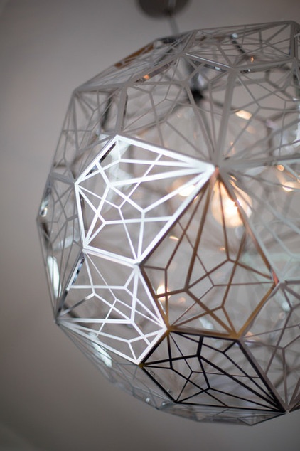
Etch Web pendant No. R344734 in black finish: Tom Dixon
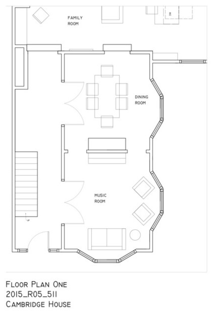
This floor plan shows the home’s entryway, music room, dining room and a portion of the family room and kitchen.
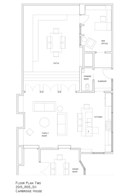
Continuing through rest of the first floor, we see more of the dining room and kitchen, the mudroom, powder room, her office and the patio.
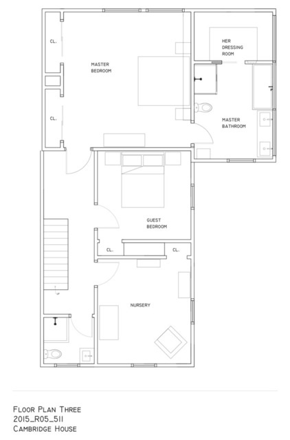
This plan shows the upstairs bedrooms, bathrooms and dressing room.
Browse more homes by style:
Small Homes | Apartments |Barn Homes | Colorful Homes|Contemporary Homes | Eclectic Homes | Farmhouses | Floating Homes | Guesthouses | Lofts|Midcentury Homes | Modern Homes | Ranch Homes|Townhouses | Traditional Homes| Transitional Homes |Vacation Homes | Homes Around the World


