Houzz Tour: A Hard-to-Find Door Just Adds to the Experience
http://decor-ideas.org 08/04/2015 03:13 Decor Ideas
Jodi Zipp’s kids like to tease her about front doors. Of all the houses she and her husband, Fred, have lived in with their three kids, most of them have had front doors that are difficult to find — around a corner or at the back of the house.
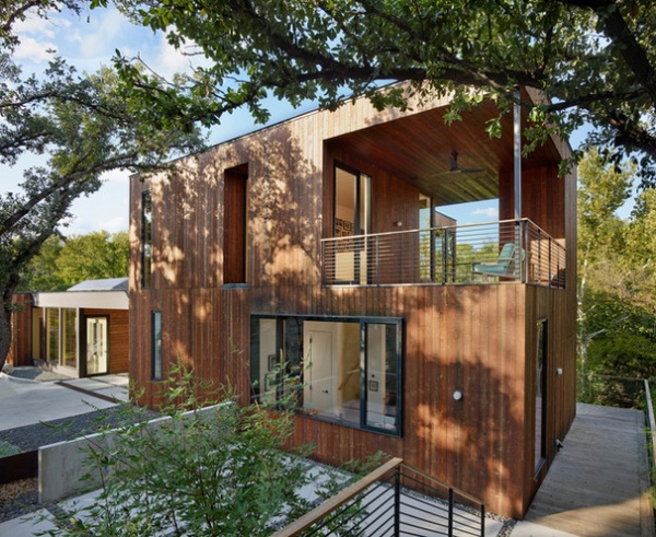
Houzz at a Glance
Who lives here: Jodi and Fred Zipp, a former stay-at-home mom and a retired newspaper editor, respectively
Location: Austin, Texas
Size: 2,700 square feet (250.8 square meters); two bedrooms, 2½ bathrooms
The same goes for the house she and Fred recently designed in Austin, Texas. Stairs lead from the street, down to platforms and along a path that takes guests to the right side of the house, shown here, and around the back to a landing that extends over a creek. “I don’t like houses that show everything at once,” Jodi says. “I like that guests come down the stairs and aren’t sure which way to go. I like that feeling of mystery and anticipation.”
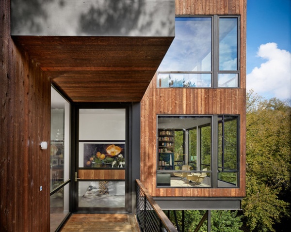
Of course, Jodi isn’t the first person to champion roundabout entry sequences. The ones for Frank Lloyd Wright’s Robie House and Hollyhock House inspired hers. Like those homes, Jodi and Fred wanted their house to, in a sense, unfold. They tasked architect Matt Garcia, who had designed and built their riverside vacation home in Llano, Texas, with creating the experience. Here you can see the “front” door, which is around the back of the house and overlooking a creek below. “It became an experience of seeing how steep the lot is and seeing the creek below before going into the house,” Garcia says.
The steepness of the lot led many people before the Zipps and Garcia to believe it was unbuildable. It was the only undeveloped lot on the street for that reason. Garcia spent a month doing a feasibility study on the site and deemed it fit for a modern house. He used a flat shelf to hold most of the home, while the rest he cantilevered over the creek.
Their previous home was a 5,000-square-foot glass box meant for entertaining large parties and their three kids, but with their last kid off to college and Fred retired as editor of the Austin-American Statesman newspaper, all that space didn’t make sense anymore. “With the kids gone, we wanted a smaller footprint and wanted it to be cozier,” Jodi says. “The previous house was quite grand. This one has a much more intimate feel. It’s a comfortable space.”
Doors and windows: Fleetwood Windows & Doors
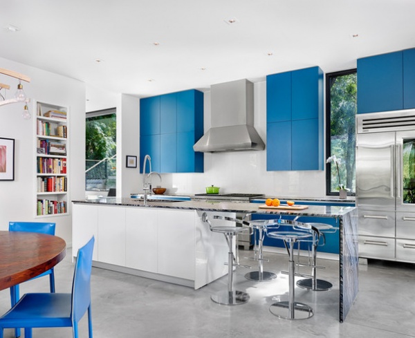
With such warmth on the exterior from the cedar boards, Jodi wanted a cooler interior. White walls throughout the home show off bright artwork, while bright blue cabinets in the kitchen create the effect of blue sky and white clouds. Jodi requested soft-close drawers without hardware, because she’d caught her hip and clothing on hardware in previous homes.
Putting the pantry, microwave and wine fridge through the opening on the left and around the corner helped keep the space open and airy.
And because the Zipps didn’t need a ton of storage underneath the island, they created seating for four at the onyx waterfall countertop supported by a steel plate.
The kitchen flows into the dining and living areas. “I wanted people to be able to come into the kitchen and help chop if they wanted to,” Jodi says. “It’s very open and ends up feeling bigger than it actually is.”
Cabinets: Poliform; backsplash: back-painted glass; faucet: Dornbracht; sink: Precision series in stainless steel, Blanco; refrigerator: Sub-Zero; vent hood: Wolf
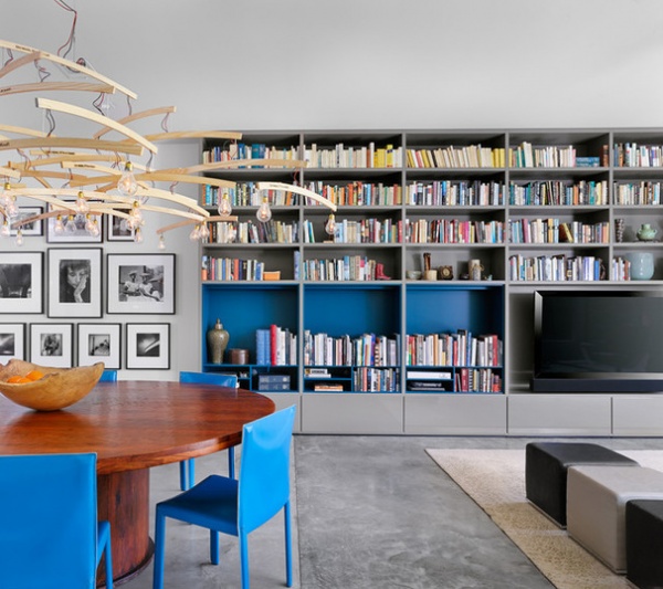
While the Zipps’ new home doesn’t work quite as well as their previous home for big parties, they still love to have dinner parties, and can squeeze 12 people around the round dining table.
Jodi and Fred love to read and have a large collection of books that they wanted to show off. Garcia designed a large bookcase in the living room and space elsewhere in the home to do just that. “We think of our books as friends, and part of our decor,” Jodi says. In their previous house, their books were upstairs, hidden in a library. “That kind of bothered me,” she says. “I like being able to see my books. It brings warmth and personality to a room.”
Bookcase: Poliform; light: Oh Man, It’s a Ray, Ingo Mauer; table: mango wood, Collectic; chairs: Enrico Pellizzoni
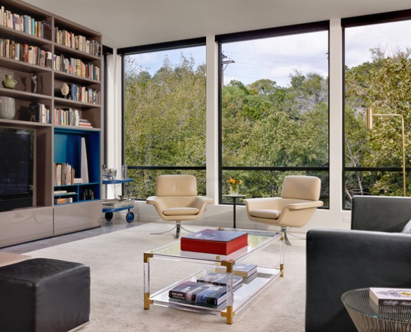
While their old house had grand views of the Austin city skyline, their new house, in keeping with the goal of intimacy, peers into the woods. “We can stand and look down and watch the creek flowing. It’s more of a treehouse,” Jodi says.
Coffee table: vintage, made of Lucite, glass and brass; Charles sofa: B&B Italia; side table: Platner, Knoll; rug: custom made of silk and wool, Tufenkian; floor lamp: Heron in satin brass, CTO Lighting
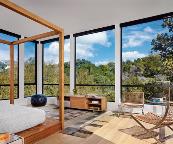
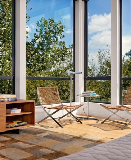
A typical day sees the Zipps waking up, making coffee and returning to their bed to read and enjoy the canopy setting. There’s also a patio off this room that they enjoy in cooler weather.
Because the room backs up to the woods, they weren’t concerned about privacy. Retractable shades can be dropped from the thick black boxes at the tops of the windows, but 99 percent of the time they stay up.
The floors are rift-sawn white oak.
Solid teak canopy bed and console: PCH series, Mash Studios; bedding: West Elm; chairs: Flexform, Poliform
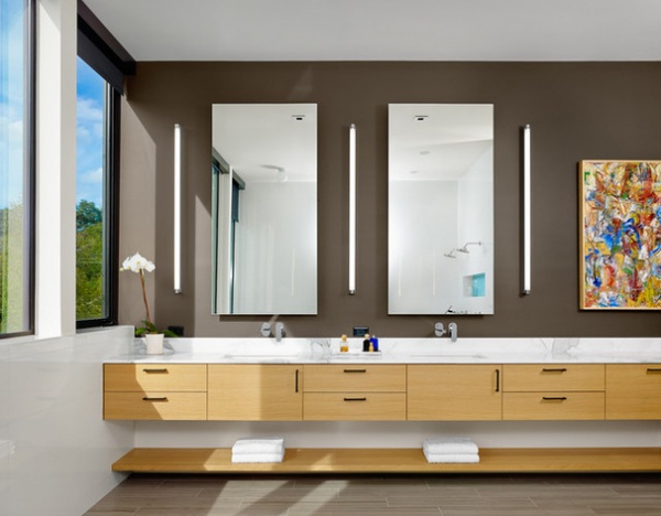
In the open-concept master bathroom, nothing separates the shower and bathtub from the rest of the space. Instead, limestone floor tiles and white porcelain wall tiles create waterproof surfaces. “We took to calling it a wet room,” Garcia says. “It gives it this big, open, spa-like feel. Plus, you really have to be dancing in the shower to get water out there.”
The cabinetry was custom made from rift-sawn white oak. The backsplash is Calacatta gold marble.
Sinks: Ladena, Kohler; faucets: Tre, Lacava; tilework: Dennis Bruhn Tile
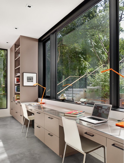
Garcia took to calling the home office in a walkway at the front of the home the study hall. Custom cabinets create his-and-her spaces for Fred and Jody, who can look out the large custom windows to see if guests or deliveries are arriving from the street.
Lamps: Kelvin, Flos
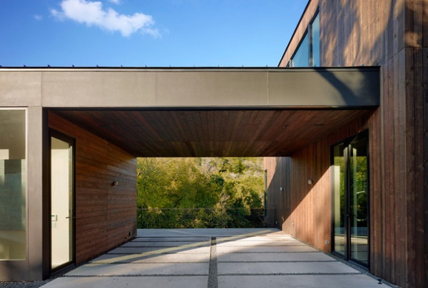
Garcia came up with the idea of separating two extra bedrooms from the main house — attached by a carport — to create privacy for guests. The door to the left leads to the separate two-bedroom unit, which the Zipps rent out almost every week to help cover the mortgage. “We’ve really enjoyed meeting people from all over the world,” Jodi says. “We have a guy coming in from Germany soon.”
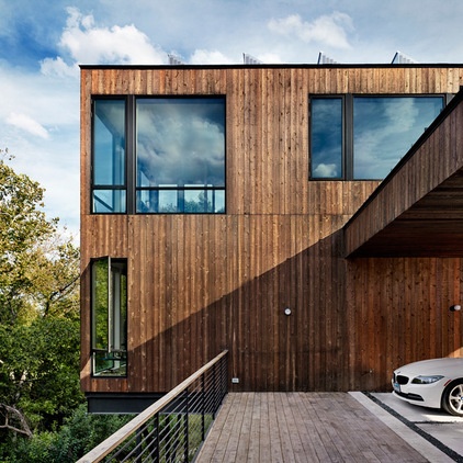
“The concept was to use rustic material on a modern box,” Garcia says of the design. He used the rougher side of cedar boards to achieve this.
A redwood deck cantilevers over the creek. The short window is part of the living room. The master bedroom is above.
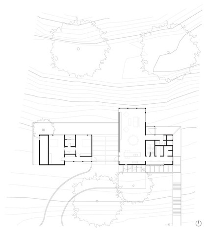
This site and general floor plan shows how the simple forms connect on the site. You can see how the living room — and the not-shown master bedroom above it — cantilevers over the creek.
Trim carpentry: Stacy Nowlin
Stucco and concrete: Boothe Concrete
Browse more homes by style:
Small Homes | Apartments | Barn Homes | Colorful Homes | Contemporary Homes | Eclectic Homes | Farmhouses | Floating Homes | Guesthouses | Lofts | Midcentury Homes | Modern Homes | Ranch Homes | Townhouses | Traditional Homes | Transitional Homes | Vacation Homes | Homes Around the World
Related Articles Recommended


