Cottage Kitchen’s Refresh Is a ‘Remodel Lite’
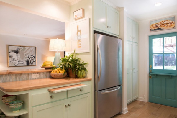
Good things come to those who wait. A few years ago we toured the rest of this California cottage, but the family was waiting to replenish their renovation savings account before tackling the kitchen. To tide them over, interior designer Charmean Neithart originally painted the back door turquoise to match the beachy and bright design in the rest of the house, swapped in some new glass knobs on all of the cabinets, added a pretty window shade and modified a cumbersome breakfast bar.
Now she has helped the homeowners complete what she deems a “remodel lite.” “We’ve done several of these types of kitchen renovations lately,” Neithart says. “You guide the homeowners to put the money in where they are going to get it back, and you make the important changes that will impact how they use the house every day.” By keeping what was working and being thoughtful about where the dollars went, she retained the home’s cottage charm and saved them enough money to complete a bathroom renovation they had on their wish list.
Photos by Erika Bierman Photography
Kitchen at a Glance
Who lives here: A couple and their 2 teenage children
Location: Altadena, California
Size: 126 square feet (11.5 square meters)
The homeowners and Neithart wanted to preserve the 1930s cottage’s charm while enhancing it with functionality and the happy colors that one of the homeowners loved. “She wanted to change the cabinets, but he couldn’t see spending the money when they were perfectly functional,” the designer says. “I assured her that the classic Shaker looked great, and then she was able to get the aqua color she loves so much via new paint.” Glass knobs also help freshen up the original cabinets.
By keeping the existing cabinets, Neithart estimates the couple saved about $30,000. She also advised against replacing the perfectly functional refrigerator with a trendier cabinet-depth refrigerator. “Those appliances start at about $7,000. I assured them there haven’t been that many advances in refrigeration that would be worth that cost,” she says.
Cabinet paint: Bath Salts 624, Benjamin Moore; hardware: Anthropologie
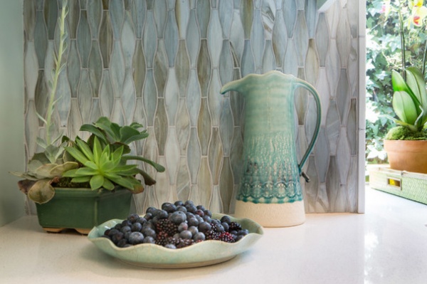
After selecting the aqua paint for the cabinets, it was time to coordinate a backsplash. “I love this line [by Lunada Bay Tile]. They have fresh patterns, colors and shapes, and it’s a cost-effective choice,” Neithart says. “This was from a brand-new collection, and it is just spot-on.”
The homeowner is passionate cook. “Her food and her presentation are always so beautiful,” the designer says. “She also has wonderful things and displays them really well. I knew for this photo shoot, all I would have to do to find great items for staging was open up her cabinets.”
Backsplash tile: Agate silk finish glass mosaic in Taiko Lucca, Lunada Bay Tile; countertops: Ocean Foam polished #6141, Caesarstone; vintage pitcher, planter and plate: homeowner’s own
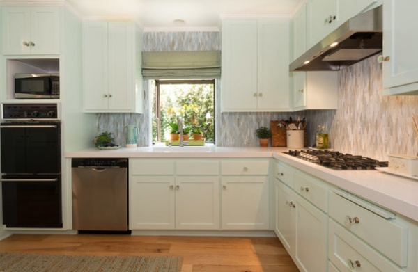
“Taking the glass mosaic tile all the way up to the ceiling really brought it home,” the designer says.
The few adjustments she’d made to tide the couple over a few years back were phase one of a master plan. For instance, the window shade she’d helped them choose back then stayed, the new floors were already installed, and the back door color and some changes they made to the peninsula all work with this final phase of the remodel.
Shade fabric: Faux Bois in Haze, Martyn Lawrence Bullard
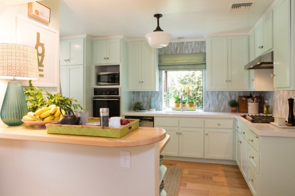
Before, this peninsula jutted out, had an odd shape and obstructed a high-traffic area. The homeowners did not wish to have stools there and felt like the peninsula just got in the way. Neithart shaved 12 inches off, keeping it large enough to serve food on top of it, and had the maple butcher block refinished during phase one. She also gave one of the homeowners’ favorite table lamps a fresh lampshade.
Lampshade fabric: Cruz in Pacific Blue by Peter Dunham, Hollywood at Home
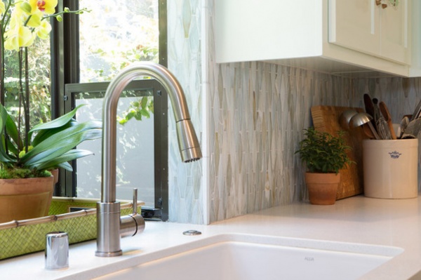
The homeowner was not a huge fan of the bay window, which was a popular feature in the early 1980s. “I told her, ‘It’s fine. You’ll really appreciate the sunlight, and it’s not worth taking it out,’” Neithart says. Plus, it’s just the spot to keep fresh flowers or potted herbs.
Faucet: #33045 pull-down, dual-stream in brushed nickel, Aquabrass
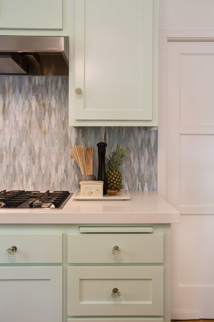
What was worth taking out? Well, while the wall ovens, dishwasher and microwave functioned just fine (and were not eyesores), the range did not, so they invested in a new cooktop. “The homeowner is a fantastic cook, and she needed the kitchen to be hardworking,” Neithart says. With a large extended family living nearby, the owner regularly hosts dinner parties for up to 40 people and enjoys preparing the meals for them.
She also needed hardworking countertops, and landed on Caesarstone. Neithart recommended a modern double straight edge. “The rest of the house has a lot of transitional moments, and the counter ties into that,” the designer says.
Hood: PRH6-K36SS, Vent-A-Hood; cooktop: GLS-3665RS, Whirlpool
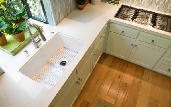
The Allia fireclay sink with grid from Rohl is another hardworking new element. It’s also a nice fit for the vintage cottage.
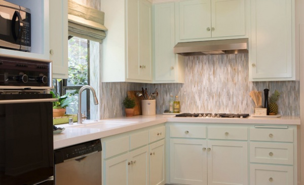
By living in the house for a few years before redoing the kitchen, the homeowners were able to figure out what was and wasn’t working for them in it. Keeping the existing layout, the appliances that were working and the cabinets, the couple were able not only to spend more on the things that mattered to them in the kitchen, but also to squirrel away enough in savings to remodel one last bathroom.
“These kinds of remodels save clients tens of thousands of dollars,” Neithart says. “Adding new paint, a new backsplash, new countertops, sinks and hardware really freshens a kitchen up.”
Kitchen Workbook: 8 Elements of a Cottage Kitchen


