My Houzz: A Minimalist Home Finds Beauty in Simplicity
http://decor-ideas.org 08/01/2015 20:13 Decor Ideas
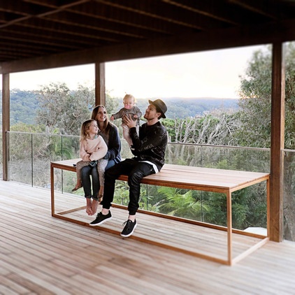
If you love the look and feel of minimalist decor, this beautiful Sydney apartment will make you feel right at home. Many of us aspire to accumulate less clutter, and it seems Sasha and Nathan White have found a stylish solution. The young couple are the founders of and designers at furniture and textile retailer Mr & Mrs White, and have used their own design ethos to deck out their three-bedroom, one-bathroom apartment just upstairs from Sasha’s parents’ place.
Houzz at a Glance
Who lives here: Sasha and Nathan White and their daughters, Selah, 4, and Oak, 8 months
Location: Avalon, Northern Beaches, Sydney
Size: 3 bedrooms, 1 bathroom
The home originally belonged to Sasha’s parents, who bought it 10 years ago when it was, as Sasha describes, “like an old beach shack.” When Sasha and Nathan got married, they converted the space downstairs into a three-bedroom apartment for themselves, while Sasha’s parents continued to live upstairs. “They work full-time and it’s completely separate, so we don’t need to see each other, but whenever they’re around, they pop in. It’s very handy when we go out to dinner and need a babysitter,” Sasha says.
The renovations were gradual, taking a little over three years, and were designed by Sasha’s sister, Amee Allsop, who is an architect.
The couple also used their skills as designers to make sure the home was completely personalized.
Nathan’s background is in boat building, and Sasha studied graphic design in college. When the two got married in 2008, they started making their own furniture for their apartment. “It was difficult finding pieces that fit into the small-space apartment, so we just started making our own things and then for our friends and family,” Sasha says.
Two years later, in 2010, they combined their skills — Nathan’s furniture making and Sasha’s textile design — to create Mr & Mrs White. And ever since, their home has been a personal showcase for their work.
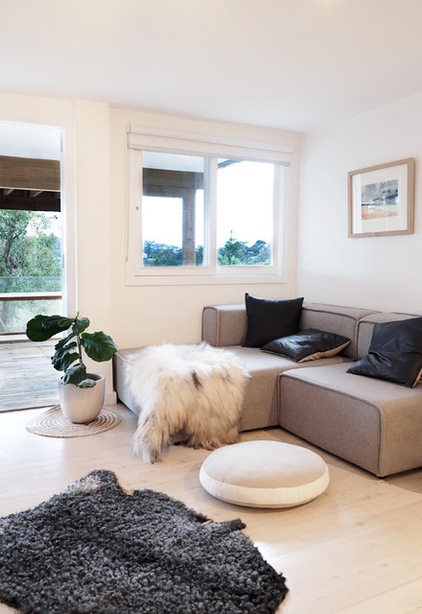
Sofa: BoConcept; Swedish sheepskin (on floor), round linen pillow, Icelandic sheepskin (on sofa) and navy leather pillow: Mr. & Mrs. White; artwork: Annette Kelsey
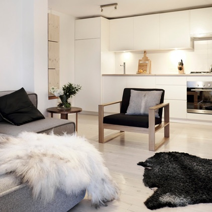
The renovation was completed by A.M. Custom Builders and occurred in three stages. The first stage included general cleaning of the apartment and repainting walls (those they intended to keep). The second stage was more extensive, so the couple had to move out. The kitchen, which had been a small nook where the living area is now located, was moved to the back wall to create an open-plan area more suitable for family living. The bathroom was shifted from where the kitchen is now to an en suite off the main bedroom. The final stage involved the decking and landscaping.
The Box chair, Kiss Cuddle side table and gray cowhide pillow: Mr. & Mrs. White
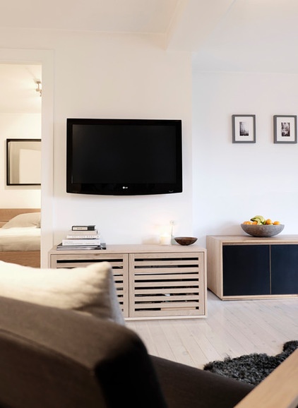
The living area is one of Sasha’s favorite spots in the house, because it’s where the family spend most of their time together. She says it’s a small space and one of the key areas in which she tries to keep clutter to a minimum. “When you live in a small space, clutter can make it feel so much more crowded,” she says. “The couch, side chair and entertainment unit is all the furniture we keep in here.”
The oak entertainment unit was custom designed for the couple’s home. “We often test things in our own home and make adjustments to the design before we decide to add it to the range,” Sasha says.
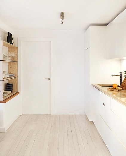
The galley kitchen is modern and simple, providing the couple with space to cook and move around in. The kitchen cabinets, as well as the custom shelving unit on the left, were designed by Nathan.
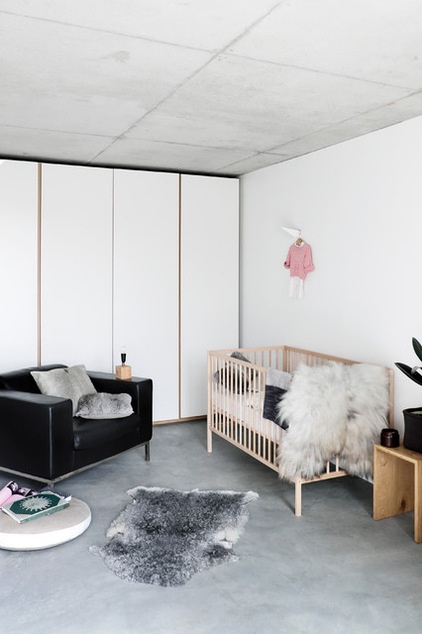
The two girls’ bedrooms are styled similarly to the rest of the home. With growing kids in the house, keeping clutter at bay can be a challenge, but Sasha says she manages to do it with clever storage. Floor-to-ceiling storage, including these built-in cupboards in Oak’s room, and handmade boxes to store the toys in, are just a couple of the tactics the stylish duo have adopted.
Crib: Sniglar, Ikea
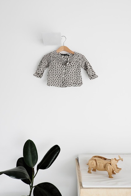
Sasha enjoys hanging the girls’ clothing as an extra layer of texture and says it’s a nice way to accessorize a growing girl’s bedroom.
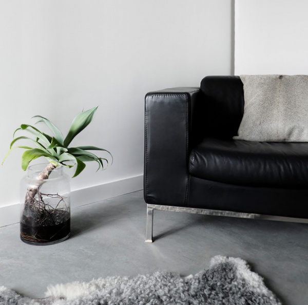
The Mr & Mrs White store, in Sydney, and the couple’s home have many similarities. The theme in both is minimalism, neutral colors, wood and natural materials, including leather and linen. “These elements really stand the test of time and get better with age,” Sasha says.
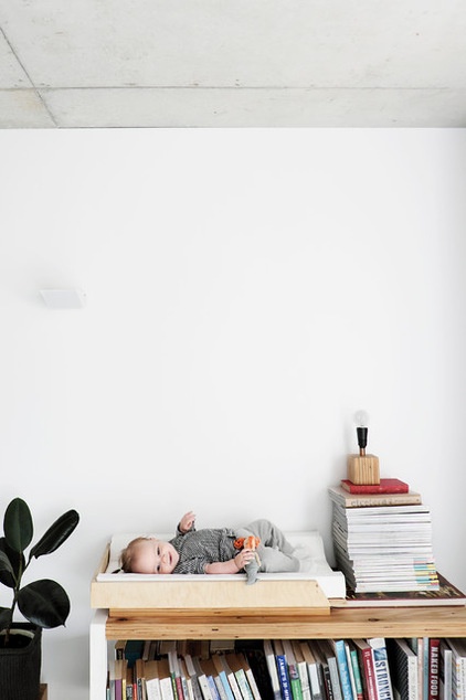
Sasha says decorating the girls’ bedrooms has been a gradual process that hasn’t involved much planning. “I have moments of inspiration but nothing too thought out,” she says. “We’ve been able to keep Oak’s room really clean, as she’s a baby and not moving around too much yet.” (A parent is just out of frame of this picture of Oak.) When styling the girls’ bedrooms, Sasha keeps things simple with natural palettes and textures, and just a touch of greenery.
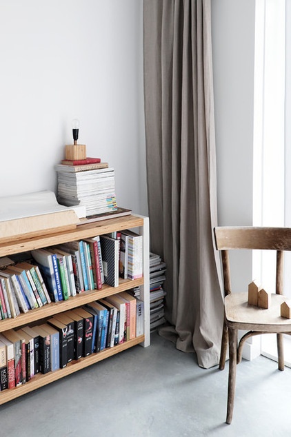
Children’s books are stacked on a humble bookcase that Nathan made with the promise of many bedtime stories. Sasha designed the linen drapes.
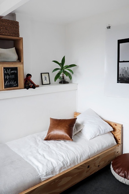
Selah’s room is designed for the 4-year-old to grow up in. The neutral palette and stylish design mean it has the potential to last her for many years to come.
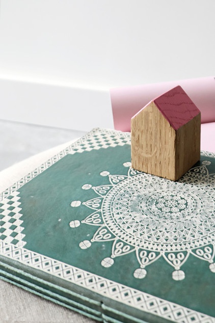
Everything in the room has a personal touch, including Selah’s book with her baby photos inside and a cute house-shaped block that Nathan made for her to play with.
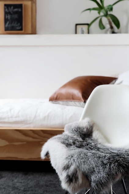
“We were excited when Selah was old enough to start sleeping in a big girl’s bed, so we built her one and kept the decor as simple as possible to minimize clutter,” Sasha says.
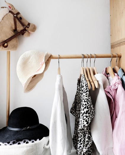
Both of the girls’ bedrooms proudly display their favorite fashion pieces, adding a sophisticated touch of color.
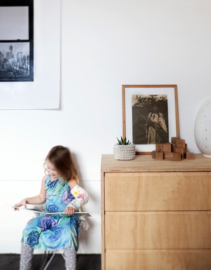
Dresser: Mr & Mrs White
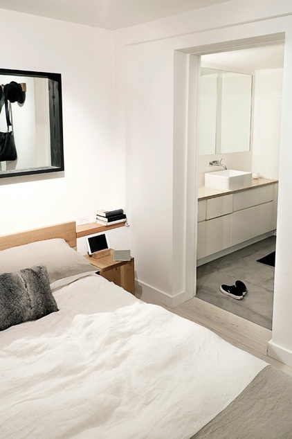
The main bedroom boasts an en suite, and the couple sleep in a bed designed and made by Nathan, called Beam. The duo also designed the gray hide pillow and linen duvet.
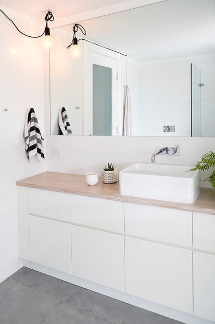
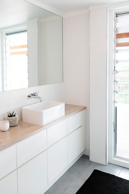
The girls share the simple en suite bathroom with Mom and Dad. Nathan designed the bathroom cabinetry.
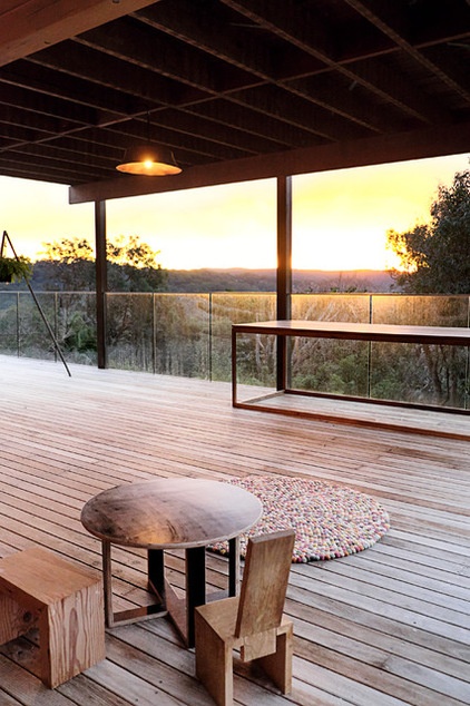
The deck is Sasha’s other favorite area of the home. She says they use it as a second living space during summer. “It’s so beautiful — up on a hill with a lovely view out to Pittwater [an estuary]. It’s especially nice watching the sun set from here,” she says.
My Houzz is a series in which we visit and photograph creative, personality-filled homes and the people who inhabit them. Share your home with us and see more projects.
Browse more homes by style:
Small Homes | Apartments | Barn Homes | Colorful Homes | Contemporary Homes | Eclectic Homes | Farmhouses | Floating Homes | Guesthouses | Lofts | Midcentury Homes | Modern Homes | Ranch Homes | Townhouses | Traditional Homes | Transitional Homes | Vacation Homes | Homes Around the World
Related Articles Recommended


