New This Week: 3 Barely There Kitchens
Call it the Age of Openness. No, it’s not an enlightened period of history in which people share their feelings. It’s a time when homeowners are increasingly requesting more open spaces. Walls are coming down, ceilings are going up, and cabinetry is getting so clever that you almost don’t even know it’s there.
To get airier kitchens, many homeowners are doing away with upper cabinets altogether, favoring open shelving to lend a lighter feel and provide more opportunity for additional windows, further pushing the openness. The problem? Storage. Without those upper cabinets, designers have to come up with innovative ways to organize pots, pans, utensils, pantry items and everything else that fills up our kitchens.
The following kitchens — uploaded to Houzz recently by their respective designers — show how you can have a place to put your stuff and still have that barely there feeling. Here, the designers share their plans of attack, “uh-oh” moments and more.
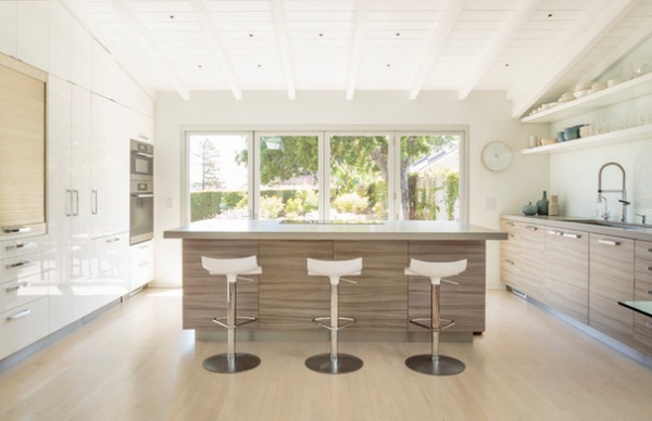
1. Bright Bungalow
Designer: Laurie Haefele of Haefele Design
Location: Santa Barbara, California
Size: 18 by 12 feet (5.4 by 3.6 meters); about 220 square feet (20.4 square meters)
Year built: 1938
Homeowners’ request: “The home is a 1938 California bungalow on the upper east side of Santa Barbara, near the California mission,” interior designer Laurie Haefele says. “The house is mission style. The clients wanted to take the interiors from cute country cottage to clean and contemporary. The kitchen felt very small and closed-in due to too much cabinetry crammed into the space. We opened up the space by taking out the walls and removing the dropped ceiling to expose the original ceiling beams of the house. The goal was to open up the space as much as possible and allow for as much light and space as possible.”
Plan of attack: “After the walls were removed and the ceiling was opened up, we blocked out the new space. We purposefully designed the room with the intentions of everyday dishes to be out and easily accessed. The client has beautiful everyday dishes, so it made sense to display them on the open shelves for ease as well as aesthetics. The open shelves keep the room feeling open and spacious.”
Why the design works: “The goal was to make the kitchen look and feel larger. The opened shelves, raised ceiling and full sliding glass back wall that opens to the patio helped achieve this open space in a once-small kitchen.”
What wasn’t working: “The kitchen felt like a cave — dark; low ceilings; closed off by walls to the rest of the house.”
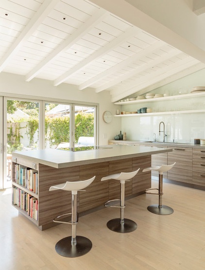
Who uses it: “The homeowners are a professional couple without children. They are very athletic and love spending time outdoors. Bringing the outside in was also a goal in this project. The sliding glass wall easily opens up to make the kitchen and patio an indoor-outdoor space.”
Designer secret: “Integrated appliance panels to keep the sleek look, a contemporary appliance garage to hide all clutter of everyday appliances such as a toaster or blender, and simple polished chrome handles for extra style.”
“Uh-oh” moment: “There was a tough engineering challenge of how we were going to support the over 12 feet of cantilevered shelves without having to use visible supports.”
Splurges and savings: “Haefele Design and the clients decided to splurge on appliances and plumbing fixtures, while saving on the cabinetry finish. The clients saved money by using a European laminate on the cabinets.”
Take-away: “It’s possible to incorporate a contemporary interior inside a mission-style bungalow.”
The nitty-gritty: Countertops: Caesarstone; backsplash: back-painted glass; cabinetry: custom; stools: Design Within Reach; appliances: Miele; sink and faucet: Blanco; filter faucet: Rohl; hardware: Atlas
See more of this kitchen
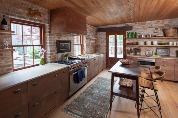
2. Feel-Good Farmhouse
Designer: Cameron Schwabenton of Cameron Stewart
Location: Charleston, South Carolina
Size: About 300 square feet (27.8 square meters)
Year built: Around 1772
Homeowners’ request: “A place for guests to relax and dine with the capabilities of a full kitchen on a small scale,” interior designer Cameron Schwabenton says. “A sensitivity to the historic building fabric and a minimally invasive design approach were a must.”
Plan of attack: “During the renovation, layers of various 20th-century wall materials were removed to expose the original 18th-century brick and plaster walls. Upon discovery of old-growth 20th-century cypress paneling hidden beneath a layer of drywall, we chose this material to face the kitchen cabinets and appliances. Sub-Zero undercounter refrigerators and freezers were selected to keep the kitchen as minimal as possible.”
Why the design works: “The design successfully blends the historic nature of the space with the conveniences of a modern kitchen. The feel is simple yet combines materials both old and new.”
What wasn’t working: “With such a small house, there was no need for a designated entry space. This space was put to better use as the dining area.”
What goes on here: “This is a combined kitchen, living and dining space. It also serves as the home’s foyer and stairwell to the second floor.”
Who uses it: “This is a guesthouse, so it serves various family members and friends.”
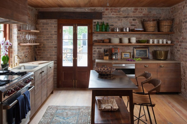
Designer secret: “Built-in cabinets and seating under the stairs utilize an otherwise wasted space. Light-finished wood floors open up this relatively small space.”
“Uh-oh” moment: “We ran out of the reclaimed cypress wood salvaged from the wall paneling to face the side of the cabinets, so we had to use additional reclaimed cypress on the ends. A custom mix of stain and oil was applied to emulate the existing.”
Splurges and savings: “Splurges: The Wolf range and Sub-Zero undercounter refrigerators and freezers. Savings: The existing antique heart pine floors were in great shape, so they only needed to be refinished.”
Take-away: “Historic renovations always present the most challenges, but they are definitely worth the end result.”
The nitty-gritty : Cast-stone countertops: Ravelle; antique rug and chairs: Cameron Stewart; wall sconces: The Urban Electric Co.; overhead lighting: Tech Lighting; kitchen island: Landrum Tables; undercounter refrigerator drawers: Sub-Zero; dishwasher: Asko; range and microwave drawer: Wolf; plumbing fixtures: unlacquered brass, Watermark; hardware: Baldwin; floor finish: Rubio Monocoat
Team involved: Meadors Construction (architect and general contractor), Odyssey Woodworks (carpenter); Mike Ledford (photographer)
See more of this house
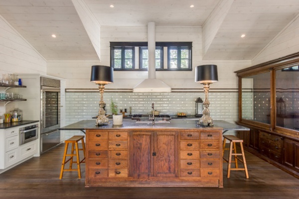
3. Sophisticated Saltbox
Designer: Richard Laughlin of Laughlin Homes and Restoration
Location: Fredericksburg, Texas
Size: About 500 square feet (46.4 square meters)
Year built: 1972; renovated in 2014
Homeowners’ request: “The owner wanted to convert an existing carport into a functional working kitchen as part of the renovation on a mid-’70s saltbox home,” designer Richard Laughlin says.
Plan of attack: “I located two unique drugstore fixtures from the early 1900s that I incorporated into the project and based the kitchen design around. We handcrafted the vent hood locally to achieve a retro feel. The kitchen also incorporates two locally sourced historic apothecary cabinets: one for the island, one for storage.”
Why the design works: “Clerestory windows allow light from the north to flood the room. Expansive steel-case patio doors open onto the alfresco patio and pool.”
What wasn’t working: “The original was small and outdated. The new kitchen, dining and master suite doubled the size and meets the families needs.”
Who uses it: “Single mom Dixie Dankworth Cope, with two high school daughters at home. Dixie has an eye for design and is the owner of Dankworth Dry Goods, which specializes in unique and vintage fabrics. Dixie is an amazing cook specializing in Southern dishes. Her daughters are also very gifted in the kitchen. The family gathers here daily to share time together.”
Designer secret: “I started out with an amazing client that has a great sense of design that fully trusted me to push the limits on the open-concept kitchen. The reclaimed pieces gave us strong elements to build the project around.”
“Uh-oh” moment: “As you can see, the island piece had several original drawers. They were originally 2 feet deep. Due to the space requirement, we had to disassemble each drawer, cut it down to 14 inches deep and reassemble them to allow for the depth of the dishwasher and kitchen sink while maintaining a maximum width of 40 inches. They all remained functional.”
Splurges and savings: “By recycling the drugstore pieces — island and cabinet — with a cost of $3,000 for both, we were able to upgrade the appliance package and remain under budget while creating a truly unique project.”
Take-away: “A trusting client is the key to a successful project.”
The nitty-gritty: Flooring: oak wood, Quality Hardwoods; fixtures: Larry Jackson Antiques; vent hood: State Air; appliances and plumbing fixtures: Ferguson; windows: Marvin, BMC West
Team involved: Laughlin Homes and Restoration (contractor); Dixie Dankworth Cope (codesigner); Douglas Grona (construction supervisor); Kent Hutton (project manager); CSI Millwork (cabinetmaker); Schumann Granite (countertops); Kiser Iron (stair rail)
See more of this house
New This Week features designs from projects most recently uploaded to Houzz. Have a great project? Here’s how to share your photos on Houzz.


