Room of the Day: Bye-Bye, Black Bidet — Hello, Classic Carrara
http://decor-ideas.org 07/30/2015 06:03 Decor Ideas
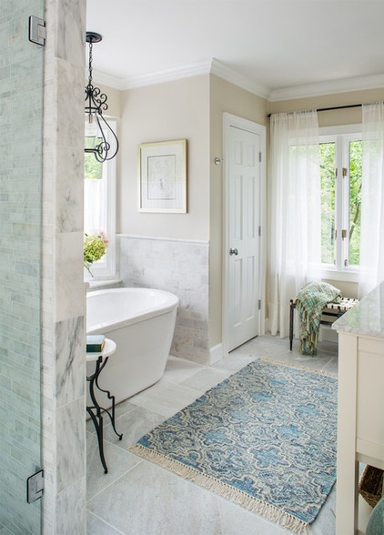
This bathroom was large, but it was a dark dungeon that included features like faux black marble, fluorescent lighting, Lucite faucet handles, a black bidet and, oddly enough, a refrigerator. With her twin boys about to go off to college, this single mom was ready for a change. At the same time, she realized a resale would probably be on the horizon in the next few years, as she wouldn’t need so much space. “My client has really great eclectic and bold taste, but for her future plans we kept things classic and neutral in here,” interior designer Beth Kooby says. She layered in more personal eclectic touches via accessories that can be switched out with ease if necessary.
Photos by Jeff Herr Photography
Bathroom at a Glance
Who lives here: A mother and her twin teenage boys
Location: Atlanta
Size: 144 square feet (13 square meters)
“I’m a big fan of classic and clean for the permanent fixtures. That way a bathroom won’t get dated,” Kooby says. “You can always switch out accents like rugs, mirrors, planters and window treatments to update or change up the look later for very little money.”
Wall paint: Winds Breath; trim paint: Simply White, both by Benjamin Moore
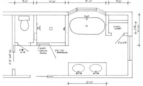
This plan shows the new layout. The linen closet previously had been a 3-by-3-foot shower stall. Kooby installed the shower where a toilet-bidet closet had been. She borrowed a little room from a large bedroom closet to work in the new bidetless water closet.
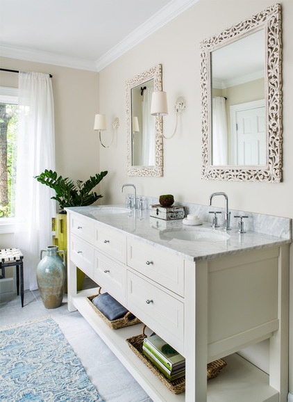
“The homeowner’s room is light, with touches of citrus, wrought iron and gauzy drapes,” Kooby describes. She created continuity via wrought iron accessories like the vintage accent table and the light fixture, the gauzy linen window treatments and the chartreuse planter.
Tip: Bring life into the bathroom with plants. “I love to use plants in a bathroom,” Kooby says. The large planter was a perfect fit for the empty corner between the vanity and the wall. “It’s even more chartreuse than it looks in the photos, and it’s covered in spikes. I got it from one of my go-to spots when I need a good dose of pretty, Lush Life.”
She scored the bench at 14th Street Antiques Market. “I love to add in pieces from local antique and consignment shops — I think it adds a lot of interest to the mix,” the designer says.
Anson Ribbon chandelier: The Urban Electric Co.
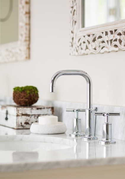
After searching high and low, looking at “every mirror in the universe,” Kooby scored the mirrors at Cost Plus World Market. “Mirrors are a great place to add a design element,” she says. “And you can always change the finish or color.” The carved wood frames add an ornate touch that isn’t too delicate or feminine.
Vanity: Pottery Barn; faucets: Kohler
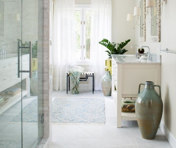
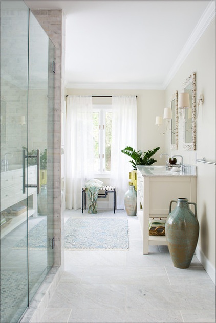
For the floor, the designer chose a reasonably priced stone that looks expensive, from Porcelanosa. In addition to helping them stay within budget, the choice warms up the room. “Too much marble can be harsh sometimes,” she says.
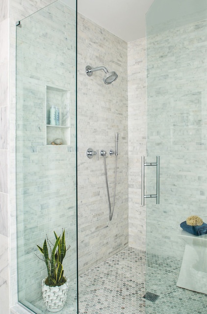
The new shower is about 5 by 5 feet. The floor and walls are Carrara marble, with penny rounds on the former and a varied linear pattern that mimics stacked stone for the latter.
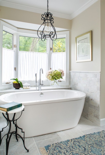
Tip: Get out of the bath section when choosing a bathroom rug. Kooby recommends looking for more interesting flat-weave rugs. “They are easy to vacuum and clean; they dry quickly and feel fine on your feet,” she says. “Rugs are made to be walked on. You don’t have to be gentle on them.”
The artwork is a print by George Braque, who helped create Cubism with Pablo Picasso.
To keep the woodsy views while also providing privacy, Kooby stood in the tub while her client looked up at the room from the driveway outside. The homeowner had never used the old tub, but she wound up using and loving the one put in for resale.
Rug: Anthropologie; tub: American Standard
More: 15 Design Tips to Know Before Remodeling Your Bathroom
Related Articles Recommended


