Houzz Tour: Garden Apartment Gains Space and Light
“When you came into this flat before, you sensed you were in a basement,” says Lisette Voûte, who redesigned this ground-floor apartment in south London to make it bigger, brighter and more efficient. “It felt dark, and there was damp. I knew I needed to lighten it all up massively.”
Voûte increased the flat’s footprint with an extension at the back and across a side exterior pathway that now contains a bedroom and bathroom. Then she treated the space to a complete overhaul, investing in luxury fabrics and quality materials, but cleverly saving funds here and there, too, with upcycling and smart design. “The main aim of this build was to get rid of the damp and extend the place to make it feel so much lighter,” Voûte says. “I then picked a look that had the country feel the owner liked, but was more crisp and fresh.”

Houzz at a Glance
Who lives here: A professional woman
Size: 2 bedrooms, 2 bathrooms
Location: Fulham, south London
Designer: Lisette Voûte of Lisette Voûte Designs
“Before, everything in this flat was beige,” Voûte says. “I wanted to use some color to make it feel fun, bright and warm, but also to keep the space really light.”
Voûte chose pale green for the walls with touches of slate blue throughout. She kept the tongue-and-groove paneling that ran around the living space, continuing it out into the hallway, but painted it crisp white. “It elevates the room, making it feel lighter and providing a break in the wall and another feature in the room,” she says. Voûte also painted the fireplace a fresh white and installed a solid slab of limestone as a hearth to replace broken black tiles. “It looks much cleaner now,” she says.
The only piece of furniture the owner brought to this house was a chest that had belonged to her grandmother. “It was quite pale, so I took it to my French polisher, and he polished it up,” Voûte says. It now works as a beautiful coffee table.
Wall paint: Willow II, Paint & Paper Library; rug: Alternative Flooring; mirror: Out There Interiors
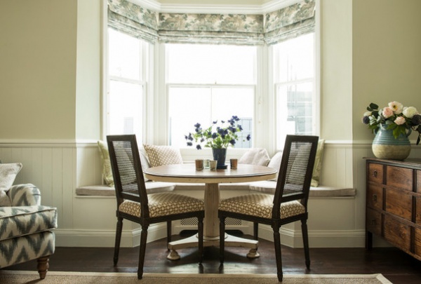
Voûte built this window seat in the living room’s bay. “It creates a handy dining nook,” she says. “The bench lifts up, and there’s storage inside.”
Blind fabric: Robert Allen; seat fabric: Schumacher
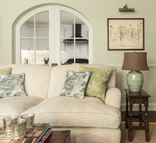
The kitchen used to be accessed via the hall, but now double doors connect it to the living room. “It’s a better use of space, and you get more kitchen out of it,” Voûte says. “Light flows from the bay window at the front right through to the kitchen now.”
The doors are a sliding, pocket design. “Doors can steal space,” Voûte says, “and doors through to a kitchen are rarely closed, so it made sense to fit sliding ones.”
To save money and make the space personal, Voûte found an inexpensive sofa, which she then had reupholstered in a beautiful fabric. “It’s a relaxed corduroy,” she says, “a modern version of a traditional fabric.” The pillows are a contemporary take on the typical country look. “The patterns are painterly florals with a slightly abstract feel, not chintzy or traditional,” Voûte describes.
Sofa: Sofas & Stuff, upholstered in Munro fabric by Zoffany; large pillow fabric: Colefax & Fowler; small pillow fabric: Robert Allen
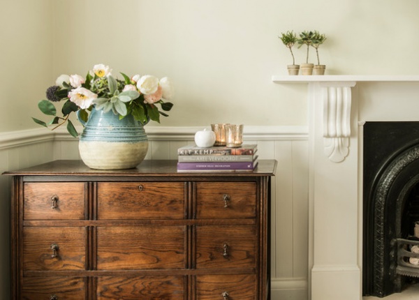
“The owner spent most on the renovation work and quality fabrics,” Voûte says. “We saved on other things.” She found the secondhand chest of drawers, for example, online for just over $300, then had it revived by a French refinisher.
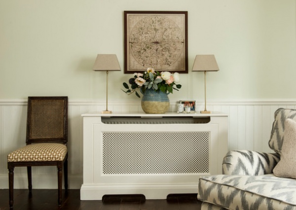
Voûte had a radiator cover built that now fulfills two functions. “It covers an ugly radiator,” she says, “but it also acts as a console table. I was going to put a console here, but in the end I just got a slightly deeper cover fitted. It’s [about 18 inches] wide, so it acts like a table, providing a place for lamps while concealing the radiator, too.”
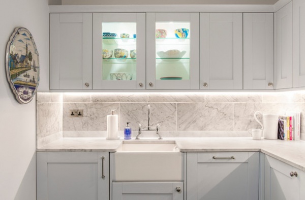
The kitchen was dated and had mismatched countertops when Voûte first saw this flat. “We decided to save on the kitchen,” she says. “I sourced plain, untreated wooden cabinets, and then the builders painted them, so it’s a hand-painted kitchen. Suddenly, the quality leaps!”
Voûte chose polished nickel knobs and then ramped up the luxe factor with a beautiful Carrara marble backsplash and countertop.
Cabinets: Homebase; all by Paint & Paper Library: Lead III (upper cabinets), Lead IV (lower cabinets) and Lead II (walls)
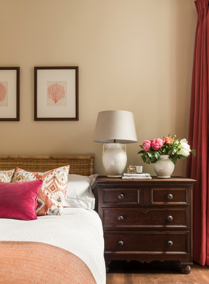
The guest bedroom is warmed by a soft raspberry and coral color scheme. The antique chest of drawers was another of Voûte’s canny buys, costing just $125 online and not needing any renovation.
Wall paint: Matchstick, Farrow & Ball; bed: Ikea; lamp: Vaughan; bedding: The White Co.
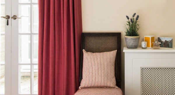
Double French doors open off the guest bedroom to a light well in what used to be the side exterior pathway. The chair belongs to the same set as those in the dining nook. “I bought two extra chairs and put one in here and one in the hallway, so if the owner has friends over for dinner, she can pull them in,” Voûte says.
“Plain fabric tends to be cheaper than patterned, so I chose a plain for the curtains, as I was sticking to a more modest budget for this room,” Voûte says. “I then added pattern through the cushions.”
Curtain fabric: Linara in Raspberry, Romo; chair seat and pillow fabric: Kravet
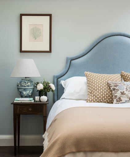
Voûte paired a simple divan bed with a custom-made headboard. The headboard is covered with a soft wool fabric and has antique brass studwork.
Voûte bought the bedside table unfinished, then had it stained and finished by a French refinisher for an antique look.
Divan bed: John Lewis; headboard fabric: wool, Nobilis; bedside table: Scumble Goosie; wall paint: Bone China Blue Mid, Little Greene; geometric pillow fabric: Schumacher; floral pillow fabric: Travers collection, Zimmer + Rohde
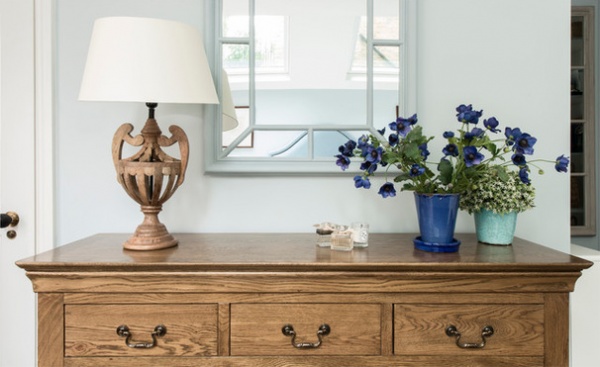
The master bedroom was expanded by extending into the side pathway. Velux windows above the bed, just seen in the mirror, allow in masses of natural light. They are fitted with blackout blinds and controlled with a remote. “So you don’t have to stand on the bed to shut the blinds,” Voûte says.
Chest of drawers: The Cotswold Co.; mirror: Oka
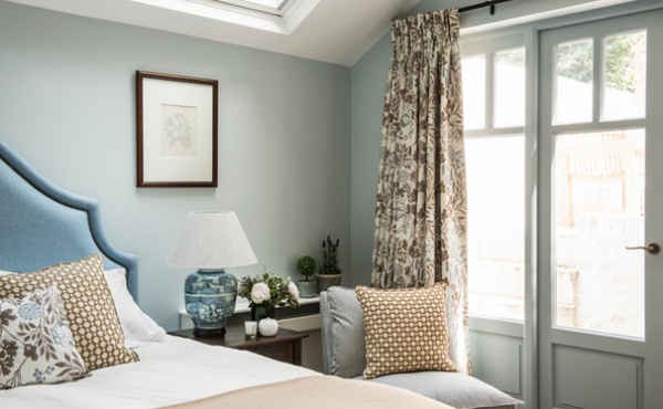
French doors open to the garden at the back of the flat and allow in lots of light. “We replaced all the doorknobs and handles with beautiful designs in materials such as brass,” Voûte says. “It gives a feeling of quality to the flat and looks warm and lovely.”
Curtain fabric: Travers collection, Zimmer + Rohde
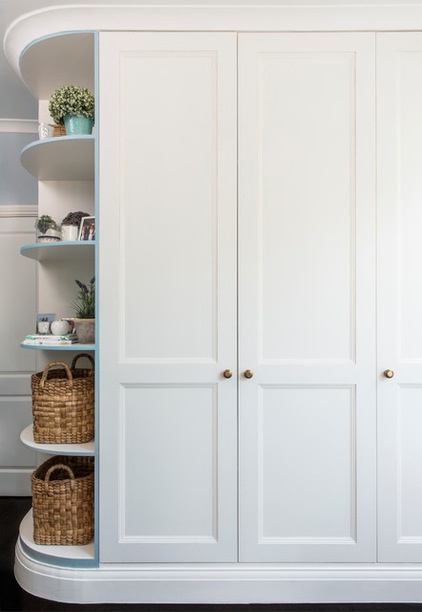
Voûte designed floor-to-ceiling storage for the master bedroom, and added curved shelves to prevent it from looking too solid. “Now the wardrobes don’t darken the entrance to the room or appear to block it,” she says.
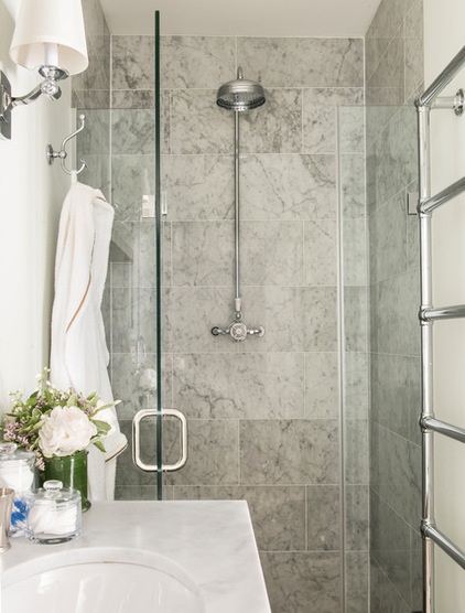
The master bathroom was built into the addition and has a frameless shower for a wet-room feel. Voûte used the same Carrara marble tiles as in the kitchen for a touch of luxe. “They are very light and easy to work with,” she says.
Shower head: Lefroy Brooks
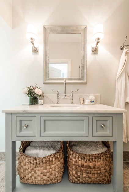
Voûte had the sink vanity made to fit the master bathroom, with a marble top and space for big baskets underneath. She also chose quality sink fixtures. “It makes such a difference to the room to have decent brassware,” she says.
Vanity paint: Light Blue, Farrow & Ball; sink fixture: Lefroy Brooks; baskets: The White Co.
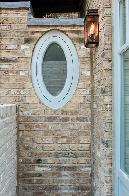
The oval-shaped bathroom window adds quirky charm to the rear of the property.
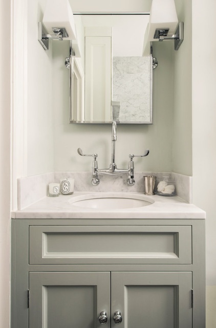
The second bathroom, off the hallway, originally had a pedestal sink in this alcove. “It was a bit useless, as there was no storage,” Voûte says. She had a vanity containing a cupboard built in, while a tall, slim cupboard behind, just visible in the mirror, provides additional storage.
Vanity paint: Light Blue, Farrow & Ball; sink fixture: Lefroy Brooks
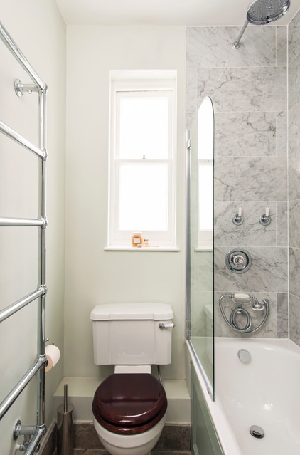
There’s a shower over the bath in the second bathroom. The space has the same luxury marble tiles and quality fixtures as in the master bathroom.
Shower head: Lefroy Brooks
Browse more homes by style:
Small Homes | Apartments | Barn Homes | Colorful Homes | Contemporary Homes | Eclectic Homes | Farmhouses | Floating Homes | Guesthouses | Lofts | Midcentury Homes | Modern Homes | Ranch Homes | Townhouses | Traditional Homes | Transitional Homes | Vacation Homes | Homes Around the World


