Houzz Tour: Split-Level Home Uses Every Square Foot
http://decor-ideas.org 07/28/2015 01:13 Decor Ideas
This recently built three-bedroom house in south London is, in many ways, reinventing the contemporary domestic space. Rather than featuring acres of open-plan space, the house has volume and a flowing layout in which a dogleg staircase links a winding sequence of areas that are open to one another. This removes the need for corridors and hallways. “There is no dead space,” architect Matthew Wood says. The home is one of three on the site, all created by Wood with developer and architect Roger Zogolovitch of Solidspace.
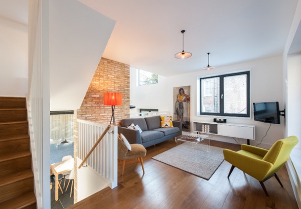
Houzz at a Glance
Who lives here: A professional couple
Location: South London
Size: 3 bedrooms, 3 bathrooms
Architect: Matthew Wood of MW Architects
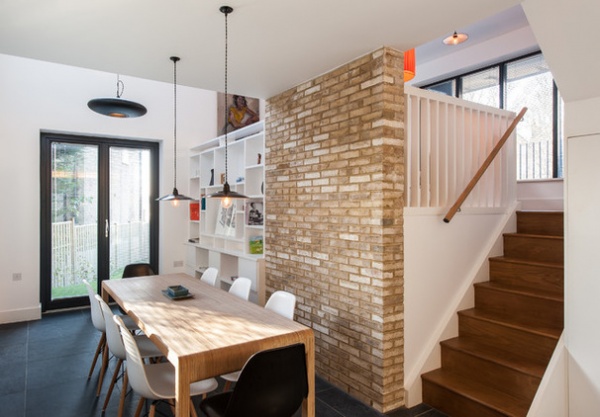
The house has a split-level design, with three floors at the back and two at the front. A kitchen and double-height dining area are located on the first floor, a sitting room is a level up, and a study balcony is above that. All these living areas are visible and borrow light from one another.
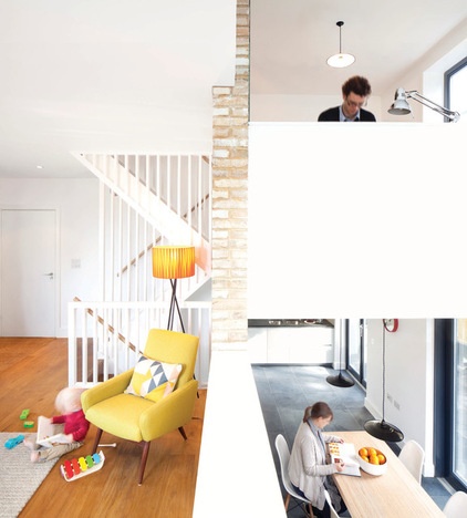
Developer Zogolovitch has been working on the concept of the split-section home for some time. “You go up half a level so you don’t need to turn back on yourself like you do in a traditional home,” Wood says. “So there’s no need for landings. Each floor takes you from one room to another. There’s no wasted space.”
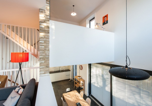
The split-section design creates flowing connections between the different levels. “There’s a visual but also a volumetric connection to the rooms above and below,” Wood says. “They are all separate spaces, though, rather than a single, open-plan area, which it can be hard to know what to do with.”
Ethel black pendant light: One Foot Taller
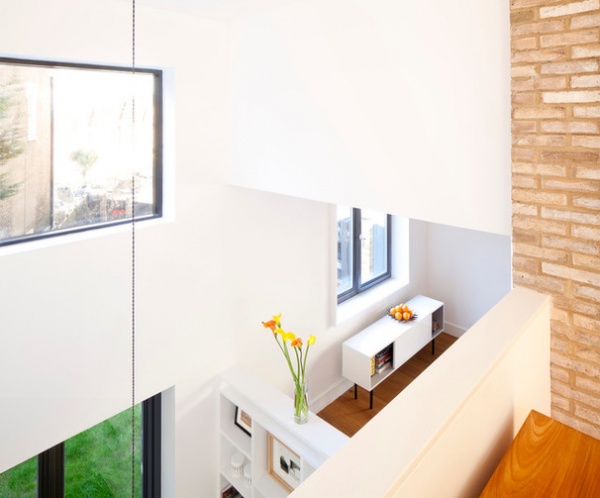
“The house has a feeling of volume, and this increases the sense of space,” Wood says. “People often only factor in floor space, but volume is relevant as well. Higher ceilings make rooms feel bigger.”
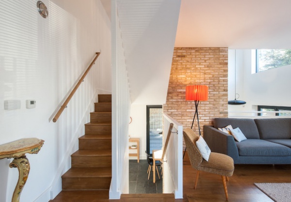
The stairs are a central feature in the house, as they run through its heart. “There’s nothing flash about them,” Wood says. “We didn’t use clever materials. They are simply traditional timber stairs, as cheap as chips!”
Oak stairs and flooring: Ted Todd; gray sofa: Do South Shop
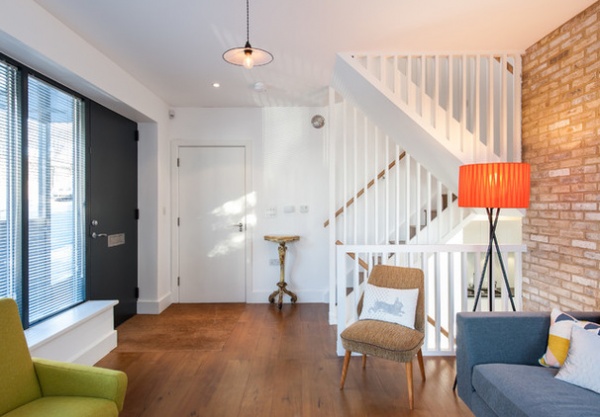
Wood kept the staircase balustrades exposed for a clean effect. “It makes them look more interesting and exaggerates the vertical aspect — the sense of up and down and the way the stairs go all through the house,” he says. The balustrades also provide a screening effect, in the way a corridor would offer privacy.
Rabbit pillow: Thornback & Peel
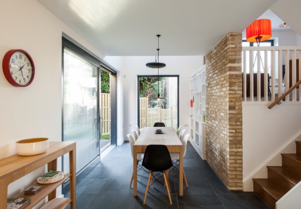
The dining space has access on two sides to the garden, with a double-height space at the far end that communicates with the living room above. The combination of exposed brick and white walls gives the house a softly midcentury feel. Gray slate flooring runs throughout the ground floor, linking the kitchen and dining space.
Nero Riven slate floor tiles: Mandarin Stone; dining table: Unto This Last; chairs: DSW by Eames for Vitra
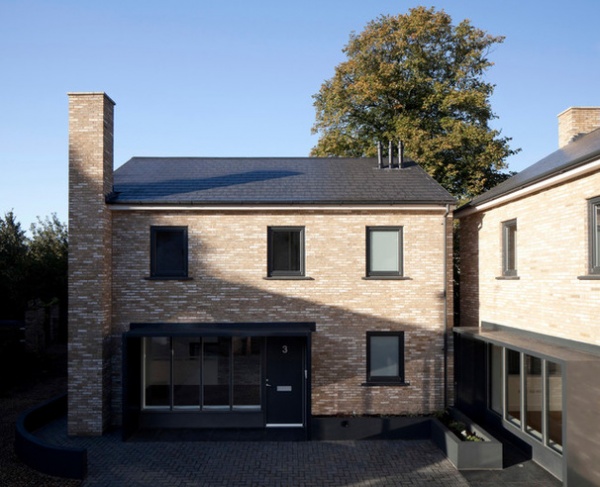
Three houses were built on a site once occupied by garages, down a narrow lane. “The planners were very particular about what we could build here,” Wood says. “The houses had to have proper gardens and off-street parking, because it’s a suburban area.”
They also had to tie in with the local, traditional vernacular. “They had to have bricks and pitched roofs,” Wood says.
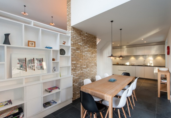
The developer, Solidspace, had modernist ideas that were at odds with the planners’ more traditional requests, but when Wood came onboard, his approach was simply to embrace what the planners wanted.
“We said, ‘OK, it’s fine. We will embrace these planning restrictions. We will use traditional materials such as brick and timber, and then add in a few quirky things to satisfy our more design-led aspirations,’” he says.
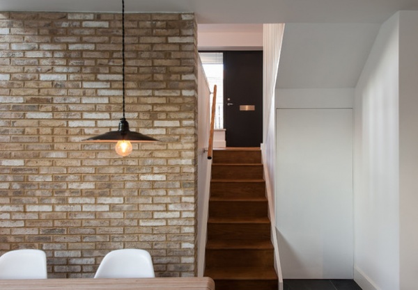
One design-led tweak that Wood made was using thin bricks. They are 50 millimeters (2 inches) thick rather than the conventional 65 millimeters (2½ inches). “They bring a subtle elegance and make the exterior and the brick walls in the interior look a bit more sharp than if we’d used traditional bricks,” he says.
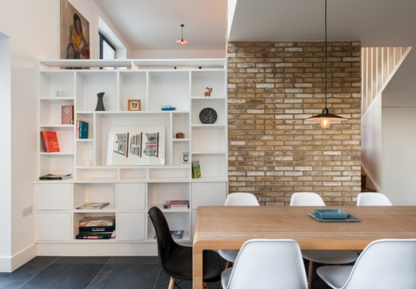
Wood designed a built-in bookcase to line one wall in the dining space. “We were going to have a piece of glass there, but felt that would be a bit too bling and not very homey,” he says. “Then we thought, ‘We could just build a wall.’ So that’s essentially what we did, although we added shelving on the dining room side.”
This design also creates a simple wall on the upper living room side, so the owners can fit a sofa against it. “One of the downsides of having no corridors is not having very many walls to put things against,” Wood says. “This was a solution, and it makes the living room work.”
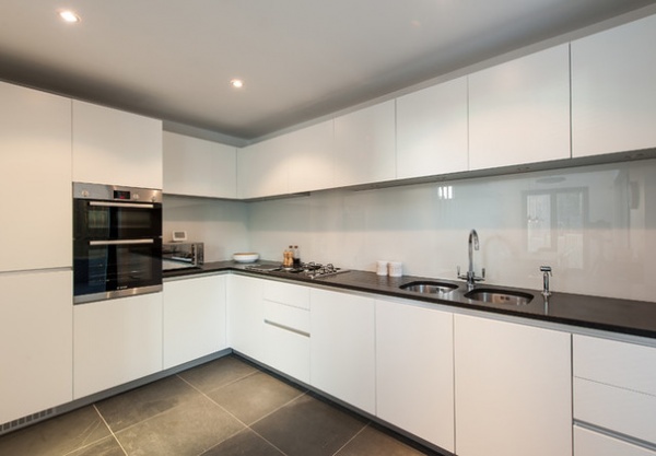
A simple, sleek white kitchen is fitted in an L-shaped configuration off the dining space. It contains both wall and floor cabinets, providing the abundant storage that’s in demand in many contemporary homes. The back-painted glass backsplash finishes the crisp, clean look.
Kitchen cabinets: Commodore Kitchens; Nero Assoluto granite counterop: OMG
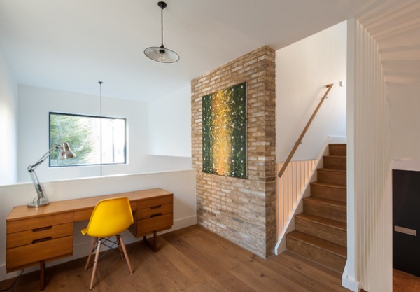
The study balcony is flooded with light from the double-height space it overlooks, but it feels anchored by the exposed brick wall. “Once we embraced the idea of a brick exterior, we felt it was important to be as honest as possible about the construction inside,” Wood says. “The house has a brick and block wall around the outside. The floors then sit into one major central structural element, which is the load-bearing wall in the middle. Any load-bearing wall is made of brick, so why not expose it and be honest about it?”
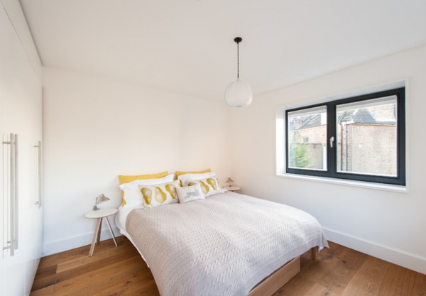
The bedrooms are simply designed with white walls and wooden flooring for a light, uncluttered feel. Each of the three bedrooms sits on a different level.
Pear on Stone linen pillows: Thornback & Peel
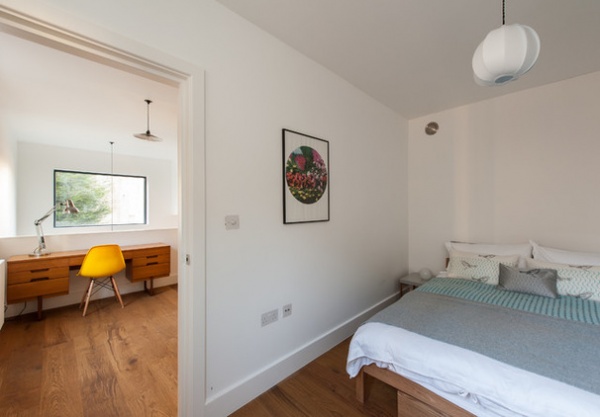
This bedroom flows off the study balcony space, while the other double bedroom is situated above the living area. The third bedroom is in the loft space at the top of the house.
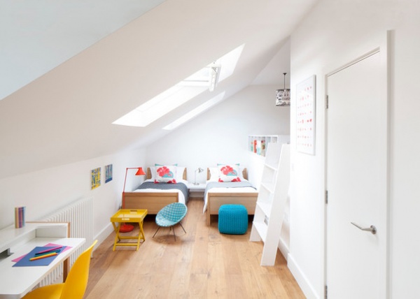
The loft bedroom is spacious and light, thanks to two skylights, seen here, and a large dormer window.
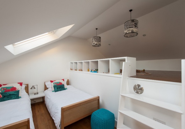
“We were obliged by the planners to design the house with a pitched roof,” Wood says. “But one advantage is that we could use the eaves for storage.”
This bedroom is flexible, with a platform under the roof offering various possibilities. “You could box it in and make it into storage, or have it as a play area for kids, or even as a bed space,” Wood says.
Sea Bream pillows: Thornback & Peel
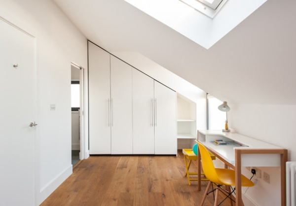
Storage has been designed in throughout the house, and the loft bedroom is no exception, with huge cupboards tucked under the pitched roof. There’s an en suite, too, just seen opening off to the left.
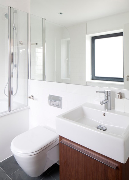
Clean, white and simple, the three bathrooms fit beautifully with the house’s unfussy, softly contemporary feel.
Toilet and vanity unit: Duravit; tub: Bette; fixtures: Grohe
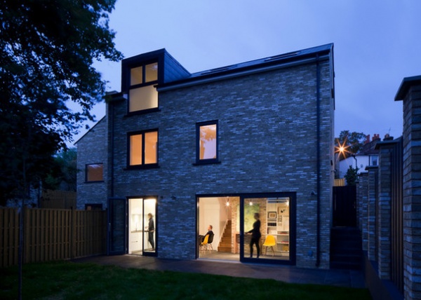
Although conventional brickwork may not have been Wood’s first choice for the exterior, it has proved popular. “That was one of the best bits of feedback we had about all three houses that we built on this site,” he says. “People were very comfortable with the outsides. We had thought the brickwork was a bit too trad — we’re all trying to be statement architects! But for the people buying the houses, it made them feel comfortable. It’s not twee, but it is familiar.”
Browse more homes by style:
Small Homes | Apartments | Barn Homes | Colorful Homes | Contemporary Homes | Eclectic Homes | Farmhouses | Floating Homes | Guesthouses | Lofts | Midcentury Homes | Modern Homes | Ranch Homes | Townhouses | Traditional Homes | Transitional Homes | Vacation Homes | Homes Around the World
Related Articles Recommended


