Houzz Tour: A Dilapidated Cottage Makes Way for Self-Expression
http://decor-ideas.org 07/27/2015 23:13 Decor Ideas
Faced with Courtney Gibson’s rickety clapboard cottage and spacious yard, architect David Boyle could have made the conventional choice: renovate and add on to meet the request for a home for her, her two young children and the accumulation of art. But she also wanted an income property on the site. Boyle’s solution was to demolish the unsound cottage and build two semidetached houses on the site. One was for Gibson to rent out or sell, and the other was for her to live in. The latter includes an open-plan living space to house Gibson’s eclectic art collection, an elevated deck and yard, and mezzanine bedroom spaces that make the most of the building footprint.
Photos by Brigid Arnott
Houzz at a Glance
Who lives here: Courtney Gibson and her 2 children
Location: Marrickville, a suburb of Sydney
Architect: David Boyle
Marrickville, located about 4 miles west of Sydney’s central business district, has growing appeal to city dwellers seeking a suburban lifestyle. “The main challenge was trying to create a sense of space within a very tight fabric,” Boyle says. Gibson’s home is 22 feet wide, the width of a small semidetached house, and 108 feet long.
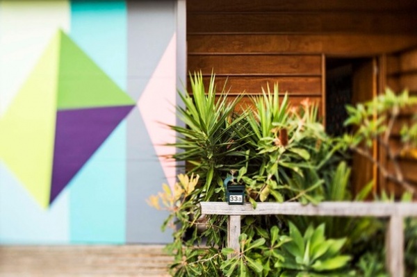
A facade of plywood panels with horizontal battens sits beside a carport door with a lively abstract mural done in exterior paint by artist Louise Tuckwell. Gibson calls it a homage to the Australian garage doors of the ’50s and ’60s.
Although the original cottage was demolished, there are nods to the old property throughout the new build, which Gibson says is “kind of comforting.” Bricks from the children’s hopscotch games at their now-gone cottage have been laid at the front door, creating a nostalgic patchwork that’s the first thing visitors step foot on.
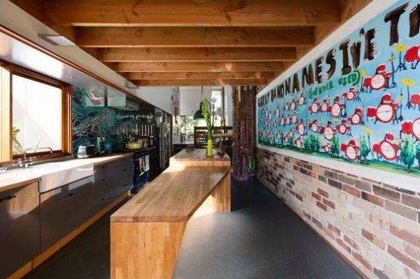
As with many narrow Sydney semidetached houses, the front door opens into the kitchen. Gibson and Boyle share an appreciation for midcentury modern architecture, and this space reflects that preference.
The warmth of oak in the expansive island designed by Boyle offsets the urban gray cabinetry and Marmoleum floors, a linoleum made from renewable and recycled materials. The “party wall” that divides the semidetached house from its neighbor contains bricks saved from the original cottage — exposed in places and painted in others. “It makes sense to recycle where possible, but it also adds another layer to a contemporary design,” Boyle says.
Flooring: Marmoleum, Concrete range in Comet, Forbo
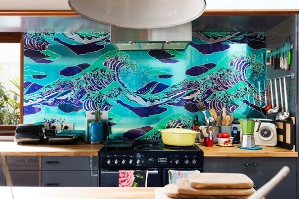
At every turn the home radiates Gibson’s love of color and all things vintage. Expect the unexpected in this house — not many backsplashes reference The Great Wave Off Kanagawa, Katsushika Hokusai’s famous woodblock print. The dynamic artwork is wallpaper behind glass. “The wallpaper was the first thing I ever bought for the house, years before the build,” Gibson says. “All the colors in the house came off the back of that paper.”
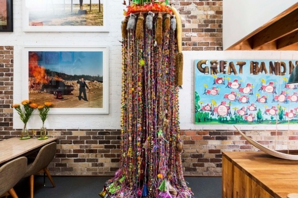
It’s clear the home belongs to a seriously passionate collector of eclectic and witty artwork. Impossible to ignore is the immense painting on the exposed brick of the kitchen space: Great Band Names I’ve Thought Of (But Never Used), by Mark Hetherington. A gigantic hanging sculpture, Mr. Kangalanga, by Rosie Deacon — a wild tangle of plastic, fabric, fur, fluffy toys, bottle caps and cocktail parasols — dominates the space.
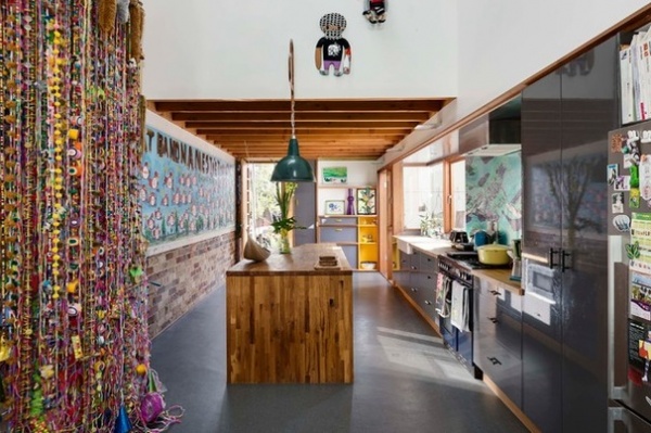
Boyle lowered the kitchen ceiling with Oregon timber beams. This may seem a surprising move with the goal of creating a sense of space, but Boyle’s strategy was to compress and then expand the spatial volumes of the long, narrow interior, to avoid the impression of a one-level “tube” running from front to back. The ceiling soars to almost 15 feet above the dining and living zones. This view looks to the front door from the double-height dining room that opens out from the kitchen.
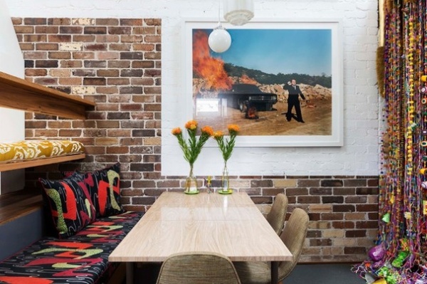
The dining space, with Gibson’s taste for midcentury design evident in the upholstered bench and vintage chairs, is separated from the living zone by open shelving, again in Oregon wood.
The photograph above the dining table, Screen Test No. 4 (Australiana), is by John A. Douglas.
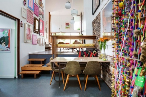
Another example of Boyle’s intent to create visual volume is a series of changes in floor level as the house moves from zone to zone, from front to back through the narrow site. A short flight of wooden steps raises the living zone from the level of the dining and kitchen zones. “It’s the split level of the ’60s and ’70s,” Gibson says. “It makes it feel much more spacious than it would if it was all on the same level.”
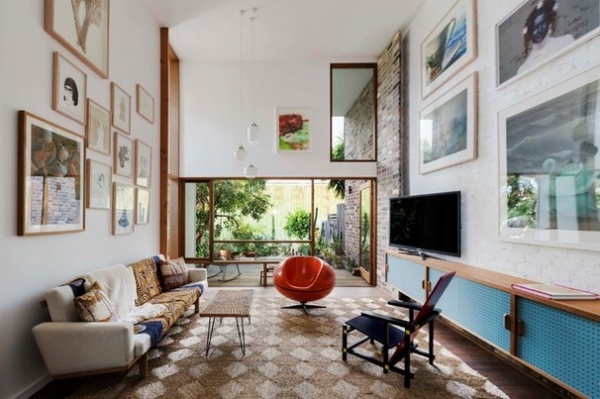
In keeping with Gibson’s desire for art-hanging space, Boyle painted the walls, including some of the exposed brick, in Dulux’s Vivid White. “We were really developing a blank canvas for Courtney to add value in terms of the interior design and artwork,” Boyle says.
Skylights and a vertical window deliver light, showcase the living room collection and, when coupled with the white backdrop, create a stage for a collection that has been 25 years in the making. Gibson’s advice when hanging a large art collection? “Leave some blank spaces, or it will be like living in a stamp album.”
The 1930s pendant lights that hang in the void were another keepsake from Gibson’s old home. Eero Aarnio’s orange fiberglass Pastil chair, originally designed to fit inside his iconic 1967 Ball chair, is a bright splash of color.
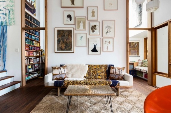
The materials change with the level. Marmoleum in the kitchen-dining space gives way to the living room’s narrow recycled blackbutt wood boards, along with practical sea grass matting, another throwback to the ’60s and ’70s.
Gibson’s passion for collecting has found expression in every corner of the house. With Boyle’s clever spatial design, the effect is not one of overwhelming clutter, but of interesting pieces that each tell a story, like the drawings by Joan Ross above the sofa. “I just choose things I like and put them with other things I like — then what’s not to like?” Gibson says.
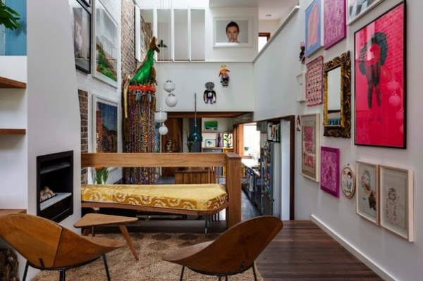
The inviting and intimate home is packed with the signs of a flamboyant spirit with a passion for midcentury design and a disregard for minimalism. The arresting portrait that hangs over the void is by Liam Benson.
Kone chairs: Roger McLay, circa 1948
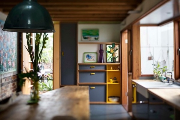
Boyle designed the cabinetry throughout the house. The simple lines of the shelving units, benches, bookcases and cupboards integrate with the architecture and create continuity between separately functioning zones. The color of the painted pegboard cupboard doors changes with each zone, from gray in the kitchen to blue in the living room.
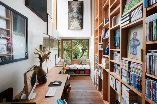
This home study, just 6½ feet wide, adjacent to the living area, accommodates a large number of books, a roomy built-in desk and a window seat, and is one of Gibson’s favorite spots.
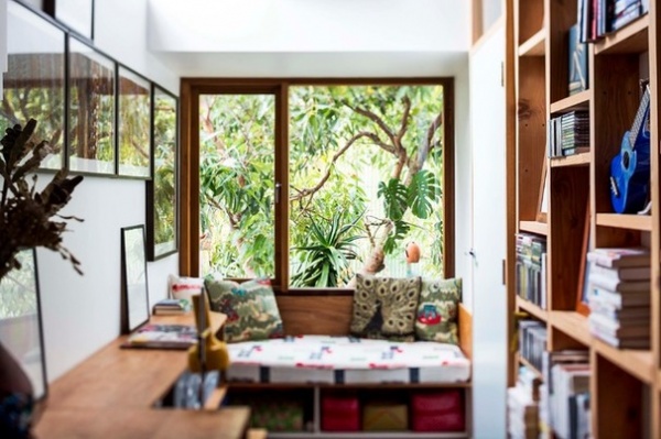
Boyle’s wife, Leah Bennetts of Sean the Prawn, upholstered the sunny seat with one of Gibson’s hoarded retro fabrics.
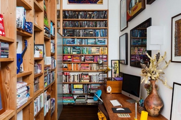
Gibson’s books are color-coded. “Entirely unoriginal and a bit design-nerd tragic,” she says.
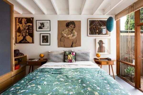
Gibson’s bedroom is also downstairs, inserted snugly adjacent to the living area.
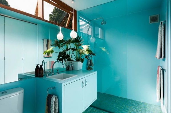
Her bathroom is a vision in blue — blue mosaic floor, blue laminate wall panels and blue vanity.
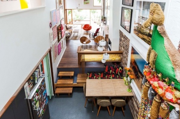
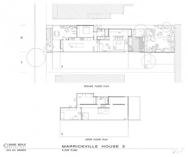
Although the house appears from the front to be a single story, it has a little mezzanine level tucked under the roof. The staircase to this first floor is reached through a short corridor between the kitchen and dining zones. In this view from the mezzanine, the corridor is just visible on the left, but the floor plan following shows it more clearly.
The outdoor space adjacent to the kitchen is behind the colorful geometric mural on the street frontage and can be used as a carport. This is an example of the flexibility of space that characterizes this house.
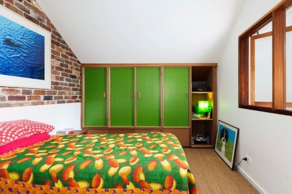
Gibson specified that her children’s bedrooms and bathroom be on the top level. The artwork, vintage fabrics and painted pegboard closets have, luckily, been approved by her offspring.
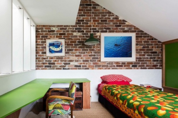
An industrial pendant light, exposed brick and yet another clever Boyle-designed built-in desk sit comfortably with a vintage carved storage trunk. The wide louvers on the left open the space to the rooms below.
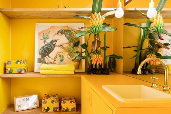
Possibly the most spectacular room in the house is the children’s bathroom. Gibson has gone all the way with vibrant sunny yellow — Dulux’s Golden Marguerite. It’s hard not to imagine the uplifting effect the vivid space must have on morning ablutions. Gibson’s electrician even found yellow power outlet plates. “It’s like a folly,” Gibson says, “and I love it.”
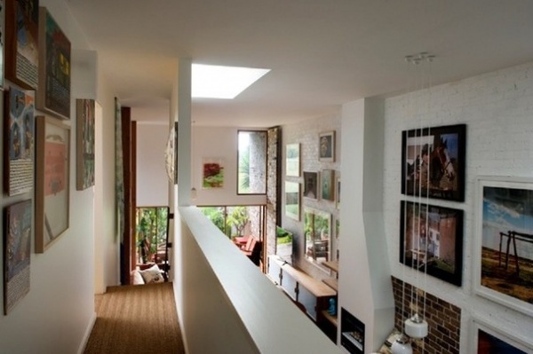
A mezzanine walkway links the children’s bedrooms and bathroom and provides a different, closer perspective on high-hung artworks.
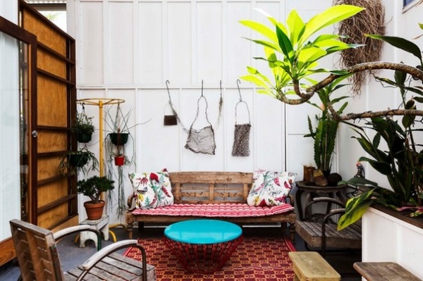
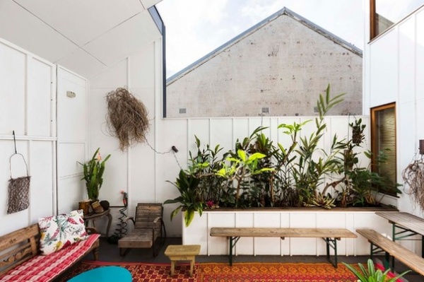
The outdoor areas also have the freewheeling Gibson stamp. A wide door in the living area leads to a rear-covered outdoor space, deck and bricked backyard. Gibson decorated it with found objects and vintage treasures, and her eclectic eye selected these sculptural baskets, by Lorraine Connelly-Northey, to hang on the wall. Northey is an indigenous artist and uses rusted wire to make traditional Wiradjuri vessels.
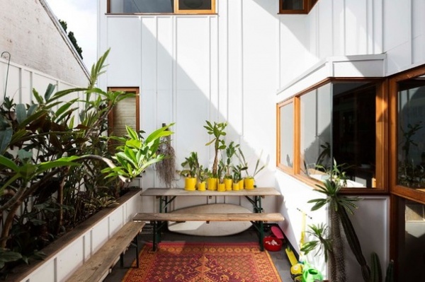
The ceiling, about 13 feet (4 meters) high, in the outdoor room creates a spacious feel, and the deep overhang protects the facade from excessive sunlight and heat.
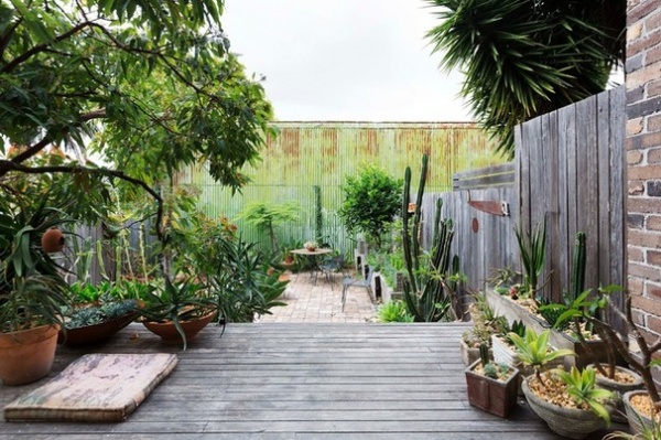
Intriguingly visible from the moment visitors step through the front door, this wall remains as a nod to the suburb’s industrial character. Gibson was so taken with the patina and interesting colors that she decided to incorporate their character into her backyard.
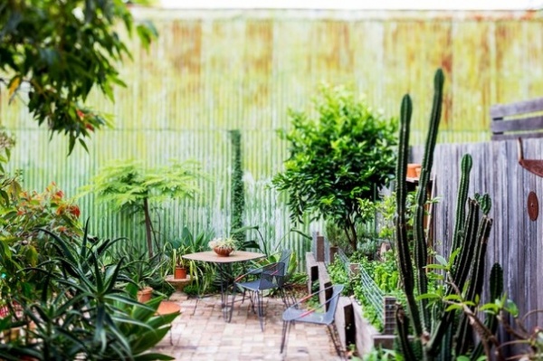
The wall at the back of an adjacent factory is green painted corrugated steel and is aging rather artistically, forming a backdrop to the sculptural low-water usage plants in the urban garden.
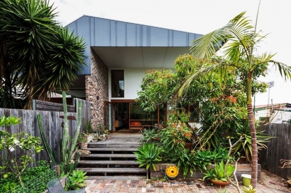
Boyle’s plan throughout the project was to create the sensation of a journey through a series of interesting, intimate and connected zones. Level changes were key to this strategy. From the living area and covered outdoor area, wooden steps descend to the brick-paved backyard.
Gibson’s house is directly under a Sydney airport flight path. This affected some of the features of the house, as acoustic requirements had to be met. These include upgraded glass, acoustic window seals, high-level insulation and double fiber cement wall boards. “Once the house is closed down and a plane goes over, you can hardly hear it,” Boyle says. A side benefit is that thermal performance was significantly improved. Gibson and Boyle were diligent in their pursuit of environmental gains from recycled and renewable materials, external shading, effective cross ventilation, rainwater tanks and an onsite stormwater retention system.
Browse more homes by style:
Small Homes | Apartments | Barn Homes | Colorful Homes | Contemporary Homes | Eclectic Homes | Farmhouses | Floating Homes | Guesthouses | Lofts | Midcentury Homes | Modern Homes | Ranch Homes | Townhouses | Traditional Homes | Transitional Homes | Vacation Homes | Homes Around the World
Related Articles Recommended


