Houzz Tour: Careful Space Planning Simplifies Life for a Family of 6
http://decor-ideas.org 07/26/2015 21:13 Decor Ideas
After seven years in their 1930s two-story house, a couple with four children decided their nest no longer suited their family’s needs. Instead of adding on to the maze-like house, they decided to renovate within the existing footprint and turned to Nexus Designs, which specializes in space planning. The firm’s creative director, Sonia Simpfendorfer, says this project wasn’t about finding storage solutions for the home but rather about simplifying the design so that clutter would be kept to a minimum and everything would have a place. One way the team accomplished this was to establish a strong and inviting color theme that replaced layers of accessories.
Houzz at a Glance
Who lives here: A couple and their 4 children
Location: Malvern, Melbourne, Australia
Size: 5 bedrooms, 3 bathrooms and a powder room
Designer: Sonia Simpfendorfer of Nexus Designs
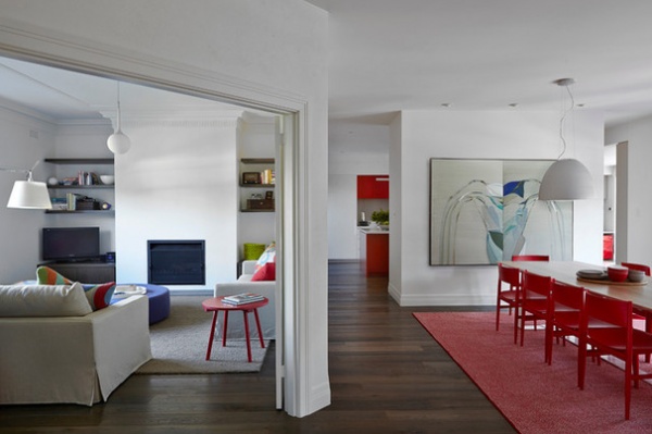
Simpfendorfer and her team focused on reworking the design of the house and developing the cabinetry. The biggest change was removing the wall between the hallway and the dining room, creating a greater sense of spaciousness in the new shared space.
“On entry, the experience used to be like walking into a dark maze. There was no connection to the outside, no view, just a long hall to a distant kitchen and a bland wall,” Simpfendorfer says.
Flooring: engineered oak in prestained Mink Grey, Royal Oak Floors
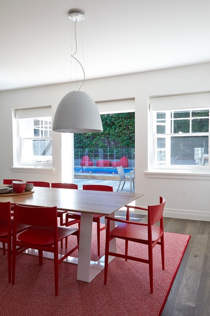
To open the dining room up to the outdoors, they added glass doors between the existing period windows. The glass doors also expanded the view of the pool in the once-cramped space. “The result was completely transformative — and now the dining room is an inviting space for family meals,” Simpfendorfer says.
Nur suspension lamp: Artemide; dining table: American oak in white lime finish: MAP International; dining chairs: Plywood Porro Neve, Space Furniture; wool rug: custom, Bibi Viro
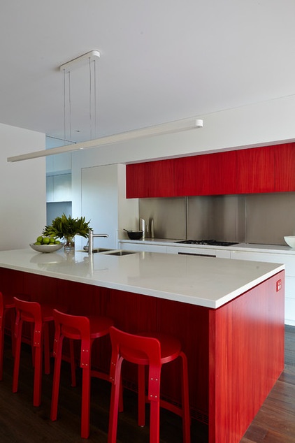
In response to the clients’ request for simplicity, vibrant red is used on simple, sculptural cabinetry. This provides visual interest without the need for layers of accessories and artwork. “The homeowners are regular cullers and didn’t want to have to fill the house with stuff just to give it color and warmth,” Simpfendorfer says.
“We were careful to balance the clear red with the murky grayness of the floorboards to keep it sophisticated and timeless,” the designer says. The primary color palette, not including the wallpaper in the kids’ bedrooms, is white, red and brown. Primary colors can veer into playground territory, she says, “but here the repetition is actually calming and unifying, despite being so intense.”
The storage in the kitchen is all about giving everything a place, rather than creating places to store unused possessions. The stainless steel backsplash slides open to reveal a 12-inch-deep cupboard reserved for small appliances, such as the toaster and teakettle.
Pantry door paint: Natural White, Dulux; countertop: Corian in Cameo White, Dupont; K65 counter stools: Artek; sink faucet: HydroTap, Zip
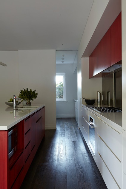
A laundry area to the side of the kitchen was streamlined with an undercounter washer-dryer that leaves room for a drop-off zone. The children have their own alcoves, with deep drawers for shoes and sports gear, hooks for jackets and raincoats, and a low bench for sorting school bags.
“It wouldn’t have been achievable if they hadn’t been willing to sacrifice half of the laundry to do it, though,” Simpfendorfer says.
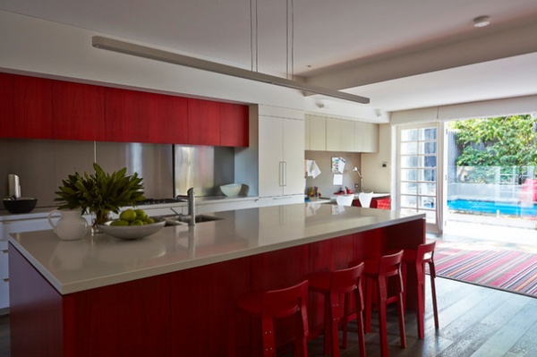
A study nook beside the Liebherr refrigerator and the expansive island counter were designed so the couple could give homework help while preparing meals. “For now the children like to be where the action is, and the kitchen-study-play area is definitely the hub of this house,” Simpfendorfer says.
Rug: Roger Oates Venetian flat-weave in Chatham Turkey Red, Milgate
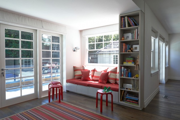
Across from the study nook is a window seat with a pass-through window to the pool area. “The children congregate here as soon as they get home,” Simpfendorfer says. “After a dip in the pool, they can sit together on the window seat or sprawl on the floor rug with puzzles.”
Artemide wall sconces illuminate the nook to transform it into a cozy evening retreat.
Alvar Aalto stackable stools: Artek
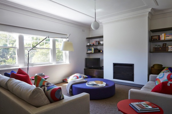
The colors and finishes are consistent throughout the house to create a sense of uniformity. The oak veneer cantilevered shelves in this living space were custom stained to match the floorboards.
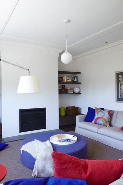
Creating a warm, family atmosphere was the No. 1 priority, Simpferdorfer says. “It’s not a showpiece for the adults, where kids are a secondary consideration. The individual characters and quirks of the children were part of the [design plan] too.”
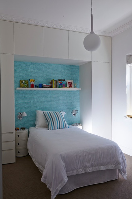
The children, who range in age from 7 to 12, chose their own colors of Crayon wallpaper by Designers Guild.
Tolomeo Faretto E27 wall lamp: Artemide
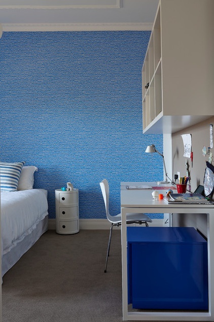
The inside of the children’s closets have the same wallpaper, and the mobile underdesk storage units are also color-coordinated.
Simpfendorfer says that as “children seem to grow up faster than the speed of light,” their room designs needed to cast an eye to the future with desks and storage that would not be quickly outgrown.
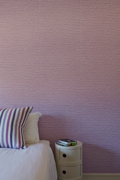
Key furnishings and fixtures were selected on the basis that a good idea bears repeating, as seen with the Kartell Componibili bedside storage units, which are used in each bedroom. Simpfendorfer appreciates the design because, she says, the units are “practical, stackable, lightweight, and are easy to repurpose.” They create a fresh look, but have a design that hit the market more than 30 years ago.
Wallpaper: Crayon in Heather, Designers Guild
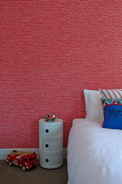
This red and white wallpaper is adaptable for a boy who loves firetrucks now but who probably won’t in a few years.
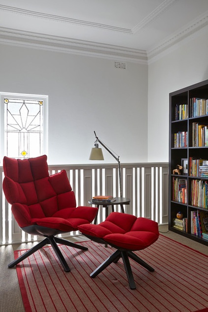
The landing at the top of the stairs became a reading nook with the addition of a free-standing bookcase and a comfortable armchair.
Rug: Bibi Viro
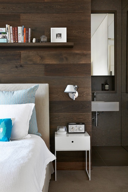
The wall behind the bed in the main bedroom is paneled with the same wood used as floorboards downstairs. The wall doubles as sliding doors to a small bathroom to the right and a walk-in closet to the left. “When they’re closed, it just looks like a beautiful timber wall,” Simpfendorfer says.
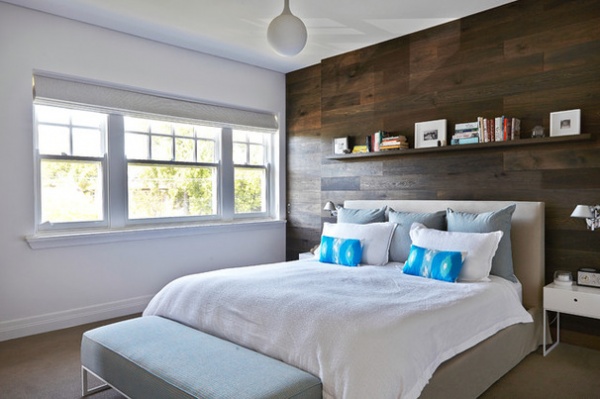
Bed: king-size Leila, Jardan; bedding: Boyac; Tolomeo Faretto E27 wall lamp: Artemide
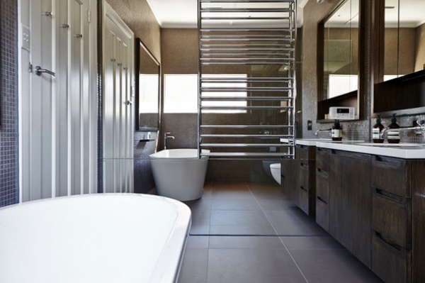
In one of the shared bathrooms, a full-length mirror wall creates the illusion of more space.
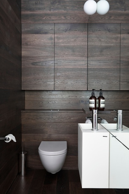
In the powder room, floorboards by Royal Oak Floors are used on unobtrusive recessed cupboard doors. The cabinetry panels were customized to accommodate the hidden tank of a Catalano Sfera wall-hung toilet.
Browse more homes by style:
Small Homes | Apartments | Barn Homes | Colorful Homes | Contemporary Homes | Eclectic Homes | Farmhouses | Floating Homes | Guesthouses | Lofts | Midcentury Homes | Modern Homes | Ranch Homes | Townhouses | Traditional Homes | Transitional Homes | Vacation Homes | Homes Around the World
Related Articles Recommended


