Kitchen of the Week: A Classic Craftsman Gets a Colorful Twist
http://decor-ideas.org 07/24/2015 22:13 Decor Ideas
Josh and Alisa Vitello love to cook and have family and friends over. But the Seattle couple, the parents of daughter Olivia, 4, and son Oscar, almost 1, were finding it difficult to create daily meals and host dinner parties in the tight 150-square-foot galley kitchen in their updated 1900s Craftsman house. “Anytime we had people over, they would try to congregate in the kitchen, and it was impossible,” Alisa says. “My husband and I would try to work at the counter and do a little dance to figure out a rhythm to get anything done.”
The Vitellos wanted to maintain the charm of their classic home, while also infusing the space with their own personality and some color. Working with kitchen designer Kayron Brewer, they did small bump-outs in the back and side of the kitchen that added 40 square feet, and used a combination of rich neutral finishes with bold walls to create a user-friendlier kitchen with a better connection to the rest of the home. “Bumping out the back portion was the key part of making this kitchen work,” Brewer says. “It just has much better flow and a better feel.”
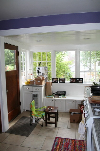
BEFORE: The kitchen previously had dark purple walls, white appliances, white cabinetry and a creamy-beige ceramic tile floor. The back section of the galley kitchen, once part of the home’s back porch before it was enclosed, had a section of small cabinets and drawers and a bench seat with a dropped ceiling above. The dark wood door seen on the left side of this photo led to the porch outside.
The bench seat was something the Vitellos didn’t really use, and the kitchen lacked usable counter and work space. “Everything was on top of each other,” Alisa says.
“After” photos by Dan Farmer
Kitchen at a Glance
Who lives here: Josh and Alisa Vitello and their daughter, Olivia, 4, and son, Oscar, almost 1
Location: Seattle
Size: 190 square feet (17.6 square meters)
Designer: Kayron Brewer/Studio K B
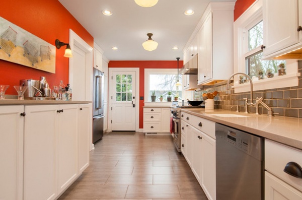
AFTER: A beam that marked where the porch once started was reconstructed and reset, so it no longer cut into the kitchen. The back section was bumped out about 2 feet, and the existing cabinets and window seat were removed and replaced with a new Dutch door and a prep area.
This section of the kitchen now includes wide drawers and a corner cabinet with a lazy Susan for much-needed storage near the range. The lower ceiling here was also raised, so the ceiling is now uniform throughout the space.
Pantry cabinets and a large stainless steel refrigerator sit where the door that led to the porch was once located, with a side bump-out of about 3 feet allowing for better flow and storage.
This photo also illustrates the kitchen’s improved lighting scheme. A combination of recessed cans and decorative fixtures chosen to capture the charm of the original house are all on dimmers and separate controls, so different moods can be created. An angled plug strip with LED lights and USB ports under the cabinets provides task lighting and keeps the backsplash free from outlets.
Oil-rubbed bronze light fixtures: Rejuvenation; undermount single-bowl sink, faucet, side spray and soap dispenser: Kohler; stainless dishwasher: Miele; stainless French-door refrigerator: KitchenAid; flooring: porcelain tile in Grigio, Pental Granite & Marble
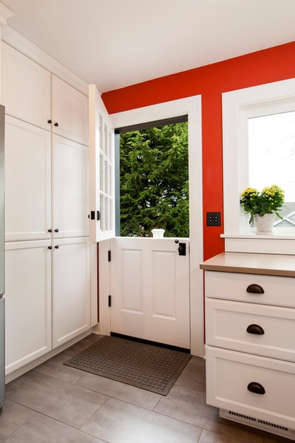
The Dutch door opens to a new small back deck and a staircase that leads to the backyard. “Maintaining the existing exit in that location of the house was important for safety, as well as being able to access the backyard,” Brewer says.
Since this classic home doesn’t have air conditioning, the Dutch door also provides natural ventilation. “I grew up with a Dutch door, and my childhood home didn’t have air conditioning either,” Alisa says. “It was a nostalgic thing for me, and it’s so pretty. It gives a nice charm to the house and creates a good cross breeze.”
Just to the right of the Dutch door are the separate old-school-style buttons that control the lights instead of modern light switches.
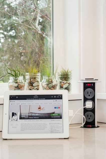
The location of the windows meant there was no space for a wall outlet. A handy pop-up power grommet on the counter to the right of the Dutch door brings power to the area. The underside of the top cap has a watertight seal to prevent any spills from seeping into the unit. “It’s really accessible and just makes a lot of sense,” Alisa says.
Pop-up grommet: Doug Mockett & Co. Inc.
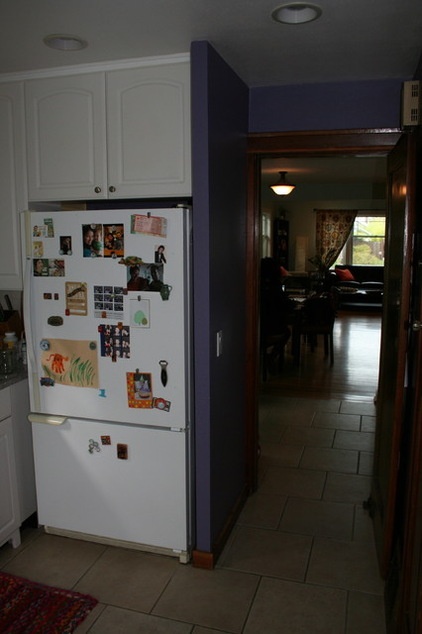
BEFORE: This photo shows the other end of the kitchen, looking toward the dining room. The kitchen’s old white refrigerator sat next to the narrow doorway that limited flow between the kitchen and dining room. The depth and location of the refrigerator and closeness of the cabinets also restricted function on a portion of the countertops.
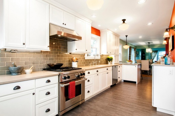
AFTER: The existing narrow doorway and wall were completely removed, so now the kitchen and dining room enjoy better access and flow.
The kitchen sink was kept in the same spot, but the range was shifted about 6 inches away from its original location. “It just made sense to keep the sink were it was,” Brewer says. “It certainly saves you money to not have to move it. But shifting the range gives more counter prep space between sink and range and more storage.”
The old ceramic tile on the floor was replaced with glazed porcelain 12-by-24-inch gray tiles. “Glazed porcelain is very durable and easy to clean, and the size was a bit different than they had before,” Brewer says. “The gray color also ties in to the backsplash.”
The kitchen’s warm gray crackled ceramic tile backsplash features handmade tiles that offer a nice variation in color and texture.
Backsplash: Sonoma Tilemakers; duel-fuel four-burner range: Wolf; vent hood: Zephyr; cabinetry: door style Breckenridge in white II, no glaze, Showplace Wood Products; cabinetry hardware: oil-rubbed bronze, Amerock; dining room chandelier: West Elm
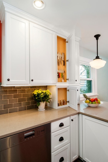
A shallow upper cabinet for knife storage with another shallow cabinet below for storage of cork trivets was added to the right of the dishwasher, with an existing chimney stack behind it. The chimney stack ran from the basement, where the furnace is located, through the kitchen and upstairs into the master bedroom. The brick structure was dismantled to gain space, but was still needed for venting. Running a vent pipe from the furnace through the kitchen and disguising it with the shallow cabinetry was a smart cosmetic and functional solution.
The sand-colored quartz counters with an eased and polished edge were chosen for their durability and color. “We did a combination of sand and beige with gray tones in this kitchen, so you have a balance of these neutrals,” Brewer says. “The combination of the gray and beige is more interesting than picking one or the other.”
Counters: polished quartz in Sahara, Pental Granite & Marble
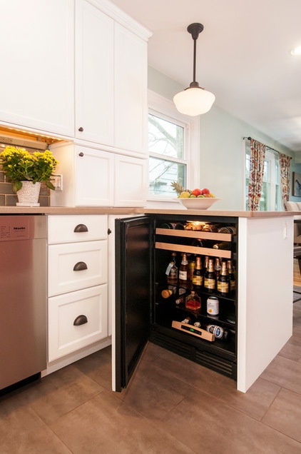
The lower cabinet contains a concealed beverage center. “They like to entertain a lot, and having additional space for beverages was important,” Brewer says. “Because this is such a long galley kitchen with the main refrigerator located on one end, it was nice to have this beverage center located by the dining room.”
This location also keeps guests out of the main work zone of the kitchen. The couple have a separate bar area around the corner, where they store glasses and other entertaining essentials.
Beverage center: U-Line
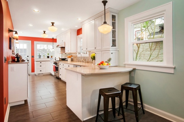
This photo shows the other side of the kitchen’s new peninsula, home to the beverage center. The peninsula provides seating for casual meals and acts as the new divider between the kitchen and dining room.
The wall by the peninsula is painted a light green that continues from the kitchen to the dining room and extends into the living room at the front of the home.
Wall paint: Plume Grass 0414, Miller Paint Co.
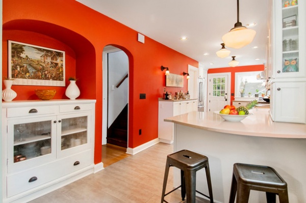
All the other walls in the kitchen feature a spicy and elegant jalapeño color. “They like lively colors, but it also ties in to some of their existing colors in their living room, in artwork and fabrics,” Brewer says. “It was to give the kitchen more life and some pop, and make it more lively than a traditional kitchen.”
The existing built-in cabinet seen in this photo was painted white for contrast and given new glass door fronts.
Wall paint: Jalapeño 6629, Sherwin-Williams; ceiling and trim paint: custom blend
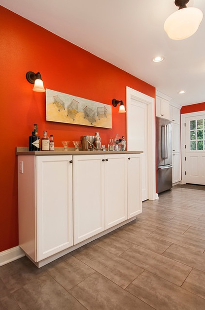
This bank of cabinets provides storage for occasionally used items, like platters and trays. The shallow cabinets, about 15 inches deep, couldn’t be full depth because they would restrict traffic flow.
The white door next to the cabinets opens to the staircase that leads down to the basement.
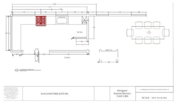
This floor plan of the original kitchen shows how the kitchen was cut off from the dining room, and how the old back door took up space that could be used for pantry storage and the kitchen’s large main refrigerator.
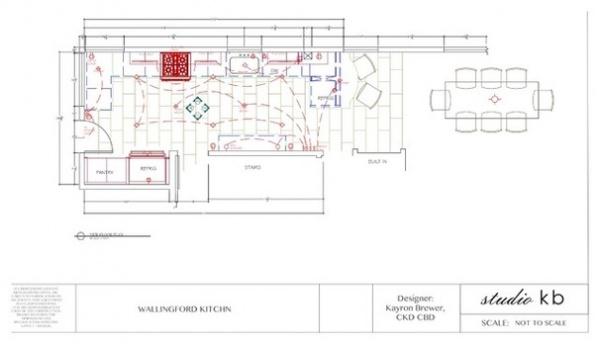
The new floor plan shows how the bump-outs at the back and side give the kitchen more flow and function, and how the kitchen now enjoys an improved connection with the dining room.
“The overall flow of our home is so much smoother,” Alisa says. “It really has created the social environment we wanted, and the usability of the kitchen has gone from a frustrating 4 to a nearly perfect 10.”
More:
See more Kitchens of the Week
Find a kitchen remodeler near you
Related Articles Recommended


