14 Indie Kitchen Designs That Stand Out From the Pack
http://decor-ideas.org 07/22/2015 23:13 Decor Ideas
Throw out your kitchen rule book because the latest wave of domestic havens is just a bit less, well, kitcheny and a whole lot more individual, boho, eclectic, colorful and all-around gorgeous.
Take a look at these indie kitchens for some inspiration on choosing your own design path. Already have a one-of-a-kind kitchen? We’d love to see a photo and hear all about it in the Comments.
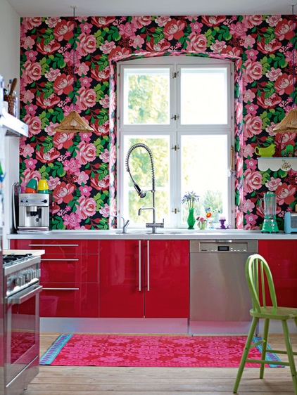
Pink. If you love it, go for it. A bold, glossy candy pink, as seen here, can be a great everyday look for some. The pink cabinetry looks super-modern and works beautifully with that floral wallpaper.
Houzz guides to working with pink
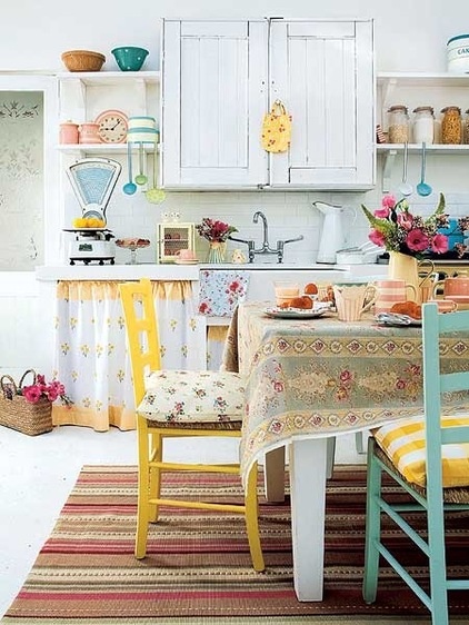
Secondhand finds. This sweet country kitchen takes all the best elements of the cutesy cottage look and mixes them up for a boho effect. Painted thrift store chairs, curtained-off shelves, vintage scale, glass jars, stripes, florals and wicker are all in the mix. The result is charming, quirky and definitely indie.
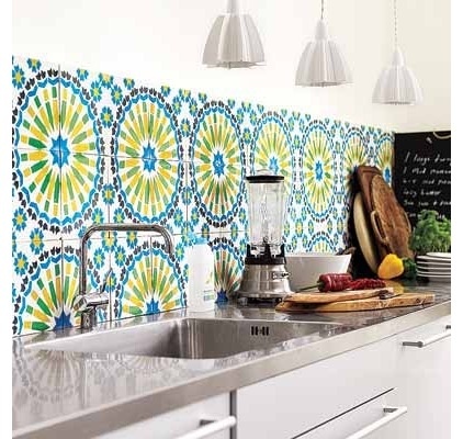
Tile. Getting bored with the never-ending trend of any tile as long as it’s subway? Try something more colorful, like these 1970s-style numbers. Unusual wall tiles are a fast way to perk up a plain kitchen and add character.
15 Creative Backsplashes Full of Character
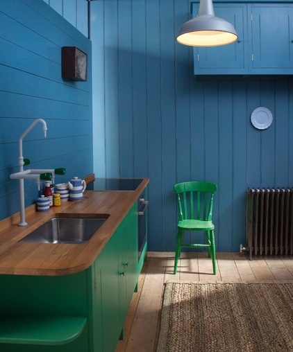
Color. Another great example of quirky color use can be found in this rustic kitchen. Deep blue tongue-and-groove walls paired with emerald green cabinets probably shouldn’t work but do. The color combo is broken up nicely by the wood worktop and floor.
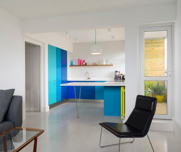
Here, streamlined units look stunning and modern painted in three vivid tones of blue, while the yellow radiator adds fluoro contrast. Using color in this way also means you need to make less effort elsewhere: The walls and floor can stay simple and chic.
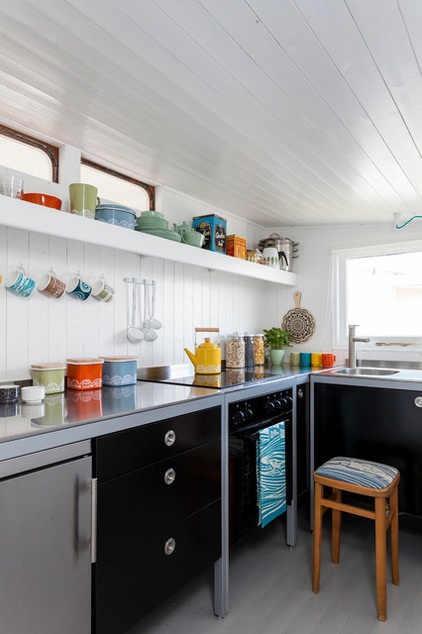
Ceramics. If you’re not quite brave enough for bright cabinets and walls, you can still do the indie kitchen with a neutral backdrop. In this majorly cute converted Victorian railway car, a coordinated collection of ceramics adds color, life and whimsy, as do the matching tea towel and stool.
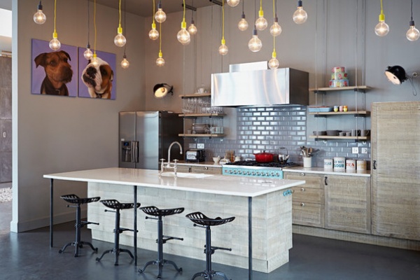
Starry lights. If you’re not a fan of subtle spotlights and want something more daring than a pair of metal pendants, consider making a cluster of bare bulbs the star. These dangling numbers with vivid yellow cords are the sort of industrial touch you’d expect to see in the latest big-city bar, but they work brilliantly, elevating the subway tiles and gray floor to another level.
Extra marks for the kitsch dog prints and warm paintwork too. The wooden cabinets, meanwhile, have a lovely reclaimed, outdoorsy feel.
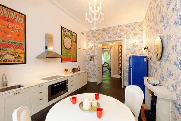
Wallpaper. Wallpaper is underused in kitchens, yet it can be a fantastic way to soften the harshness and sterility of shiny worktops and utilitarian appliances. In this kitchen-diner, a white and blue French-style floral print adds a delicate touch and gives a homey, eclectic feel. It also fits in with the simple white cabinetry, frothy chandelier and colorful prints. Absolutely loving the blue fridge too.
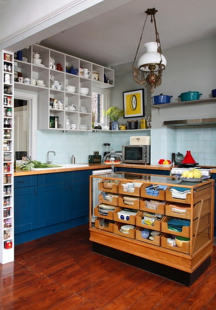
Unusual furniture. You might not expect to find a reclaimed vintage haberdasher’s unit in the kitchen, but here a fine specimen has been repurposed as a beautiful and highly functional island, with plenty of space to stash cutlery, linens and crockery. A special tempered-glass top has been added by the owners so it can be used for chopping and dicing. This one-of-a-kind island has a lot more character than a block of white marble.
See a kitchen inspired by a factory cart
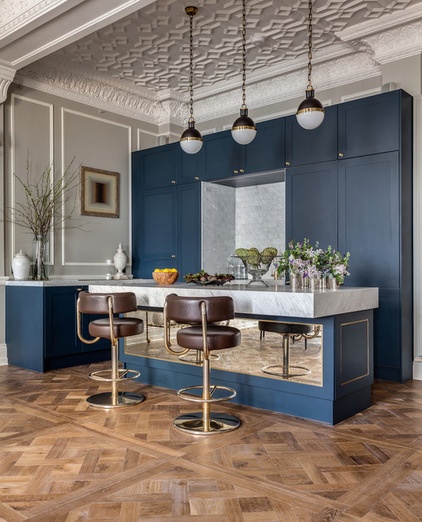
Grand intentions. OK, so we don’t all have an amazing original period ceiling like this one to show off. But this upmarket kitchen unashamedly adds other details usually reserved for living or dining rooms: inky blue walls, a parquet floor — even the bar stools are brown leather, and those splendid lights could work equally well in a library or old-fashioned study.
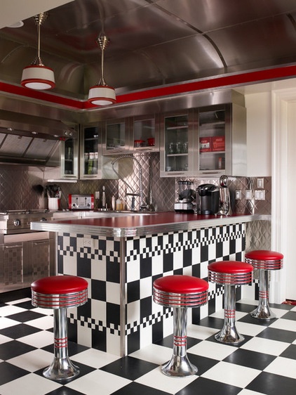
Diner style. Retro diner is a theme that still works in kitchens. It also ensures the bar will be well-used, whether for burgers, fries and a shake, or coffee and pie. If you don’t want to go whole hog, borrow the red, white and black color scheme, the checkerboard floor and the stools.
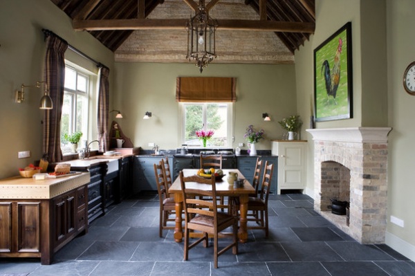
Manor house style. This large, square country kitchen has a formal feel thanks to a number of factors: the wooden dining table and chairs in the center; the large fireplace; the big artwork; and details such as the high rafters, pendant light, curtains and pale green walls. The end result resembles an elegant dining room that just happens to have a few kitchen elements around the edges — sink, stove, worktops — and is the better for it.
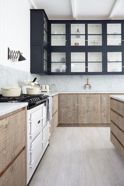
Reclaimed materials. Building kitchen cabinets from reclaimed wood instantly creates a lovely log cabin vibe. The rough, natural, slightly unkempt finish is pleasingly casual, while the variation in tone adds warmth and character. Find a local carpenter who can help you realize your vision, and source wood from local reclamation yards or online.
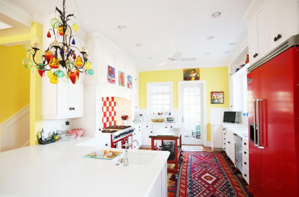
Cheer. Persian rug: check. Yellow wall: check. Multicolored chandelier: check. Secondhand artwork: check. The owners of this kitchen aren’t afraid to express themselves and show their arty side. The result is a friendly room that feels like a family hangout rather than a place to just ping the microwave.
Have a kitchen like no other? Please share it with us with a photo or two in the Comments and tell us what inspired you.
Related Articles Recommended


