Room of the Day: Hello, Yellow!
http://decor-ideas.org 07/21/2015 02:13 Decor Ideas
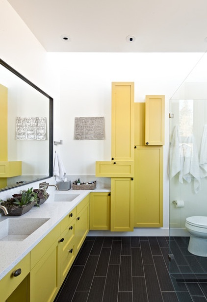
Architect David Wilson likes natural wood cabinets, but he’s game for anything. When his clients told him they wanted to paint the cabinetry in their new master bathroom a striking yellow, he answered with a plan to make the room even more dramatic. The result is a bathroom with a strong color and aesthetic sense.

Room at a Glance: Bathroom
Who lives here: A couple with 2 children
Location: Berkeley, California
Size: 90 square feet (8.36 square meters)
The bathroom lives in a bungalow David Stark Wilson (principal at WA Design Architects) remodeled. He designed an addition that gave his clients a new master bedroom and this bath.
The project was well underway when the clients told him they’d like to paint their cabinets yellow — and not a pale, watery pastel shade of lemonade, but a bold hue.
“They are world travelers,” Wilson says. “And this is the kind of yellow that you’d find in a hot, sunny Latin American climate.”
Wilson, never one to shrink from a color request, was concerned that painted cabinetry in the room would look a little flat. So he answered the request by shuffling the deck. He rearranged the wall cabinets in a way he likens to a Mondrian painting.
“We are really inclusive of our clients’ desires,” he says. “I like to see a wood grain in cabinets, but instead of holding on to that idea, I created a new composition.”
That composition turns the idea of a row of boxes on its head. Wilson installed a collage of skinny, wide, shallow and deep cubbies, each one sized to something the owners needed to store. “We are in the habit of treating our cabinetry like furniture,” Wilson says. “In this case, it’s sculpture.”

The yellow is a custom hue developed by the architects. When forced to put a name to it, Wilson says it’s bright yellow with a tint of green. “It’s complex,” he says.
The gray floor tile had already been selected, but once yellow was added to the mix, Wilson started experimenting with bold wall colors to stand up to the cabinet color. “It spiraled out of control a bit when I did that,” he says. “We came up with pure white with a touch of cream to help ground the yellow. In this case, it was best to keep the background simple.”
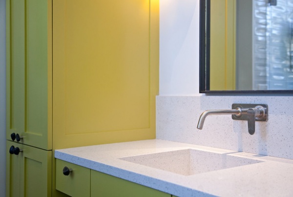
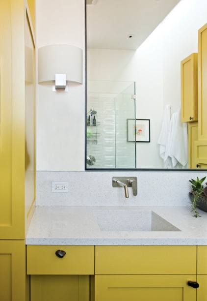
The quartz countertops are bright white with a gray fleck. The architect chose to have the sinks crafted from the same material. “We did this [integral sinks] with concrete for years,” Wilson says. “More recently, we’ve been able to do it with quartz. I love the way it looks; it looks like a single piece of material that’s been carved out.”
Countertop: Caesarstone

The clients chose the polished river rock knobs for their look and for their floor-matching color.
Wilson notes that the floor tile was chosen months before the idea of yellow cabinets rose like the sun. “In my experience, it’s very rare to select every color exactly as it is going to be before construction starts,” he says. “Sometimes it pays to be a little flexible and make subtle changes.”
See more Rooms of the Day
Related Articles Recommended


