New This Week: 3 Bed, Nightstand and Wall Combos You’ve Got to Try
http://decor-ideas.org 07/18/2015 10:53 Decor Ideas
Three: It’s a magic number. And if you’re looking for some harmony in the room where the, er, magic happens, look no further than the holy design trinity for bedrooms: bed, nightstand and wall. Focus your attention on making these three elements complement one another by playing with color, material, pattern, symmetry and form, and you’ll have a space that feels right.
The following three bedrooms — uploaded to Houzz recently by their respective designers — hit this trifecta spot-on. Here, the designers share their plans of attack, “uh-oh” moments and more for making these bed, nightstand and wall combinations work.
1. Character Driven
Designer: Anna Duval of Anna Duval Designs
Location: Toronto
Size: 98 square feet (9.1 square meters)
Year built: 2013
Homeowners’ request: “A relaxed, calming, simple, not-overloaded space that literally makes you fall asleep,” interior designer Anna Duval says.
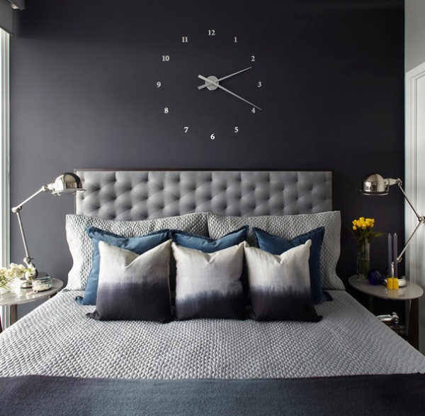
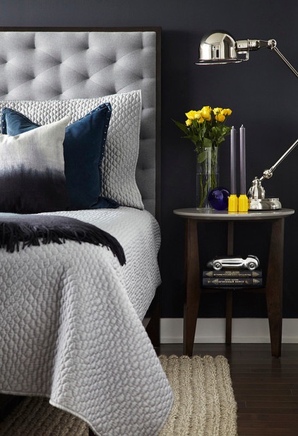
Plan of attack: “My source of inspiration was a song, a lullaby from my childhood, which was about the night, magical dreams, dark blue sky, shining stars, soft and tender steps of a polar bear. This brought me to the idea of a dark blue wall behind the headboard, metal digits of the clock above the headboard, shiny chrome table lamps and the combination of sensual fabrics for the bedding, including a soft gray woolen headboard, silk quilt and shams, dark blue velvet pillows with silver buttons, raw-silk ombré pillows and a supersoft woolen throw. It all came together at once, as I had a clear vision of the character I wanted to create.”
Why the design works: “This design approach worked because the character that I found and created, by the means of colors, materials and textures, was exactly what my clients were looking for. My character-based approach to creating an interior space allows me to achieve a harmonious, balanced, solid space.”
What wasn’t working: “A challenge was to fit a king-size bed in this tiny room. To make it work, I needed to find the nightstands, which would not only fit into the room but also look right in terms of the composition. I decided to go with round side tables, which would balance the big, rectangular headboard.”
Who uses it: “This is a master bedroom in a two-bedroom condo of a young married couple in their early 30s. One’s in public relations in business, and the other in governmental organizations.”
Designer secret: “Color palette: The combination of various shades of blue-gray and dark blue is perfect to create a sleepy ambience. Combination of fabrics: Wool, silk and velvet always gives you a tender, exquisite and luxurious feeling. Presence of all types of natural materials in a space: Glass, metal, wood and stone makes the space alive. Though in this particular case I did not use any stone, but theoretically I could.”
Splurges and savings: “When working on the project, I had a certain budget that I had to fit in. I saved on the side tables in the favor of the table lamps.”
Take-away: “From completing this project, I learned that one really needs to be inspired in order to create something worthy. When you have a strong inspiration, you can achieve a clear vision of what you aim to get. And once you get a clear vision, all you need to do is to bring your vision into reality by the means of colors, materials, textures and shapes.”
The nitty-gritty: Headboard, bed frame and bedding: West Elm; nightstands: Structube; lamps: Restoration Hardware; wall paint: Soot, Benjamin Moore; rug and clock: EQ3; accessories on nightstands: CB2 and HomeSense
Team involved: Context Development (construction); Those Repair Guys (painters)
2. Modern and Minimalist
Designer: Deana Lewis of Design Office of Deana Lewis Inc.
Location: Calgary, Alberta, Canada
Size: 13 feet, 6 inches by 11 feet, 6 inches (14.1 by 3.5 meters)
Year built: 2013
Homeowners’ request: “In the bedroom, simplicity was key — a calming place to unwind at the end of the day,” designer Deana Lewis says. “And no clutter.”
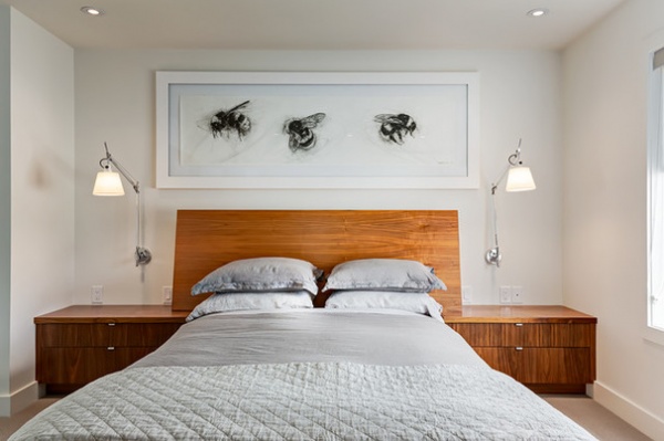
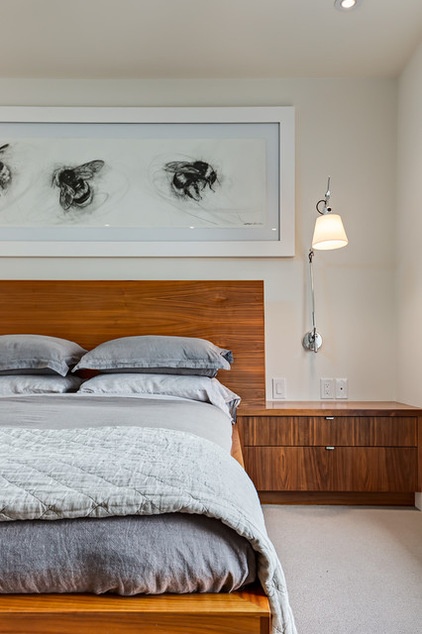
Plan of attack: “All furniture was custom designed and built to fit perfectly in the space, edge to edge. Even the bedside lights were placed at the right height and location to keep the tabletops free from clutter.”
Why the design works: “We kept the finishes consistent with the rest of the home, which makes it feel connected to the other spaces through natural materials and colors while still feeling airy and light. We found a place to hide everything: extra pillows behind the headboard, which stands off from the wall, TV components and wiring in a built-in hutch, bedside storage.”
What goes on here: “This is the master bedroom for parents of teenagers. The homeowners are incredibly stylish white-collar professionals — classic GQ. This space is for sleeping, unwinding, TV — a private oasis for the homeowners away from the teenagers.”
Designer secret: “The homeowners found an artist that they loved and commissioned her to create a custom piece with the exact proportions we needed above the bed — every little detail was considered.”
“Uh-oh” moment: “Custom millwork can be tricky, and there were a few connections and details that were difficult to resolve into a clean, modern aesthetic. We had an amazing carpenter onsite that helped ensure that everything came together as cleanly and beautifully as we had envisioned during the design process.”
Splurges and savings: “We had a lot of splurges, which happens when the homeowners have such great taste. We decided to focus all of our efforts on one or two beautiful statement details within an otherwise simple space.”
Take-away: “With some attention to detail and creativity, any mass-produced suburban spec house can be a showstopper. So many people feel like the possibilities are limited. We disagree after being a part of this transformation.”
The nitty-gritty: Bed and nightstands: custom designed by Design Office of Deana Lewis Inc.; lighting: Tolomeo wall-mount lamp with parchment shade, Artemide; artwork: private commission; wall paint: Scroll in eggshell, C2; trim paint: Scroll in semigloss, C2; window coverings: Phifer SheerWeave, Style 7100 blackout fabric in Q06 Bone/Platinum; bedding: West Elm
Team involved: Hearth and Home (general contractor)
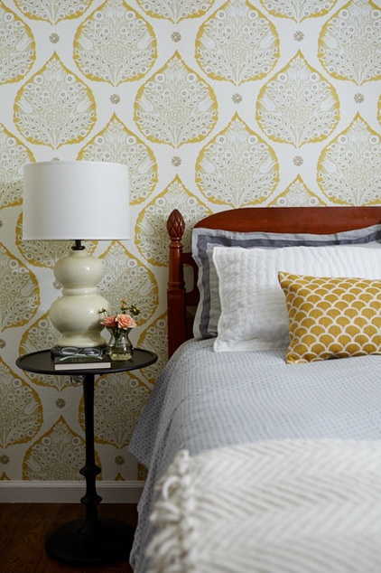
3. Sunny Sanctuary
Designer: Jill Cordner of Jill Cordner Interior Design
Location: San Francisco
Size: 9 feet by 14 feet, or 126 square feet (2.7 by 4.2 meters, or 11.7 square meters)
Year built: 1978
Homeowners’ request: “My clients are a young professional couple from the East Coast who really wanted a comfortable and inviting guest room for their underused and darker part of the house, so family could stay when they are in town,” interior designer Jill Cordner says. “The goal was to make it inviting and full of life and to create an overall guest suite on that floor.”
Plan of attack: “My clients had an existing antique bed frame that they wanted to use in the space, so I mostly started with that and built around it. We also wanted to add some color and pattern, so the wallpaper came next. It is the Lotus pattern from Galbraith & Paul, and both the clients and I fell in love with it. I had always imagined adding yellow into this room to brighten it up, and we liked how the wallpaper pattern echoed the shapes on the bed frame as well. Since it was a guest room, I looked for simple nightstands and lamps that would be budget friendly and not clash with the wood on the bed frame. I then added bedding that provided textural interest and a yellow throw pillow from West Elm to pick up on the yellow in the wallpaper.”
Why the design works: “It was a space that really needed some personality and a jolt of energy. It was a little depressing when we started out. Wallpaper is the perfect go-to for bringing a space to life and creating a focal point.”
Designer secret: “Mixing up bedding. We used a duvet and shams from a few different collections to create a unique and layered look for the bed — more interesting than matchy-matchy. Another tip is looking at children’s furniture stores for adult rooms. I love Restoration Hardware Baby & Child — great pieces at better price points. Land of Nod is a favorite source as well for child and adult rooms alike.”
“Uh-oh” moment: “The clients had shown me photos of the antique full-size bed frame unassembled. Once we put it together in the room, it turned out it was really, really short. All of the bed risers I initially looked at were so ugly, so we got creative and found extra 5-inch legs in a matching stain that we attached to the bottom to make it the right height for the room and nightstands. It ended up being an easy fix.”
Splurges and savings: “We definitely splurged on the wallpaper and went with more budget-friendly nightstands and table lamps. The great thing about a wallpaper is that everything you place in front of it pops and looks higher-end.”
Take-away: “The transformative power of wallpaper.”
The nitty-gritty: Bed frame: antique; wallpaper: Lotus, Galbraith & Paul; bedside lamps: Pottery Barn; bedside tables: Restoration Hardware Baby & Child; throw pillow and duvet cover: West Elm; pillow shams: Pottery Barn
Team involved: Jon Robertson Wallpapering
More:
14 Steps to a Perfectly Polished Bedroom
32 Creative Ideas for Your Nightstand
New This Week features designs from projects most recently uploaded to Houzz. Have a great project? Here’s how to share your photos on Houzz.
Related Articles Recommended


