Kitchen of the Week: Function and Flow Come First
This homeowner could no longer go with the flow — with the dysfunctional flow of her kitchen, that is. As someone who loves to cook, bake, try new recipes, be health-conscious and even teach cooking classes, she simply could not get by with her poorly laid-out kitchen any longer. “It is very important to her that she connect with her kitchen, and she was acutely aware that the way her old kitchen flowed was bothersome,” interior designer Sophia Reay says. “Really, style was absolutely secondary to her in terms of importance — function was the priority.”
To get the kitchen exactly right, Reay sat down with her clients and had them write down their every kitchen desire. “They ranged from a large appliance to the placement for a small drawer for a laptop,” Reay says. The designer came up with what she hoped would be the most functional plan, drew it up in SketchUp and laid out everything on the floor with tape — from the island to the sink placement. She then had her client pantomime how she wanted to work in the kitchen. This helped Reay determine drawer placement, the distance from the sink to the dishwasher and so on. In the end she gave her clients a family hub with sophisticated contemporary style.
Photos by Christine Kufske
Kitchen at a Glance
Who lives here: A couple and their 3 teenage sons
Location: Kitchener, Ontario, Canada
Size: 350 square feet (32.5 square meters)
Designer: Sophia Reay of LemonTree & Co. Interiors
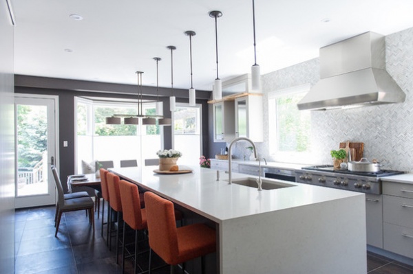
The result is a kitchen with a specifically laid-out work triangle, a long island with a kitchen table on the end of it, a wall for pantry storage and a TV, and a separate drinks station that keeps the rest of the family out of the cook’s way. “She’s a very practical person. Function was of primary importance, while style was secondary,” Reay says.
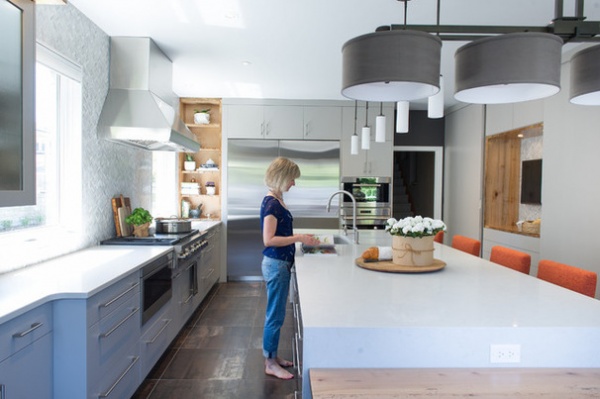
Here is one of the homeowners, hard at work in her carefully thought-out work triangle. Everything was planned out according to how she likes to function and move around in the kitchen. The island is 12 feet long.
This is also a danger zone. “Mom doesn’t like her work triangle interrupted when she’s in action,” Reay says. The designer planned the rest of the kitchen accordingly. Those keeping the homeowner company while she’s cooking are out of the way across the island and around the table.
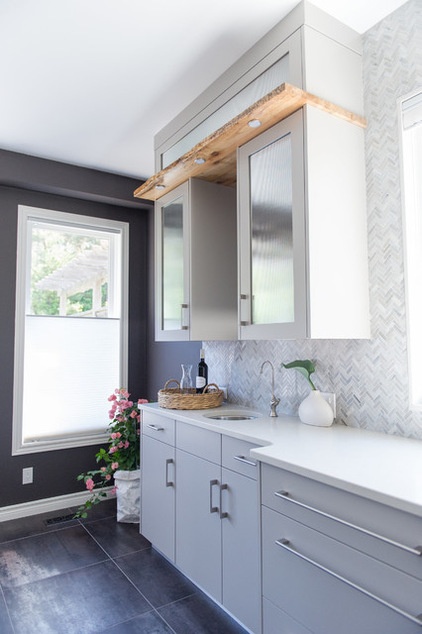
Anyone who wants a drink stays away from the work triangle sink and heads instead to this handy beverage station at the end of the kitchen. The family members are very health-conscious; they drink mostly water, and they also love tea. This sink is equipped with a water filter. Cabinets store glassware, mugs, teas and an electric teakettle.
The glass on the upper cabinets is reeded. Live-edge reclaimed wormy maple barn wood makes appearances throughout the kitchen, adding warmth to the cool whites and grays. Here it pops up over the cabinets with integrated lights.
Floor tile: Corten porcelain in Graphite, 24 by 24 inches, Ceragres
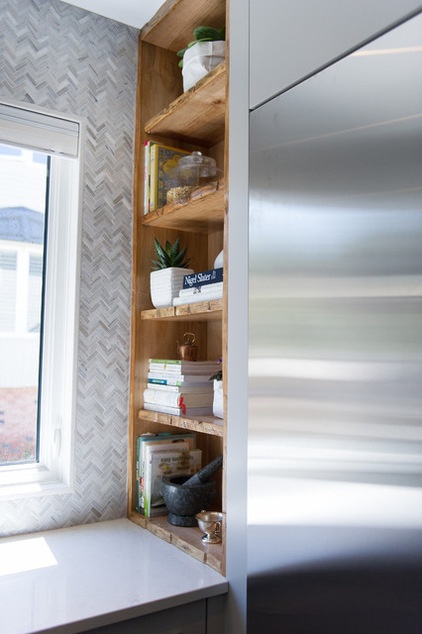
This niche was another carefully planned spot. “She has tons of cookbooks that she uses all the time, so we needed to make room for those,” Reay says. More reclaimed wormy maple barn wood warms the room from this corner. The spot between the refrigerator and the range keeps her recipes close at hand.
Refrigerator: Sub-Zero
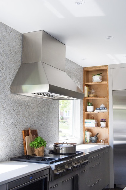
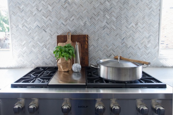
A herringbone tile backsplash extends to the ceiling. Though style was not paramount in the design, the redesign has a cool, contemporary vibe warmed by the reclaimed wood, spicy orange counter stools and bronze-like tile floors.
“Connecting with nature is also very important to my clients,” Reay says. The designer added two new windows flanking the range to open up the views and let in the natural light. At the far end of the room she replaced the old door with a glass one (see first photo).
Countertops: Caesarstone in London Grey 5000; paint by Benjamin Moore: Silhouette AF-655 (walls and island) and Stone Harbor 2111-50 (cabinets); backsplash: Verona-blend herringbone marble, Olympia Tile
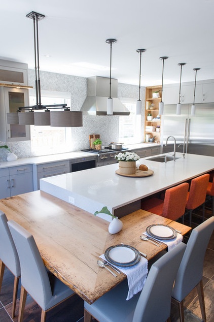
The family members eat almost all of their meals in the kitchen together. The reclaimed-maple section of the table adds warmth between the cool Caesarstone counters and gray cabinets and chairs.
The stools and kitchen chairs were tough to get right. “They wanted something comfortable, and she’s petite while he’s very tall,” Reay says. “It was tricky to find something that worked for both of them.” Sturdy but comfortable upholstered stools and chairs with high backs work well for everyone in the family.
Reay had also recently completed the couple’s family room and knew that her client loved orange. “She wanted to bring an orange element in here and keep it as something continuous throughout the house,” the designer says.
Pendant lights and chandlier: Hubbard and Forge; Nube stools: Trica Furniture; Bess chairs: Calligaris, Schreiter’s
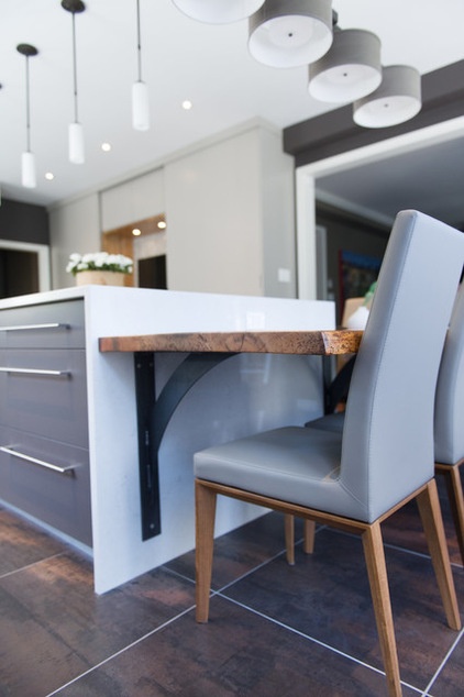
Here is a closer look at the way the wraparound table attaches to the waterfall counter, and a close-up of the chairs. “They are perfectly proportioned and work well for everyone in the family,” the designer says.
After a project is finished, Reay asks her clients about their favorite parts of the design. When she asked her client about what she would change if she did the whole thing over again, the homeowner responded that at first she would have said the dark floors, because they show crumbs. But that had turned into a positive, because she realized she likes knowing where crumbs are so she can clean them up.
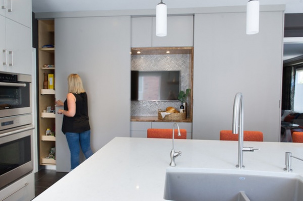
Reay’s colleague Melissa offers us a peek into the pantry. The family needed lots of storage, so she designed two large pantries that flank a recessed TV. The one on the left stores lots of baking supplies and Tupperware close to the work triangle.
Each section is the same width. Should the clients decide to create a display area in one of the storage areas, they could slide open one of the doors to cover the TV and reveal the display at the same time. “We did this so that they could switch up the look in the kitchen,” Reay says.
The sink is gray quartz that’s darker than the quartz of the countertops.
Sink: Performa in Truffle, Blanco; faucet: Vento pull-down faucet in stainless, Riobel
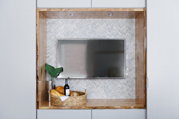
The reclaimed maple wood makes another appearance around the TV recess, with the herringbone backsplash creating continuity from one side of the kitchen to the other.
Backsplash: Verona-blend herringbone marble, Olympia Tile
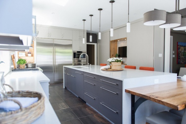
The drawers are coated in a gray lacquer. A waterfall Caesarstone countertop wraps them in quartz. Long satin nickel pulls add contemporary flair.
Cabinet pulls: Richelieu
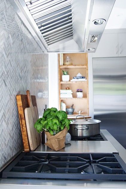
While the homeowner is not back to teaching cooking classes again, Reay is pressuring her to do so. “Her food is incredible!” the designer says. Hopefully the new kitchen will encourage her to get back to it as well.
Contractor: Scott Hoegy
Cabinetmaker: Jacob’s Woodworking
Browse more Kitchens of the Week


