Before and After: Modern Update Blasts a '70s Kitchen Out of the Past
http://decor-ideas.org 07/17/2015 03:13 Decor Ideas
Call it a case of hate at first sight. When Allie and Jeff Siarto began looking for a home in East Lansing, Michigan, the first house they looked at was a 1978 home that they quickly dismissed for its retro design, which included a wooden scalloped decorative feature over the kitchen sink that they just couldn’t get over. “It was not our style,” Allie says.
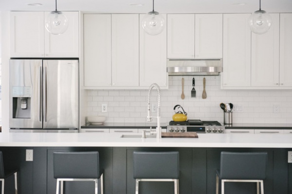
Photos by Allie Siarto & Co. Photography
Kitchen at a Glance
Location: East Lansing, Michigan
Who lives here: Allie Siarto, a wedding photographer; her husband, Jeff, a web designer and developer; and their daughter, Zelda, 19 months old
Size: 351 square feet (32.6 square meters); 27 by 13 feet (8.2 by 3.9 meters)
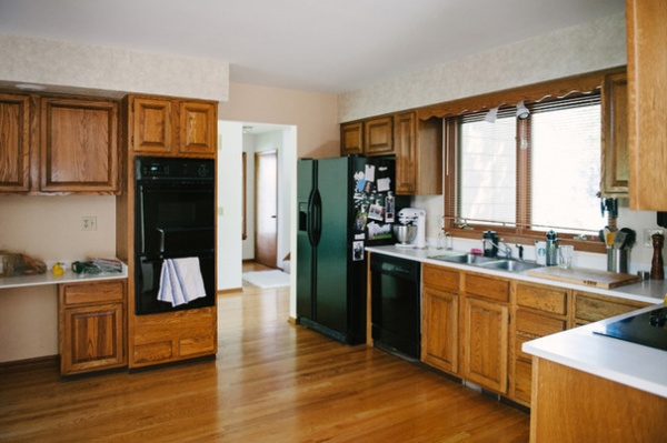
BEFORE: “The scallop above the sink, seen here, was a big reason we didn’t buy it in the beginning,” Allie says.
But after the couple spent months looking at houses built in the early 1900s, this home’s open floor plan and proximity to downtown began to have some appeal. They consulted a few friends, one of which was Allie’s cousin’s architect husband, Jon Jorgensen. They realized the home had great potential, particularly in the kitchen.
They bought the home and lived in it for two years before embarking on a kitchen update helmed by Jorgensen. Their previous space mainly was horrible for socializing. “There was nowhere to sit, so we would sit on the floor when guests came over,” Allie says.
When demolition began, Jeff did the honor of forcibly removing the scalloped feature over the sink.
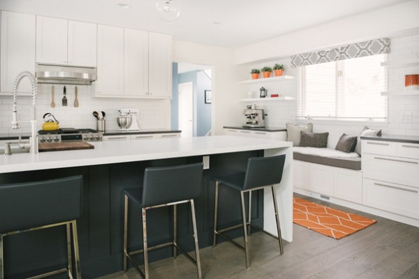
AFTER: Jorgensen reoriented the kitchen to accommodate a massive 13-foot island that seats five people comfortably. He also doubled the storage from their previous kitchen.
Floor-to-ceiling cabinets were planned for the window wall. But when construction began, the Siartos discovered the soffit couldn’t be removed because it contained vital ductwork. Allie didn’t want to have cabinets hanging at different heights, so they reworked the plan to include open shelving. “It turned out better than it would have with all cabinets,” she says. “This way it’s not so heavy.”
The Siartos originally thought they’d put a desk under the window where the sink used to be, but Allie’s mom, a librarian, suggested a window seat for reading, and the idea stuck. “It ended up becoming the perfect spot and gets a lot more use than if it were a desk,” Allie says.
Floating shelves: Lack, Ikea; faucet: Parma single handle, Danze
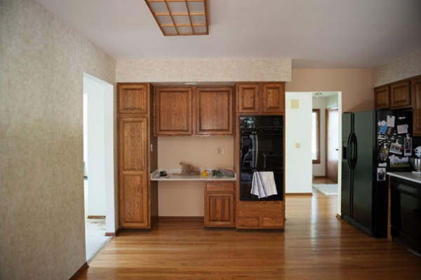
BEFORE: A wall to the left partially blocked natural light from entering the kitchen. Meanwhile, the flooring turned out to be what Allie calls an “archeological dig.” Hardwood covered linoleum in the kitchen, and carpet covered parquet floors in the adjacent rooms. Removing all the layers dropped the floors so much that after the new floors were installed, the doors had to have fillers added to the bottom so there wasn’t such a large gap.
The Siartos donated all the old cabinetry and appliances to Habitat for Humanity.
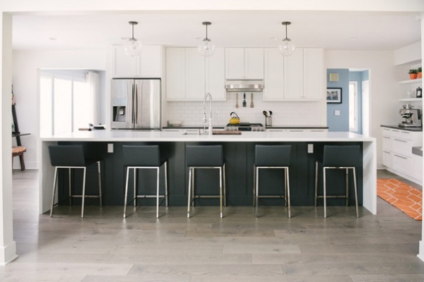
AFTER: Removing the wall to the left brought in more natural light. Argonne forest oak flooring acts as a neutral anchor for the new palette.
The Siartos chose Arctic White Corian for the island countertop because they couldn’t find a single slab of quartz or granite over 10 feet long, and they wanted a seamless look. “It actually worked out. Corian is less expensive and looks really nice,” Allie says. “We’ve had smashed blueberries and spilled wine on there, and it always looks clean.”
When the couple moved in, Allie says she got a little crazy with color and painted the dining room bamboo green, other rooms blue and so on, to the point where she was sick of seeing color. “I was overwhelmed and tired of colors,” she says. “I wanted everything to be white and clean, then I could put up colorful artwork.”
Dark cabinets on the island, dark chairs, gray Marengo quartz counters on the perimeter and matte subway tile with warm gray grout for the backsplash set off the white just enough.
The cabinet shells are from Ikea, but the Siartos ordered custom Shaker fronts that their painter finished onsite.
Cabinet fronts: Semihandmade; island cabinet paint: Cracked Pepper, Behr; perimeter cabinet paint: Alabaster, Sherwin-Williams; chairs: Phoenix in carbon gray (24 inches), CB2; lights: Luna in antique black, Schoolhouse Electric & Supply Co.; flooring: Shaw Floors
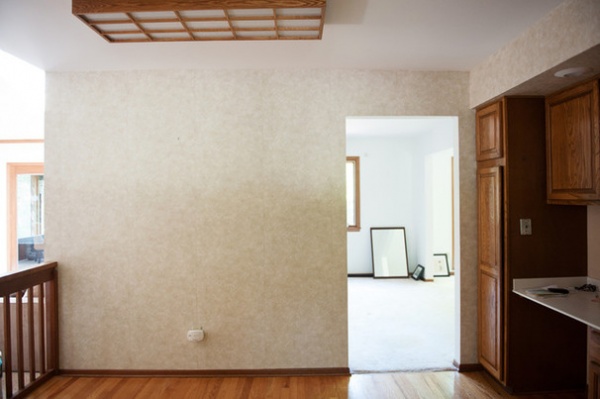
BEFORE: A railing stuck out 3 feet into the kitchen to give the impression of separation from the family room. “The lovely railing really had no purpose,” Allie says.
The carpeted dining room on the other side of the doorway wasn’t practical with a child around.
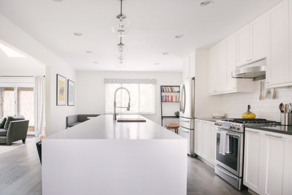
AFTER: Taking down the wall opened the kitchen to the rear window, bringing in more light.
Refrigerator and oven: Samsung
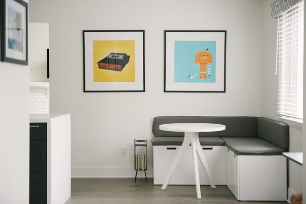
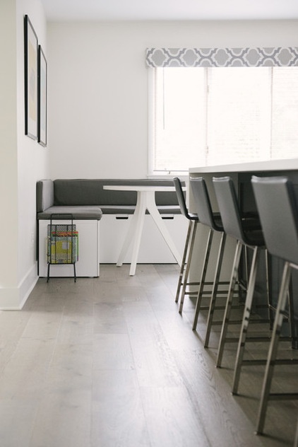
The 7 feet of space in the corner at the end of the island was going to be a reading area, but Allie had always wanted a breakfast nook with a booth, so after construction she took action. She brought up Ikea Stuva benches from her basement and had custom cushions made. To attach the cushions, she sewed a 3M Velcro-like product to the cushions, then glued the same to the benches and wall. “Those 10-inch cushions on the back make it look built in and feel more cozy,” she says. A 30-inch table completed her dream breakfast booth.
Cushions: Cushion Source; table: West Elm; art: Chris Bishop
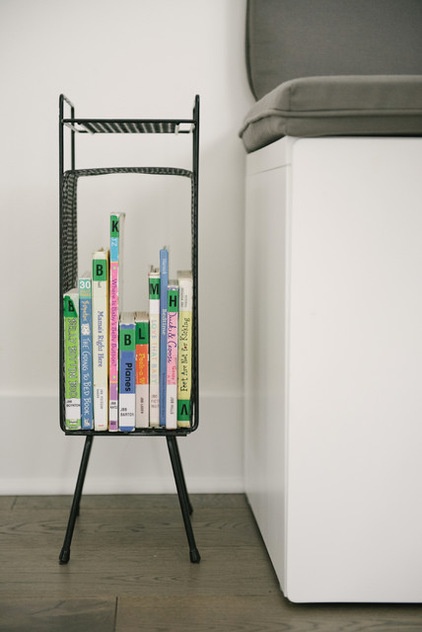
Allie repurposed a record holder she found at a thrift shop as a small shelf for children’s books.
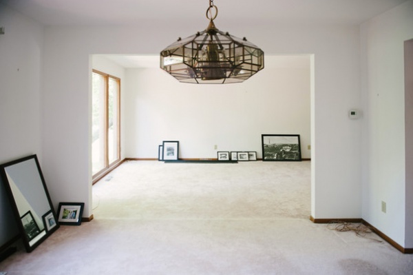
BEFORE: In the old dining room, you can see how the living room was bumped down an inch from the poor flooring installation.
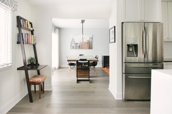
AFTER: The new floors evened everything out. The texture of the wood coupled with a wax coating helps hide nicks and scratches.
The dining room is now part of the living room. The art piece is a blown-up photograph of Detroit that Allie shot during a wedding.
Desk and dining table: Crate & Barrel; pendant: Firefly, CB2; chairs: Sears: high chair: Stokke
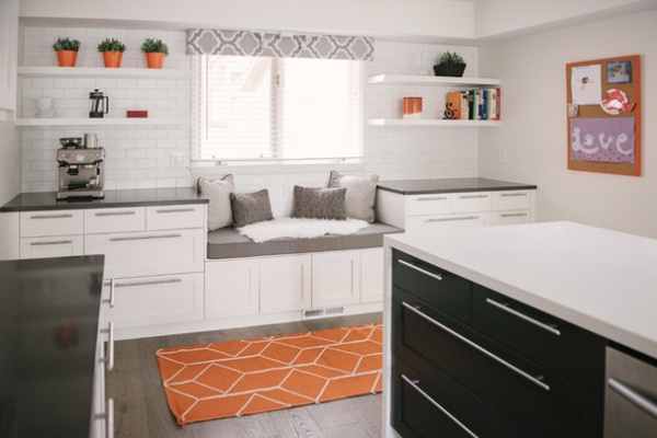
Here you can see how the dark countertops and island cabinets create contrast in the mostly white kitchen.
Allie made the window valance by cutting a curtain from Target and pinning it to a piece of foam. She hung it by gluing the 3M fastener to the tile and the foam board so she wouldn’t damage the tile by drilling into it.
Cabinet pulls: Lansa, Ikea
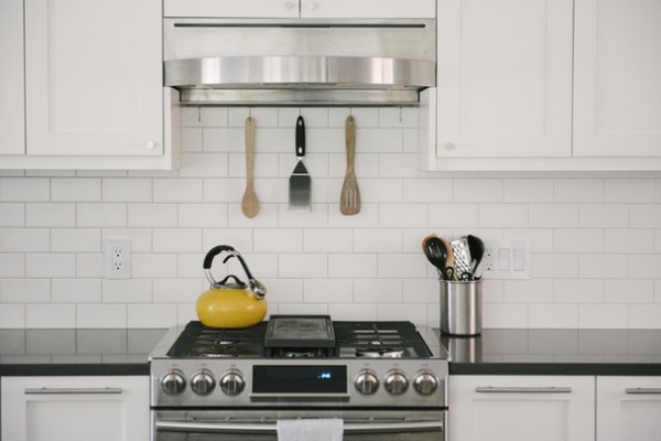
Allie used Houzz to validate her and Jeff’s material choices while planning their remodel. “We’d wonder about a tile choice or whatever, so we would look it up on Houzz and look at examples of what others did to prove it to ourselves that it could look good,” she says.
Backsplash tile: Rittenhouse square matte 3-inch by 6-inch ceramic wall tiles in Arctic White, The Home Depot; vent hood: Tamburo, Zephyr
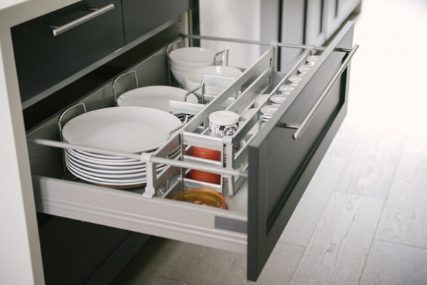
The Siartos opted for Ikea separators to help organize dishes in the pullout storage drawers.
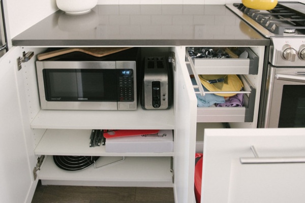
An undercabinet shelf keeps the microwave off the counter, lessening visual clutter.
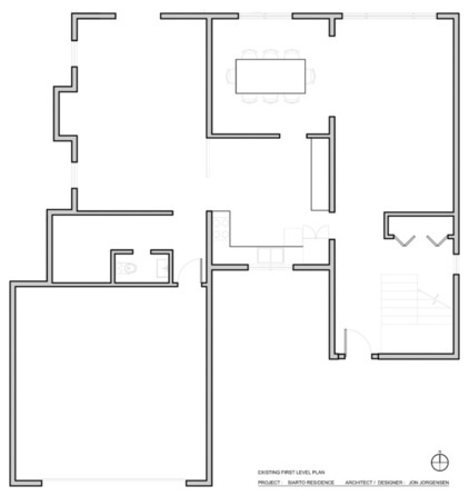
BEFORE: The previous floor plan shows how the kitchen, in the center, was walled off from the rest of the home.
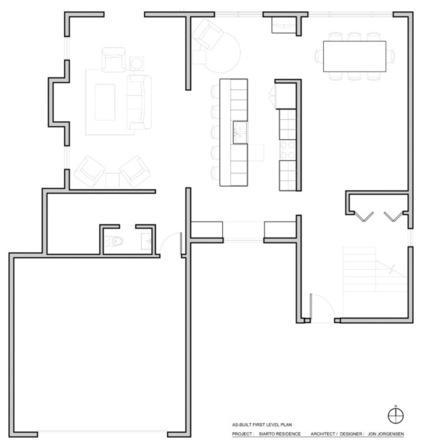
AFTER: The new floor plan illustrates the expanded and open design.
Despite a rocky first encounter with their retro home, the Siartos now feel nothing but love. Here’s the cost breakdown of their kitchen remodel:
Ikea cabinets (no faces): $2,508Semihandmade DIY Shaker cabinet faces (unpainted): $4,554Countertops (99 square feet; a combination of Quartz and Corian): $4,473Sink, disposal, faucet and hardware: $1,332Appliances (refrigerator, dishwasher, range, microwave, vent hood, espresso machine): $6,535First-floor hardwood flooring: $9,965 (entire first floor, around 1,000 square feet)Design and construction labor: $16,85
Total: $46,220
General contractor: Lau Construction
More: Homeowner’s Workbook: How to Remodel Your Kitchen
Related Articles Recommended


