Houzz Tour: Reorganized Tribeca Penthouse Suits This Family Well
http://decor-ideas.org 07/14/2015 00:13 Decor Ideas
The original proportions of this loft in Manhattan’s Tribeca neighborhood were off, the layout felt disjointed, and there was no master suite. Luckily the owner, Yen Ha, is an architect. She used her expertise to reconfigure the space, turning it into a warm, welcoming and functional home for her young family of four. “I’m super organized,” she says, “so there is a place for everything.” This meant she was able to eliminate large closets her family didn’t need, borrow space from a large hall bathroom, move a few walls around and take the space gained for a true master suite and a playroom-study for her kids.
Photos by Alice Gao Photography
Houzz at a Glance
Who lives here: A young family of 4
Location: Tribeca neighborhood of Manhattan
Size: 1,800 square feet (167 square meters); 3 bedrooms, 2½ bathrooms
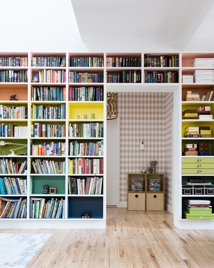
Wall-to-wall bookshelves painted in muted rainbow colors create a focal point in the living room, which is open to the dining room and kitchen. “This is where we hang out the most, so we wanted to make it feel warm and homey, with the warmth coming from more than just the books,” Ha says.
She carefully selected a color palette and had her contractor paint swatches in the apartment before committing. “We didn’t want it to be too primary colored or childish, but a more adult rainbow, if there is such a thing,” she says. The color study paid off; The first attempt at painting the shelving was a winner.
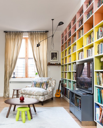
The shelves also have space for the TV and media equipment. A chaise provides a comfortable reading spot, with good light from overhead. “Our kids are pretty active, so we didn’t want anything to be too precious,” the architect says.
Paint by Benjamin Moore, used throughout most of the home: Pale Oak (walls) and White Dove (trim); light fixture: Wo & We
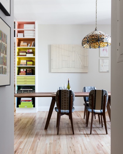
In the adjacent dining room, a hand-me-down Tiffany-esque glass pendant light is an unexpected touch. Ha’s mother-in-law gave it to her and her husband; it used to hang in her dining room. Now it adds age, pattern and color to the modern space.
The couple had bought the chairs at ABC Carpet & Home years ago and reupholstered them in Maharam’s Alpine Stripe fabric, which picks up on the colors of the light fixture. The large artwork on the wall is by Vietnamese artist Christian Nguyen.
Dining table: Studiolise Together
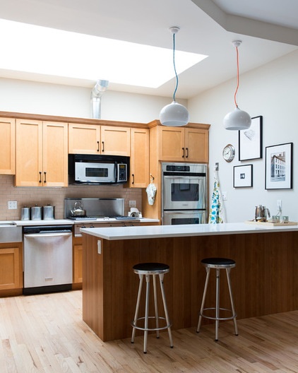
In the kitchen, the couple kept the original cabinets and appliances. “We changed the backsplash, hardware and countertops, and it changed the whole room,” Ha says. They also moved the island to square off the kitchen; previously it was set at an odd angle.
Seven existing skylights bathe the apartment in natural light. The couple were also able to use the existing oak floors; they sanded them down and gave them a light stain that eliminated the yellow and orange tones.
Counters: Caesarstone in Blizzard; backsplash tile: Elements Earthenware in Victorian Rose Crackle, Ann Sacks; Medium white pendants: Hand and Eye Studio
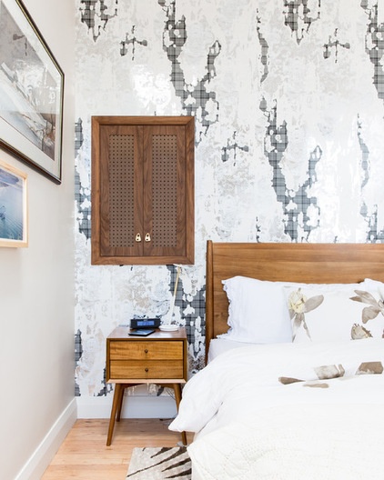
In the master bedroom, a striking wallpaper from Brooklyn company Flavor Paper makes the room. It was designed by a good friend of Ha’s. “I’ve wanted to use this wallpaper forever!” she says.
When redoing the layout, they discovered some extra space between the walls. Ha made the most of it; she had the contractor create the recessed cabinet for off-season clothing storage.
Bed, nightstand: West Elm; wallpaper: Celestial Dragon Gold, Flavor Paper
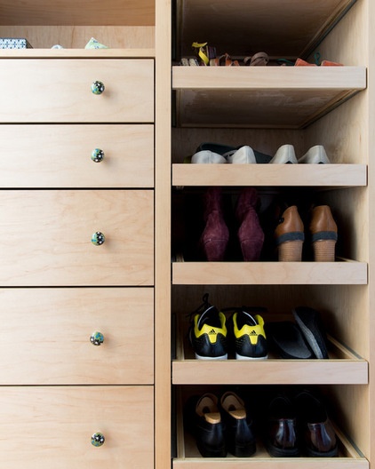
A new walk-through dressing room leads from the master bedroom into the master bathroom. Ha has a place for everything, thanks to efficient built-ins like these pullout shoe shelves.
Knobs: Anthropologie
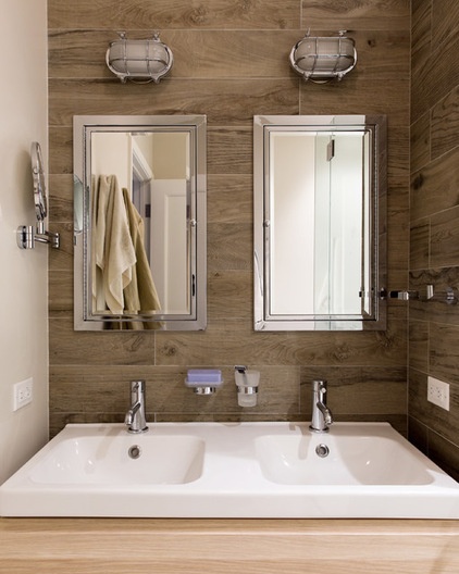
“My favorite thing about the new bathroom is having two sinks,” she says. “It is the smallest two-sink option we could possibly have, but now I have mine and he has his.” His-and-her medicine cabinets give them both ample room to store their toiletries.
Cage light sconces: Shiplights; Framed medicine cabinet: Restoration Hardware; sink: Godmorgon/Odensvik, Ikea; faucets: Cigno, Lavaca
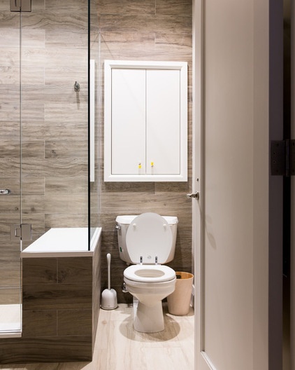
The room is covered in porcelain tile that looks like wood; the floor tile is a lighter version of the wall tile. “I wanted it to have a sauna feeling in here, with most of the surfaces covered in wood,” Ha says.
Another recessed cabinet over the toilet takes advantage of space in the wall.
Tile: Oxy Wood Collection in White Smoke (flooring) and Grey Pepper (walls), Nemo
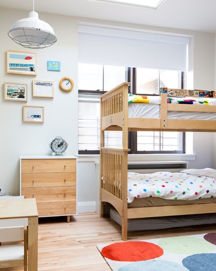
Though her son and daughter have their own rooms, right now they prefer bunking together in his room. The rug is a special purchase from The Rug Company that the couple bought when their son was born.
The artwork is a mix of pieces found on 20x200. “I love buying artwork for my kids there; there is so much variety, and you can make a themed wall,” Ha says. She used a transportation theme here.
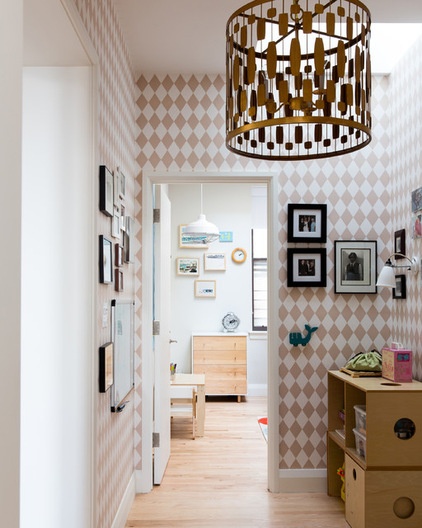
Ha eliminated several large closets, carefully planning out new smaller closets for their storage needs — one for coats, one for linens and one for tools. She also decreased the size of the kids’ large bathroom by getting rid of a large shower stall and combining the tub and shower.
One of the benefits of getting rid of the closets and decreasing the size of the kids’ bathroom was gaining this extra space in the hallway between the kids’ rooms and the living room. The space serves as a toy storage and play area, but it will become a study for the kids when they get a little older.
Wallpaper: Harlequin Rose, Ferm Living; Gold Leaf Wire pendant: Pieces
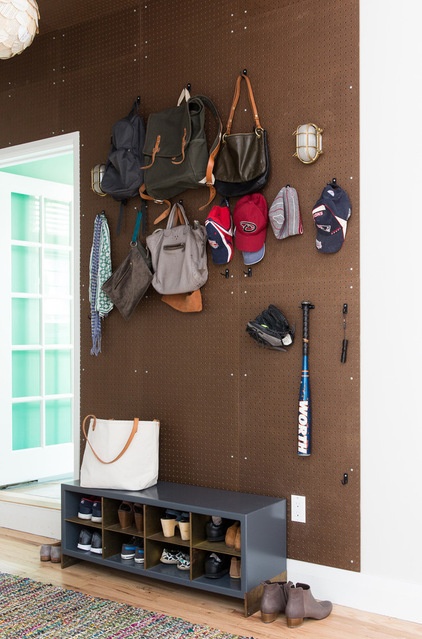
Back in the entryway, Ha wanted to create a place to pause and unload and have room to store all of the kids’ equipment and gear. She covered two walls and the ceilings in pegboard. “There is a lot of storage space in here, but it doesn’t feel overly cluttered because you can hang thousands of things from pegs, yet they all still look like they are part of one idea,” she says.
Of the home’s renovation, Ha says: “The whole process took about eight months, and it was worth it. It feels really cozy, and we’re really happy with it.”
Natural brown pegboard: The Home Depot
Browse more homes by style:
Small Homes | Apartments | Barn Homes | Colorful Homes | Contemporary Homes | Eclectic Homes | Farmhouses | Floating Homes | Guesthouses | Lofts | Midcentury Homes | Modern Homes | Ranch Homes | Townhouses | Traditional Homes | Transitional Homes | Vacation Homes | Homes Around the World
Related Articles Recommended


