Houzz Tour: Color and Light Transform a Brooklyn Townhouse
Sitting in south Park Slope, the expanding frontier of gentrified Brooklyn, New York, this three-story townhouse was something of a mess. But it afforded the young family of four who bought it the ability to rent out the first floor while living on the top two. For architect Jeff Etelamaki of Etelamaki Architecture, the lack of preciousness was a great opportunity. “We felt we could be adventurous, because it wasn’t a landmark block of brownstones,” he says. Working with a limited budget, Etelamaki and his team nevertheless were able to maximize the potential of the nondescript building to create a “modern, light-filled home that acknowledges the building’s past while envisioning the neighborhood’s future,” he says. Etelamaki’s fresh viewpoint, and his use of stylish yet inexpensive materials, gave this townhouse a charming and bright personality without breaking the bank.
Houzz at a Glance
Who lives here: A couple in their 30s with 2 children, ages 8 and 10
Location: Brooklyn, New York
Size: 1,800 square feet (167.2 square meters) in the homeowners’ two-story space; 2,600 square feet (241.5 square meters) total including the first-floor rental unit; 3 bedrooms, 3 bathrooms
Architect: Jeff Etelamaki
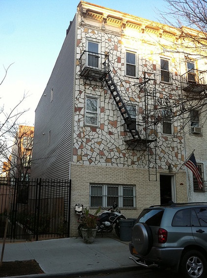
BEFORE: First to go during the exterior remodel was the fire escape. But the architect had bigger problems: an unstable wall where the mainly wood-framed building was once attached to another structure no longer there. “The house had started to deteriorate,” Etelamaki says. “When we opened it up, it was really scary — the contractor was terrified at what we found. It wasn’t the kind of thing you could see without opening up the walls. We had to do a lot of structural work to stabilize the house.” Fortunately, the team discovered that the upper stories had been built over a one-story masonry garage that had been incorporated into the ground-floor plan. They used that solid shell to support the wall that was in danger of coming down.
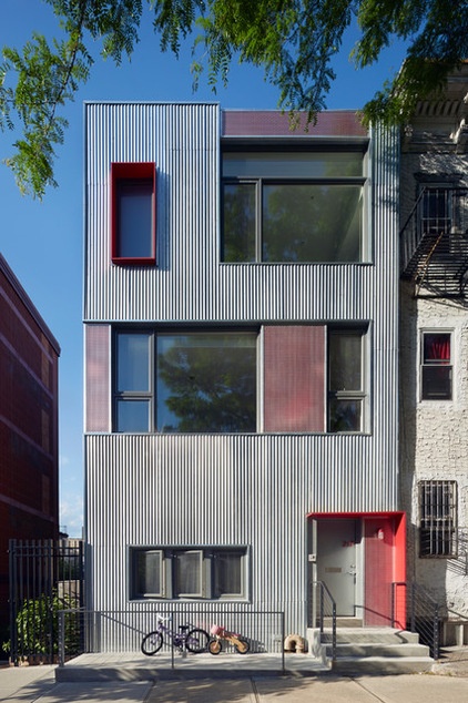
AFTER: The Park Slope block has an eclectic array of early-20th-century multifamily buildings mixed with newer and larger condominiums. “The lack of uniformity presented an opportunity for a bold facade design,” Etelamaki says. He chose an asymmetrical mix of large and small windows, with a nod to the original facade “in the rhythm of window placement and in the geometry of the exterior cladding materials.”
For the building’s primary cladding, Etelamaki opted for simple corrugated galvanized steel. He chose it both for its affordability and “to blend in with the gritty, eclectic architecture adjacent to the site,” he says. With a fine-tuned whimsy that is a hallmark inside as well, Etelamaki installed framed accent panels of perforated aluminum in front of flat fiberglass panels painted the project’s signature red. The layering of materials, colors and textures provides complexity and balance to the facade, he says.
Paint: Red Statement 3-16, Pratt & Lambert
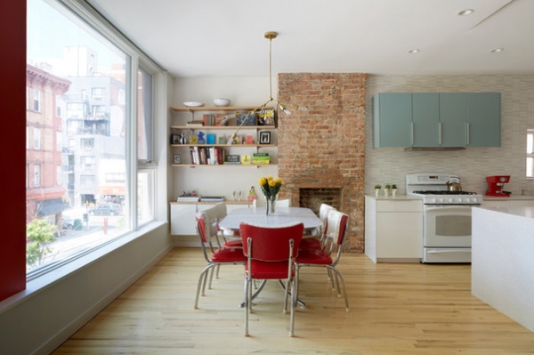
With a broad view of the neighborhood as the backdrop, the main floor’s open kitchen and dining room are the family’s center. Etelamaki’s minimalist approach includes the simple color scheme: white for the walls and ceiling, touches of attention-grabbing bright red for interest and a quiet strip of robin’s egg blue cabinetry as a complement.
The homeowners originally thought to set the breakfast table in the front room and create a more elaborate dining room down the hall and at the back of the second story. As the design evolved, they decided to keep the dining room adjacent to the kitchen in the front, so the back room became a combination living and family room.
Dining table and chairs: vintage Formica, homeowners’ own; interior paint throughout house: White Dove OC-17, Benjamin Moore
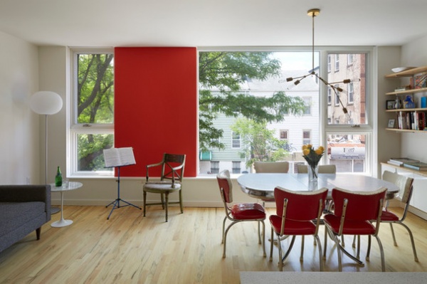
Completing the front room layout: a music practice area and couch that “fit into the idea that this would be the informal family space, where someone could play an instrument while someone else is cooking dinner,” Etelamaki says. The bright red accent wall gives the room a strong focal point, and a brilliant counterpoint to the city’s greenery.
It’s the expanse of glass, however, that is transformational. Etelamaki replaced the original three small windows across the top two floors with “the largest windows the manufacturer could make” — 9 feet, 8 inches wide and 7 feet, 8 inches high for all three combined. “But we tried to leave traces of the original windows,” he continues. “The divisions in the larger windows reference the original window placement.”
Windows: LePage Millwork, available through Architectural Building Components; You Make It chandelier: Lindsay Edelman, assembled by architect; red paint: Red Statement 3-16, Pratt & Lambert
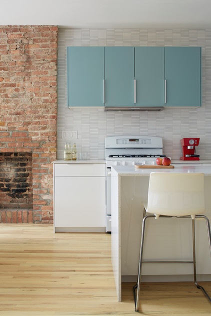
For the kitchen decor, Etelamaki and his crew took the time to experiment. “We tried a bunch of different things,” he says. “Different colors for the backsplash, the blue cabinets, a bunch of iterations until we found one that worked.” An early thought was to go bold with green glass mosaic tile for the backsplash. “That was always going to be the big, bold statement,” he says, “but in the end, it just seemed like too much.” He opted for a pale gray and white 8- by 8-inch porcelain tile that left room for the blue cabinets, two of which house the stove hood, which they thought blended well with the exposed brick.
The column may look like an old chimney, but it’s not. “It never was a fireplace,” Etelamaki says. “We made the opening ourselves and took out some brick to make it look like a chimney.” Its presence, however, adds warmth and a sense of history to the spare space. “It gives it character,” Etelamaki says. “It makes it almost picturesque.”
Wall cabinetry: Akurum, Ikea; backsplash: Duo tile in Nacar, Porcelanosa; stove: Profile, GE; hood: Miele; dishwasher: Ascenta, Bosch; counters: Caesarstone in Nougat
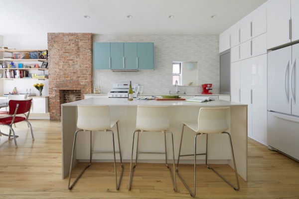
Etelamaki was able to provide the homeowners with ample storage “without filling the back wall with cabinets. We wanted to avoid that and not fill up the space too much,” he says. The major cabinetry runs floor to ceiling along the back wall in addition to the wall, counter and island cabinets. An aluminum appliance garage with roll-up front sits adjacent to the counter.
Sink: Bredskar, Ikea; faucet: Simplice, Kohler; soap dispenser: Franke; water filter: Aquaversa, Multipure; refrigerator: KitchenAid; counter stools: Glenn, Ikea
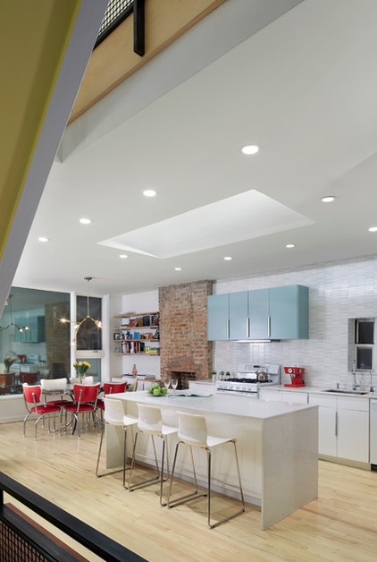
The homeowners asked for an open, loft-like space on the main floor. “People often make that request, especially when they buy,” Etelamaki says. “The proportions don’t always work in every scenario. In talking it through, we thought it might be nicer to have some complexity in the floor plan.”
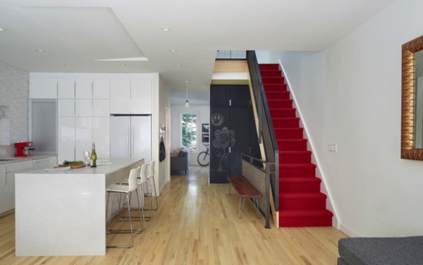
The brilliant slash of the red-carpeted staircase carries through the red-accent motif that so enlivens the interior. The existing red oak flooring was bleached and lightly stained to generate additional brightness in the hall to the combination family and living room at the back.
Cord carpet in Chili 616: Tretford
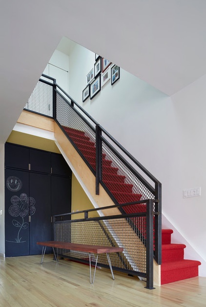
More whimsy greets family and guests as they climb the stairs. Etelamaki painted the facing wall with chalkboard paint for an ever-changing gallery of the children’s artistic moments. The wall masks the coat closet and one for cleaning supplies and additional storage. Etelamaki made the entryway bench of simple natural-oil finish wood planks with steel hairpin legs.
Magnetic primer and chalkboard paint in black: Rust-Oleum
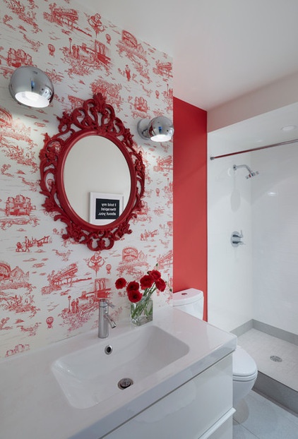
The main-floor guest bathroom — “a powder room with a shower,” Etelamaki calls it — offers the most tongue-in-cheek design touches of the project. The red-on-white wallpaper reads as French toile, but it’s France by way of Brooklyn. It was originally commissioned by Mike Diamond of the Beastie Boys for his Brooklyn brownstone. The vision was to pay tribute to all things Brooklyn, according to the manufacturer, with images of the Brooklyn Bridge, the subway, Coney Island, Hasidic Jews, pigeons and The Notorious B.I.G. Etelamaki upped the ante by installing an elaborate mirror he painted the signature red.
Wallpaper: Brooklyn Toile, Flavor Paper; Ung Drill mirror (painted by architect), Odensvik sink, Dalskar faucet and Godmorgon cabinetry: Ikea; toilet: Acquia II, Toto; Eyeball sconces: Urban Outfitters; paint: Red Statement 3-16, Pratt & Lambert; Stillness thermostatic control and showerhead: Kohler; floor tile: Sant Agostino Basalti in Perla; wall tile: Tea for Two in gloss, Crossville
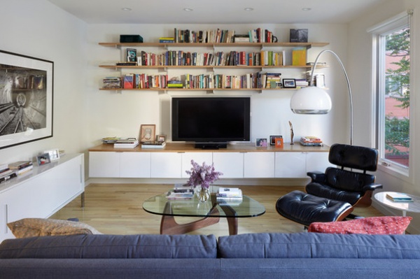
Part of adding complexity to the main floor plan meant creating a combination living and family room in the area originally thought to be for a formal dining room. “The back is where you go to have time alone to work or watch TV,” Etelamaki says. “It evolved as we worked on the preliminary designs.” The low cabinet and shelving arrangement echo a smaller version next to the brick fireplace in the front dining area.
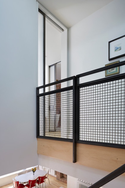
The blackened-steel staircase railing seems the perfect choice here, playing nicely against the white walls and red staircase. The truth is, “it was economically driven,” Etelamaki says. “It was less expensive than doing a curved railing.” The matte black comes from a chemical treatment, not paint. “We kept it simpler, more industrial to fit in with this spare aesthetic,” he continues. “We made it look like it was intentional and considered, not that we were putting in a cheap material.”
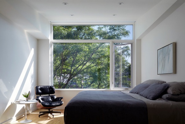
The roofline slopes downward from the front of the building to the back, which gave Etelamaki the opportunity to install a window combination that is 9 feet, 8 inches wide and 8 feet, 4 inches high, including a transom window, in the front-facing master bedroom. “It is carved into the attic space,” he says. “The space goes from nothing at the back and 2 feet at the front. We used that space to pop the ceiling up and make the window more dramatic — and,” he adds, “have a view of that tree.”
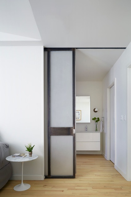
The master bedroom, with double mirrored medicine cabinets and double sinks, connects to the master bath through a steel-framed pocket door with acid-etched glass. Closets are to the right.
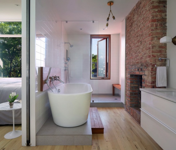
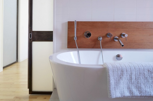
Etelamaki had to move the master bath plumbing to accommodate both a tub and a walk-in shower. The elevated tub sits on 18- by 24-inch porcelain tiles and is accessed by way of steps made of teak, the same wood used for the backsplash. The surround for the shower window is made of mahogany. The casement window itself sits where the original window was set but, at 54 inches, is much taller.
Sinks: Toto; sink faucets: Purist, Kohler; cabinetry: Godmorgon, Ikea; countertop: Caesarstone in Nougat; wall sconces: Pierce, Schoolhouse Electric; floor tile: Sant Agostino Basalti in Perla; wall tile: Tea for Two in gloss, Crossville; Stillness thermostatic control and showerhead: Kohler
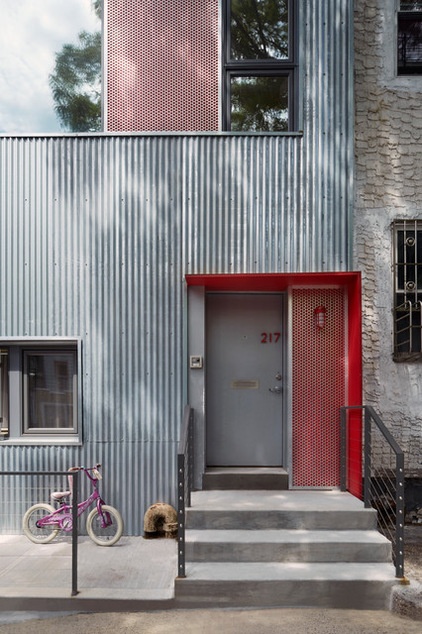
A boldly articulated red painted steel canopy clearly marks the common entrance to the first-floor rental unit and the homeowners’ upstairs living space. Its strong red lines are copied and counterbalanced on the building’s upper left in the jutting vertical frame of the third-floor frosted glass window, which is in the master bathroom’s walk-in shower.
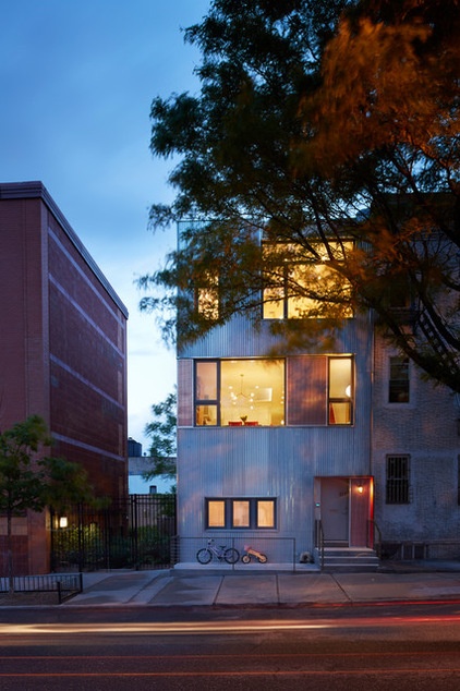
At night the building’s expansive windows become warm, welcoming beacons of light in this rejuvenated neighborhood.
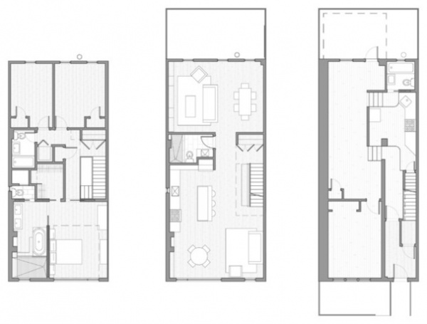
The three-story floor plans, from top floor at left to bottom rental unit at right. The entire project, including the exterior renovation, was completed within a $350,000 budget but reads as much more expensive. Etelamaki’s fine eye and knowledge of materials were the keys here.
“Inexpensive things don’t need to be necessarily equal to being bad,” he says. “It’s picking the right combination. We used paint because that’s inexpensive. The other materials were relatively inexpensive. It’s getting the right mix so that it looks intentional, and not that the contractor picked out cheap stuff for you.”
Browse more homes by style:
Small Homes | Apartments | Barn Homes | Colorful Homes | Contemporary Homes | Eclectic Homes | Farmhouses | Floating Homes | Guesthouses | Lofts | Midcentury Homes | Modern Homes | Ranch Homes | Townhouses | Traditional Homes | Transitional Homes | Vacation Homes | Homes Around the World


