New This Week: Proof the Formal Dining Room Isn’t Dead
http://decor-ideas.org 07/11/2015 03:13 Decor Ideas
It’s true that many homeowners are ditching their dining rooms and remaking the spaces into more frequently used home offices and media rooms. But not everyone is jumping on the bandwagon. Homeowners who entertain often with small dinner parties centered around great food, wine and games are finding that nothing compares with having a designated spot for those special occasions.
And if the following spaces — uploaded recently by their respective designers — are any indication, graphic wallpaper, herringbone-patterned floors and fire features might just save formal dining rooms from extinction. Here, the designers dish on their secrets, plans of attack, “uh-oh” moments and more.
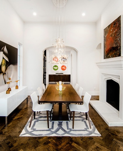
1. Less Is More
Designers: Justin Kettler and Tim Loecker (homeowners and design hobbyists)
Location: Dallas
Year built: 2015
Size: About 13 by 22 feet (3.9 by 6.7 meters)
Homeowners’ request: “Our vision centered around a fluid entertaining area evoking a formal yet fun and approachable feel,” homeowner Justin Kettler says. “The dining room is the integral space at the heart of this entertaining area, bringing together family and friends for lively conversations and celebrations over food and wine.”
Plan of attack: “The dining room is connected to a den, butler’s prep area and enclosed wine cellar. We began with sight lines to draw the eye from one room to the next without giving everything away. We like there to be pleasant surprises. As you enter the foyer, the dining room is situated to the far left, but you may not immediately know it’s there. Preceding the dining room is the den, where company can relax and catch up on life before sitting down at the table.
“To create a distinct space for the dining room, we added a double-sided fireplace flanked by pass-throughs on each side. You catch glimpses of the dining room beyond the fireplace and pass-throughs without revealing its entirety. Once in the dining room, the table is lined and centered with an oversized window on one end and a butler’s prep area with focal art wall on the other end.
“We love wine. Our friends love wine. Therefore, it seemed natural to have the enclosed wine cellar reside adjacent to the dining room for emergency access.”
What wasn’t working: “One challenge was limited wall space for artwork, so we made some adjustments on the size and placement of the side windows to accommodate an oversized art piece.”
What goes on here: “Beyond sitting down for dinner, the dining room is also a great place to congregate with a glass of wine in hand and play poker, dominoes, or board games with small groups of friends. The abundance of natural light makes it a great place to read and enjoy a beverage while looking out over the front yard and neighborhood.”
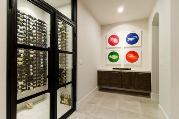
Who uses it: “We’ve hosted several dinners of various sizes and causes, along with a wine tasting for Sojourn Cellars all the way from Sonoma, California.”
Designer secret: “It’s cliché, but less really is more. We curate the room’s elements to focus on fewer, more distinctive pieces of furniture and art. We do not force color, and allow the unique elements to pique interest and collectively establish harmony within the space. Sometimes this is trial and error, and we prefer to add incrementally rather than overproduce an environment.
“Tending to the senses is also crucial. For example, lighting can make or break the mood, so we invest in dimmable zones. While out of sight, an integrated sound system pipes in music to complement the occasion, with digital controls on our smartphones to discreetly adjust volumes or selections without ever stepping away from our guests.”
“Uh-oh” moment: “When solving for an exterior elevation and proportion challenge with our architect, the length of the dining room increased several feet. Proportionally, the dining room became very long, perhaps too long. As we tried to problem-solve this lengthy-dining-room situation, each alternative resulted in another obstacle downstream. Instead of fighting it, we finally embraced it with a herringbone-pattern wood floor running the length of the room. We were really unsure about this last-ditch solution, but once it was installed, we gave a high five, as the impact was striking. At the same time, the herringbone added balance, softening the length of the room.”
Splurges and savings: “We place a lot of value on impact pieces. And with impact pieces, we don’t want them competing against each other. In this room, the chandelier is an impact piece where we bit the bullet and splurged. Because we’re not decking the walls with extravagant trim or draperies, we intend to draw the eye to a few key elements you might not expect but [that] still feel right to the senses.
“While we intended to create a custom mantel, we discovered a similar modular cast stone version that embodied the look and feel we had in mind, allowing us to allocate our budget to other impact pieces.”
Take-away: “This project allowed us to play with gold. We had been skeptical to step out beyond chromes, nickels and pewters. However, the gold chandelier taught us to be more adventurous with metals. And to not fear combining metallics, such as chrome, gold, black iron and pewter. We have them all within a few feet of the dining room, and it works.”
The nitty-gritty: Floors: custom hand-scraped white oak in a herringbone pattern; cabinetry (butler’s prep area): Precision Woodworks; chandelier: Eurofase; table and chairs: Cantoni; magnolia art: “Magnolia” photo on canvas, by Carolyn Brown; clouds art: Sky series, by Ted Kincaid; abstract art on fireplace: Jeff Noble; wall paint: Eider White, Sherwin-Williams
Team involved: John Lively (architect); Mark Hayes (general contractor)
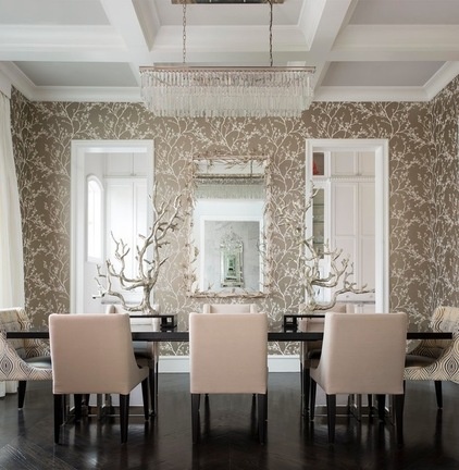
2. Pattern Perfect
Designer: Catherine Dolen of CDA Interior Design
Location: Plano, Texas
Year built: 2014
Size: 13 by 17 feet (3.9 by 5.1 meters)
Homeowners’ request: “The clients desired a transitionally styled space consistent with the rest of their new home,” interior designer Catherine Dolen says. “It serves as the formal dining room but is adjacent to the bar, kitchen and informal dining areas.”
Plan of attack: “We started early in the process with a neutral color scheme that would allow for the use of any color for flowers, place settings etc. The client loves metallic finishes, so we used silver, gold and a combination of both with white. The herringbone-patterned wood floor, the table and the wood of the chairs are all a dark wood, grounding the space. The architectural trim and ceiling coffers are painted white. White silk taffeta draperies cover the windows. The dining room was also designed to be comfortable and approachable. The chairs are upholstered in a metallic faux leather for durability.”
Why the design works: “The space is very symmetrically balanced. The entrance is directly off the foyer and is opposite the client’s study. During construction we changed the framing of the study entrance to be the same width as the dining room entrance in order to emphasize the symmetry.”
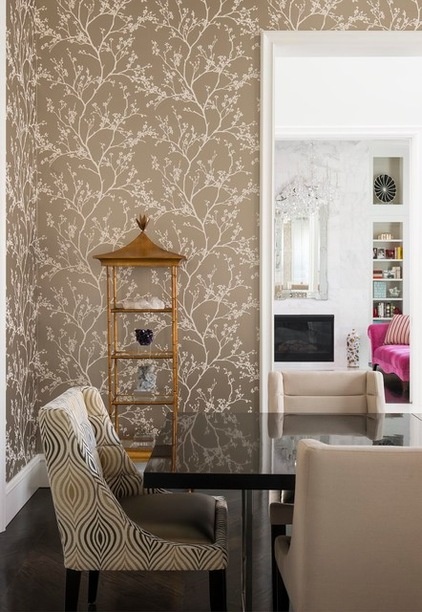
Who uses it: “The family consists of husband and wife, the wife’s mother, 22-year-old daughter and 7-year-old son. They have extended family and friends that use the space often as well.”
Designer secret: “Because the space is neutral and balanced, there was visually room for adding pattern for interest. A soft silvery-gold wall covering with a branching pattern covers the walls. The wall covering adds interest without overwhelming the space. The branching motif is then emphasized by the mirror design and by the branching sculpture accessories for the table.”
“Uh-oh” moment: “About a week after the furniture installation, the clients were using their dining room for the first time. During dinner the backs of five of the chairs broke. Of course, these were brand-new custom chairs. We were horrified and immediately ordered a new set of chairs from a different vendor to replace them. What a nightmare!”
Splurges and savings: “The Restoration Hardware chandelier was a compromise for a much more expensive one. However, the custom Allan Knight mirror was a splurge, with silvery-gold intertwining branches and rock-crystal florets.”
The nitty-gritty: Table: Century Furniture; chairs: Lazar; chair fabric: Kravet; trim paint: Extra White SW7006 in semigloss enamel, Sherwin-Williams; ceiling paint: First Star SW7646 in flat finish, Sherwin-Williams; wall covering: Schumacher; drapery fabric: RM Coco; mirror: custom, Allan Knight; chandelier: Restoration Hardware; branching sculptures: McGannon Showrooms; gold-leafed pagoda étagères: Baker, Knapp & Tubbs; mineral on display: Empressive GeoDesigns
Team involved: Ventura Custom Homes (builder)
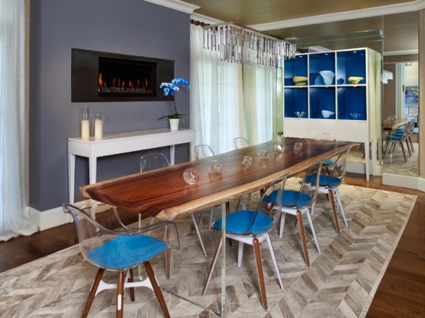
3. Blue Crush
Designer: Kristen Shoup of Clutch Design Studio
Location: Greenwood Village, Colorado
Year built: 2003 (redesigned in 2014)
Size: 14 feet by 20 feet 4 inches (4.2 by 6.1 meters)
Homeowners’ request: “The homeowner requested a light, airy, contemporary aesthetic with pops of color,” interior designer Kristen Shoup says.
Plan of attack: “The client was interested in a live-edge dining table, so the vision for the space centered around the table. We softened up the space by bringing in the cowhide rug and then highlighted the table by utilizing the acrylic chairs so your view of the table was uninhibited. The custom cabinetry came next as a means to bring in storage to the space, as well as bring the color up to eye level. The teal color in the cabinetry and in the chair pads is a favorite color of the client, so it was used as a main accent for the space. The drapery was the final touch to keep the room feeling light and airy.”
Why the design works: “The approach to start with the table and play off of that piece worked because to effectively highlight an item in the space, you have to play up its strengths and let it shine. If we had big, bulky chairs that masked your view of the table, we wouldn’t have been as successful. The design also works because the room has interest and texture as your eye moves through the space from the floor up the wall to the ceiling.”
What wasn’t working: “One of the big challenges with the space was storage and serving space. We solved those problems with the custom display cabinet in the mirrored niche, and the custom console table below the fireplace. We designed the cabinet with storage drawers below the display cubes, and the console table has a quartz surface so it can be easily cleaned when utilized as a secondary serving area.”
Who uses it: “The client utilizes the space for extended family gatherings and dinner parties, rarely on a day-to-day basis.”
Designer secret: “One decision that made this room successful was ordering a bigger rug. People often have rugs that are too small for the room; it’s OK to have a rug that fills the room and provides interest. “Less is more” is always a great motto to stick by as well. Don’t clutter up your space with knickknacks if it’s the furniture you are really proud of. Let the table or the cabinet be the star of the show, and accent minimally but purposefully.”
“Uh-oh” moment: “A challenging moment in the design process was selling the homeowner on the custom furniture pieces. They were unsure of the value of the pieces, but after some discussion and a few sketches, the pieces were created and the homeowner can’t imagine the room without them. Even though creating a custom piece sounds expensive, it can come in right at or under budget and be the perfect finishing touch.”
Splurges and savings: “We certainly saved big bucks on the chandelier, but it still looks stunning. We were also able to save quite a bit on the table by researching several manufacturers. This allowed us to splurge on the rug and custom millwork pieces.”
Take-away: “Time is of the essence when ordering any kind of custom furniture, and no matter how long they tell you it takes, add three weeks. It’s a take-away on every project, no matter how many you have done.”
The nitty-gritty: Dining table: EcoSlab, ModShop; Slice chairs and Zigzag chairs: 212 Concept; display cabinet and console table: custom, designed by Clutch Design Studio and fabricated by Elisons Workshop; rug: Exotic Zebu herringbone in custom size, Pure Rugs; Modern Contemporary Linear chandelier with crystal: The Gallery; drapery: One Fifth collection, Ava Silver, Ralph Lauren Home, fabricated by Lu-Tek
Team involved: Elisons Workshop (custom furniture); Lu-Tek Inc. (drapery)
More:
Key Measurements for Planning the Perfect Dining Room
How to Seat Your Dinner Guests in Comfort
Related Articles Recommended


