Kitchen of the Week: Colonial Kitchen Opens Up to Scenic Views
http://decor-ideas.org 07/11/2015 00:14 Decor Ideas
A small window over a kitchen sink was a poor way for Leigh and Gabrielle Cohen to enjoy the scenic views of the 35 acres of protected tidal wetlands that their brick Colonial home in Mamaroneck, New York, overlooked. “The best part of our house is our yard and view,” Gabrielle says. “I do cook a lot, and was in the kitchen all the time and didn’t get to enjoy the views outside.” Working with kitchen designer Sarah Robertson, they raised the kitchen’s ceiling, expanded the window over the sink and built a small addition at the back to improve views and bring in more natural light.
“After” photos by Jeff McNamara
Kitchen at a Glance
Who lives here: Leigh and Gabrielle Cohen and their 3 children
Location: Mamaroneck, New York
Size: 390 square feet
Architect: Bana Choura/Choura Architecture
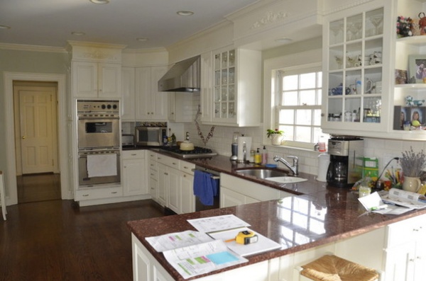
BEFORE: The existing, mostly white kitchen was U shaped, with granite counters, cabinets with traditional detailing, a small peninsula, no island and a 2½-foot window that failed to capture the stunning views outside. “They wanted a space that was more functional and spacious,” says Robertson, of Studio Dearborn. “The lack of workable counters was an issue. The kitchen also didn’t capture the beautiful views, and they felt cut off from the outdoors.”
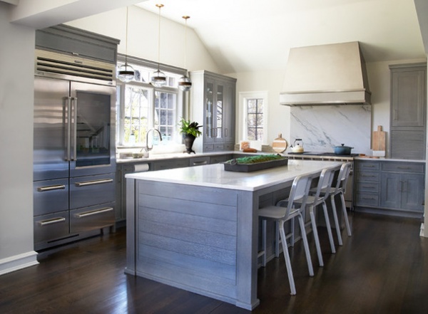
AFTER: After reviewing options with their architect, Bana Choura, Leigh and Gabrielle decided structural changes were needed to improve the flow and function of the kitchen.
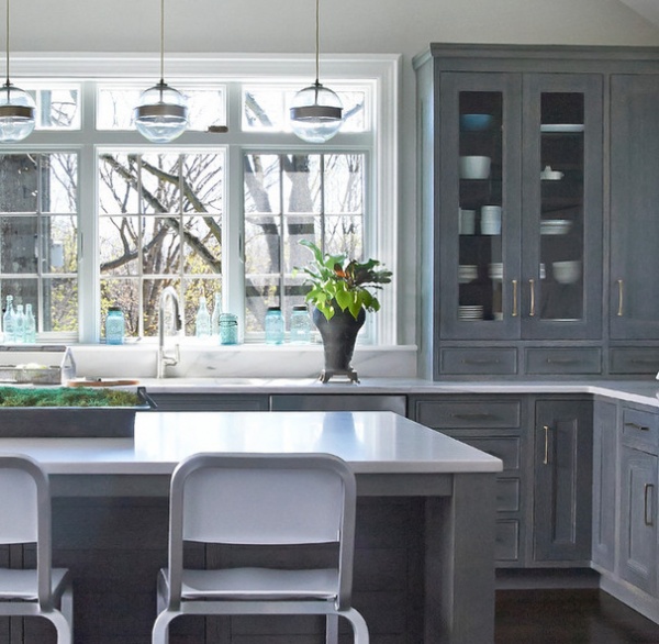
To bring views of the conservation area inside and create a better connection with the outdoors, the small double-hung window over the sink was replaced with an 8-foot-wide casement window with transom. “It felt so dark before, and this really allowed the light inside,” Robertson says.
The old 8-foot kitchen ceiling was vaulted and raised to 11 feet high at the peak. A tall and slim window Leigh really wanted to the left of the range offers a view of the garden. A 7-foot-wide slider, not pictured, located to the left of the sink, adds more natural light and gives the family easy access to the outdoors.
Paint by Benjamin Moore: Light Pewter (walls) and White Dove (celing and trim); floor: quarter-sewn oak finished with a custom mix of Ebony and Dark Walnut stains from Minwax; island stools: Emeco
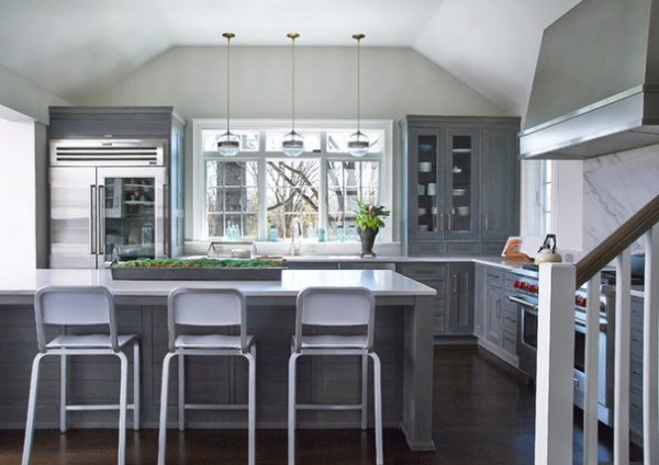
An addition expanded the back of the kitchen by 4 feet, allowing space for a large island, where the family preps meals and spends lots of time together. “It was amazing how much space we got without a lot of additional square footage,” Gabrielle says.
The expansion also allowed Robertson to set distinct work zones so the family could prep and cook meals as well as socialize and entertain. The natural earthy tones of the color scheme were inspired by the lush setting outside. “I’m a big beach person and love that I live close to the water,” Gabrielle says. “I wanted the kitchen to have that earthy and coastal personality.”
Wanting the look of marble but more durability, the couple chose White Macauba quartzite for the island top, perimeter counters and backsplash. The kitchen’s custom cerused rift-sawn oak cabinets have a white glaze over a darker charcoal stain that highlights the grain of the wood. “The color of the cabinets almost matches the 150-year-old oak tree right outside the window,” Robertson says. “They wanted something robust that could withstand daily wear and not show every scratch.”
The inset Shaker-style cabinets and drawers are finished with brushed-brass handles and pulls that bring warmth and character to the cabinets. Brass and glass pendant lights over the sink area offer illumination and give the kitchen a nice glow at night. A large, sleek brushed-steel hood sits over the range. “We wanted it to be a focal point without being fussy,” Robertson says.
Oak cabinetry: custom, Studio Dearborn; brushed-brass cabinetry hardware: Schaub & Co.; island and perimeter countertops and backsplash: White Macauba quartzite, Marble America; pendant lights: Arteriors; vintage-style trough planter on island: Restoration Hardware; urn-style planter at sink: vintage; main sink: Franke; faucet: Kallista; range: Wolf; range hood: Rangecraft
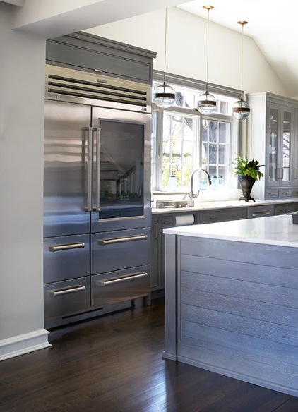
To the left of the kitchen’s main sink sits a 48-inch stainless Sub-Zero refrigerator. It includes a glass door on one side and gives the space a bit of an industrial vibe.
The refrigerator is close to both the cooking area and the eating area with breakfast table, and has a cabinet on top for storage of large trays that are used only occasionally.
This photo also shows the horizontal paneling on the base of the island (with shoe molding) to reinforce the rustic modern feel.
A stainless dishwasher sits to the right of the kitchen’s main sink, with a glass-front cabinet hutch above for storage of everyday cups and dishes. Drawers below the cabinet offer storage for flatware. The close proximity to the dishwasher was planned to make the daily chore of loading and unloading the dishwasher as easy as possible.
Dishwasher: Bosch
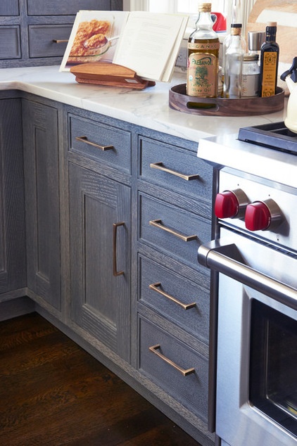
Drawers to the left of the range store utensils and oven mitts, with a roomy cabinet nearby for a large mixer.
This photo highlights the beauty of the grain of the wood used for the cabinetry, and the contemporary Italian brushed-brass handles and pulls.
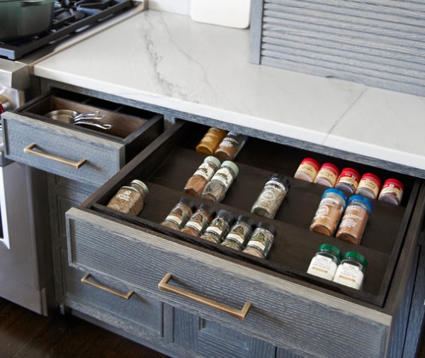
On the other side of the range are a spice drawer and a small drawer for measuring cups. An appliance garage above provides a place to store small appliances to keep the counters free from clutter.
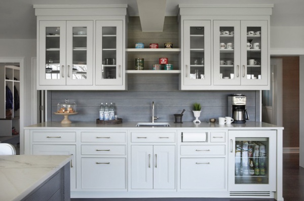
A stand-alone breakfast bar, where the family stores their coffee and cereals, has a light gray painted finish. The bar’s backsplash has the darker cerused charcoal finish used on the surrounding cabinets. “I love that I can put my teakettle, coffeepot, toaster and fruit bowl over there,” Gabrielle says. “It gives the kitchen so much more workable space.”
Upper glass-front cabinets hold cups for coffee and espresso. Open shelves between the cabinets display a collection of old coffee tins. “I love coffee, and when I decorate, I love to mix old with new,” Gabrielle says. “I thought it was a cool way to brighten up that area.”
A built-in paper towel holder to the right of a prep sink with a cold-water filter keeps the breakfast bar counter less crowded and allows the kids to wash up away from the main sink. A beverage refrigerator is also kid friendly, stocked with juice, milk, soda and water.
The doorway on the left leads to a mudroom and pantry; the doorway on the right leads to the dining room and bar.
Beverage center cabinet paint: Nimbus, Benjamin Moore; beverage refrigerator: Sub-Zero
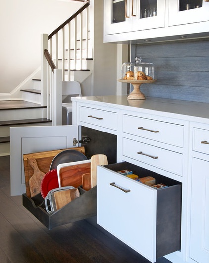
A large pullout drawer provides organized tray storage. To the right sits an extra-deep drawer for cereal boxes. An additional deep drawer (not pictured) was included for storing tall water bottles.
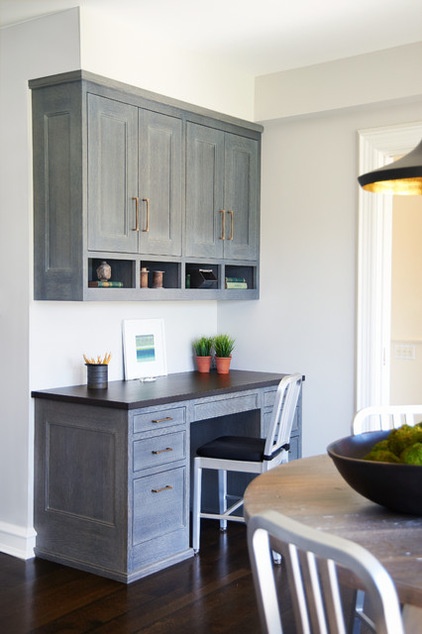
A built-in desk near the breakfast table serves as command central for all of the family’s activities. Slots above the desk hold notepads and decorative items, and upper cabinets hold various office supplies.
Kitchen table: The Old Wood Co.; chairs: Emeco
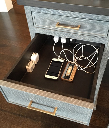
A docking drawer inside the desk is a handy place to charge electronic devices.
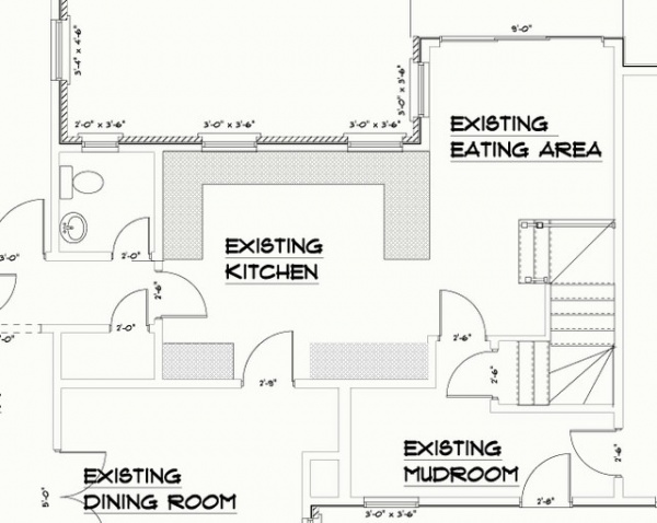
BEFORE: This floor plan shows the limitations of the previous kitchen, including the layout that wasn’t very user friendly.
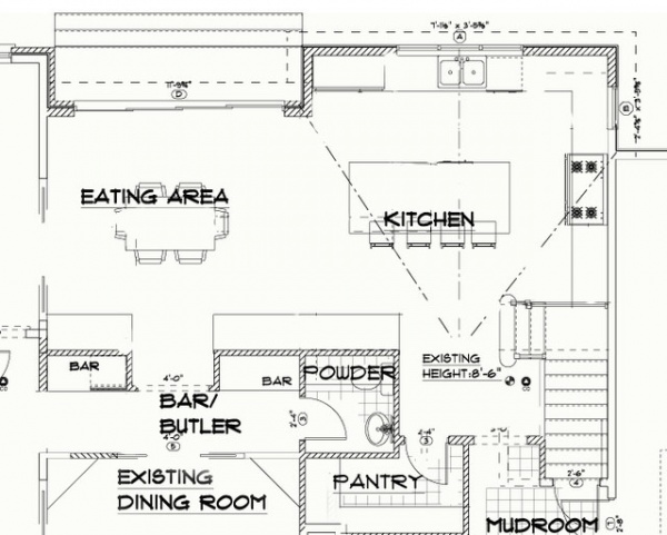
AFTER: The new plan highlights the efficient layout of the updated kitchen, which combines the main L-shaped work area with the adjoining breakfast bar and eating area. Now the family have the more attractive and comfortable space they wanted for daily living.
“I love the light and the spaciousness. It’s so pleasant to cook and be in there, and it has plenty of room for the kids,” Gabrielle says. “And I really do love how it brings the outdoors inside.”
Kitchen design: Sarah Robertson, Studio Dearborn
General contractor: Nick Girardi, NGI Development Corp.
See more Kitchens of the Week
Related Articles Recommended


