Kitchen of the Week: Coastal Kitchen Honors a Beloved Husband
http://decor-ideas.org 07/08/2015 00:14 Decor Ideas
Ten years ago, San Diego fire captain Rick Nelson went to buy groceries at his local supermarket. There he met his future wife, Cherie, who was the supervisor at the front checkout section. The two of them, who both had young-adult children, dated and eventually settled into Rick’s 35-year-old, 1,517-square-foot cottage in nearby Carlsbad.
“After” photos by Nathan Padilla Bowen
Kitchen at a Glance
Who lives here: Cherie Nelson, who created the kitchen with her now-late husband, Rick Nelson
Location: Carlsbad, California
Size: About 132 square feet (12.2 square meters) before and 140 square feet (13 square meters) after
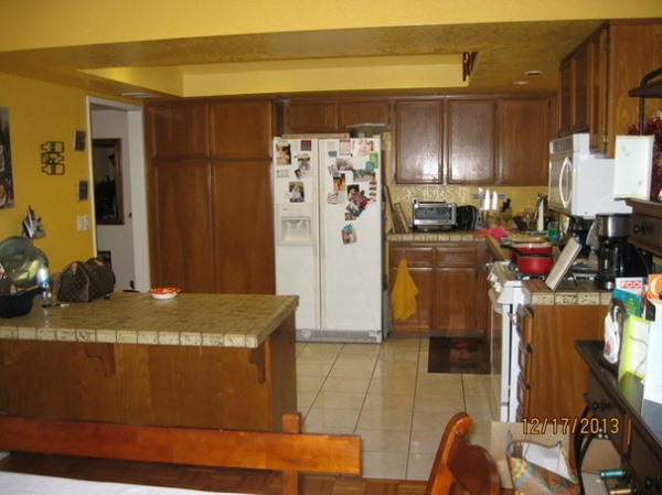
BEFORE: Cherie and Rick wanted to give the public spaces in their house a facelift, focusing on updating the cottage’s dated kitchen, with its mustard-yellow walls and ceiling, brown tile countertops, builder’s grade oak cabinets, white appliances and ceramic tile floor.
But just before the kitchen project was finished, Rick was diagnosed with cancer. He had to have surgery and chemotherapy almost immediately. The couple asked their designer, Karen Wirrig of Karen Cole Designs, to help them quickly organize a backyard wedding so they could celebrate their love in their newly renovated home.
After a hard fight, Rick passed away in December 2014. The updated kitchen and home were something the couple created together, and Cherie views it as somewhat of a memorial to their time together. “When you’re able to spend 24/7 with the person you love and treasure, that’s a gift,” Cherie says. “That’s something special I’ll have with me forever.”
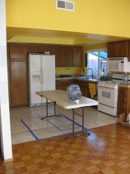
BEFORE: This photo shows how removing the peninsula freed up floor space. The blue tape on the floor designates where the new center island now stands, and the blue tape inside the square shows the location of the new cooktop in the island. “We wanted more space for our buck, but I couldn’t imagine how we could have an island there,” Cherie says. “Karen really simplified this for us.”
A wall between the kitchen and living room was also removed, so all the spaces could flow together. “The lighting plan was extremely poor, and the floor plan was difficult,” Wirrig says.
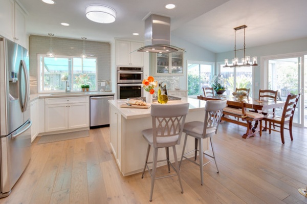
AFTER: In addition to removing the peninsula and wall between the kitchen and living room, they raised the kitchen ceiling 13 inches to really open things up.
A light tube brings in more natural light while looking like a standard light fixture. “Within the tube is an LED light, so at night it lights up and doesn’t look like a black hole like a standard tube would,” Wirrig says.
Wide-plank engineered hardwood flooring with a beachy feel anchors the space and complements the walls that have a blue-green color that was Rick’s favorite. The new island in the middle of the room offers storage and a spot for casual meals.
An upgraded stainless steel refrigerator with a French door sits in about the same location as the old refrigerator, but the kitchen’s new five-burner gas cooktop was moved to the island. “This allowed us the space to add a convection-microwave combo and standard wall oven plus a warming drawer where the old range once stood,” Wirrig says. “This offers many more cooking options in the same square footage, and makes the kitchen much more usable.”
Island chimney hood with glass canopy: Frigidaire; island cooktop and wall ovens: KitchenAid; island swivel stools: Amisco Industries Ltd.; refrigerator: Samsung; flooring: Hallmark Floors Inc.; tubular skylight: Solatube Home Daylight; all paint by Dunn-Edwards Paints: Sky Glass DE6303 (walls), Ash Gray DEC751 (island) and Whisper White DEW340 (cabinet, base molding and ceiling)
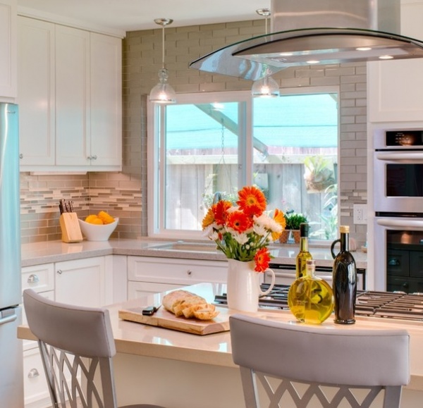
Views to the side yard where Rick built a greenhouse can be enjoyed from the swivel stools at the island.
The sink window is framed by an eye-catching backsplash made from 2- by 8-inch frosted glass subway tiles. Random metallic mosaic tiles of polished and matte glass in ivory and taupe add visual interest under the upper cabinets. The tiles help “reflect light on this north-facing wall, and it’s also our only wall opportunity in this kitchen to make a statement, since the rest of the walls have appliances and cabinetry,” Wirrig says.
The backsplash complements the two neutral beige colors used for the perimeter, buffet and island quartz counters. The perimeter counters are a lighter beige to reflect light, while the island and buffet tops have more of a sand color, which offers contrast but also keeps with the coastal feel of the room.
Pendant lights over the sink have seeded glass that mimics the bubbles seen in ocean water. The pendants are mixed with well-placed recessed lights and undercabinet LED light bars to provide both general and task illumination.
Backsplash tiles: The Five Elements; quartz counters: Arizona Tile; pendants over sink: Coast Lighting; LED light bars and receptacles: Task Lighting
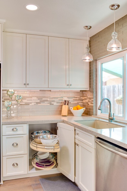
The birch cabinets and drawers, painted in Dunn-Edwards’ Whisper white and with satin nickel knobs and pulls, have a rubbed finish on the edges for a hint of a distressed look.
The cabinets have lots of storage options, including a blind corner pullout in the lower cabinet to the left of the sink. “It’s the most efficient way to use a dead space corner,” Wirrig says. “This kidney-shaped double shelf fully extends so you can access all of your cooking equipment without having to crawl underneath.”
A double trash pull-out is located under the sink next to the dishwasher.
Cabinetry hardware: Architectural Products by Outwater; dishwasher: existing; two-bowl sink: Blanco; faucet: existing
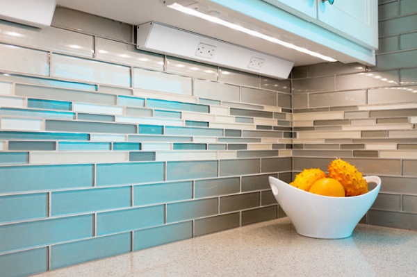
This close-up shot shows the texture of the backsplash, and the LED light bars and receptacles under the upper cabinets. “I did it specifically because we had very limited space to do detailed tile trim,” Wirrig says. “In order not to break it up with outlet faces, we put an undercabinet outlet bar that’s hidden from view so we have a complete run of decorative tile.”
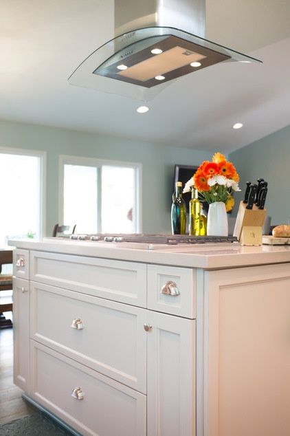
This front side of the island includes a combination of storage solutions. Two large center drawers below the cooktop are for pots and pans, while the two small drawers to the left and right are for utensils. The narrow cabinet on the left is a pullout spice rack, and the narrow cabinet on the right stores cookie sheets.
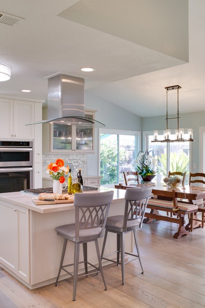
In this shot you can see a side cabinet on the island that was included for a pop-up mixer, which helps the island become a baking station. “That’s my favorite,” Cherie says. “I love to bake, and have a big mixer that’s super heavy, and it would have to be brought in from the garage before. Rick would do that for me. It was such a production to bring in the mixer. That pop-up is my little treat.”
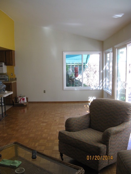
BEFORE: This photo shows what the adjacent dining room with old oak parquet floors looked like before the renovation, and how the lower ceiling in the kitchen made the space feel cut off.
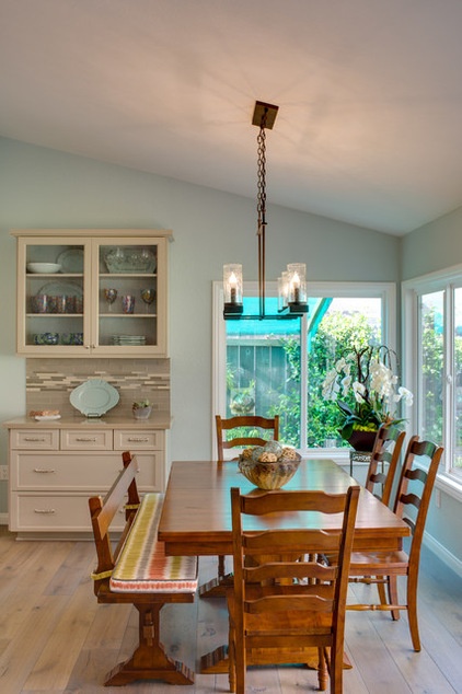
AFTER: Now the dining room blends with the kitchen. The chandelier chimneys over the dining room table have the same seeded glass seen in the kitchen.
Dining room chandelier: Hinkley Lighting; dining room furniture: existing
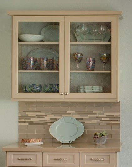
This buffet, which sits between the dining room and kitchen, was designed by Wirrig using standard cabinetry to create a custom look. Seeded glass was used for the upper cabinet doors, with furniture-feel hardware. “It’s a much more economical way to add storage than buying a standard buffet,” Wirrig says.
The buffet was placed between the dining table and dishwasher to make cleaning up and entertaining easy. The buffet includes drawers for napkins, tablecloths, utensils and large serving platters.
A textured wall covering was used for the inside back of the buffet’s upper glass cabinets for visual interest.

Here is a photo of Cherie and Rick from their backyard wedding in 2014. “The updated kitchen allows me to interact when when I have family and friends over,” Cherie says. “Before, they would joke I was stuck in my little cave. When Rick was here, this was the space where we could be together. He could watch golf on TV or read the newspaper while I was cooking. That’s where all of our conversations happened. Every time people came over, even when he was sick, he would entertain us. He could just light up a room.”
See more Kitchens of the Week
Related Articles Recommended


