Room of the Day: An Outdoor Space for Living and Playing
http://decor-ideas.org 07/07/2015 21:13 Decor Ideas
Conventional wisdom says that good design can solve the most intractable of problems, but when the issue involves turning a small, overgrown garden into an outdoor room where there’s lounge seating for adults, a grill area and a playspace for kids, the situation appears particularly difficult. Here’s how one designer delivered results.
Photos courtesy of RareField Design/Build
Garden at a Glance
Who lives here: Chikai Ohazama and Mira Waldman and their 2 children
Location: San Francisco
Size: 286 square feet (26 square meters)
Homeowners Chikai Ohazama and Mira Waldman have a small urban lot in San Francisco’s Mission District. From the description of what they wanted from the space, you would think that stretching the space would be the only answer. “The space had a small patio adjacent to the house, a beaten-down grass area and overgrown plants on all sides,” says the designer, Todd McCrea of RareField Design/Build. “They wanted a space that felt like an outdoor living room and a place for their kids to play.”
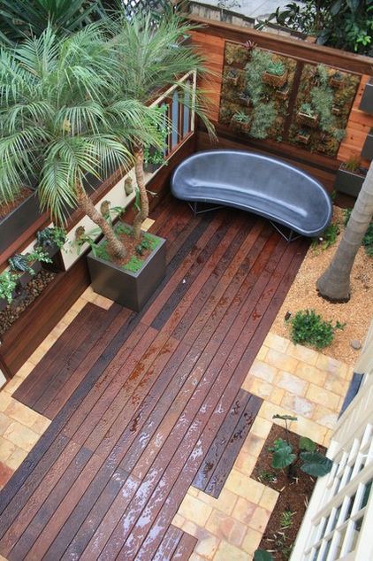
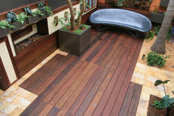
This overhead shot tells a lot of the story: The grass is gone, and so are ungainliest plants. The designer saved two palm trees: the pygmy date palm, which has a new home in a container, and the larger king palm, which stands in the upper-right corner (the gravel that surrounds it is for the dog). “If you can use some of the things that are already there, it makes the project seem much more established when it’s done,” McCrea says.
Another design trick is in the material mix. Here, there is an ipe wood deck surrounded by light-colored tile. “It’s funny how using just one material in a small space makes it seem even smaller,” McCrea says. “Breaking up the space with different materials gives it movement and makes it feel bigger. In this yard, the lighter tile picks up the floor tile in the kitchen and makes it feel like a continuation of the indoor living space.”
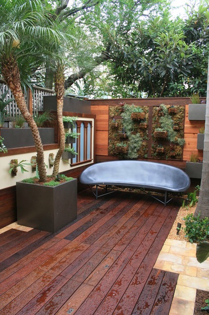
At eye level, you can see there’s a lot more going on here than in your average small garden. The kidney bean-shaped cast-stone lounge is particularly suited for relaxing on a cool San Francisco evening, because it’s heated. “Eventually, after the kids are older, the owners want to add a fire pit in front of it,” McCrea says.
You can also see that the perimeter plantings have been lifted. On the wall behind the potted palm, there’s a series of custom metal containers on top of and hanging from the wall. “We were playing with the idea of living walls,” McCrea says. “Here, we decided on a series of staggered containers to add architectural elements and layers of interest.” Lifting the plants in the air allowed for more usable square footage and put the plants out of the way of the active kids and a small dog. Setting them in containers rather than in a living wall allows them to grow naturally. “Succulents that are in a living wall system tend to crane their necks over time,” McCrea says.
To prevent dripping and staining, McCrea designed the pots with a drainage system that runs behind the wall and into the ground. This keeps the decking dry and less stained.
Lounge: Helios, Galanter & Jones
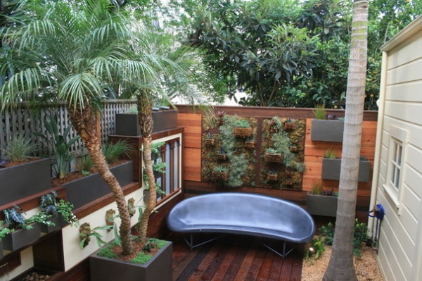
The wall behind the lounge also has a series of vertically mounted planters, but these are wire baskets meant for orchids that are modified to hang on a screen. The baskets and screen are filled with moss and tillandsias. Misters hidden in the armature keep the plants green and happy. The baskets are planted with succulents and bromeliads. “We decided to make this wall a bit softer than the other parts of the garden,” McCrea says.
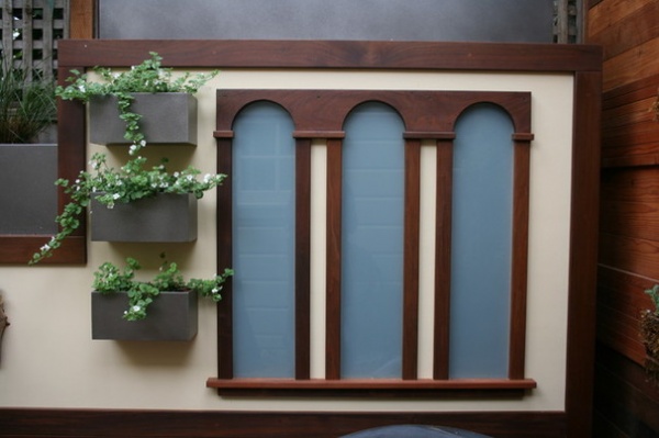
The architectural element to the side of the lounge mimics the arched windows on the upper stories of the house. In the garden, the arches surround what appears to be a series of obscured windows. In fact, the opaque glass hides strip lights. In the evening when they are turned on, the panes are illuminated by a soft glow. “It’s primarily an atmospheric thing,” McCrea says. “It gives the space a warm feeling and a sense of mystery — and isn’t a bit of mystery always fun?” He adds that whether the lights behind the glass are on or not, the illusion of windows makes the garden feel more expansive.
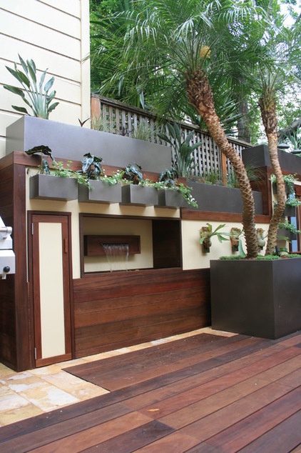
Looking at the space, you may wonder: Where is the kids’ space? The answer is both in plain sight and under wraps. The cabinet to the left of the fountain is for toy storage. “The fountain itself is primarily for the kids,” McCrea says of the recirculating, wall-hung water feature.
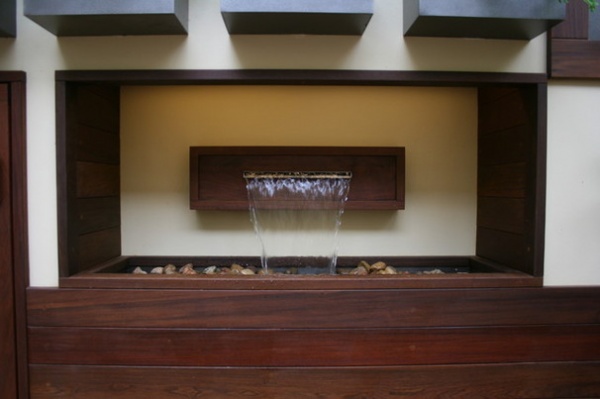
“They love to put their fingers in it and to arrange the stones in it,” he adds.
But the biggest kid-friendly feature is hard to locate with the naked eye. You have to look closely at the deck in front of the fountain to see a pair of inset handles.
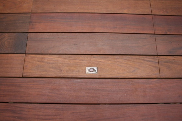
Pull on them, and the deck comes up to reveal a sandbox.
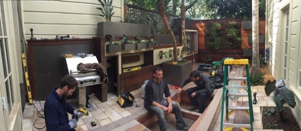
There’s no photography of the below-deck sandbox in use, but a construction shot reveals how it’s put together.
“The clients ended up with what they wanted,” McCrea says. “They wanted their outdoor space to be usable for all of them, they wanted it to be comfortable, and they wanted it to be an extension of their home.”
They also ended up with some pleasant days spent outside. “Our favorite afternoons have our boys playing in the sandbox and us sitting on the warm, heated bench,” Ohazama says. “Also, at night the new lighting creates an intimate and romantic spot for us.”
Browse more stories about urban gardens
Related Articles Recommended


