Houzz Tour: Happiness Reigns in a Seattle Home
“The theme of this house is ‘the happy house,’” architect Lathrop Douglass says. “It’s got happy style that really fit the homeowners’ personalities and is spiritually uplifting and optimistic.” He worked closely with a team made up of the homeowners, Liz and Tom Sharp; interior designer Markie Nelson; and the builders at Potter Construction. Together they brainstormed ideas and found solutions to make the house’s happiness infectious to all who entered.
Beyond beauty and happiness, the couple were also seeking practicality in their home. Recently retired, they wanted their home to be safe for their aging relatives who would be visiting, as well as for themselves to age in place. The one addition to the home’s footprint was a new, safer staircase to the basement. They transformed the floor plan to make it all one level and added universal design features such as grab bars in the bathroom and a shower bench. In addition, energy efficiency and economy were paramount. They brought in new systems, insulation and natural light sources, as well as a new LED lighting scheme, new windows and doors, and sustainable materials to make the house as energy efficient as possible.
Photos by NW Architectural Photography
Houzz at a Glance
Who lives here: Liz and Tom Sharp, who recently retired and moved from Menlo Park, California, to be close to family
Location: Ballard area of Seattle
Size: 1,664 square feet (154.5 square meters); 2 bedrooms, 2 bathrooms
Year built: Original home: 1924; addition: 1981
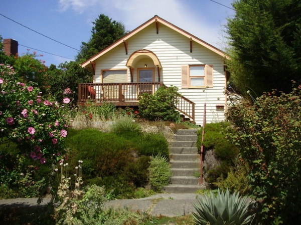
BEFORE: The bungalow had its charms, but it was ready for a postmillennium update. The couple chose it for the beautiful natural light that floods it, the one-floor living plan and its location in Ballard. The couple chose their neighborhood based upon walkability, bikeability and beauty. “We really wanted a location that wouldn’t keep us tied to a car,” Tom says. They are just a few blocks from Puget Sound in one direction and from channels to the lakes and locks in the other. The neighborhood has shops, restaurants and other local businesses they enjoy walking to.
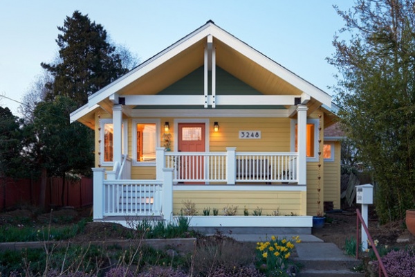
AFTER: A deeper overhang created a new outdoor room and a front porch, and gave the facade contemporary Northwest Craftsman style. Now Tom and Liz enjoy sitting here and watching the world walk by. Though there are steps to this entrance, there is a door right off the alley where they park the car one step from ground level. A ramp can easily be added if needed in the future.
One of the couple’s favorite features is the planter that’s integrated into the front porch design. Among other things, they grow blueberries there.
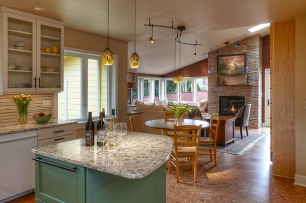
The Sharps wanted an open floor plan for the main living spaces — most of their daily indoor activities take place in the spaces you see here, the kitchen and family room. A view of the new fireplace can be enjoyed from anywhere in these two spaces.
Cork flooring: Ipocork Lisbon Natural, Associated Inc.
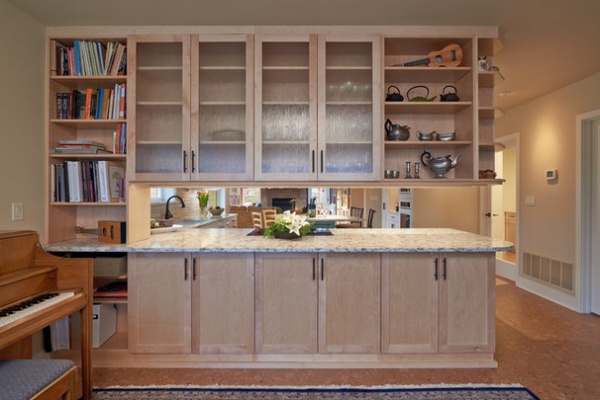
“There were some odd ceiling configurations in this house,” Douglass says. “It felt very contained, and the hallways made it hard to wander through.” The team set out to create an easy flow from the front of the house, seen here, to the back (where the fireplace is located).
Making the most of natural light is paramount in the Pacific Northwest. The team removed hallways and walls to share light among the spaces, and replaced exterior and interior doors with glass doors. The former front foyer now serves double duty as the piano room, and new shelves offer lots of storage options. New built-ins also offer peeks through to the rest of the living spaces, creating a visual connection through the first floor and an open feeling.
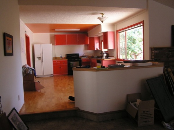
BEFORE: Opening up the kitchen and family room was an important part of the plan. The wall with the red cabinets on it in the back was replaced by the built-ins in the previous photo. This side of those built-ins now includes kitchen cabinets, the range and the view through to the entry.
The step down at the half wall marks where the 1981 addition to the home began. That step and half wall divided the kitchen from the family room. There was also an awkwardly placed corner fireplace just to the right of the half wall that they removed in the renovations.
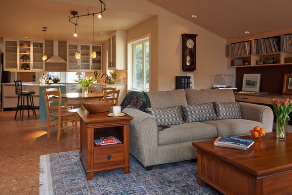
AFTER: “Removing that kitchen wall created a really nice flow for parties,” Liz says. They also removed the step, leveling out the entire first floor. The new floors are cork and create cohesion between the two spaces. There was hardly a straight line in the house; the team at Potter Construction got everything squared off, which was no easy feat.
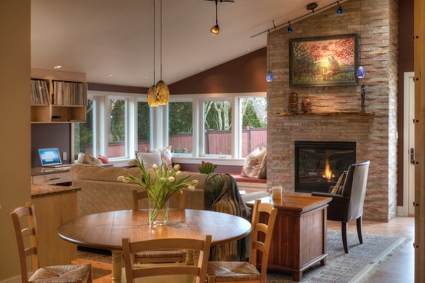
A new eat-in area in the kitchen also serves as the dining room. Most of the rooms in the main living space serve double or triple duty.
Fireplace surround: China multi natural cleft plate slate, 12 by 24 inches, Pental
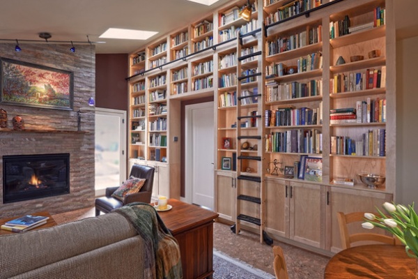
For instance, the family room also serves as a library and an office. Tom and Liz are book lovers, and before, their house was full of freestanding bookshelves. “The new bookshelves are a dream-house kind of feature for us,” Liz says. The floor-to-ceiling built-ins are crafted of natural maple, with cabinets on the bottom and a rolling library ladder to access high shelves. The ceiling also has new solar-powered operable skylights. “They bring in great airflow and light,” Tom says.
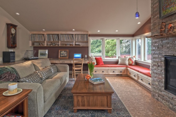
One of Tom and Liz’s favorite things about the hardworking family room is the window seat, which their interior designer, Markie Nelson, came up with during a team brainstorming session. “It’s so comfortable for reading and conducive to hanging out with groups of people,“ Liz says. “That kind of collaboration happened a lot between everyone involved…. Everyone’s goal was to make the house more beautiful.”
Douglass throws credit back at the couple. “Tom and Liz really dedicated themselves to this, and they made the project — their spark enlivened the team,” he says.
To the left of the window seat is a built-in home office with a Paperstone countertop. More built-in shelves provide storage overhead.
Accent wall paint: Nicholson Red; Benjamin Moore; desktop: Cabernet slab, Paperstone
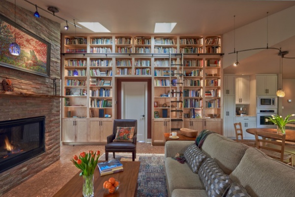
The natural-gas fireplace has a fan that heats the whole room. Here you can see how new skylights bring in more natural light from above.
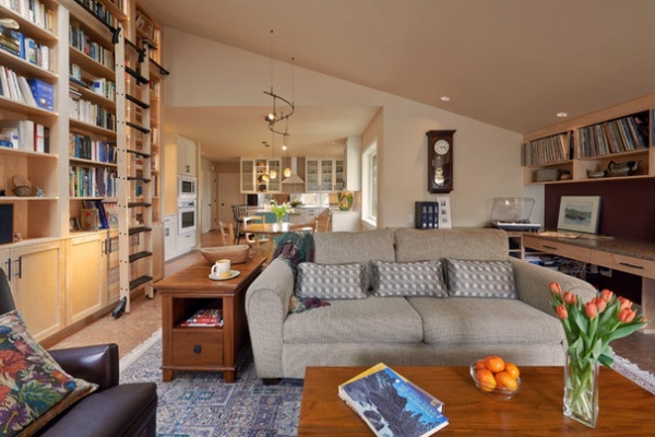
Having the two spaces open to each other is great for being in the same area for conversation, and works really well for parties.
Paint on walls and ceilings throughout most of the house: Putman Ivory HC-39; trim paint used throughout the house: White Down, both by Benjamin Moore
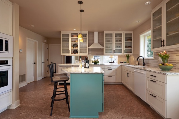
The original kitchen had a lot of open, wasted space. The new kitchen is larger, with new countertops and cabinets and added storage. “Figuring out a practical kitchen layout was a collaborative process between our architect, interior designer and contractor,” Liz says. They listened to how the couple functioned together in the kitchen, then figured out how to fit in the right island and convenient storage, including a large drawer opposite the stove for heavy pots, a big drawer under the stovetop and places for herbs and oils near the range.
The lovely turquoise island is perfect for breakfast and features built-in cabinets. While the couple loves color, they wanted to introduce it in more modern ways than the existing interiors had. Nelson was a big help, bringing it in via elements like the island, bathroom tile and upholstery, like we saw on the window seat.
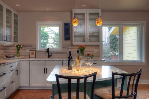
Now Liz and Tom trade head-chef and sous-chef duties with ease, with one of them working the stove while the other is at the sink and the island cutting and prepping. They also like that another couple can come in and sit at the island counter with some wine and keep them company while they prepare dinner. Liz’s sister and her husband are their most frequent island perchers. “It’s been a really fun plan to share with others,” Tom says.
Another feature the couple loves is the patterned glass on some of the cabinets. They can see where things are without having to keep everything perfect, and it helps keeps the room light.
Cabinet paint: White Down 970; island paint: Waterbury Green HC-136, both by Benjamin Moore; Serra quartz counters and Parc Botticino Airstrip backsplash: Pental; pendant lights: Monty in Mocha, LBL Lighting
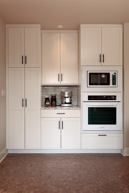
Concentrating this bank of cabinets here, along with the oven, microwave and coffee station, freed up a lot of wall space in the kitchen.
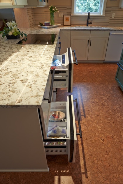
Also helping to keep the space open is this refrigerator alternative. Rather than having a typical refrigerator bulk up their space, the couple opted for refrigerator and freezer drawers. The drawers works great for the two of them, and they have another refrigerator in the basement.
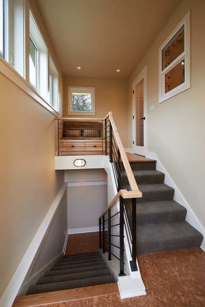
“The existing staircase was ridiculous,” Douglass says. It was a rickety “head banger” and was in the middle of the house, throwing off the floor plan and hogging up space. He relocated it to the east side of the house, the only addition to the home’s footprint. Now the stairs are much safer and tucked out of the way.
The unfinished basement serves as an area for projects, some storage and that extra refrigerator. Part of Tom and Liz’s new life involves cutting down on the things they store, so they are slowly culling through and getting rid of things they don’t need.
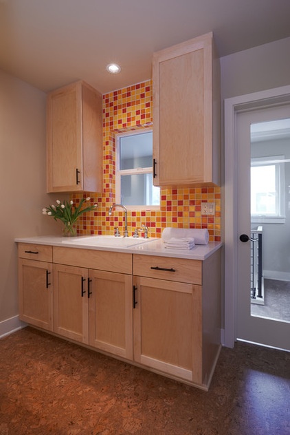
For convenience and safety as they age in place, the couple relocated the laundry room from the basement to the main floor, overtaking a third bedroom. Note how the interior window and glass door share the light from the new stairwell.
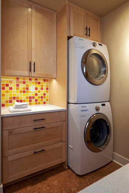
A lively mosaic tile brings in color, while natural maple cabinets provide lots of storage.
Counter: Snow White, Eco-Top
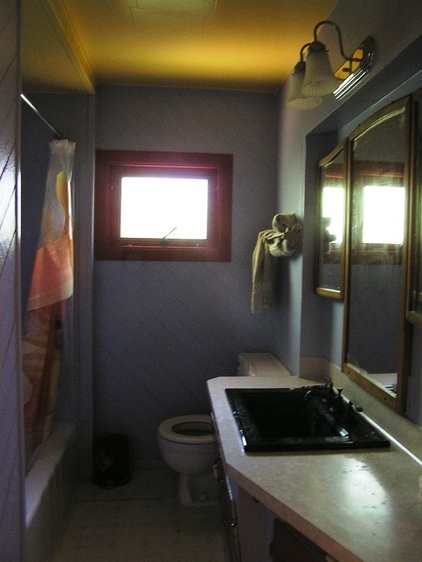
BEFORE: The guest bathroom was dark and dreary.
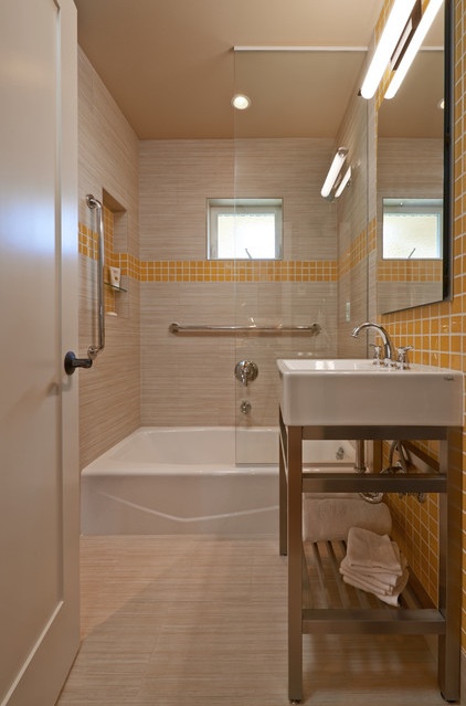
AFTER: Thanks to a lighter color scheme, an open vanity, a new arrangement and sunny yellow tiles, the guest bathroom is much more open and light.
Tile: Mikado in Bambu, Pental; vanity paint: Rock Gray 1615, Benjamin Moore
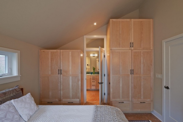
One of the biggest draws of the original home was the single-floor layout. Both the master bedroom, seen here, and the second bedroom are on the main floor. Armoire-like built-ins add lots of storage as well as warmth from their natural wood.
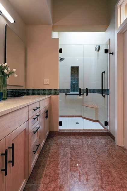
One of Tom’s dream-house features is the large new shower. He loves to let in cool, fresh air through the operable skylight.
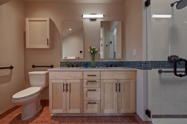
“Working with this team really made this process a joy for us,” Tom says. “Everybody wanted to work toward the beauty of the house. It was a truly great experience.”
What’s next for the couple? Right now they are enjoying improving the yard and adding to the beautiful gardens the former owners planted. It has given them a great start that suits their love of color, and includes foxgloves, orange poppies, roses, bulbs and garlic. The couple are working on raised beds near the new staircase construction and improving some of the slopes in the yard.
They are also making a plan for the downspouts, French drains and rain barrels, in keeping with Seattle’s RainWise Program. And while the original renovation plans called for a solarium, they decided to live with the house as it is without it for a while to see if it’s something they really want and need.
Counter: Oyster Quartz, Pental; backsplash tile: Tropical Reef Iridescent and Non-Iridescent by Oceanside Glasstile, Ambiente European Tile Design; floor: Rajo Capri polished marble: Ambiente European Tile Design; shower floor tile: Parc Crema Luna in matte, Pental
Browse more homes by style:
Small Homes | Apartments | Barn Homes | Colorful Homes | Contemporary Homes | Eclectic Homes | Farmhouses | Floating Homes | Guesthouses | Lofts | Midcentury Homes | Modern Homes | Ranch Homes | Townhouses | Traditional Homes | Transitional Homes | Vacation Homes | Homes Around the World


