New This Week: 4 Great Kitchens With Workhorse Islands
If the kitchen is the heart of the home, the kitchen island is what keeps it beating. It’s a place brimming with life, where family and friends and kids gather to eat, drink, be merry or just do a little homework or watch a show on an iPad. Today, kitchen islands are more than the name implies. They’re not some deserted entity poking out in the middle of the room. They’re more like a Swiss Army knife, packed with function.
These four kitchens — uploaded to Houzz recently by their respective designers — show just how important hardworking islands have become. They make these spaces complete. Without them, each kitchen would lose a significant amount of storage and function. Here, the designers dish on what make these kitchens, and their islands, work so darn hard.
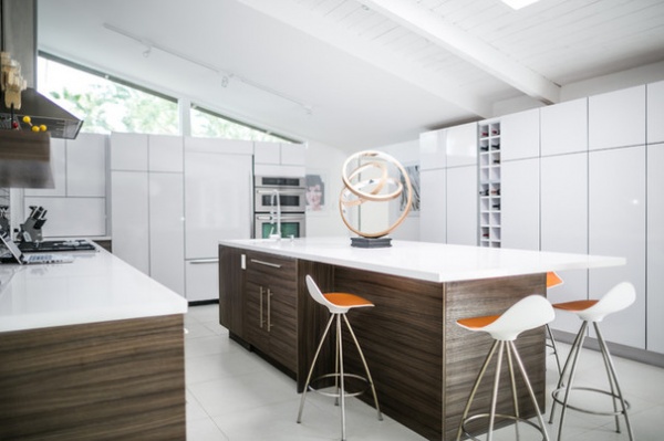
1. Boldly Modern
Designer: Randy Blom of Better Built Inc.
Location: Palm Springs, California
Kitchen size: 275 square feet 25.5 square meters
Island size: 55½ inches wide by 120 inches long (1.4 by 3 meters)
Homeowners’ request: “My client requested a clean, contemporary kitchen that would complement his classic Palm Springs midcentury residence,” designer Randy Blom says. “He wanted to enlarge the existing kitchen to include a separate home office area that blocked natural light from the triangular clerestory windows reaching the kitchen. The kitchen also needed to relate and extend into the living and dining areas. Central to my client’s wishes was to have a large central island that would function as a gathering place for his guests.”
Plan of attack: “First order of business was to allot particular spaces for normal kitchen functions — prep, cooking, storage, cleanup. The new kitchen needed to have a circular flow, since the new layout was to become an extension of the adjacent dining area and living room, as well as work with the large triangular clerestory windows to allow natural light into the main area of the kitchen. This wall provided a perfect location for an appliance garage to store countertop appliances, a tall pantry for food storage and integrated built-in refrigerator-freezer, and a combination convection oven-microwave.
“Since one of my client’s main requests was to have no upper cabinetry, a line of shallow tall cabinetry with wine storage cubbies was placed along one side for normal dish, glassware and additional pantry storage. Once the layout was decided, we moved into the finish selections. My client wanted a white kitchen to coordinate with the rest of the residence, so we selected Bellmont Cabinet’s Jazz door style in Gloss White with silver PVC edge banding.
“To contrast all the gloss white, we selected Bellmont’s Terra door style in Bark for the base and island cabinetry. For clean, crisp white countertops, I selected Pental’s Super White honed quartz and had an integral sink fabricated from the same material, only with a polished finish to minimize discoloration. New white floor tiles were installed throughout the residence and a fresh coat of white paint on the walls, wood beams and wood decking on the ceiling, allowing my client’s modern art collection to provide the color for the spaces.”
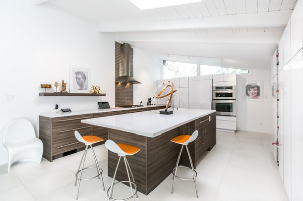
Why the design works: “Since the residence has a very clean, modern aesthetic, the new kitchen design needed to reflect this same aesthetic. Clean, contemporary, uncluttered yet provide normal kitchen functions and allow for interaction with guests. Once the office area was removed, the new kitchen space became a clean white box within which the kitchen cabinetry could be displayed like the artwork in the rest of the residence.”
What wasn’t working: “The main challenge for this kitchen was my client’s request for no upper cabinetry. All his dishes and glassware had to find a new storage location, so a bank of tall cabinets was placed along one side for this purpose. Since this bank of cabinets were shallow, 12 inches deep, they did not encroach into the main kitchen space too much, and actually make it easier to store and retrieve items.”
What goes on here: “The kitchen was designed for normal daily preparations of meals, as well as for entertaining family and friends in a relaxed Palm Springs environment.”
Who uses it: “The kitchen was designed for a single bachelor, an entertainment professional who lives in Vancouver, Canada, during the summer and fall and lives in Palm Springs during the winter and spring. My client has frequent houseguests that congregate in the kitchen for coffee and breakfast in the mornings and for drinks in the late afternoon.
“The kitchen is located adjacent to sliding doors that allow direct access to the pool and outdoor entertaining areas. He has a frenetic life and likes the relaxed lifestyle that his Palm Springs residence and his new kitchen afford him. It has become a gathering place for local, and not-so-local, family and friends to congregate at.”
Designer secret: “Don’t be afraid to eliminate upper cabinetry in a kitchen. Tall or short, shallow cabinetry can accomplish the same task. I find clients are wanting to introduce more artwork into their kitchens, and by freeing up coveted wall space, they can personalize their kitchens with artwork rather than having banks of cabinets above their countertops.”
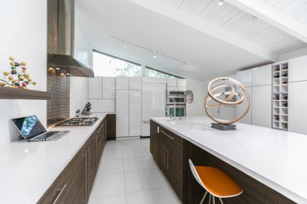
“Uh-oh” moment: “My main challenge, as with any white kitchen, is how to coordinate all the different tones of white. White flooring, white cabinetry, white countertops and white paint on walls and ceiling — it can be daunting. I would awaken in the middle of the night thinking, ‘How am I going to get all the whites to match?’ Well, they don’t have to — they just need to complement each other.
“You can take the same white and it will look different on a vertical and horizontal surface, so having white cabinet doors on top of a white tile floor, you can play with the tones so they complement each other, rather than try to match them. Don’t be afraid to mix white. Also by varying the finish on each of the whites — matte, semi or gloss — you can make a cohesive design statement.”
Splurges and savings: “My client wanted the purest white quartz for his countertops, which almost always tends to be the most expensive color selection, so countertops became my budget priority. By designing with a combination of Bellmont Cabinet’s 1900 and 1600 series, I was able to furnish the kitchen with cabinetry at a cost that allowed the countertops to take a priority.”
The nitty-gritty: Base cabinetry: Bellmont Cabinet’s 1600 Terra in Bark; tall cabinetry and appliance panels: Bellmont Cabinet’s 1900 Jazz in Gloss White; countertops: Pental Quartz in Super White honed finish; flooring: 24- by 24-inch Everquartz tiles in white, Everstone; appliances by Jenn-Air: 36-inch gas cooktop, 36-inch wall vent hood, 36-inch built-in top fridge and bottom freezer, and 30-inch convection oven-microwave combo; dishwasher: Miele; backsplash: 2- by 6-inch brushed stainless steel tile
Budget: $40,000, including demolition of office area; moving of main electrical panel that was located in office area; new floor tiles, countertops, drywall, painting, cabinetry and installation; electrical and plumbing relocations; does not include appliances and furnishings
Team involved: Mike Yakovich, Better Built Inc. (construction); Desert Stone (countertops); Mike Slaten Tile (tilework)
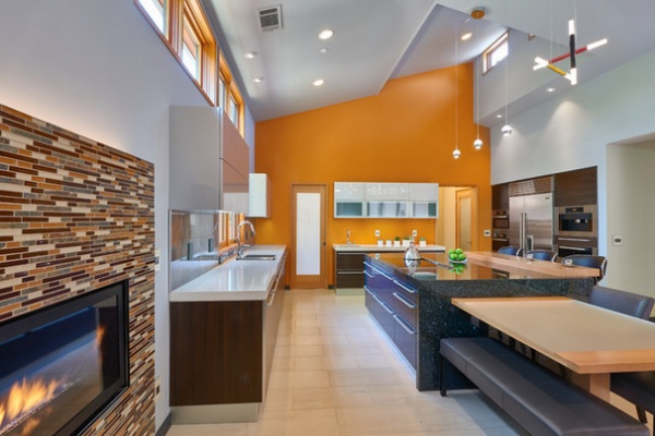
2. Warm Contemporary
Designer: Diann Saviano of Via Builders Inc.
Location: Saratoga, California
Kitchen size: About 350 square feet (32.5 square meters)
Island size: 4 feet, 6 inches by 7 feet (1.3 by 2.1 meters)
Homeowners’ request: “They wanted a bright and airy space, with a great room fit for a family,” interior designer Diann Saviano says. “Most importantly, they really wanted lots of natural light.”
Plan of attack: “Ralph Saviano, the owner of Via Builders, who designed and built the house, wanted to bring in as much natural light as possible without exposing this space too much to the neighbors. So he incorporated the clerestory windows above cabinets as well as the exposed windows coming from the right peak of the ceiling, making the shape of the ceiling very unique and modern. He beautifully designed the windows so you see the trees but not the neighbor’s home. He took advantage of the pretty trees on the side of the house that made for pretty scenery when looking through the windows.
“As for the kitchen cabinet design and colors, it was a collaboration of ideas with the homeowners, me and Ralph. The homeowners are not afraid to use color, as you can see in the images of the rest of the house. This is something I love about them. They always envisioned that back wall to be a fun accent wall with a bright color, so we kept that in the back of our minds when we were designing the cabinets. As we started to think through the finish colors for the cabinetry and were considering the dark blue for the island, orange was a natural fit for a complementary color scheme. We let the design evolve as we tackled each space. Then we worked the countertop colors and backsplash from the cabinet colors selected, keeping in mind the blue island and orange accent wall.”
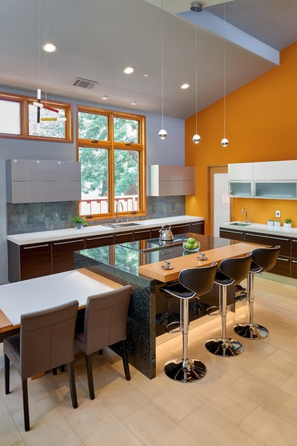
Why the design works: “What’s unique is the mix of materials and colors. I will admit that I was nervous to use three different woods — window stain, dark cabinet stain and then the raised-bar island stain — so making sure that this all coordinated together nicely was important.”
What wasn’t working: “Because we have a table extension off the island, it was really important to have the proper-width island that allowed for enough space for a table and chairs to fit comfortably, but also wanting it to feel a part of the kitchen yet not crowding the bar stool space. Hence the waterfall countertop was a great solution to keeping the spaces separate. We also mocked up the space with cardboard and chalk so they could visually see the space and made the proper adjustments to fit their exact liking.”
Who uses it: “The homeowners have two boys under the age of 12. They also have family members come and stay with them for months out of the year, so designing this space with many different ages was kept in mind. There is a bar area with beverage fridges that extends into the family room space, as well as a mini desk for the homeowners to sit and print things out or use the desk while still being a part of what’s going on in the space. They like to cook and entertain for family and friends, yet also needed a kid-friendly environment.”
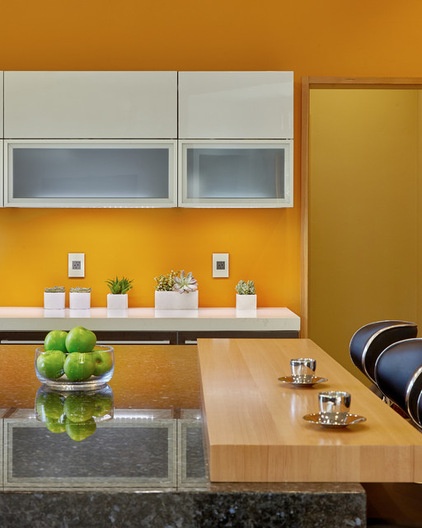
Designer secret: “The waterfall edge to the island really made the space feel complete. Also, incorporating the lighting in the table extension off the island was such a cool feature. Something I learned while working on this project was to not be afraid of mixing bold colors and textures. It always helps me to use the complementary color schemes to ensure a successful outcome — for example, split complementary, triad, analogous etc.”
Take-away: “To not be afraid of color and mixing materials.”
The nitty-gritty: Floor: natural limestone; countertops: engineered quartz; gray backsplash: Porcelanosa; all paint: Sherwin-Williams
Team involved: Ralph Saviano of Via Builders (builder); Pedini (cabinets); Tile Plus (countertop, backsplash and floor installation); Franciscan Glass and Boyd Built Cabinets (bar countertop installation); Primo (project manager)
3. Feel-Good French Country
Designer: Anthony Stavish of A.W. Stavish Designs
Location: Suburb of Chicago
Kitchen size: About 580 square feet (53.8 square meters)
Island size: 5 by 10 feet (1.5 by 3 meters)
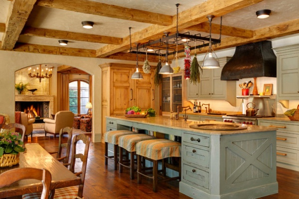
Homeowners’ request: “They wanted it to be open and family friendly,” designer Anthony Stavish says. “They had taken a family trip to France, where they stayed in a house with a nice big open kitchen with lots of seating groups, and a table at the counter and comfortable sofa seating. The wife could stand in the kitchen and cook and hold court and work at the stove. She loved how the South of France light came in and the energy and colors. So this kitchen was about having family together and having that French country energy.”
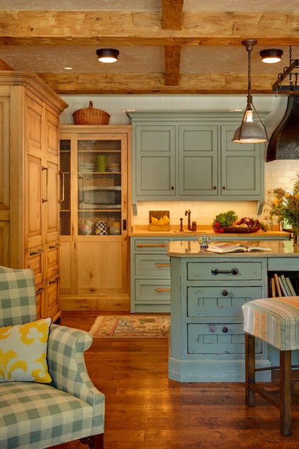
Plan of attack: “This was a split ranch home that they were going to renovate. But after looking at the home, it was clear that it wasn’t worth it to renovate such an old house. It was suggested that we knock it down and build a new one. She had a glass of wine, sat down and said, ‘Do it.’ The heart of the house needed to be located centrally to see the pool and yard. It was important to get that old-country-French feel. To do that, we wanted it to be an unfitted kitchen. In a fitted kitchen, the cabinets are all the same. An unfitted kitchen looks like it evolved over time. So here it looks as if the island comes from somewhere else, the stove and cabinets are one thing, the side cabinets with sliding doors is another, the fridge looks like an armoire and so on.
“The island was important too. It does a lot of different things. The limestone counter has little shells and crustaceans in it that the grandkids love. Drawers near the stools hold craft supplies for the kids. There are cookbooks in the kneehole. On the other side is a garbage and recycling center. And you can pull up a stool on the other side so you can sit and talk while cooking.”
What wasn’t working: “Previously the kitchen was in a lower level, and the backyard was 5 feet above the kitchen. It was never going to be nice. So we excavated and built a new house and did everything to make it charming.”
What goes on here: “This is a blended family with four kids and three grandchildren. The homeowners have lots of friends with children, so it’s all about people coming by and using the pool, spreading out food and making it as easy and casual as possible.”
Designer secret: “Keeping the ceiling low makes it feel like the South of France, where you’ll rarely find high ceilings. We built down with beams to increase that feeling of intimacy.”
“Uh-oh” moment: “When we ordered the island from the manufacturer, I sent them a door bought in Lyon, France, in a flea market and asked them to duplicate the finish. It came and was just terrible. They had just dabbed paint on anywhere and everywhere. It was so disappointing and heart-wrenching. We found a local professional faux finisher to capture that dirty blue aged distressed finish, and it was just wonderful.”
Splurges and savings: “We splurged on wide plank floors from Apex flooring that are hand planed and hand placed. That was very pretty. Also, the walls are hand-troweled plaster. We could have just painted but didn’t feel like that would capture the feeling they were going for. It would have looked like a typical kitchen in a suburban house. We wanted texture. The architectural beams aren’t structural, so we made them hollow. It was lighter and more cost effective.”
The nitty-gritty: Faux finishing on cabinets: Simes Studios; limestone counters: Chadwick’s Surfaces International; hand-planed flooring: Apex Wood Floors; pot rack ironwork: Peter Moorman Construction; lights in pot rack: Architectural Artifacts; counter stools: Barbara Pearlman of Designs Atelier, Merchandise Mart Chicago; stool slipcovers: Cowtan & Tout; stove: Viking; cabinet hardware: Clark & Barlow; trim paint: Puritan Gray, Benjamin Moore
Team involved: Mike Kollman and Stewart Wexlar (architects); Kurt Smith of McElligott Smith Builders; Dan McFadden of Past Basket Design (kitchen cabinets and custom hood); Artifactural Furniture & Design (reclaimed barn beams); Frank Veres of B & V Painting and Decorating (interior painting); Vito J. DeNicolo of Expert Plastering & Stucco (hand-troweled plaster)
4. Industrial Edge
Builder: Nicholas Moon of MontesBuild
Location: SoHo neighborhood of Manhattan
Kitchen size: 85 square feet (7.8 square meters)
Island size: about 11 by 3 feet (3.3 by 0.9 meters)
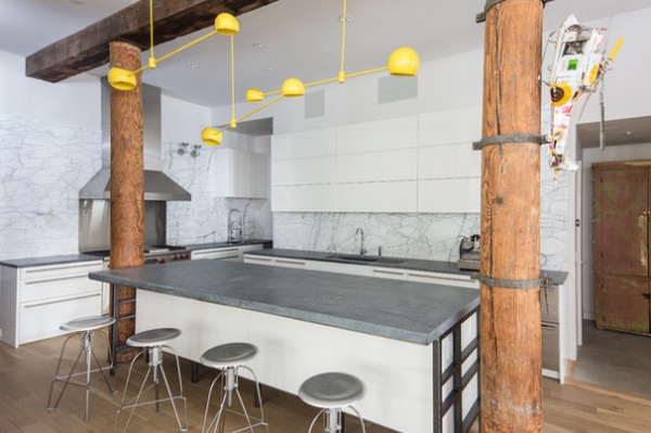
Homeowners’ request: “The customer was looking for a complementary countertop surface that would work with the modern feel of the open floor plan,” builder Nicholas Moon says. “Originally they were considering concrete tops, but they were not enthusiastic about the colors and textures of the samples. With more research they discovered Alberene soapstone, from the Polycor Virginia quarry. They immediately fell in love with the cool blue-gray tonality of the stone and its subtle white veining.
“Right away they knew it would be the perfect choice for the tops, adding a bit of warmth with its organic nature. They specifically requested to have the thicker island countertop, and had it custom produced at the quarry in a solid 2-inch thickness. The perimeter countertops were left at the standard 1¼-inch thickness. They opted to leave the countertops untreated. With soapstone the slabs can be treated with mineral oil or wax to darken the stone. Alberene soapstone turns black when enhanced. They preferred the original natural finish to keep the lighter tone.”
Plan of attack: “The open-floor-plan loft style was determined early in the design process. The kitchen was not to be sectioned off from the rest of the space. Contemporary cabinets were decided on, and ultimately Poggenpohl was selected for their well-designed and engineered German quality. The countertops were then selected, and when the 2-inch-thickness island was decided, they knew they needed additional structural support to hold up the very heavy slab.
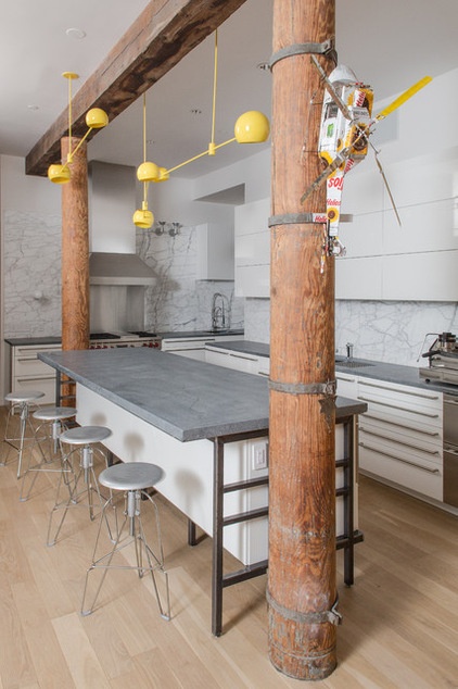
“The decision was made to create a welded frame to carry the weight. Instead of trying to conceal the frame, the decision was made to incorporate it into the design, adding an industrial edge. There is a solid plate of steel underneath the island to hold up the stone and not bear down onto the cabinetry, which would affect its performance.”
Why the design works: “The open-plan loft style was the most unique feature, creating a large communal living space that invites the creativity of playing music — one of the owners is musically trained.”
Who uses it: “The space is designed for a communal, family environment for active engagement and to foster creativity and collaboration: creating and playing music, playing games and Ping-Pong, cooking, eating and entertaining. The husband specializes in finance. The wife is in the music business.”
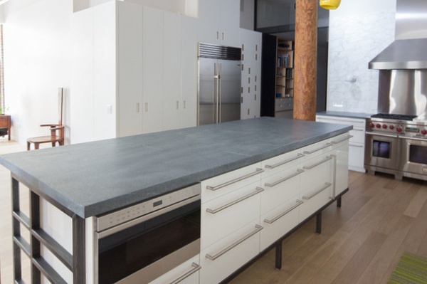
Designer secret: “The greatest solution to the island-weight dilemma was the inclusion of the welded steel frame and the steel plate underlying the slab. Also, the inclusion of the full backsplash in contrasting Statuarietto marble to the ceiling line added a modern touch to the traditional material, giving a contemporary feel by extending it all the way up.
“Also, maintaining the support columns and not trying to cover them up and hide them added to the industrial effect. Metal ties around the column also show their texture. The contrast of textures, the shiny lacquer of the cabinetry and the honed island, the welded steel, the wood columns, natural wood floors that carry through the whole living and kitchen space, and stainless appliances create a visual interest that keeps the eye moving throughout the space.”
“Uh-oh” moment: “The big issue was getting the island in one piece without a seam. But with the constraints of the space and the sizes that the slabs could be produced, it was impossible to make it in one piece, even if we could have it done at the quarry that size. The weight was also prohibitive. The solution was having a quality fabricator, Garden State Soapstone, to perform the installation and conceal the seam, which was pulled off flawlessly. The seam was surface sanded and evened out to the point that it is not visible and smooth to the touch.”
Take-away: “Soapstone can be a really versatile material. It is equally suitable in a traditional New England farmhouse, a rustic log cabin, Scandinavian minimalism or contemporary and modern aesthetics. Whether left natural or enhanced, it can work with so many different tastes. Also, mixing the thicknesses of the island and perimeter countertops makes an interesting addition. And full slabs of marble extending to the ceiling line makes a striking detail. The look of white marble complements the soapstone perfectly as well.”
The nitty-gritty: Countertops: custom-fabricated Alberene soapstone with honed finish, Polycor quarry in Schuyler, Virginia; island countertop: custom sourced and supplied, solid 2-inch thickness; perimeter countertops: 1¼ thick; full backsplash: ¾-thick Statuarietto marble; cabinets: Poggenpohl; timber support columns: original to the space, refinished; industrial range with stainless steel backsplash and hood: Wolf; faucet and sprayer: Dornbracht
Team involved: Garden State Soapstone (fabricator); Polycor (stone supplier)
More: How to Design a Kitchen Island


