Kitchen of the Week: Tile Sets the Tone in a Modern Farmhouse Kitchen
This bold approach to a modern farmhouse kitchen was just the lifestyle change a Washington, D.C.-area, couple needed after living for 10 years in their 1,400-square-foot, two-story home with its snug 7½- by 11-foot kitchen. With their twin boy and girl hitting preteen years, they were eager for a generous space that would bring the family together to cook, eat, do homework, relax and enjoy one another’s company.
Doubling the original house with a 1,400-square-foot, two-story addition afforded designer Katharine Otis an ample 630-square-foot ground-floor area to create a spacious 400-square-foot kitchen with an expansive counter island, a dining banquette and an adjoining family room. “We spend most of our time in the kitchen-family room, just like you predicted!” homeowner Jennie Rosecan wrote to Otis. And the original 84-square-foot kitchen? It’s now the powder room.
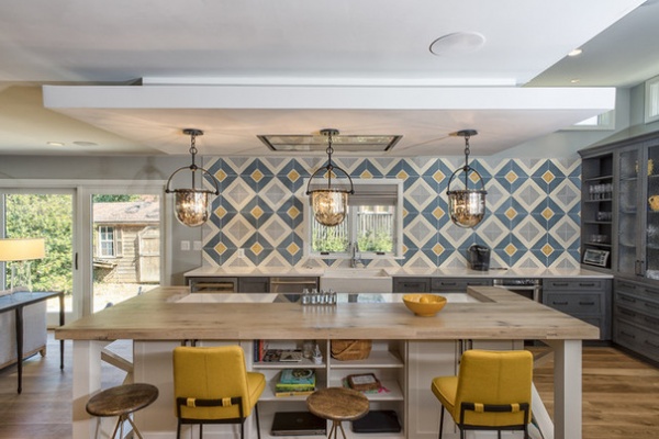
Kitchen at a Glance
Who lives here: Jennie and Matt Rosecan and 12-year-old twins Ava and Will
Location: Arlington, Virginia
Size: 630-square-foot (58.5-square-meter) kitchen, dining room and family room
Designer: Katharine Otis, associate creative director at Sagatov Design-Build
The Rosecans wanted a farmhouse-style kitchen, but Otis found clever ways to give traditional elements a modern twist — “going back and forth between the two styles to bring a balance,” as she puts it.
To start, Otis persuaded her initially dubious clients to go with an unusual hand-rubbed blue stain on the perimeter custom cabinetry, but opted for simple white cabinetry for the island. Traditional bronze cabinet hardware is paired with modern counter stools, while a farm sink and old-style seeded-glass cabinet fronts are juxtaposed with modern bright white quartz countertops. The island’s barn-gate-style legs at either end and mercury glass pendants read traditional, but they play against the modern induction stovetop and flush-mounted stove hood in the floating soffit. And, of course, dominating the space is the decidedly modern tile wall — the room’s focal point — that pumps up the volume on the kitchen’s otherwise cool color scheme.
Kitchen island pendants: Mercury three-light pendant in Old Iron, F2563, Troy Lighting; custom backsplash tile: Sabine Hill, Arch Ceramics; swivel counter stools: Wyndham, Arteriors; upholstered counter seats: custom Elysian stools, Lawson & Fenning; upholstery fabric: Hallingdal, Maharam; Roman shades: linen blend in Ash, The Shade Store; paint: Sleigh Bells 1480, Benjamin Moore
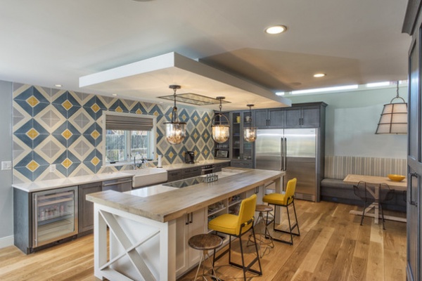
The old kitchen “was not functional at all,” Otis says. “It had barely any counter space, no storage, not even a dishwasher.” The new kitchen has ample counter space, and storage not only in undercounter and end cabinetry but in a large traditional pantry cupboard across from the island. The island has a series of storage drawers on the cook’s side and open shelving on the counter side that accommodates books and a charging station for the computers.
One place you do not see cabinetry is on the tile wall. “It really is the focal wall,” Otis says. “They wanted something fun to show their personality. We were able to get a lot of storage space throughout the kitchen, so that it wasn’t necessary to have wall cabinets.” The long counter houses the new dishwasher along with a drop-in microwave drawer. With two kids and their friends in circulation, the couple asked for the undercounter beverage refrigerator — strategically placed near the doors to the yard.
Custom perimeter oak cabinetry: Heritage door with S2 lip and SQ bead drawers in Night Forest stain, Adelphi; island custom birch cabinetry: Snowcap stain, Adelphi; door and drawer hardware: Sandcast bronze, Adelphi; countertops: Morning Frost, One Quartz, Daltile; sink: Whitehaven apron-front, Kohler; faucet: Talis C pull-down, Hansgrohe; wood counter: white oak, custom whitewash finish; dishwasher: 800 series, Bosch; undercounter refrigerator: U-Line Beverage Center
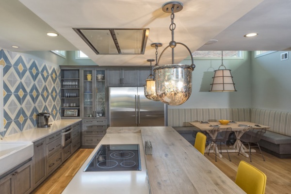
Matt, an avid cook, requested the induction cooktop. The oven is installed in the 10¾- by 4-foot island, which is topped by another one of Otis’ ingenious style combinations: a white quartz cooking counter bounded by a 3-inch-thick counter of reclaimed white oak from a West Virginia barn. Three planks of the wood were planed and glued together for strength and thickness, and then whitewashed and treated to be stain resistant. The wood counter can be used as a cutting board without being the worse for wear. Legs support and extend the oak countertop.
Otis installed strips of plug molds into a recessed channel where the quartz counter meets the oak, so the cook can easily plug in appliances without having to string cords around the island.
Induction cooktop: Jenn-Air; oven: KitchenAid; hood, blower and accessories: Best
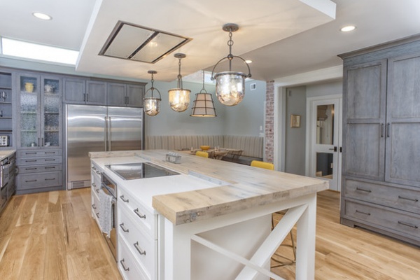
Otis set the stove vent in a floating soffit that sits a foot lower than the room’s 9-foot-high ceiling to define the island and make it a more intimate space. She chose a flush-mounted rather than an articulated hood. “Because we were doing pendants, it would have made the space too busy,” Otis says. “And obviously, the tile backsplash is the feature, and it would have blocked a lot of that.”
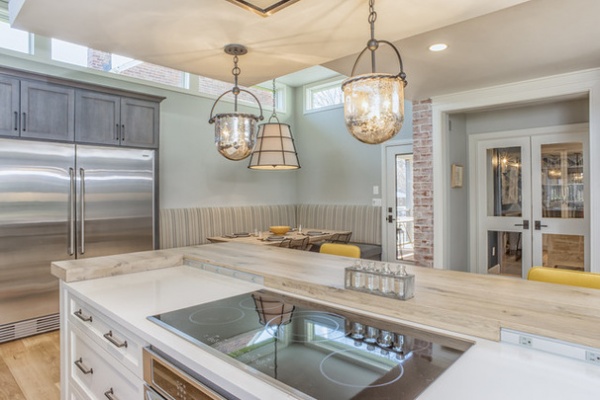
The glass doors lead to the old family room, which is now a home office and sitting room for Jennie. The addition is off the back of the house, and the Rosecans wanted to nod to the original structure. Otis accomplished the task by leaving exposed portions of the original whitewashed brick as a decorative element along the back wall.
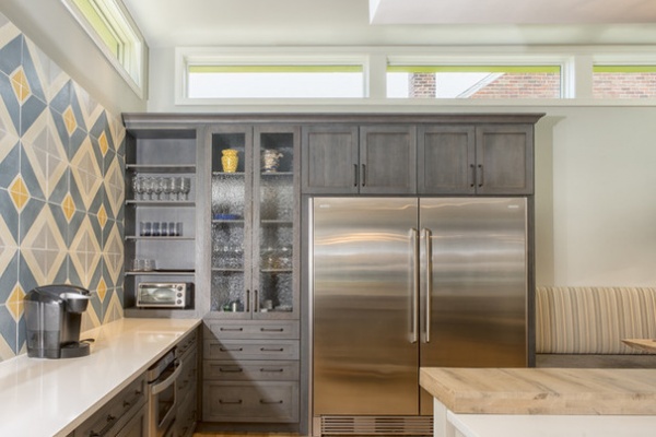
The close proximity of neighbors in Arlington prompted Otis to bump up the height of the ceiling at the far end of the kitchen and the dining area to 12 feet, and add clerestory windows that bring in light while maintaining privacy. The roomy refrigeration setup is two separate units, one a refrigerator and one a freezer.
Refrigerator and freezer: Electrolux
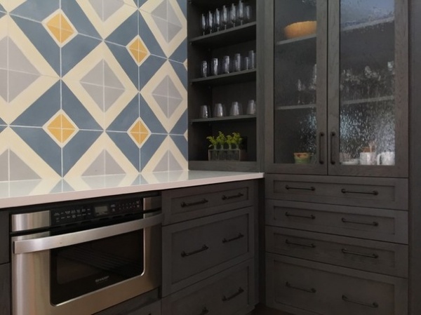
Traditional cabinetry with seed glass, open shelving and stacks of narrow drawers comes face to face with the boldly modern tile, white quartz countertop and drop-in microwave drawer.
Microwave drawer: Sharp
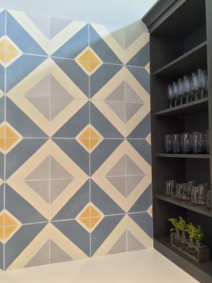
To achieve the wall’s bold look, Otis went with custom concrete tile, upping the scale to 10 by 10 inches. She and the Rosecans chose the color palette: blue-gray to coordinate with the cabinetry, pale gray to pick up the wall color and, at the clients’ request, golden yellow. “They wanted yellow to brighten up the space,” she says, and the color is repeated in the counter seating. The subtle X pattern of the intersecting white squares echoes the island’s barn-gate legs.
Custom concrete tile: Sabine Hill, Arch Ceramics
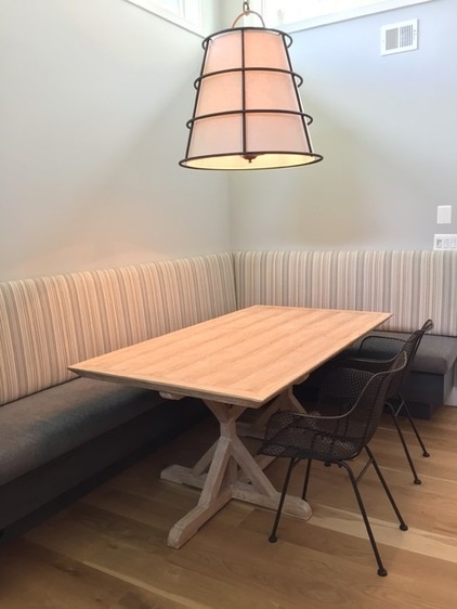
The Rosecans did not want formal seating for their dining area, so Otis opted for a 10- by 5-foot built-in banquette. “I made it a cozy nook,” Otis says, “not to just eat.” A good deal of the coziness comes from the seat fabric, an indoor-outdoor Holly Hunt chenille style with an exceptionally soft feel. The neutral tone ensures “it doesn’t feel heavy, because the color is matched to the cabinetry,” Otis says. Natural light comes through the high clerestory windows, but the nook is defined by the imposing 30-inch-diameter lampshade light fixture that is 31½ inches high.
Custom oak banquette: Night Forest stain, Adelphi; lighting fixture: Habitat in Liberty Rust finish, Troy Lighting; table: Made Goods
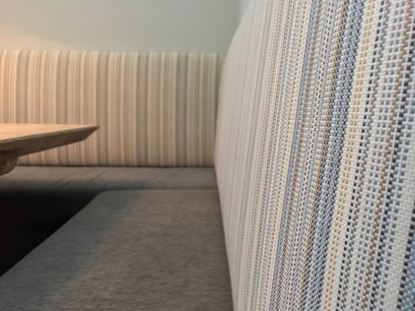
Otis used indoor-outdoor fabric on the seating for its durability and stain resistance. “Typically people think that solution-dyed acrylic means that rough-textured outdoor fabric,” Otis says. “But there are a lot of options now that have the luxurious feel of interior upholstery.”
Seat fabric: Clean Slate: Blue Smoke, Holly Hunt; back cushion fabric: Linomix, Maharam
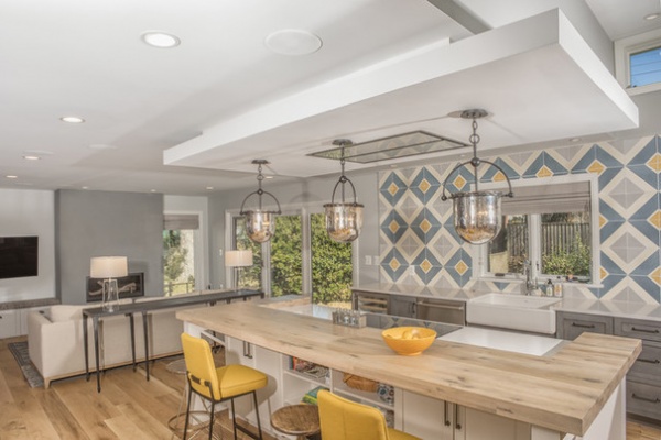
Along with the generous kitchen, the addition provided space for a much-needed open family room and entertainment area — just what the family of four ordered. The addition has been transformative, Jennie says. “We rarely had parties before, because there was no space,” she wrote to Otis. “Now we cook, eat meals, do homework, spread out science projects on the big table, play board games, hosted parties for the Super Bowl and a baptism reception. Before, Matt was the only one who cooked. Now I am learning to cook, because I love the kitchen so much. Ava and Will are cooking, too. We play music while we all cook, and then we eat together as a family. It is awesome.”
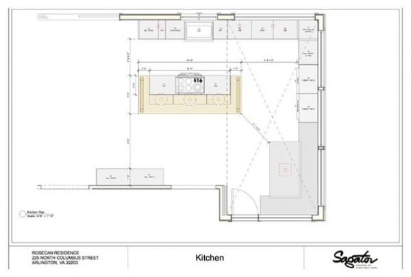
The floor plan shows the 700-square-foot ground floor portion of the two-story addition to the back of the house. The existing brick-clad back wall was retained and exposed as a decorative element in the kitchen as well as in the adjacent family room area.
See more Kitchens of the Week


