Houzz Tour: Ranch House Changes Yield Big Results
http://decor-ideas.org 06/29/2015 23:13 Decor Ideas
The owners of this Minnesota home bought it for its great location and large lot, not for the aesthetics of the 1940s-era ranch house itself. But, together with architect Meriwether Felt, they worked on it for nearly a decade to bring the house in line with its more desirable features. The most recent remodel involved a new kitchen, dining room, sleeping porch and mudroom. That’s not a full-house remodel by any means, but the additions and shifts to the floor plan made a big impact.
Photos by Corey Gaffer
Houzz at a Glance
Who lives here: A couple, their 2 daughters and 2 dogs
Location: Golden Valley, Minnesota
Size: Before the remodel, 2,200 square feet (204.3 square meters); after the remodel, 2,800 square feet (260 square meters); 4 bedrooms, 3 bathrooms
Architect: Meriwether Felt
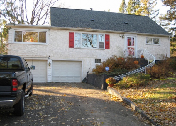
BEFORE: The original house was likely built in the 1940s and was a typical rancher on an atypically large lot.
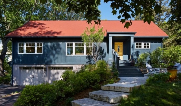
AFTER: The new house is larger and filled with touches that make it special and personal. On the outside: A blue-gray exterior and a red roof speak to the owners’ appreciation for Scandinavian design. A small, covered porch makes the entry more gracious and comfortable. (After all, who likes to wait for the door to open in the pouring rain?) At first a red door was considered, but the architect suggested yellow for a pleasing contrast. “It picks up the ocher tones in the flagstone,” she says.
What you can’t see is the work that’s behind the walls. “The owners are very energy conscious, and they re-insulated the house and redid the siding some years ago,” Felt says.
What you can see, when you compare the photos closely, is that the gable of the roofline has been extended. It encloses a sleeping porch off the master bedroom.
Exterior gray paint: Stonecutter, Benjamin Moore
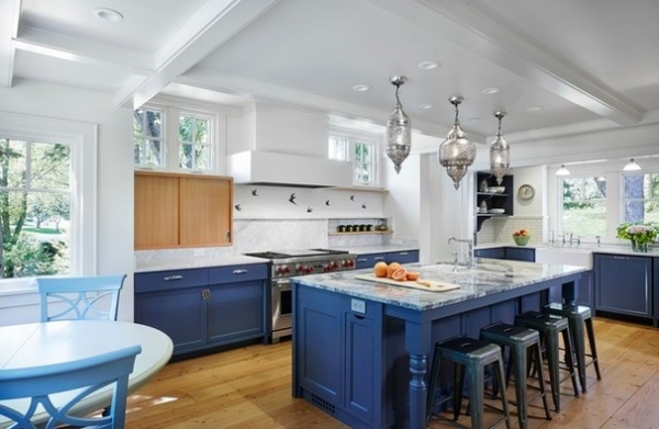
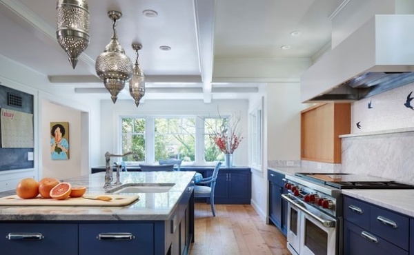
There’s a new kitchen where an enclosed porch used to stand. “The porch was on the south side of the house. They loved the light there, but it was very narrow, and it was hard to furnish and use,” Felt says. “They also had the kitchen on this side of the house, and the owners liked looking at the backyard from the kitchen. We went round and around on how to remodel everything — but when we landed on the idea of making the porch the new kitchen, everything fell into place and it opened up the whole house.”
The new kitchen is full of things dear to one of the homeowners’ hearts. “She grew up in a turn-of-the-century home in Minneapolis,” Felt says. “It was full of charming details. We wanted to bring some of that feeling to this house.”
To start with, the cabinets are a brilliant blue, the client’s favorite color. Then there’s a backsplash that’s partially crafted with tiles showing birds in flight, another thing the client loves. Add the trio of silver Moroccan-style light fixtures, and you have a kitchen that’s decidedly one of a kind.
But it’s not all looks here; function is foremost. The kitchen is divided into zones: Prep happens around the range and island, eating happens in the adjacent seating area, and the space they call the scullery is at the far end by the sink. “Breaking down the long, narrow space into zones makes it work better for them,” Felt says.
Cabinet paint: Macaw, Devine Color; tile: Flight, New Ravenna Mosaics; light fixtures: Joss & Main
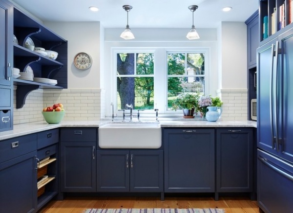
The scullery is home to the sink, refrigerator and open shelves for plates and cutting boards. “Details like the brackets on the open shelves take the owner back to her childhood home,” Felt says.
On the opposite end is an eating area.
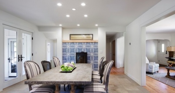
“The owner took a trip to France, and she was very inspired by the old tile and stone she saw in the country houses there,” Felt says. You can see those influences in the tumbled limestone floors and the encaustic cement tile that backs the woodstove.
“The old enclosed porch had a massive stone fireplace that didn’t put out much heat,” Felt says. “The owners chose a woodstove that heats much more efficiently.”
The mantel is crafted from an old piece of wood taken from the other owner’s family cabin.
Limestone tile floor: Francois & Co.; cement tiles behind stove: Float, Sabine Hill; woodstove: Monet, Hwam
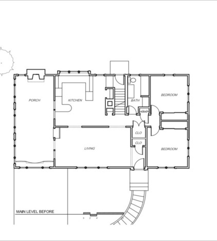
To understand the remodel, it’s helpful to study the “before” and “after” floor plans. This is the floor plan prior to the remodel.
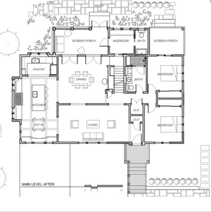
Here is the plan after. You can see that a formal dining room takes the place of the old kitchen. In back of it are a few rooms that make a big difference: two screened-in porches and a mudroom.
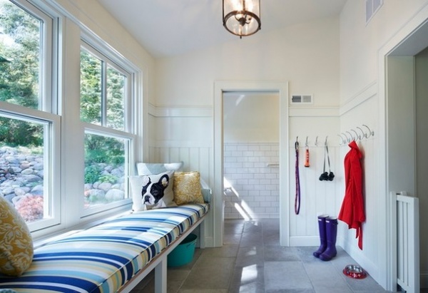
As the pillow on the mudroom banquette suggests, this house is home to a pair of Boston terriers. When you have four people and two dogs going in and out of the back door in Minnesota, there you will have an ideal spot for a mudroom — or the dog room, as this family sometimes calls it. Maybe it earned that name because of the unique pocket gate you can see sliding out of the doorjamb on the right. It’s a repurposed radiator cover the architect spotted at a flea market. Here, it is an elegant dog gate. The dogs are enclosed here while they are drying after a bath or when the homeowners are gone for short periods.
The many hooks are for leashes, coats and hats.
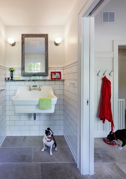
Meet the four-legged residents of the home: Hope (under the sink) and Tuxie (full name: Tuxedo, eating at the right).
The large sink doubles as a dog-washing station. The ledge above it is a Felt signature. “It’s a small spot to put things while you use the sink,” she says.
Plaster work sink: American Standard
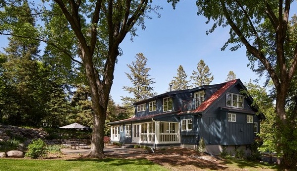
An exterior view shows the screened porches (the far porch is awaiting screens) that bookend the mudroom. The larger one, closest to the camera, is used for family meals when weather permits.
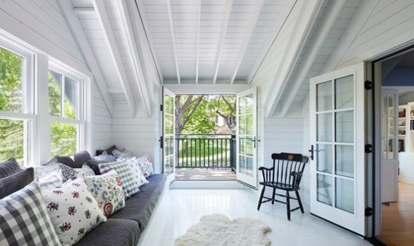
By extending the gable, the architect made the exterior of the home less awkward and more balanced and attractive. She also made way for a sleeping porch off the master bedroom on the second floor.
“In this part of the country, we are closed up for a lot of the winter. We tend to get cabin fever,” she says. “When the weather warms up, there are certain rituals: Everyone opens up their windows, and they go out and start to garden.”
The sleeping porch is meant to embrace that time when Minnesotans are drinking in nature. “It’s to celebrate that part of the year,” Felt says. “It’s a serene and quiet place to enjoy that window of time.”
It’s also one of those relatively small changes that make a big difference in the enjoyment of a home.
Browse more homes by style:
Small Homes | Colorful Homes | Eclectic Homes | Modern Homes | Contemporary Homes | Midcentury Homes | Ranch Homes | Traditional Homes | Barn Homes | Townhouses | Apartments | Lofts | Vacation Homes
Related Articles Recommended


