Relocated Colonial Kitchen More Than Doubles in Size
These homeowners loved the architectural details and location of their classic 1939 brick Colonial house in the Boston suburb of Lincoln, but they were frustrated with how closed off their kitchen was from the rest of the ground floor.
The professional couple, who share their home with their cat, Sunny, wanted a better connection with the surrounding rooms, along with a more efficient layout and better appliances. Working with designer and builder Thomas Buckborough, they realized that moving the location of their kitchen would dramatically improve the entire layout of the house. The more central and open kitchen features painted maple cabinets, a center island with a mahogany base and granite counters, a warm red oak floor, top-notch appliances and a soothing color palette. The couple now enjoy a more inviting, open kitchen in a transitional style that fits their home and their lifestyle.
Kitchen at a Glance
Who lives here: A professional couple and their cat, Sunny
Location: Lincoln, Massachusetts
Size: 420 square feet (39 square meters)
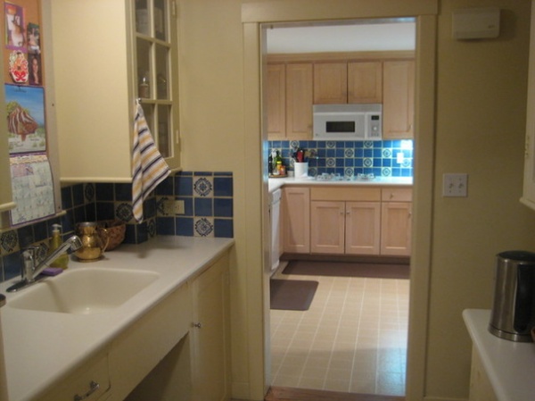
BEFORE: The previous, closed-off kitchen had a blue ceramic tile backsplash, solid-surface counters, a vinyl floor and older wood cabinets. A large butler’s pantry, a closet and a powder room kept the kitchen separated from the rest of the home.
“After” photos by Eric Roth Photography
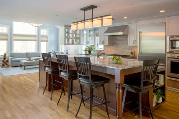
AFTER: The kitchen was moved to a more central spot in the home, borrowing space from the existing family room and butler’s pantry. A large wall between the kitchen and family room was removed, creating good flow between both spaces. These design moves took the size from 175 square feet (16.2 square meters) to 420 square feet (39 square meters). The family room’s large windows now flood the space with natural light.
Doors that once separated the kitchen from the dining and living rooms were replaced with open doorways that encourage good circulation. The kitchen and surrounding spaces have a simple color palette that combines soothing blue and gray colors mixed with natural earth tones.
Paint by Benjamin Moore: Silver Half Dollar (walls) and Navajo White (trim); island stools: Stickley, Audi & Co.; light fixture above island: Hubbardton Forge; flooring: red oak, finished onsite
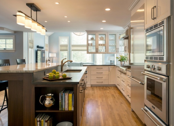
The prominent center island has a mahogany base with a cranberry glaze. The island helps define the kitchen proper and provides seating for casual meals.
The side of the island shown here has open shelves for display storage of collectibles and cookbooks. The sink side includes trash and recycling pullouts and drawers for plastic wrap, foil and food storage containers.
Upper cabinets with beaded glass on both sides, seen at the far end of this photo, provide storage for drinking glasses and cups, and also allow as much natural light as possible to filter into the kitchen from the family room.
Main sink: Franke; main sink faucet: Grohe; integrated dishwasher, stainless refrigerator, gas cooktop, hood and convection oven-microwave drawer combination: Thermador
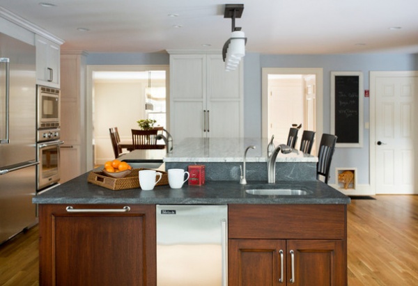
This lower island countertop and perimeter countertops are 1¼-inch-thick honed Jet Mist granite The bar-height counters are a lighter 1¼-inch-thick Snowflake granite, which has subtle cranberry highlights that complement the cranberry glaze on the island’s base.
The sink includes an instant hot-water faucet for tea. A handy towel bar hangs to the left of an ice maker. “Towel bars are important for a kitchen, and a lot of times people don’t include them,” says Buckborough, of Thomas Buckborough & Associates.
Ice maker: U-Line and Perlick; prep sink: Franke; prep sink faucet: Grohe
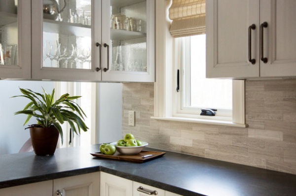
The eye-catching backsplash includes 2-inch by 8-inch Athens Silver Cream travertine tiles from Ann Sacks with a birch grout. The backsplash adds movement and pattern to the wall. “The tiles have a subtle color and nice texture,” Buckborough says. “All of the selections are subtle, classy and textural. This whole kitchen is a wonderful example of the transitional style.”
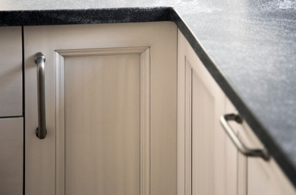
Brushed-nickel hardware provides a rich contrast against the painted maple cabinets and drawers. The cabinetry has a light gray glaze for a distressed look. “We had several samples of glazing, and this one gave us the look we wanted,” Buckborough says.
Cabinetry: Prévo; cabinetry hardware: Top Knobs
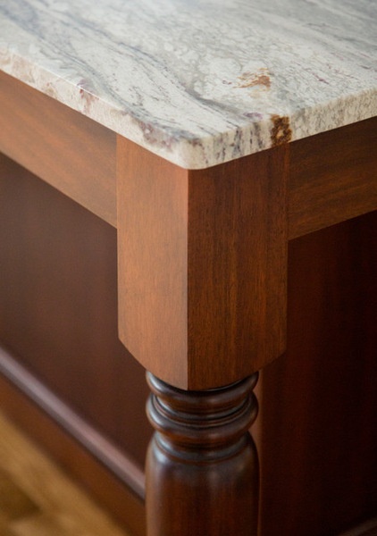
The mahogany wood with a cranberry glaze on the base of the island adds richness and dimension to the kitchen and provides contrast for the lighter cabinets and drawers.
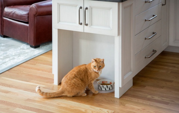
A handy cat station for Sunny sits at the end of the cabinets that separate the kitchen and the family room. The cabinets above store cat food.
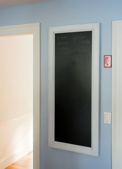
A chalkboard message center gives the homeowners a place to post reminders for the week.
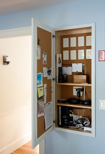
The message center opens to reveal a charging station, Wi-Fi equipment, a corkboard for pinning messages and all the switches for the home’s lighting system. “When you have lots of layers of light in a kitchen and surrounding areas, you need a big bank of switches,” Buckborough says. “A big switch bank would be really ugly in this kitchen, and this allowed us to conceal it.”
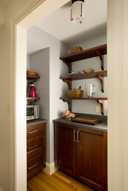
The new walk-in pantry has replaced the old butler’s pantry. It gives the homeowners an organized space for storing smaller countertop appliances and serving pieces they use occasionally.
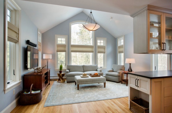
The now-open family room features the same soothing color palette as the kitchen. “The kitchen and family room is where they spend most of their time,” Buckborough says, “and the kitchen itself doesn’t have many actual windows. The great connection between spaces gives them that natural light from the nice architectural window scheme in the family room.”
Sofa and chair: custom, A. Rudin; chandeliers and lamps: Hubbardton Forge; area rug: Dover Rug & Home; woven shades: Horizon Window Treatments
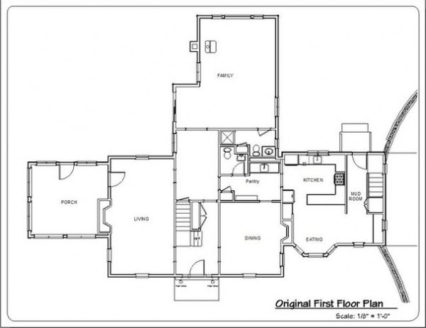
BEFORE: This floor plan of the kitchen’s original first-floor layout illustrates how the old kitchen was smaller and cut off from the surrounding spaces.
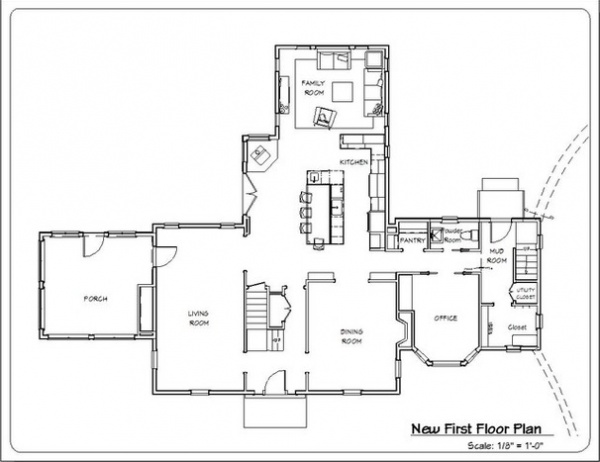
AFTER: As the new first-floor plan shows, the relocated and larger, open kitchen enjoys a more central location and good connection with the adjacent family room and living and dining rooms.
“The kitchen and all the rooms now relate to one another,” Buckborough says. “I think this renovation totally transforms the whole house into a more modern lifestyle.”
Team:
Design-build: Thomas Buckborough & Associates
Interior design: Amy McFadden Interior Design
See more kitchen stories


