The Missing Piece in Your Room Design
http://decor-ideas.org 06/28/2015 02:13 Decor Ideas
A ceiling that’s comfortably higher than the height of the average human is essential to the functionality and feel of any room. A low ceiling can make a space feel cramped and oppressive, while generous space above our heads gives a feeling of lightness and expansiveness. Typically, though, we underuse the upper sections of our rooms. There is, of course, the issue of being able to reach that part, but as these 11 innovative ideas illustrate, working those lofty vertical reaches and putting them to cool and creative use can be the space-smart way to go.
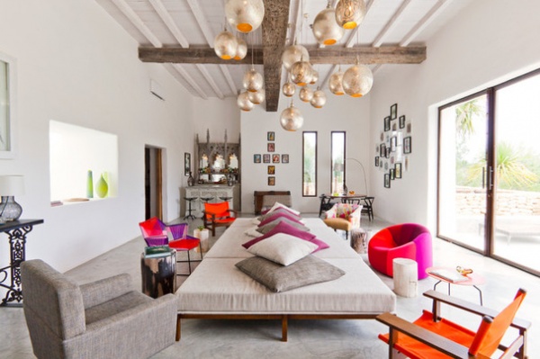
Add some statement lighting. Hang a cluster of pendant lights that will invite you to look up and that will give your space real depth. Go chic and stylish or consciously eclectic, as here, by hanging the lights at different levels for a layered effect.
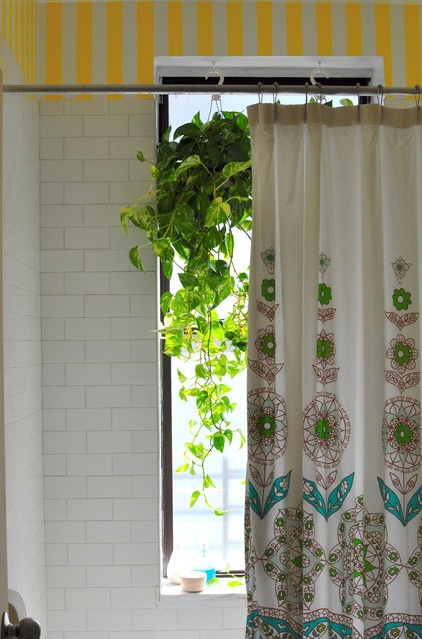
Put up a plant. Hanging planters allow you to introduce greenery to your home without its taking up useful surface space. When planted with trailing plants, such as ivy, they bring a vertical splash of vivid, lush green to the upper part of a room.
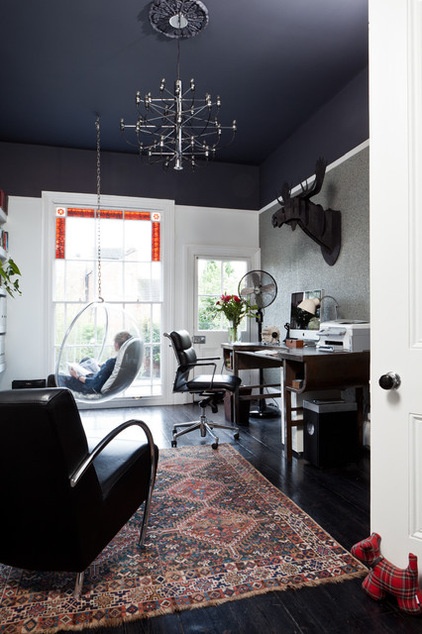
Paint above the picture rail. Take the idea of a feature wall and apply it to the space above a picture rail. You can extend the color to the ceiling, too, for greater impact.
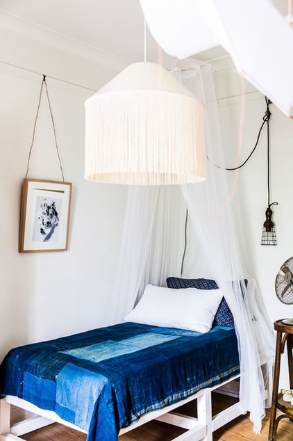
Create a canopy. Lying in bed allows you to look up at the ceiling and the upper reaches of your room, so give yourself something to gaze at by fashioning a simple canopy above. It doesn’t need to look over-the-top: Go light and minimalist with white gauzy fabric draped casually from a small circular rail.
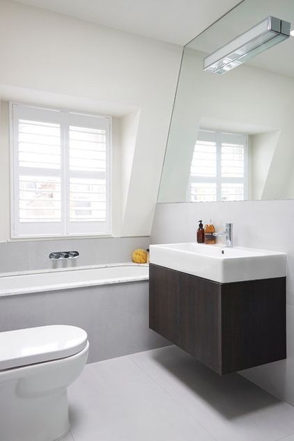
Boost light levels. Combining a mirror with a light installed in the upper portion of the wall is an effective method for boosting light levels throughout the day. In this bathroom the mirror captures and maximizes the natural light flooding in through the window, while the strip light provides task lighting for shaving, washing and putting on makeup.
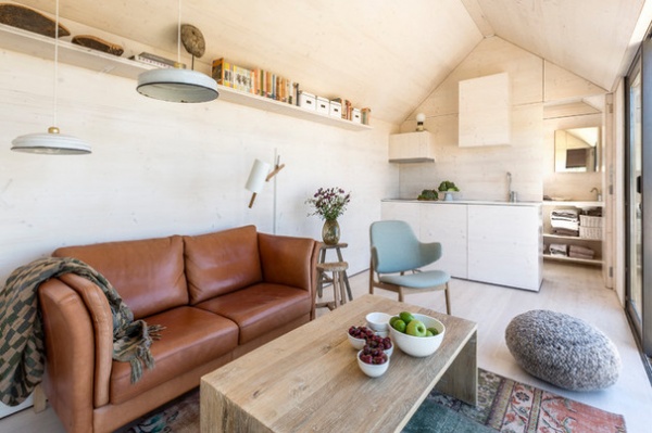
Try a high shelf. In a small space, shelves mounted high up on the wall provide a useful storage and display surface without using up vital wall room. This shelf is tucked in under the roof, drawing the eye up to the roof’s apex and creating a sense of loftiness.
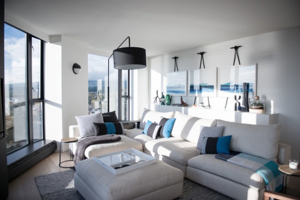
Hang out. Traditionally pictures were hung from a wire or cord and suspended from a hook that was fixed to the picture rail. Try bringing this idea up to date by making a feature of the hanging as well as the artwork. Use thick cord that creates a strong silhouette against the upper third of the wall and attach it to statement hooks.
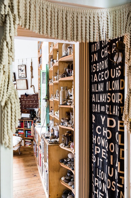
Fashion some trimmings. Indulge your eclectic side and add trimmings or swags to the upper section of your rooms. Here, a thick trim that might be used on curtains or upholstery gives a door frame a fun feel.
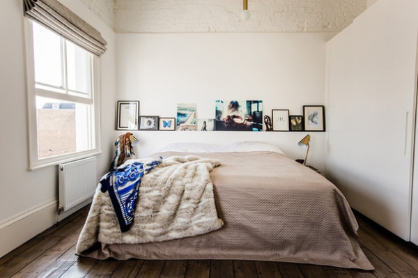
Bare those bricks. Exposed brickwork, whether painted or left raw, brings in texture and industrial style. If you like the look but don’t want an entire room displaying its brickwork, try exposing only the upper third. Your space will still get a shot of loft-style grittiness, but in a confined area, and the brickwork will make an exciting contrast to the smooth plaster below.
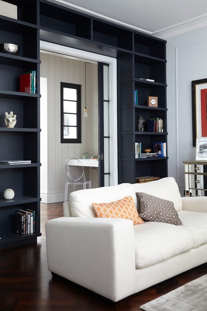
Build above the door. Space above a door is rarely used, but it’s a natural home for shelves. Here, the shelving over the door creates a wraparound effect, as a continuation of the built-in storage stretching across the wall, but a stand-alone shelf would work just as well.
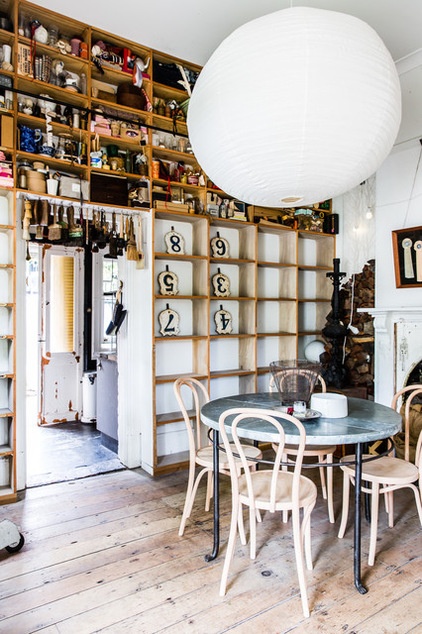
Maximize the upper third. This space illustrates how it’s possible to turn conventional notions of room design on their head. There seems to be more happening in the upper third of this room than in the lower section, with the shelves loaded on high but left deliberately bare beneath. An oversized paper lantern attracts further attention to the upper part of the room for a quirky, topsy-turvy effect.
More:
11 Reasons to Paint Your Ceilings Black
Your Guide to Common Light Fixtures — and How to Use Them
Related Articles Recommended


