Houzz Tour: Industrial Flavor and Playful Touches in a 1980s Home
http://decor-ideas.org 06/27/2015 23:13 Decor Ideas
This is a story of a pair of brewers who fell in love and created a home together. Each owned and operated a brewery, loved industrial design, was inspired by camping and tooled around San Francisco on a bike. When they met, something exciting started to ferment. But the backdrop for their romance and lifestyle wasn’t as interesting. “It was a home built in the 1980s,” says interior designer Regan Baker, who helped the couple with the remodel. “It was put up by a developer as cheaply as possible, and it was bland.”
Photos by Sarah Hebenstreit/Modern Kids Co.
Houzz at a Glance
Who lives here: A pair of brewers
Location: Duboce Park neighborhood of San Francisco
Size: 2,100 square feet (195 square meters); 4 bedrooms, 3 bathrooms
Designer: Regan Baker
The new look for the home was to be industrial, modern and playful. One of the owners “was especially influenced by industrial style,” Baker says. “As a brewer, she does a lot of work in factories and warehouses. I think being surrounded by those details did a lot to form her aesthetic.”
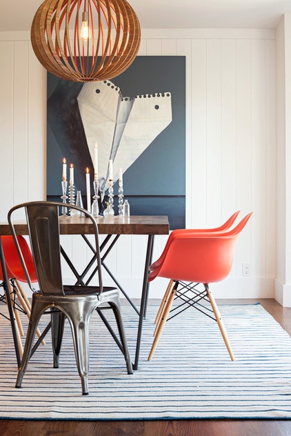
In the dining room, the tone is set with a painting by Jeanne Vadeboncour of an oversize paper airplane made of ruled notebook paper — the kind used in elementary schools around the country.
The same owner also brought the orange chairs to the project. It’s one of her favorite colors, and it’s seen around the house.
Art: “Touchdown,” by Jeanne Vadeboncour, Stephanie Breitbard Fine Arts; light fixture: CB2
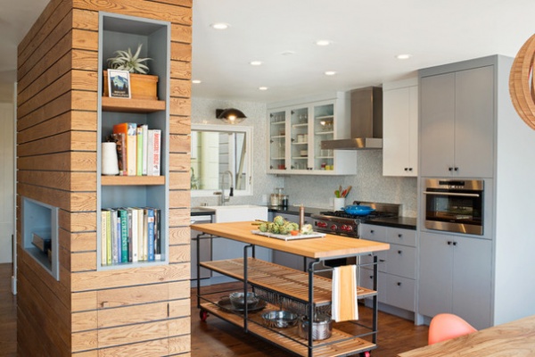
A wall with a door to the kitchen used to stand behind the dining room table. “It made for a very tight space,” Baker says.
The designer wanted to open up the walls between the dining room, kitchen and living room, but a structural support beam needed to stay. She solved the problem by moving it slightly and covering it with a sculptural dividing wall. The beefy wall houses a pantry on the kitchen side, bookshelves on the dining room side and a turntable niche facing the living room. Baker made it interesting by painting it a dark gray color and then covering it with oak panels, leaving gaps between each board. “It turned into a very cool divider. It’s a feature element,” she says.
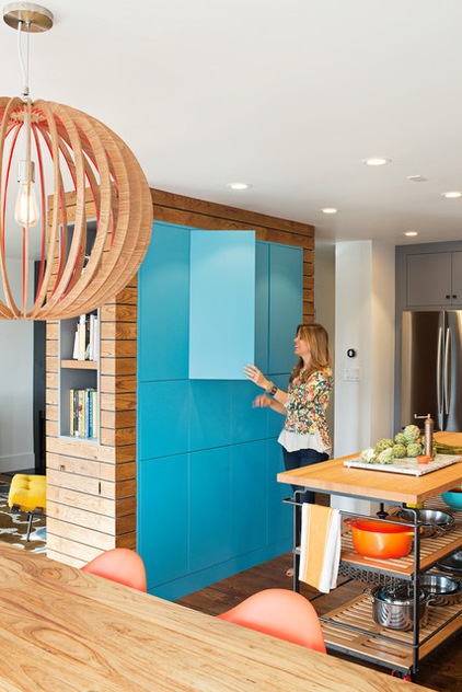
Because there’s a lot of wood and gray and white tones in the home, the designer suggested painting the pantry cabinet fronts a color. “We debated colors for a long time,” Baker says. The choices were the blue seen here and a more sedate color. “I finally asked the client if she wanted a look that was more Ann Taylor or more Anthropologie,” Baker says. “She picked Anthropologie.”
Baker is pleased with the choice. “I wanted something that was more contrasting,” she says.
Pantry paint: Cool Blue, Benjamin Moore
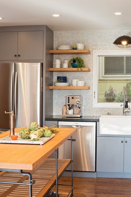
For the cabinetry, the designer and client selected gray for the lower cabinets, and white and gray for the upper cabinets. Small, round tiles known as mini pennies make up the backsplash.
A custom island is on red casters, the client’s idea. The island’s industrial lines make it reminiscent of a factory cart, and its wheels make it versatile. “If you need more room anywhere in the kitchen, you can just scoot it over,” Baker says.
Cabinet paint: Whale Gray and Genesis White, both by Benjamin Moore; light fixture over sink: Circa Lighting
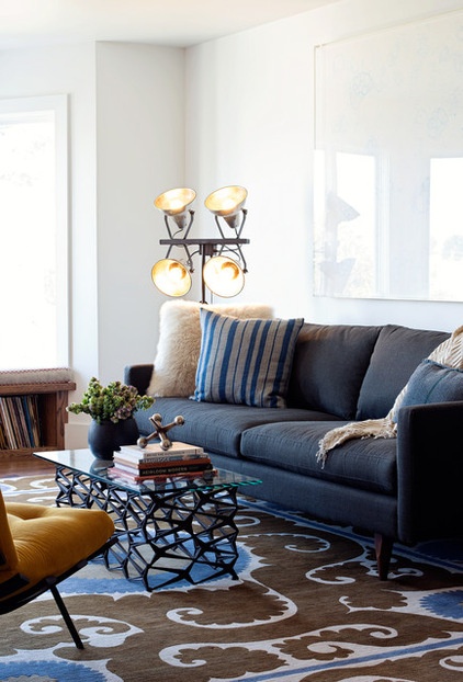
The living room is where the couple entertain, listen to music and read. To keep the space open, Baker designed a see-through metal coffee table with a glass top.
Rug: Madeline Weinrib
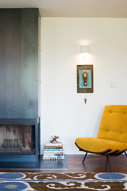
In keeping with the factory-inspired look, Baker had the fireplace encased in steel.
Chair: custom

The clients prefer to listen to their music on vinyl, so a new window seat in the bay window contains storage for records.
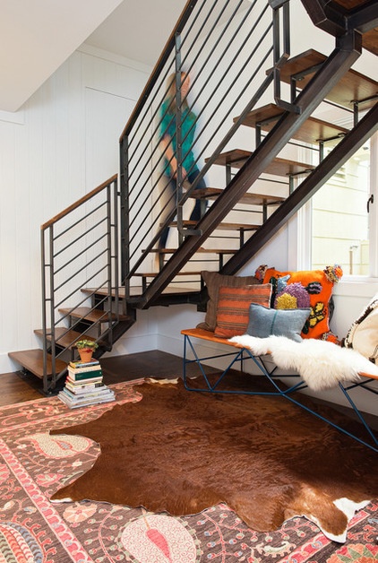
Baker bumped out a wall near the spot where a spiral staircase once stood to give the owners a run of stairs that’s conventional in form but modern in detailing.
In this house, the public areas (kitchen, dining room, living room) are upstairs, and the master bedroom is below.
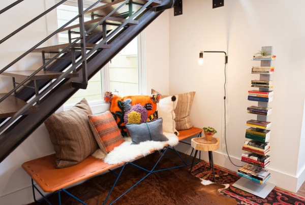
A leather-topped cot is positioned under the stairs for reading.
Saddle leather cot: Garza Marfa
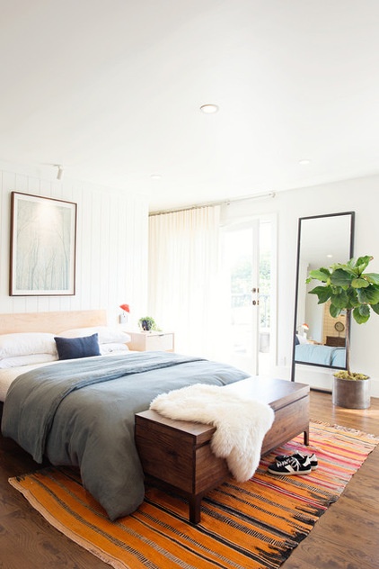
The master bedroom had an awkward layout. Baker moved the closet behind the bed for better flow.
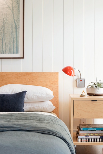
She paneled the wall behind the bed (the rest of the walls are smooth), to draw the eye there and add texture.
Bed and bedside table: Room & Board; light fixture: Schoolhouse Electric & Supply
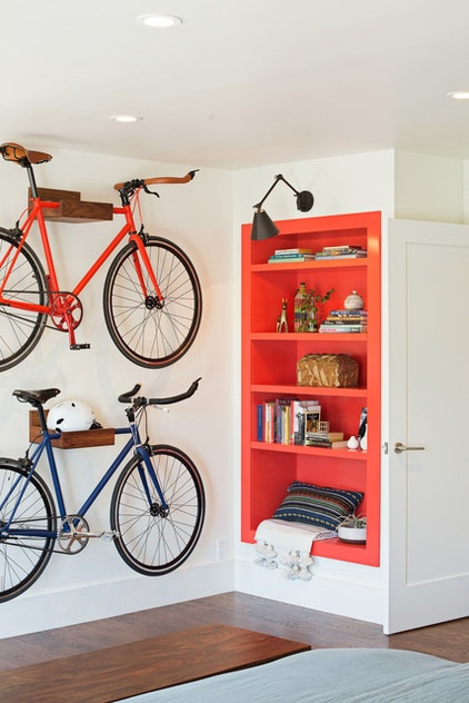
On the wall opposite the bed, the designer installed interior-worthy wooden bike racks. She also created bookshelves in that beloved orange hue.
Bike racks: CB2
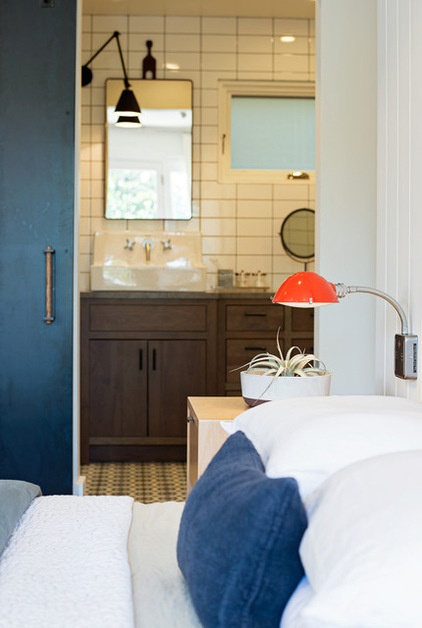
The new door to the master bathroom is a steel barn-style door. Baker wanted to carry the steel from the fireplace throughout the house.
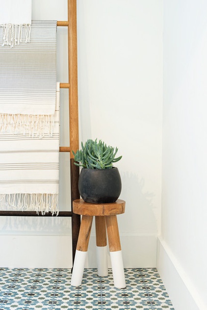
A ladder-like towel rack in the master bath gives storage an architectural twist.
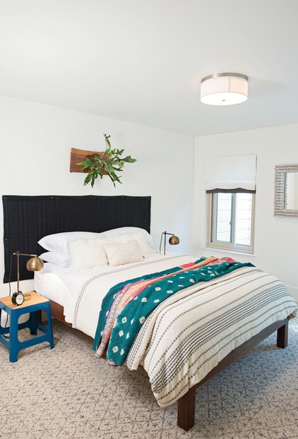
In the guest bedroom, a custom headboard dresses up a simple platform bed.
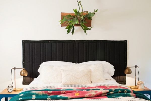
The quilted canvas piece is trimmed in leather.
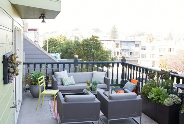
Outside, a garage made way for a deck. The gray-cushioned outdoor furniture was purchased previously.
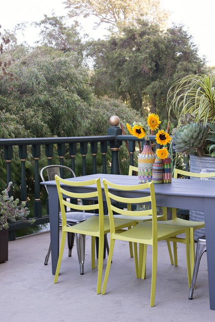
Baker’s job with the deck was to bring in more color, which she did by adding green chairs. “That made it a little less basic,” she says.
The finished house would never be called a bland builder’s special. “We were able to bring more character and more creative use of space to this home,” Baker says. In other words, it goes down smoothly like a good malty ale.
Browse more homes by style:
Small Homes | Apartments | Barn Homes | Colorful Homes | Contemporary Homes | Eclectic Homes | Farmhouses | Floating Homes | Guesthouses | Lofts | Midcentury Homes | Modern Homes | Ranch Homes | Townhouses | Traditional Homes | Transitional Homes | Vacation Homes | Homes Around the World
Related Articles Recommended


