Houzz Tour: Saving a ‘Brady Bunch’ Staircase in a Midcentury Remodel
Despite being the “second ugliest house in the neighborhood,” Di Bruning says, she and husband David Owen fell in love with the interior of this two-level 1968 Washington, D.C., home when they spotted an open-riser entry staircase that reminded Bruning of the one in “The Brady Bunch,” a favorite show of hers during childhood. “Inside, the house had a great vibe and a great amount of space, including two spare bedrooms we could use as offices,” she says. “I knew we could work with it.”
After searching for local pros on Houzz, Bruning and Owen found architect Lou Balodemas, who had done several modern renovations in the same neighborhood. Working with builder Highbury Construction, Balodemas and the homeowners came up with a plan that updated the kitchen and baths, and opened up the main living areas to create a modern, airy setting.
Houzz at a Glance
Location: Chevy Chase, Maryland
Who lives here: Di Bruning, an attorney; her husband, David Owen, a software services entrepreneur; and their 2 school-age children
Size: 3,500 square feet (325 square meters); 5 bedrooms, 3 bathrooms
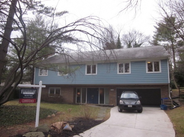
BEFORE: Bruning and Owen felt the exterior of the 1968 house had a somewhat oppressive look. However, the lot, which slopes up from the street, afforded a spacious two-level floor plan, with the garage, family room and a bedroom built into the hillside on the first level, and the kitchen, dining and living rooms, and four bedrooms upstairs.
Photos by Anice Hoachlander (except as noted)
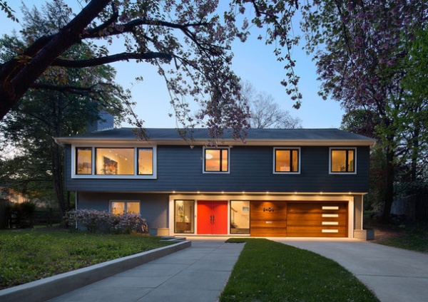
AFTER: Balodemas, of Balodemas Architects, updated the home’s curb appeal by installing a new entry door and sidelights; new windows, including an enlarged opening for the second-floor living room; new fiber cement siding for the upper level; and a new garage door. “The original entry door was a bit recessed,” Balodemas says, “so we popped it out to give the foyer a few more feet of space.” He also added a new front walkway to create a grander approach to the house.
Windows: Windsor Windows & Doors; siding: HardiePlank; paint by Benjamin Moore: Hearthstone (first-level brick), Westcott Navy (siding) and Poppy (door)
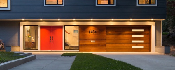
Balodemas suggested removing the original two-car garage door and replacing it with a sapele wood-lined single-car garage door. The extra space went to storage for things like bicycles. “It was a 1968 version of a two-car garage door,” Bruning says, “and too small for today’s cars. Besides, we had no car when we lived in New York, and now we only have one, so we decided we wanted the extra storage space.”
Wood siding and garage door: Clingerman Doors; entry door hardware: Emtek
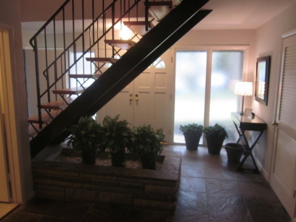
BEFORE: The original entry staircase won Bruning’s heart the moment she saw it. “I grew up in Australia, obsessively watching ‘The Brady Bunch,’” she says. “I loved all things American in the 1960s and ’70s. This staircase was almost exactly like the iconic one on the show, so I was in love.”
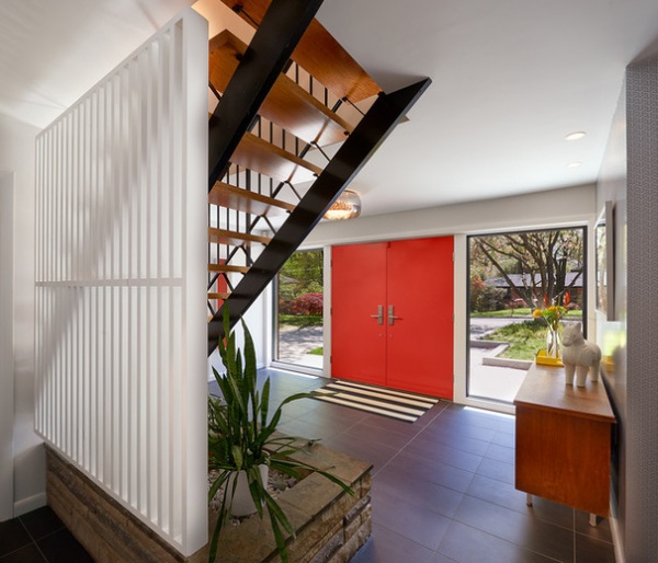
AFTER: Balodemas left the staircase and fieldstone planter in their original condition, but added a painted wood screen to separate the stairs from the lower-level family room and bedroom, the latter of which is now used as an office. Pushing out the entry door gave the foyer a bit more breathing room, and new porcelain tile flooring updated the look.
Tile: Architectural Ceramics
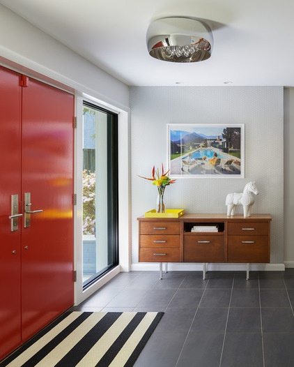
Most of the home’s furnishings came from Bruning and Owen’s previous home in New York. Bruning worked with Bethesda, Maryland, interior designer Christie Leu to source a few new pieces for the interior, creating a simple setting with midcentury references.
The credenza is a vintage piece, scored by Owen at a garage sale. The photograph is by Slim Aarons. The Jonathan Adler horse is another sly “Brady Bunch” reference. (The show set had something similar at the bottom of the stairs.)
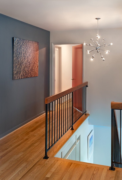
Photo by Elissa Crowther
The landing at the top of the stairs leads to the bedrooms down the hall, as well as to the kitchen and dining and living areas.
Chandelier: AF Lighting
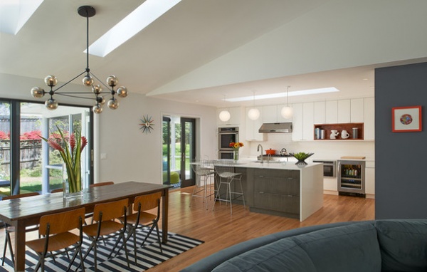
Balodemas removed walls between rooms, creating an open great room for family living. The white oak flooring is original.
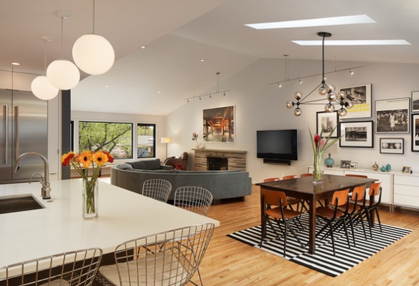
The architect added four new skylights between trusses in the second level’s vaulted ceilings, creating a brighter setting. The deep drywall openings for the skylights are longer than the actual skylights, a tactic that scatters more light into the interior.
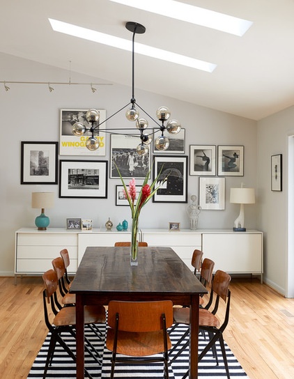
A collection of framed photographs provides the backdrop for the dining area. The teak farmhouse table is surrounded by vintage (1955) Friso Kramer Revolt chairs.
Sideboard: BoConcept
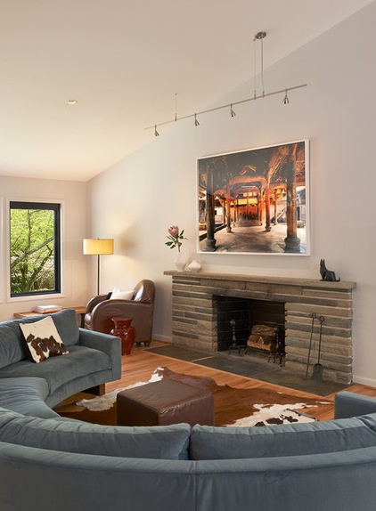
Photo by Shao Yinong and Mu Chen
A curved sectional provides a cozy setting for lounging in front of the living room’s original fieldstone fireplace.
Sofa: Room & Board
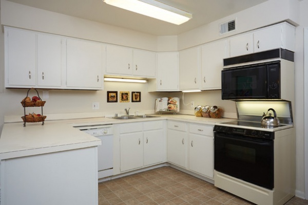
BEFORE: The kitchen, probably remodeled since the home’s 1968 construction, was closed off from the dining and living rooms.
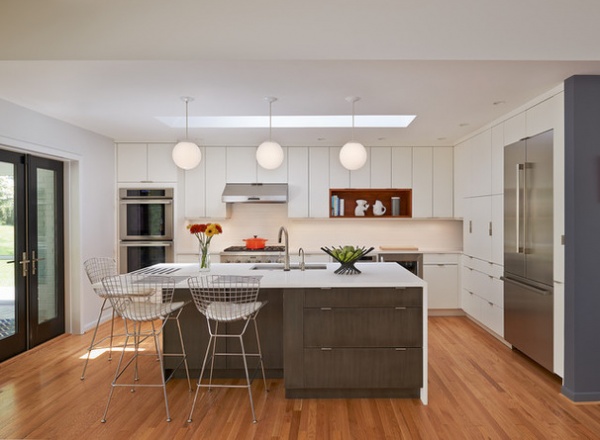
AFTER: The architect opened up the kitchen and added an island so that Owen, who does most of the cooking, could be part of the conversation with family and friends. The white lacquer and gray wood custom cabinetry has a sleek, modern look. New doors lead out to the backyard’s screened-in porch.
Doors: Western Window Systems
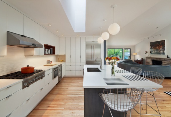
While Owen picked the appliance package, which includes a Thermador cooktop, hood, refrigerator, ovens and dishwasher, Bruning had input on the configuration of the island. “I didn’t want everyone sitting in a line on bar stools at the island,” she says. “Being able to put a stool around the corner is better for conversation.”
Countertops: Caesarstone; faucet: Brizo; globe lights: Progress Lighting
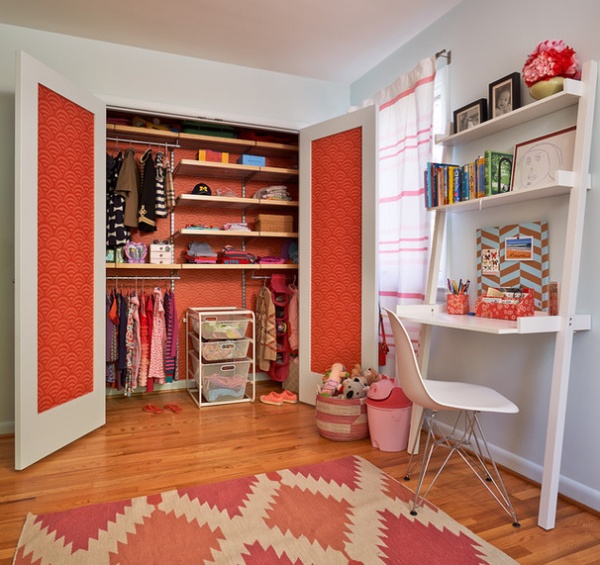
New doors and wallpaper add a bright touch to the bedroom of the couple’s young daughter.
Wallpaper: Serena & Lily; desk: The Container Store
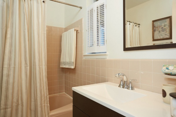
BEFORE: Pale peach was the color scheme in the original master bath.
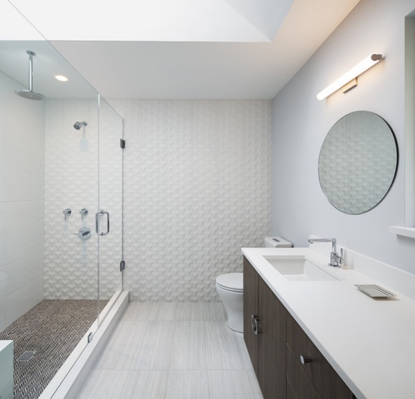
AFTER: Balodemas pushed the master bathroom out, stealing a bit of space from the kitchen to add a walk-in shower and dual-sink vanity, as well as to add a walk-in closet in the master bedroom. The existing window is now above the middle of the vanity. (You can see a bit of the windowsill and opening on the far right.) A new skylight illuminates the space.
Floor tile: Architectural Ceramics; shower and wall tile: Porcelanosa; faucet: Moen; shower fixtures: Graff
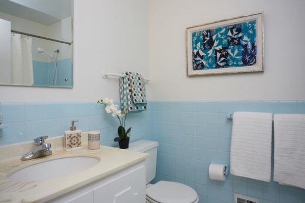
BEFORE: The hall bathroom was quaint but rather compact, with an old shower and tub combo just out of view.
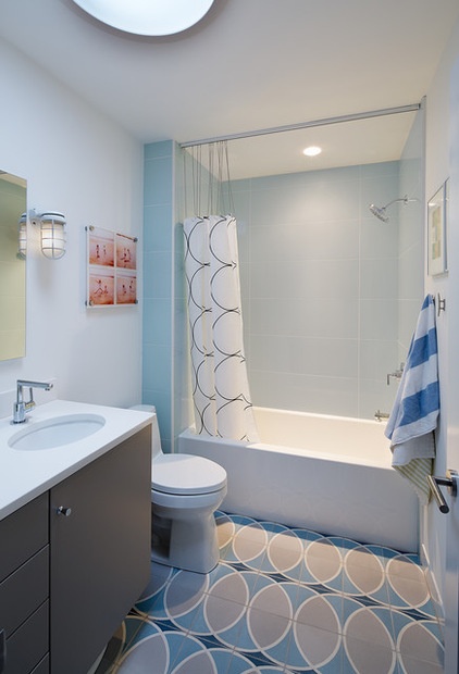
AFTER: The space was reconfigured for the children, underscored by playful tile flooring from Architectural Ceramics. A new Solatube daylighting device floods the bathroom with natural light.
Tub: Americh; faucet: Moen; sconce: Nuvo Lighting
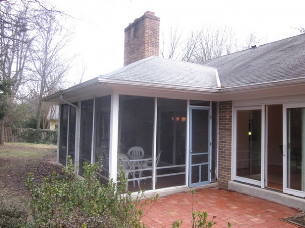
BEFORE: The wood framing of the screened-in porch overlooking the backyard had begun to warp and rot after 45 years, and the door didn’t shut properly.
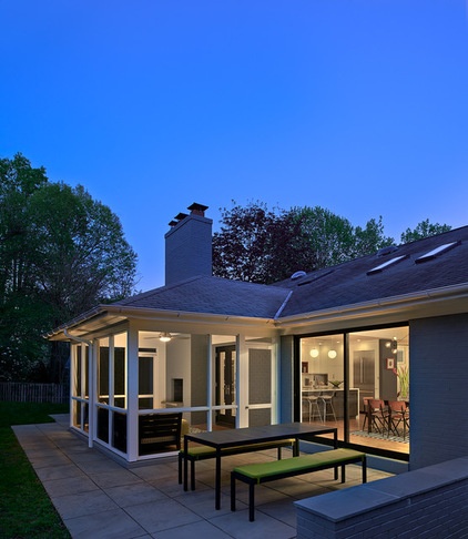
AFTER: The architect rebuilt the porch with new framing and screening, expanded the patio and added a garden wall that doubles as a serving ledge.
Table and benches: Crate & Barrel
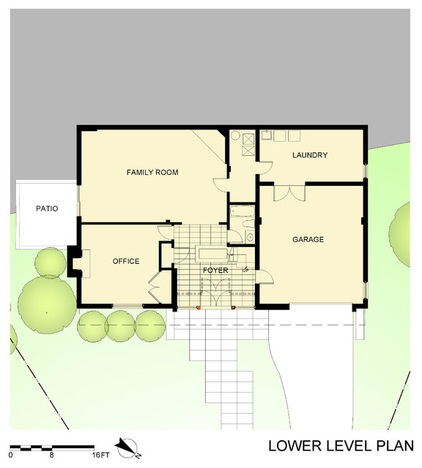
The lower-level floor plan.
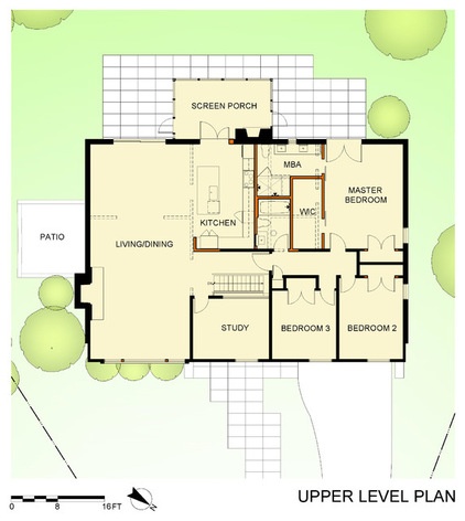
The upper-level floor plan. The dotted lines indicate the original walls that were removed. The red lines represent the new walls.
Browse more homes by style:
Small Homes | Colorful Homes | Eclectic Homes | Modern Homes | Contemporary Homes | Midcentury Homes | Ranch Homes | Traditional Homes | Barn Homes | Townhouses | Apartments | Lofts | Vacation Homes


