Kitchen of the Week: Modern Update for a Historic Farmhouse Kitchen
It’s ironic: Farmhouse kitchens from the mid-19th century often need a major renovation to get the farmhouse look that is so sought after today. This is because 1850s kitchens were often tiny, dark, strictly utilitarian and not very functional for modern life, as they predate electrification by 50 years or more. And previous renovations of these kitchens typically were done years ago and predate the farmhouse look that’s popular today.
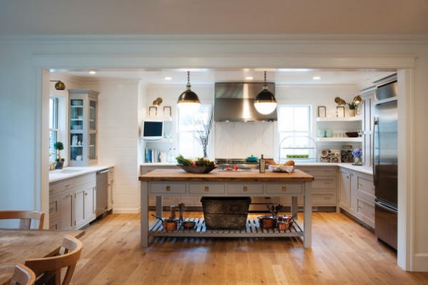
The owners of this Massachusetts kitchen were eager to update their mid-19th-century farmhouse to function better for their family’s lifestyle, but they didn’t want their home to lose its old-time charm. “The homeowner has impeccable taste, and she really drove the design,” designer Nina Archambault says. One part of the extensive renovation was moving the kitchen and opening it up to the dining room and family room. Traditional elements like Shaker cabinets and a beadboard ceiling keep the farmhouse feel, but are counterbalanced by modern elements, such as horizontal shiplap and floating shelves.
Photos by Crown Point Cabinetry
Kitchen at a Glance
Who lives here: A young family
Location: Outside Boston
Size: 225 square feet (21 square meters)
Designer: Nina Archambault of Crown Point Cabinetry
“The previous kitchen was very old and tired,” says Archambault, who helped the homeowner extensively with the cabinet, island and shelving designs, working with architect Marshall McLean’s plans. Before, the kitchen had been in the middle of the floor plan; the renovations pushed it to the edge of the house and opened it up to other rooms. The artisan finish on the new white oak planks gives them an older, unfinished look. These work seamlessly with the rest of the floors.
In this photo you can see the dining room in the foreground. The renovations included a small bump-out addition on the left side of the house, where the kitchen sink is. A large island in the center makes the U shape of the kitchen functional for this busy family.
Cabinets: Crown Point Cabinetry; cabinet paint: Dove Tale, Farrow & Ball
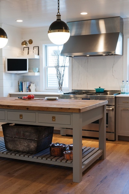
The homeowner has a large collection of copper pots she uses all the time, and she wanted a place to keep them handy where she also could enjoy looking at them. “In her previous home, they all hung from a pot rack, but it was better to keep things more open in here and not block the views from room to room,” Archambault says. The long slatted shelf beneath the island is just the spot.
The island’s reclaimed-wood top provides a balanced contrast to the elegant marble countertops and backsplash. It also brings a big dose of farmhouse style to the room.
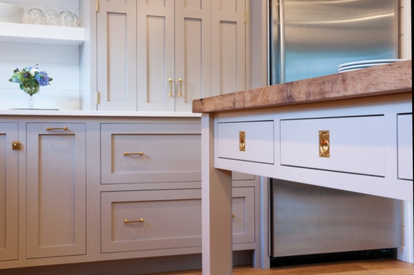
Unlacquered brass hardware, faucets and sconces add a warm antique feeling. Traditional handles, twist latches and pull-ring hardware accessorize the cabinetry and will patinate over time.
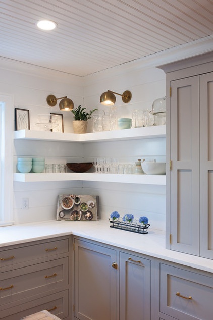
The well-composed arrangement of floating shelves and upper cabinets keeps a light, open look. “I always have a serious conversation with my clients before making this decision,” Archambault says. “You have to be really comfortable with your stuff being out all the time and not always looking photo shoot-ready.”
This was not an issue for this homeowner, as she has a relaxed style and wanted to enjoy looking at her things. They played around with different options but decided the clean lines of the bracketless floating shelves worked best. The shelves also paired perfectly with the horizontal shiplap on the walls. “She really wanted to incorporate some more modern twists while keeping the room connected to its farmhouse roots,” Archambault says.
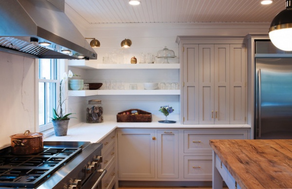
To make up for any lost space, the base cabinets work hard. “We used every inch of space very efficiently,” Archambault says. “There is all kinds of technology going on in those cabinets.” For instance, some drawers are equipped with pegs to hold plates. And there are inserts, pullout doors with adjustable shelves for spices and oils, roll-outs and a magic corner on the blind corner, and more.
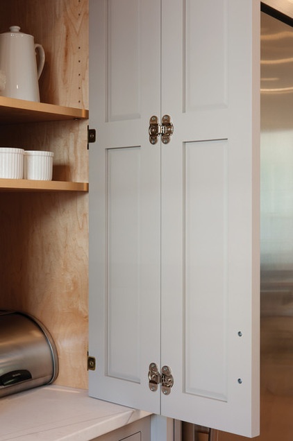
One of the few upper cabinets is this hutch, which was inspired by English cottage style and has a freestanding furniture look. “It’s a twist on the usual appliance garage,” Archambault says. The tall cabinets, outfitted with bifold doors, house a coffee and tea station, blender, toaster and small countertop microwave. All the electrical outlets are inside the hutch.
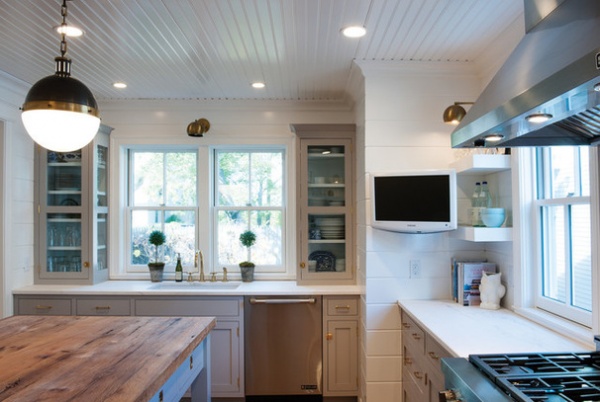
Glass cabinet fronts flank the two double-hung windows over the sink.
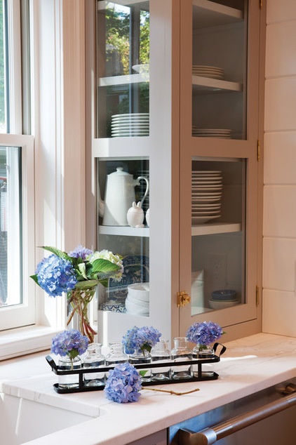
Not only are the fronts of the cabinets glass, but the sides are too. This allows the light from the window to pass through them completely.
Tip: Don’t overlook the design opportunity inside your cabinets. The interiors of these cabinets are painted a beautiful pale shade of blue.
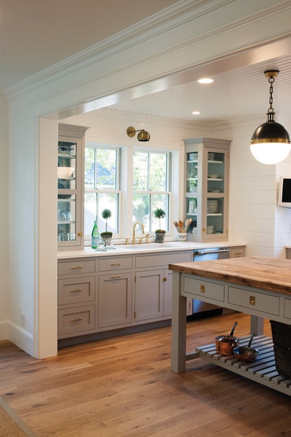
In addition to the recessed lights and large pendant lights over the island, brass globe sconces add a dollop of midcentury modern spirit. While the recessed lights are great for lighting up the whole room during serious kitchen work, the sconces are a wonderful way to add ambience at night. And foraging for a snack on a movie night doesn’t cause pupil dilation.
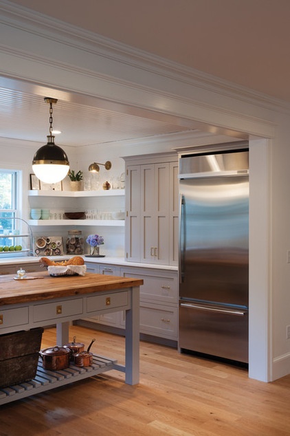
The Hicks pendant lights and wall sconces pick up on the unlacquered brass hardware, which will patinate over time. The new kitchen looks as if it’s been evolving over time as well.
Hicks pendant: Circa Lighting
Browse more Kitchens of the Week


