Throwback Kitchen Gains Countertop Space, Color and Smart Storage
Every time Ken and Debby Willett wanted to do dishes in their old kitchen, one of them had to wheel their portable dishwasher over to the sink in the middle of the workspace, hook a special attachment up to the faucet, turn the thing on and listen to loud rumbling noises until the cycle was done. “You couldn’t do anything in the kitchen while it was running,” Ken says. “But the worst thing was forgetting to turn on the water and the machine runs a whole cycle with no water. The heater then cooks all the food. I did that a few times.”
But that’s not the only thing that spawned a recent remodel. The lack of countertop space was frustrating. Hanging cabinets obstructed views to the adjacent dining area, and a wall separating the space from the living room gave it a dark and isolated feel.
They worked with architect Joel Fraley to take down the wall and some of the upper cabinets to open the kitchen to the other living areas. Then they stole space from an underused hallway linen closet to extend the storage space, and added new cabinets in a cheery yellow and new appliances. The latter included a spiffy new built-in dishwasher that was one of the quietest models they could find. “You can hardly tell it’s running,” Ken says.
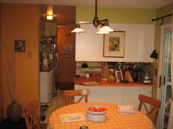
BEFORE: While parts of the kitchen had been somewhat redone over the years, most of it was original to the 1970s, such as the orange laminate countertops. The only prep space was on the peninsula between the kitchen and dining room, but with overhead cabinets, it made work frustrating. On the left you can see the dishwasher on wheels.
Photos by Aaron Ziltener Photography
Kitchen at a Glance
Location: Portland, Oregon
Who lives here: Ken Willett, a software development manager, and wife Debby, a nurse
Size: About 120 square feet (11.1 square meters)
Architect: Joel Fraley of Fraley + Company
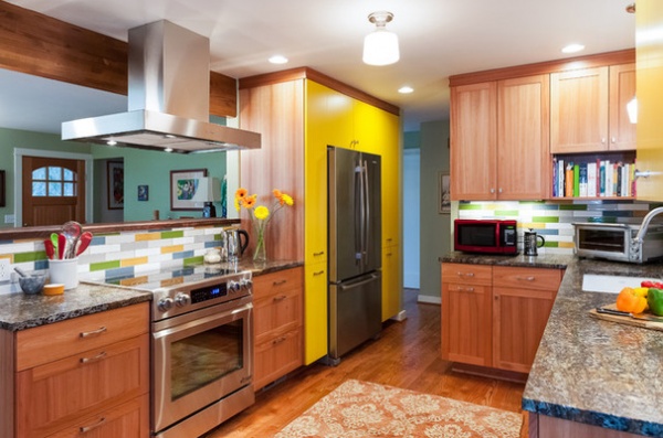
AFTER: Fraley gutted the old kitchen and added new cabinets, flooring, countertops and appliances. He moved the stove to the other side of the space to gain more countertop area.
The wall between the kitchen and the living room to the left was removed to open the space up. A glulam beam provides structural support.
Because the kitchen would be on display from the front door, adding color was important to the Willetts. They chose yellow for some of the cabinets after Fraley made some suggestions on colors that resonated with him while growing up in the 1970s. They also chose a more architectural range hood since it would be seen from both sides.
For the remaining cabinets, the Willetts wanted natural wood. They settled on lyptus, a tropical hardwood, because of its sustainability. When harvested, lyptus regenerates from its trunk, allowing it to be harvested multiple times. “It’s an unusual wood,” Fraley says.
They removed the vinyl flooring and extended the oak floors into the kitchen. “It makes the space feel bigger when one material is running throughout,” Fraley says.
Stove: Dacor; range hood: Roma, Zephyr; fridge: Jenn-Air; faucet: Talis S2, Hansgrohe
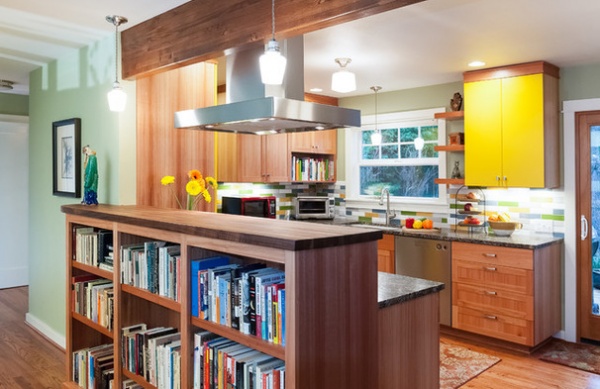
Removing the wall meant the Willetts had to take out two large bookcases, so Fraley made built-ins below a walnut bar top to store the couple’s collection of classic and modern fiction books.
What to Know Before You Tear Down That Wall
Dishwasher: Asko
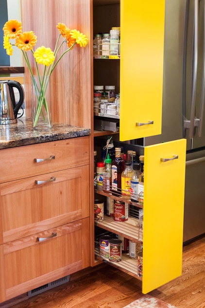
Removing the upper cabinets created the challenge of how to store spices and oils within reach of the stove without the Willetts’ having to bend down all the time. “It’s hard to find the right spice by bending over and just looking at the tops,” Ken says. Fraley came up with the idea of adding a narrow pullout food pantry on both sides of the refrigerator.
How to Add a Pullout Spice Rack
Pullout pantry: Richelieu
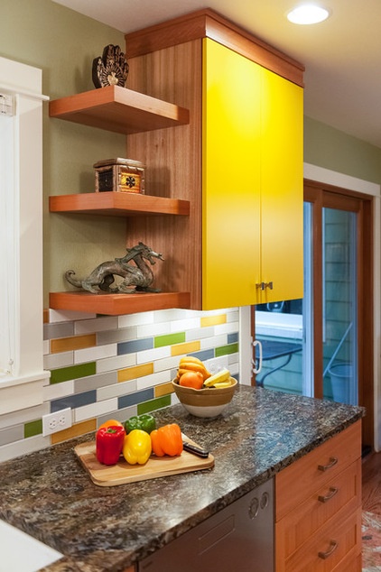
The backsplash is a random mix of white, ash gray, golden orange, blue and green glass tiles.
Tile: Clayhaus Ceramics
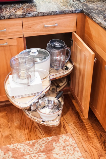
A swing-out storage piece makes the most of a corner cabinet.
Pullout shelving: LeMans, Richelieu
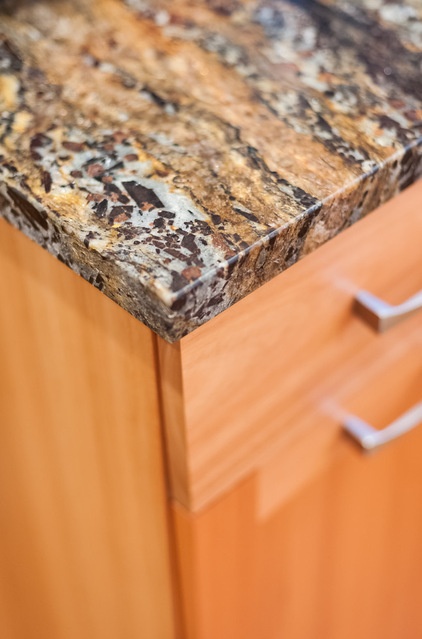
During a previous bathroom remodel, the couple had ended up with a unique piece of granite for the countertop and were open to finding something equally alluring for the kitchen. While out looking for countertop materials, Fraley called the Willetts and said, “You’re going to love this,” and sent a picture from his phone of a copper meteorite satin granite slab he’d come across. The Willetts thought it looked gorgeous and went to look at it in person. “We didn’t look at anything else after that,” Ken says.
The slab has a textured, not polished, finish. “It’s a very unusual slab, and I haven’t seen it again since,” Fraley says.
More:
See more kitchen stories
Find a kitchen pro near you


