Clean Lines and Soft Colors in a South London Kitchen
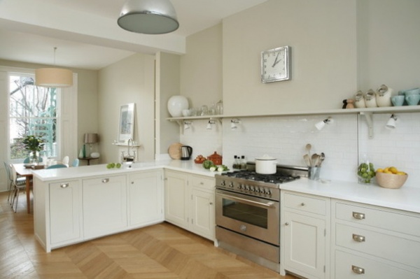
When she began thinking about installing a new kitchen, “crisp” and “clean” were the words the owner of this Victorian terraced house in South London came up with. “She was looking for a design that would feel softly industrial and contemporary, but was made with traditional materials,” says Tim Higham of Higham Furniture, who designed, made and installed the new kitchen. “We went for a simple framed Shaker kitchen. … It has cleaner lines than traditional Shaker cabinets, to keep the space looking airy.” Higham had to build around a chimney and a huge bay window at the front of the house, while also making sure the design made the most of the abundant natural light in the room. The result is a functional kitchen that, despite being loaded with storage, feels light and spacious.
Kitchen at a Glance
Who lives here: A couple and their 2 daughters
Location: Clapham, South London
Size: About 28 by 13 feet (8.5 by 4 meters)
Designer: Higham Furniture
“The owner didn’t want tall units on both sides of the room,” Higham says. “This is a really bright space with windows at either end that allow light to flood all the way through. If we had built in lots of cupboards, it would have felt cramped and enclosed.”
The solution was to go for simple shapes in pale tones, and to build just base units along one wall, working around existing features. “To accommodate the range cooker, we created deeper cabinets [on] either side of the chimney,” Higham says. “Now this run of units has a clean, continuous line.”
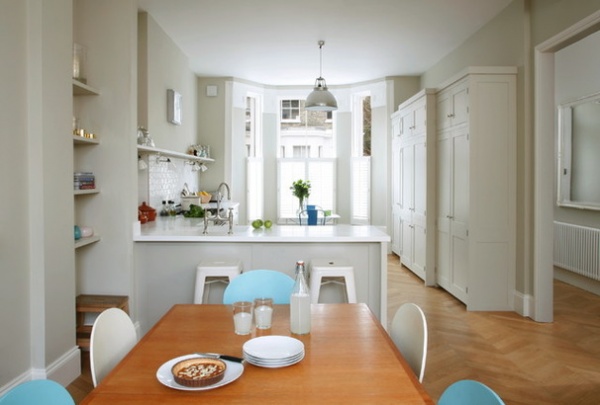
A shallow shelf above the run of base units balances the look and is ideal for displaying small items. A peninsula containing the sink divides the cooking area from the family dining space beyond.
Chevron solid oak flooring: Türgon
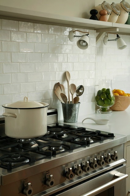
A backsplash of glossy white tiles behind the stainless steel range softly reflects the abundant daylight and contributes to the light, open feel. The work surface is pale, too, to enhance the effect. “We chose 40-millimeter Corian worktops in Glacier White, to create the clean, crisp look the owner wanted,” Higham says.
Range: Bertazzoni
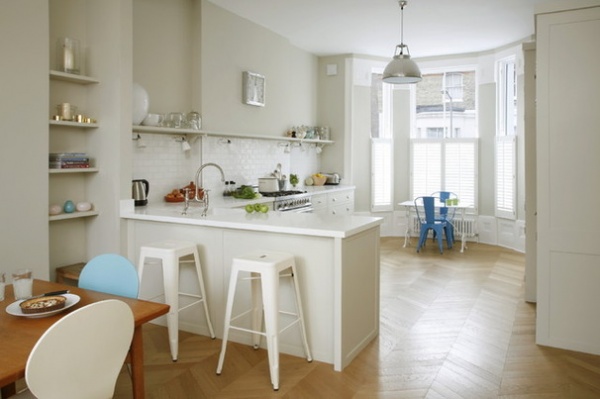
“To help the kitchen function as a flexible family space, we added casual seating at the peninsula,” Higham says. “Now it can work as a breakfast bar or somewhere for friends to perch while the owner is cooking.”
Tolix H stools: John Lewis
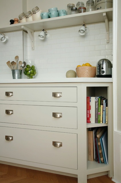
“We had to reduce the depth of the cabinets at this end, to fit alongside the angle of the bay window, so we created recessed bookshelves here,” Higham says. “The owner loves to cook, and this is a handy place for her books.”
Satin nickel cup handles: SDS London
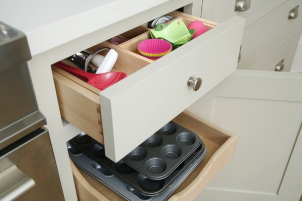
Storage was designed to suit specific items. This set of drawers contains a maple utensil tray in the top and space for cookware below. “The scooped and scalloped design is low at the front so you can see what’s inside, but taller at the back so things don’t drop off the end,” Higham says. “It works really well with cookware like baking trays.”
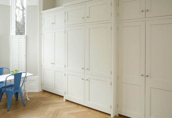
This tall bank of units contains two integrated fridge-freezers flanked on either side by substantial cabinets. To prevent the deep units from projecting across the window, Higham designed a breakfront for this run, with the central cabinet protruding slightly farther than those on either side. “This design creates enough space for the appliances without obstructing the window,” he says.
Cabinet paint: Shaded White in estate eggshell, Farrow & Ball; satin nickel knobs: Homebase
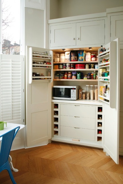
A pantry unit contains a microwave and custom storage for everything from spice jars to wine bottles. All the cabinets are made from a mix of lacquered and painted birch plywood, while the drawers, storage racks, pullout shelves and trays are solid maple.
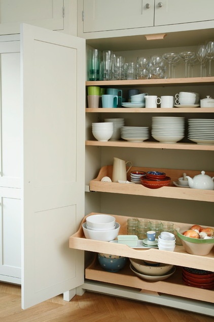
Scooped and scalloped drawers feature again in this beautiful dishware cabinet. “They pull out, so it’s easier to access everything,” Higham says. “But the raised back means there’s no risk of the objects falling down the back of the cabinet.”
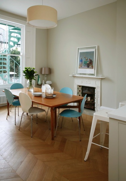
The dining space continues the kitchen’s light, pared-back aesthetic, but with a few pops of blue in accents. The owner chose a warm off-white for the walls, which helps the white details stand out without darkening the space overall.
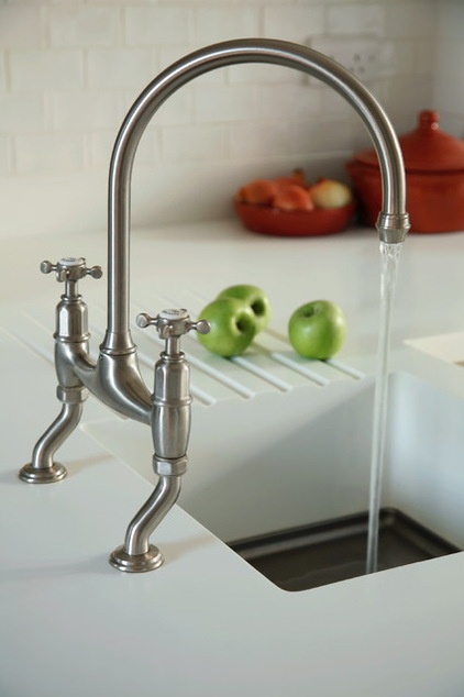
In the peninsula, the white Corian worktop contains a molded sink. “It’s a completely seamless part of the worktop, with no material change and no evidence of a join,” Higham says. The sink has a stainless steel bottom, which “is easier to keep clean and can be more robust.”
Ionian pewter-finish faucet: Perrin & Rowe
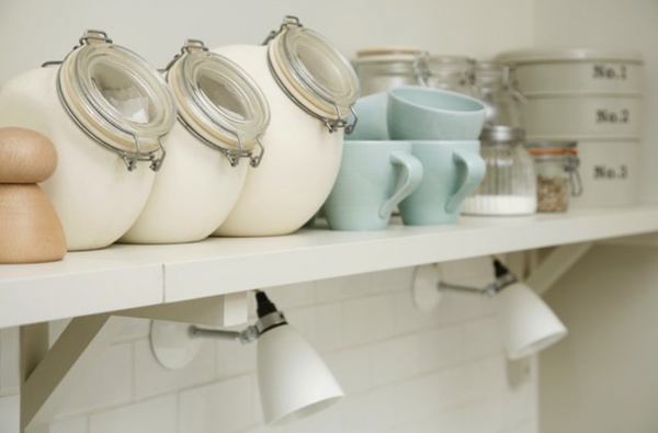
“The owner didn’t go for lots of ceiling lights,” Higham says. “Instead, small wall lights below the shelf provide task lighting.” The simple wooden shelves are painted in the same shade as the cabinets.
Hector wall lights: Original BTC; shelf paint: Shaded White in estate eggshell, Farrow & Ball
More:
Shaker Style Still a Cabinetry Classic
8 Top Hardware Styles for Shaker Kitchen Cabinets


