Houzz Tour: A California Country Home With a French Accent
http://decor-ideas.org 06/22/2015 21:13 Decor Ideas
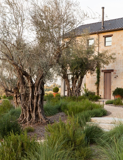
For people who love design and architecture, looking at some homes is something like gazing at rugged Greek isles, a rolling Western mountain range or the point where the white of Hawaiian sand meets the strong blue of the Pacific Ocean — they are just so beautiful it hurts. Of course, no human-made structure is a real match for the majesty of the natural world, but some of them come pretty close. A prime example is this California wine country home. It’s a new home, but its classic details, rustic materials and perfect siting make it a timeless beauty.
Photos by Lisa Romerein
Houzz at a Glance
Location: Healdsburg, Sonoma County, California
Designers: Jute Interior Design (interior design); ARC Design (architecture); Lucas & Lucas (landscape architecture)
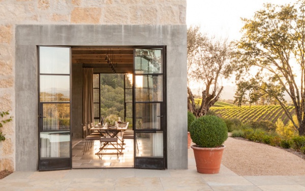
You would be hard-pressed to identify this as a new home just by looking at it. The stone walls, rustic wood doors and old olive trees growing in front (landscape architect Mike Lucas rescued the century-old Sevillano trees from a Fresno orchard that was being dismantled) make it seem timeless. The owners wanted it that way, and were inspired by the age-old farmhouses that dot the French countryside. Vineyards circling the property complete the picture.
“Inside, they used plaster walls and refused to put in things like recessed lighting,” says Alison Davin, the interior designer. “It appears to be a very old house that was updated over the years.”
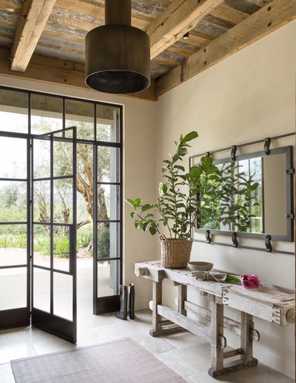
Some of those imagined updates would be the metal doors and windows. “There are definitely modern elements and clean lines that make the project feel more contemporary,” Davin says.
In the entry, clean meets craggy, with metal doors opening to a weathered worktable.
Console table: Garden Court Antiques; mirror: custom; light fixture: Urban Electric; striped leather rug: Holland & Sherry; wall treatment throughout: integral color plaster inspired by Farrow & Ball’s Skimming Stone, TCB Plaster Artisans
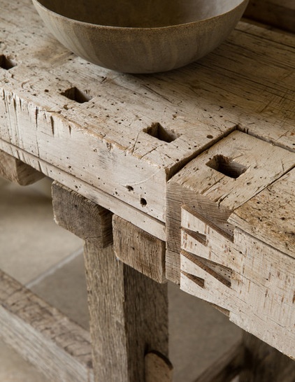
Davin doesn’t know exactly where the worktable was used previously, but it has clearly done some hard time and was not originally created for floral centerpieces. But, cleaned up and taken out of the context of a barn or workshop, its cuts, holes and grayed boards shine. “This light, bright space showcases what makes it beautiful,” Davin says. “In an old barn, you might not notice its details, but here you do.”
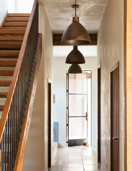
This entry, the one used most by the family, leads to an open mudroom equipped with a dog shower. A reclaimed-wood staircase leads up to the master bedroom.
Hand-troweled walls add to the old-world flavor.
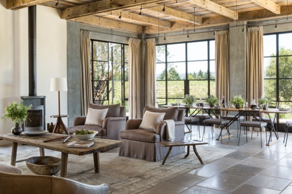
The front door, the one guests use, opens to the formal living room and dining room. In this context, we are talking country formal, not black tie. “We had long conversations about how they were going to use this space,” Davin says. “It’s a room where you would have a big meal, like Thanksgiving dinner, then gather on the sofa and chairs.”
Sofa: Tuscan, John Saladino Furniture; floor lamp: Finn, Rose Tarlow Melrose House; rug: Tony Kitz Gallery
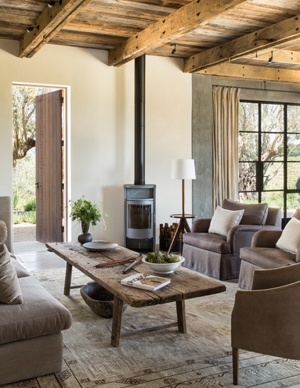
Given the new-house-as-old-house mentality, the team installed a woodstove. “In a really old country house, this is perhaps what you have for heat, not a fireplace,” Davin says.
Upholstered chairs are grouped around a weathered wood coffee table, which likely started life as a farm table. Davin had the legs shortened to make it fit for living room service.
Coffee table: Galerie Half; armchair: custom; woodstove: Gabo, Rais
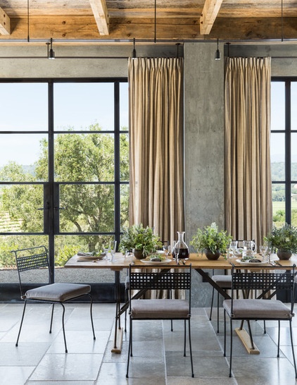
The other end of the room is dominated by a spectacular view, and Davin didn’t want the decor to get in the way. She selected a long draper’s-style table (a long, narrow table that would have been used for cutting fabric in turn-of-the-century suit factories). Its metal legs are there but not there. Same for the skinny metal chairs with perforated backs that don’t stop the eye on its way out to the hills and the grapevines that snake over them.
Table: Rose Uniacke; chairs: custom
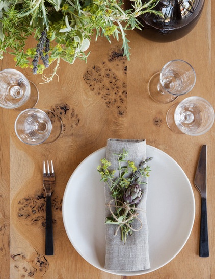
Davin likes the tabletop as much as the legs. “It’s an English burled wood called pippy oak,” she says. “To me, it feels light and airy.”
A side view shows how transparent the table can be.
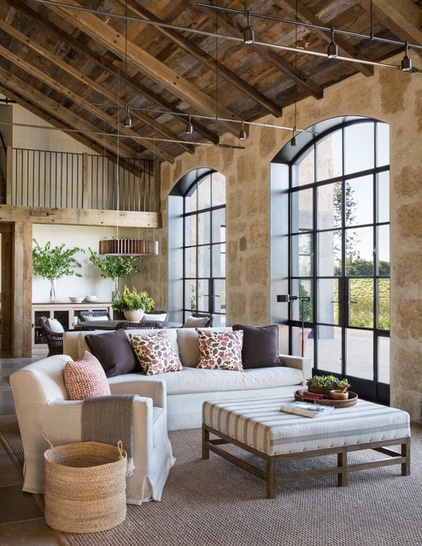
The other side of the house has a more casual living space. “This room opens up to the kitchen, and it’s their hangout space,” Davin says. “It also opens to the pool, barbecue and outdoor seating area.”
Here’s how casual the room really is: The ottoman is upholstered for beings both two- and four-legged. “The dog usually sleeps here,” she says. “Every bit of furniture and fabric in here is indestructible and dog friendly. In this space you have people coming in and out from the pool, and you don’t want to be worrying about where you sit or step.”
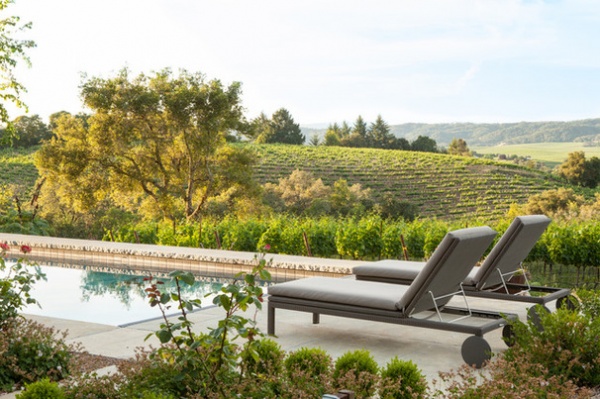
And with a view like this, who would want to cloud things with worry?
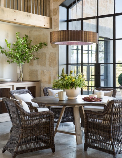
The other side of the room is a casual dining and coffee-drinking area.
Noah dining table: Lucca Antiques; Arbor armchairs: Janus et Cie; chandelier: Gear, McEwen Lighting Studio
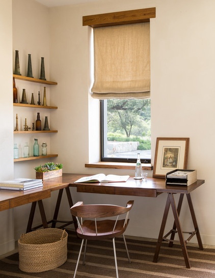
A small office is equipped with an L-shaped desk. Its pieces were custom designed by Davin, and she added a leather strap detail between the inverted V-shaped legs. The narrow shelves above one desktop are filled with the vintage nozzle and bottle collection of one of the owners. “I love these pieces,” Davin says. “It’s a collection that’s really unique, and the old nozzles have a really pretty patina.”
Desk: custom; Spindle side chair: BassamFellows
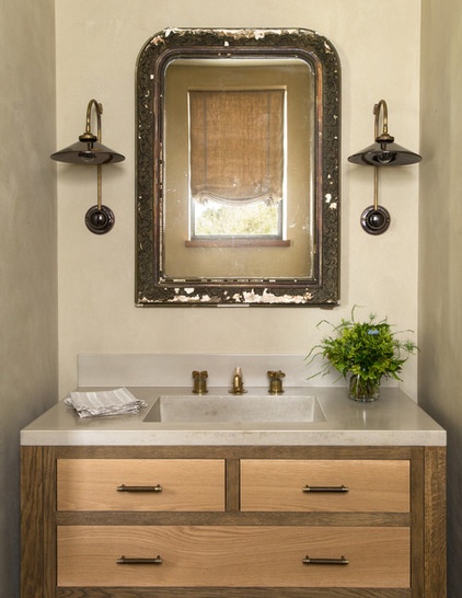
She brought patina into the nearby powder room too, installing a mirror over the sink that is showing its age, in a good way.
French Ceramic wall sconce: Hector Finch
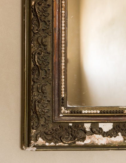
The gilded piece is now more bronze than gold toned, and bits of the finish are chipped away. “I like the juxtaposition of the old, decaying mirror and the modern concrete basin,” Davin says.
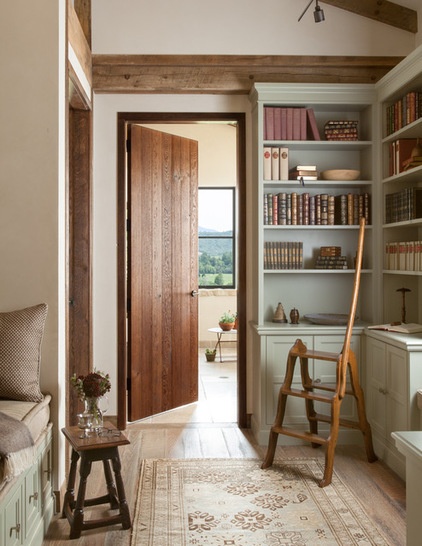
Upstairs, a pass-through to the master bedroom has become a small library space. There’s a built-in daybed, which makes a great place for comfortable reading. A vintage library ladder allows the owners access to the books on the uppermost shelves.
“This is the only place in the house we have color on the walls,” Davin says. “To me, it almost gives it a British feeling.”
Shelf paint: French Gray No. 18, Farrow & Ball; ladder: Antiquario
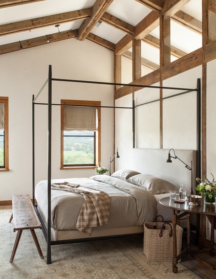
Comfortable reading was on Davin’s mind when she designed the custom bed — that’s why she included a padded headboard.
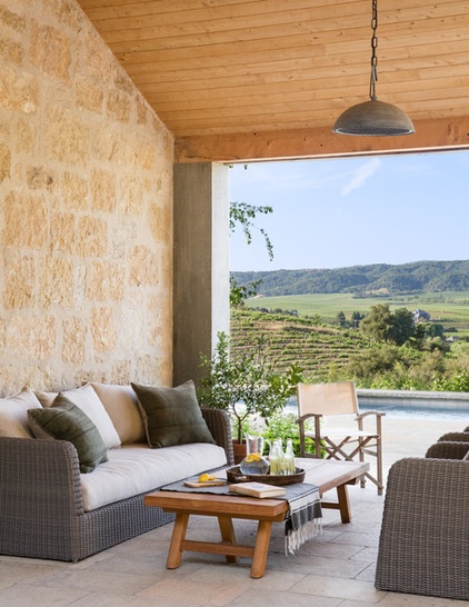
The outdoor areas are a front seat to the landscape.
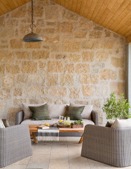
A comfortably appointed outdoor living room makes use of the texture of the stone walls.
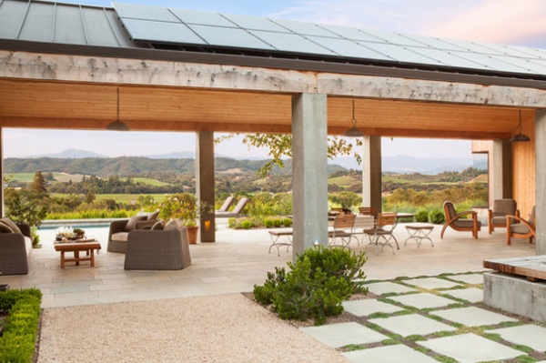
It’s in a covered breezeway that leads to the guesthouse. The long stretch is home to two seating areas and a dining table.
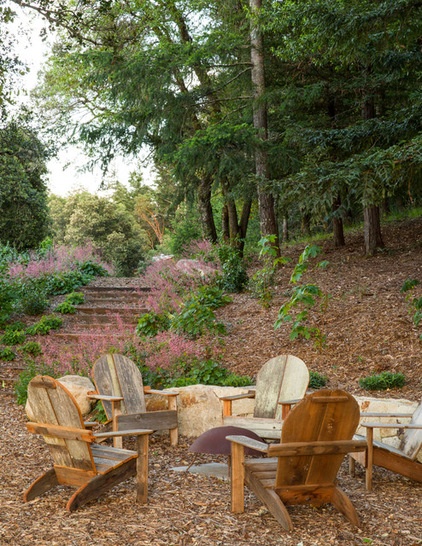
Another satellite seating area around a fire pit utilizes rustic chairs, and that’s one of the points. Nearly everything is weathered (what’s another dent or scratch?) or bulletproof. “This house is a good example of how you achieve interiors whose materials are nearly indestructible, but still have it feel pulled together and elegant at the same time,” Davin says.
Browse more homes by style:
Small Homes | Colorful Homes | Eclectic Homes | Modern Homes | Contemporary Homes | Midcentury Homes | Ranch Homes | Traditional Homes | Barn Homes | Townhouses | Apartments | Lofts | Vacation Homes
Related Articles Recommended


