How to Lose Some of Your Upper Kitchen Cabinets
http://decor-ideas.org 06/21/2015 10:33 Decor Ideas
“I tell my clients all the time, if you have a cabinet, you will fill it.” — Interior designer Kim Clements
I’ve never forgotten this gem Clements dropped during an interview, and I repeat it all the time. We’ve been trained to think we need to fill every bit of wall space in the kitchen with cabinetry because that’s the way we’ve always done it. But after seeing so many kitchens on Houzz break the typical “put an upper cabinet wherever you can fit one” rule, I’ve been giving certain upper cabinets in my kitchen the side eye and letting them know their days are numbered.
If you’re considering some upper cabinet removal, here is how to get by without them and some compelling reasons to do it.
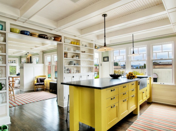
This is Clements’ kitchen, the one that got me thinking about upper cabinets in a whole new way. Instead of upper cabinets on every wall, she concentrated storage on interior walls, allowing her to keep a wall of windows and a more open space over her range.
Shallow open shelves and a hardworking island provide the storage she needs. She thought carefully about how each would function. For example, she sized large bin drawers along the bottom of the island to fit things like jumbo cartons of Goldfish within her kids’ reach.
A very small pantry (not shown) makes up for the rest. “Having a pantry that size means you can find storage for brooms, recycling bins and other things that tend to hijack the kitchen,” she says. She also stashes a library stool in there for hard-to-reach items on the high shelves in the kitchen.
Island paint: Castilian Gold, Pratt & Lambert; hardware: a mix of pieces from Rejuvenation and salvaged pieces; sink, counters: soapstone
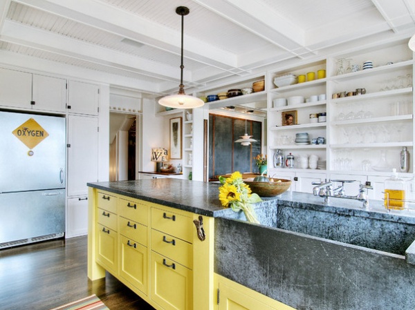
The shelf wall also adds character and function to her kitchen. “I really like that my guests can grab a glass for wine without feeling like they are snooping through my cabinets,” Clements says.
When planning for open shelves, she advises figuring out everything you’ll want to fit on them and measuring first. For instance, she wishes hers were 9 inches deep instead of 8, so she could place wine glasses two deep, one in front of the other, rather than having to stagger them.
On the highest shelves, she displays sentimental items like a beloved bird pitcher she received as a wedding gift. She stashes items like vases, flower frogs, candles and incense in the cabinets below. There’s also a liquor cabinet underneath the barware.
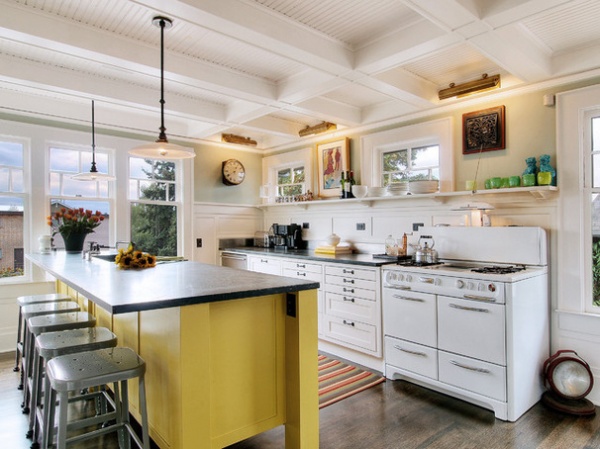
Clements has firm rules for prioritizing kitchen storage that will help guide you when you’re reorganizing your storage. You’ll have to do a thorough inventory and really think about how often you need every item (or if you use it at all).
1. If it’s something you use at least every other day, leave it out in the open. For example, everyday coffee cups, bowls and plates.
2. If it’s something you use once a week or less, have it in the kitchen but not taking up prime real estate in the most accessible areas.
3. If it’s something you use once a month, stash it in the pantry.
4. If you use it two times a year or less (turkey roaster, fondue pot, breadmaker), keep it in a storage area like the basement.
5. If you rarely use it and you don’t love it, donate it.
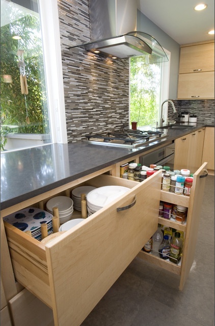
If you’re still not convinced you can free some wall space from upper cabinets, check out The 15 Most Popular Kitchen Storage Ideas on Houzz to see more storage solutions.
Now that you have some ideas about how to make up for the lost storage space, you may be wondering why you’d ever want to chuck some upper cabinets in the first place. What follows is a handful of kitchens that make me want to rip out some of mine, and why.
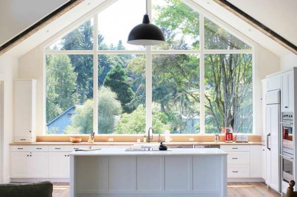
Open up a view. The dramatic impact of these large windows makes this kitchen a showstopper. They not only lend a treehouse feeling, they let the natural light flood into the space.
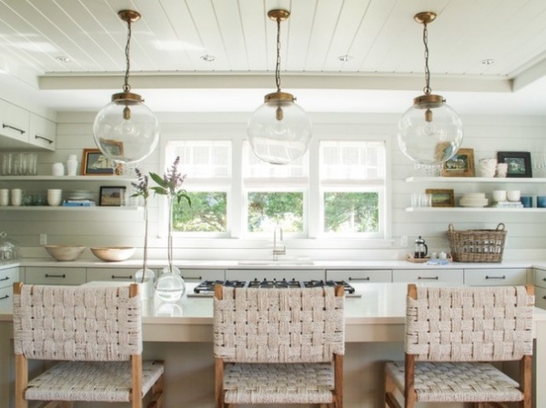
Give those seated at the island a lovely view. Perches at the counter are so popular in today’s kitchens. Instead of looking onto a bunch of bulky cabinets, people seated at this island can gaze out the windows to the trees and at lovely personal objects artfully arranged among the everyday glassware and china on the open shelves.
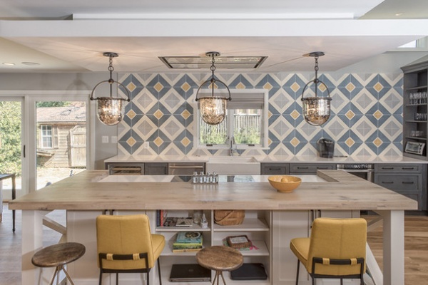
Make a powerful statement with a beautiful backsplash. This large-scale geometric pattern simply would not work if it were squashed between the counter and a bank of upper cabinets.
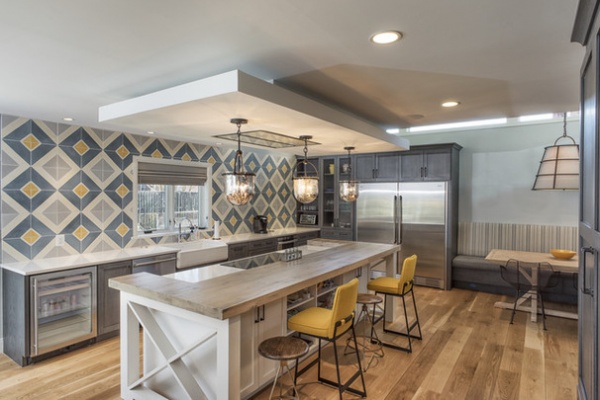
This kitchen is sneaky: It was simply reconfigured to eliminate the upper cabinets on the backsplash wall and stack them elsewhere. You can catch a glimpse of a bank of large cabinets in the right foreground of this photo and see more arranged around the refrigerator. There’s a hardworking island here too, where less-frequently used objects are stored in cabinets and on shelves in front of the counter stools.
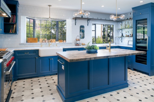
Similarly, architect Jeff Troyer created a smart layout that gives the beautiful windows in this kitchen the attention they deserve.
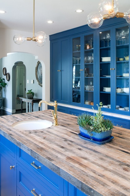
To pull this off, he built floor-to-ceiling cabinets along the back wall of the kitchen. They have a china cabinet look that suits the 1930s home.
Cabinet paint: Stiffkey Blue, Farrow & Ball
See the rest of this kitchen makeover
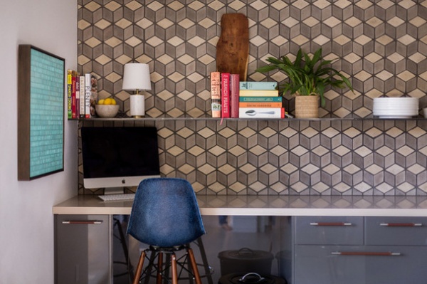
Create a lovely view from other rooms. With the popularity of open floor plans, many homeowners want their kitchens to look more like the other rooms. This portion of the kitchen can be seen from other rooms in the house and is the first thing you see as you approach it. Designer Ryan Brown made the most of that design opportunity by covering the wall in spectacular handmade concrete diamond-patterned tiles by Arto.
See the rest of this house
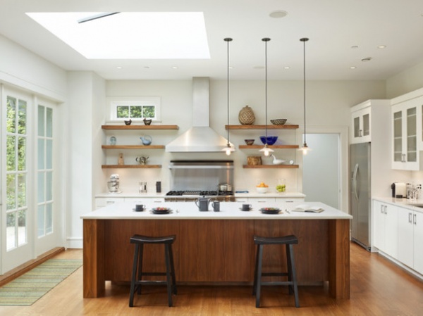
When dealing with today’s open plans, a lot of architects and interior designers tell me they don’t want the kitchen to look “too kitchen-y,” which is kind of funny, but I get it. For example, this kitchen is wide open to other rooms on the first floor. The shelves bring some living room style into the kitchen so that the view of it from the other rooms is pleasingly cohesive.
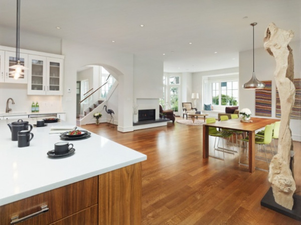
Here’s a look at just how open the kitchen is to the dining and living rooms.
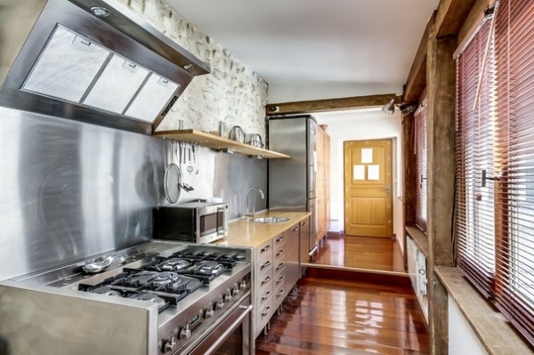
Make a narrow galley kitchen feel more expansive. This European kitchen is short on width but long on style. By stacking tall cabinets for storage at one end of the room, the designer avoided the closed-in feeling upper cabinets would have created.
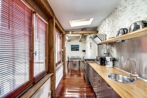
The design also preserved the wonderful old-world texture of the stone wall.
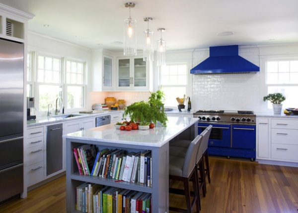
Let a large vent hood take up the upper real estate. In this stunning kitchen on the coast of Massachusetts, a striking cobalt blue range and vent hood make a strong impact. This kitchen is a great lesson in the value of white space.
Vent hood and range: BlueStar; backsplash tile: Waterworks
See the rest of this home
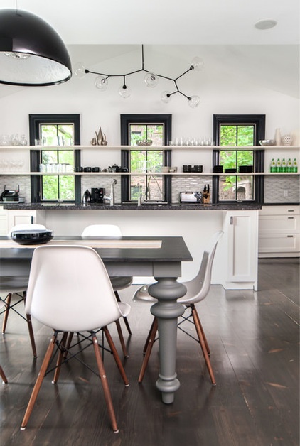
Make room for a stunning light fixture to shine. If you’re going to splurge on a piece of art like a Lindsey Adelman light fixture, you’ll want it to get the attention it deserves.
Window trim paint: Wrought Iron, Benjamin Moore
See the rest of this home
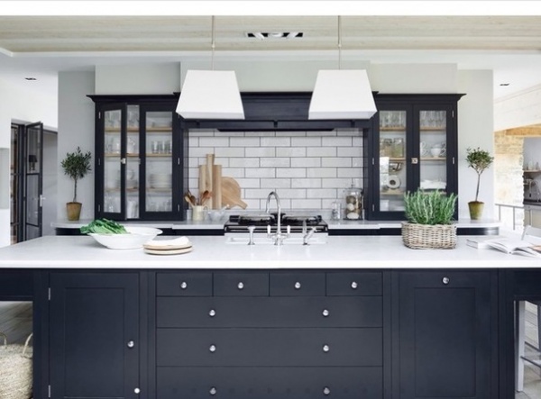
Of course, losing some upper cabinets is not for everyone. This is just food for thought if you’re planning a kitchen remodel, or want a smaller change that will make your kitchen feel new to you.
If you’re on the fence or hate the idea of having to dust open shelves, consider a few cabinets with clear glass doors. They’ll open up the view, maintain your current storage potential and lighten things up while closing out the dust.
More: Play the Trading Game With Kitchen Storage and Views
Related Articles Recommended


