Kitchen of the Week: Retro-Farmhouse Mash-Up
http://decor-ideas.org 06/19/2015 22:13 Decor Ideas
John Varady and Eve Hoyt weren’t interested in taking the standard white-tile-and-stainless-steel-appliance route when remodeling their turn-of-the-century farmhouse kitchen. They wanted color, creativity and retro-inspired designs to make a family space that felt unique and reflected their personalities. Interior designer Hannah Dee provided the game plan for a kitchen that put a premium on character.

Kitchen at a Glance
Who lives here: John Varady, Eve Hoyt and their 2 boys
Location: Glenside, a suburb of Philadelphia
Size: About 200 square feet (18.6 square meters)
Designer: Hannah Dee Interiors
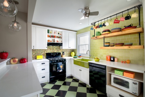
It all began with the green and black checkerboard floor. John and Eve wanted a kitchen that wouldn’t come across as brand spanking new or, more important, boring.
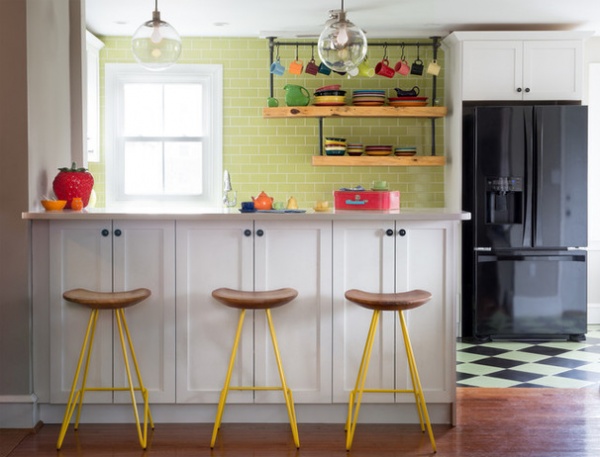
Dee describes the kitchen’s vibe as a “retro-farmhouse mash-up.” Color and personality were at the forefront of all the design decisions, but some practicality still came into play. For example, Eve thought that the inclusion of extra cabinets on the outside of the island might be unnecessary, but she was reassured by Dee. “I told her to trust me, you can never have too much storage.” It has been reported that the cabinets are now filled to the brim.
Stools: Perch, Anthropologie; pendant lights: Globe, West Elm; floor tile: Caesarstone in Pure White; subway tile: Key Lime, Daltile

Dee describes Varady and Hoyt as a very talented and creative couple. She calls Varady a bit of a mad scientist who’s always up to something, from growing hops in his garden that he uses for brewing beer to woodworking in his shop. Varady built the open shelving unit on the back wall of the kitchen using live-edge wood and metal pipes. The shelves display an assortment of brightly colored Fiestaware that Hoyt inherited from her grandmother. When Hoyt is not homeschooling her two sons, she is creating neon art for her company, Evening Neon.
Sink: Whitehaven in Greenwich Green, Jonathan Adler

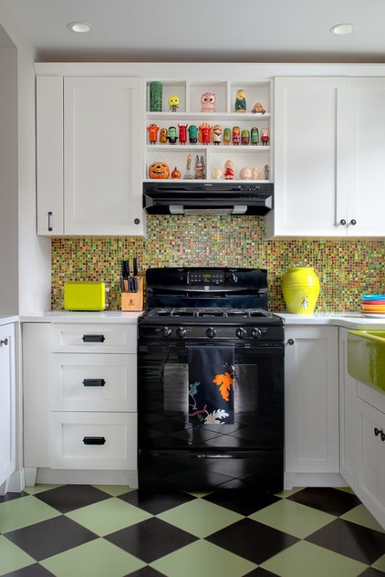
Black appliances were selected to complement the tile floor and to keep with the retro-inspired design. “Stainless steel appliances would have looked too sleek and out of place,” Dee says.
Dee designed custom display nooks in between the cabinets above the range so Hoyt could exhibit her collection of colorful and quirky figurines that she likes to call “its and bits.”
Over stainless steel appliances? Check out 14 reasons to get into color.

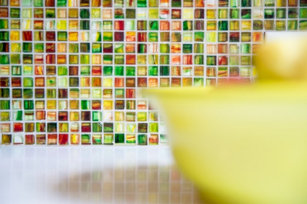
Dee says that no color was out of bounds, but keeping the kitchen from looking like a clown tent was a juggling act. The artistic glass tile shown above provides a rainbow of color behind the oven, therefore a solid green subway tile was used on the other wall to strike a balance.
Tile: Jewelstone, Hirsch Glass
More: Get ideas from other Kitchens of the Week
Related Articles Recommended


