Patience Pays Off for Owners Renovating Their Beach Condo
http://decor-ideas.org 06/18/2015 23:13 Decor Ideas
“This project took forever,” says interior designer Bridget McMullin. To be more exact, renovating this condo on the Jersey Shore took eight years. The owners, a couple from Pittsburgh, dreamed of the day they wouldn’t be using the Sea Isle City vacation home for rental income only, but could summer here themselves. Completing the renovations in phases over time helped them to reach that goal. And now many members of their extended family can enjoy overnight visits too. Here’s a look at their labor of love.
“After” photos by Rich McMullin
Houzz at a Glance
Who lives here: This is a vacation home of 2 lawyers from Pittsburgh. They often have many members of their family here at once; they have five grown children and lots of grandchildren.
Location: Sea Isle City, New Jersey
Size: 2,100 square feet (195 square meters); 4 bedrooms, 2.5 bathrooms
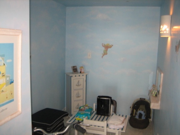
BEFORE: Back in the 1970s, someone had combined two condo units into this one. During that time, they covered up the main entry door to one of the units, leaving this small windowless waste of space in its place. Meanwhile, the main entrance to the house opened smack-dab into the kitchen, which was very awkward.
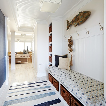
AFTER: Phase one included this foyer, the kitchen, the bathrooms and the master bedroom. McMullin opened the old entry back up and transformed the space into a hard-working foyer that set a beachy tone for the entire home. One of the homeowners found the wooden fish folk art piece seen here, which adds a whimsically welcoming touch.
Now there are plenty of hooks for coats and bags. Baskets for shoes and a bench are helping the entire family get in the habit of kicking off their shoes instead of tracking sand into the house. However, new habits take time, practice and a little nagging. McMullin reports that on a recent visit ,she saw that they were all still working on getting the shoes from the floor into the baskets.
Another significant design move worth noting is the new architectural elements — new applied moldings, columns, beadboard and soffits. These were key in delineating spaces after the chopped-up plan was opened up. “The ceilings were under 8 feet high, but we needed to make some of them smaller to make the whole space look bigger,” the designer explains. This was a tough argument to present to two lawyers, but the designer hung in there and won. The homeowners were glad she did; they wound up loving the beadboard so much that they added it to their bedroom after the construction was complete.
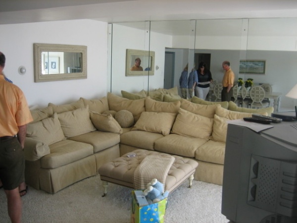
BEFORE: The last phase of the project was the main living space. Before they met with McMullin, the clients were sure they’d want to get rid of the dated wall of mirrors.
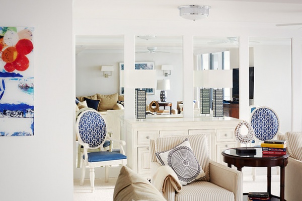
AFTER: However, the designer knew the mirrors were key to reflecting all of the great beach light. She added moldings around them to update the look and moved the large sofa across the room.
The soffits and beadboard not only look great and help delineate the spaces, but they are also functional in another way — they hide all of the new electrical work. Previously, the only way to run wires in the concrete building was via strips painted to match the walls and ceilings. Now they are cleverly concealed behind the beadboard and in the soffits.
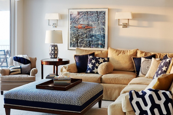
Getting the lighting scheme just right was a big part of the project. “If you don’t take care of lighting during a remodel, you’re foolish,” McMullin says. She used a mix of flush-mount lights, sconces, chandeliers, table lamps and floor lamps to suit different moods, times of the day and activities.
Another priority was reusing as much of the homeowners’ existing furniture as possible. “She had picked out good-quality pieces originally, and it was my obligation as a designer to reuse as much as I could,” McMullin says. She estimates that about 80 percent of the furniture in the project was already there. She had the sofa fixed up with higher-quality inserts and new upholstery, and added a mix of patterns with throw pillows.
“I knew navy was going to be a strong neutral throughout the home; it then became about how many different patterns could work, including star, chevron, Greek key, basket-weave and trellis patterns,” she says. Not wanting to spend a lot on pillows, she found almost all of them reasonably priced at Pottery Barn.
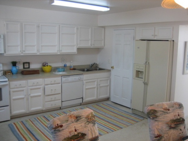
BEFORE: “The kitchen was adequate, but it was odd; it was a galley kitchen that wasn’t in a galley,” McMullin says. She needed to make better use of the space.
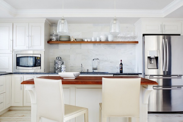
AFTER: Closing up the entry door helped with the kitchen layout (it used to be just beyond the left side of this photo). Moving the refrigerator and creating a zebrawood open shelf opened up the space and made it feel lighter than a bank of cabinets would have. The Arabescato marble backsplash recalls the textures of the beach.
The flooring keeps the room light as well. “The floors were an awesome surprise,” says McMullin, who admits she wasn’t so sure about them at first. “The whitewashed finish hides the sand much better than a regular floor would have.”
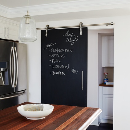
A new track door covered in chalkboard paint leads to the laundry room. Meanwhile, a new island creates a much more practical layout. The custom island top is warm walnut butcher block, made by The Grothouse Lumber Company in Pennsylvania.
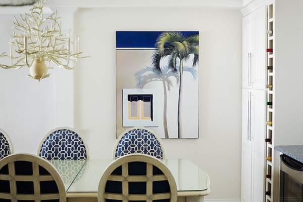
To create a larger living room, the designer took over the existing dining room and moved the dining table into the kitchen. This space is just behind the island. She was able to use the clients’ existing dining table and chairs. “Reupholstering them was not cheap, but they are really nice chairs and it was worth it,” she says.
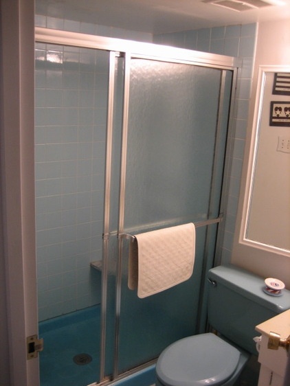
BEFORE: The existing bathrooms were cramped and dated.
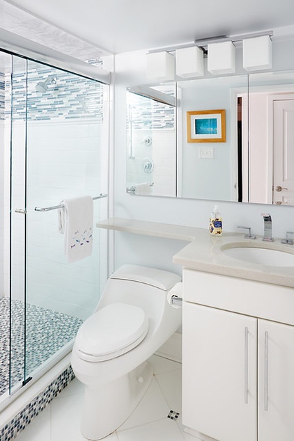
AFTER
Tip: Use hotel tricks when trying to make a bathroom larger. “The low-profile toilet leaves room for an additional shelf above it,” McMullin says. “It was also important that the medicine cabinets provide a lot of storage.”
“The homeowners basically wanted a ‘kid car wash’ for the grandkids,” the designer says. The shower is roomy enough for a bunch of the little ones to jump in and get the sand off after the beach. There are showerheads at either end.
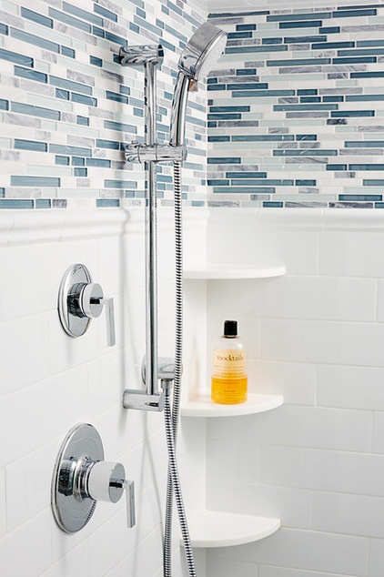
Solid white tile mixed with a watery blue glass mosaic creates a look that’s classic and refreshing.
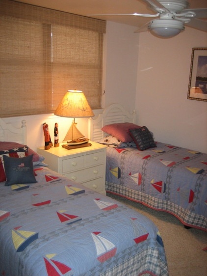
BEFORE: Renovating the guest rooms was the second phase of the project. The goal was to sleep as many people as possible. “I had to help my clients realize that this place is about being outside all of the time and using the bedrooms only for sleeping and stashing stuff,” McMullin says. She estimates that if the sofas are included, 16 people can comfortably sleep in the condo.
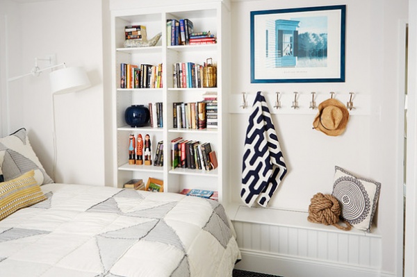
AFTER: Hooks for towels, bathing suits and beach cover-ups; built-in shelves; a bench; and a new built-in armoire provide space to put everything away. “One of the biggest ways to make a room feel bigger is to get things off the floor,” the designer says.
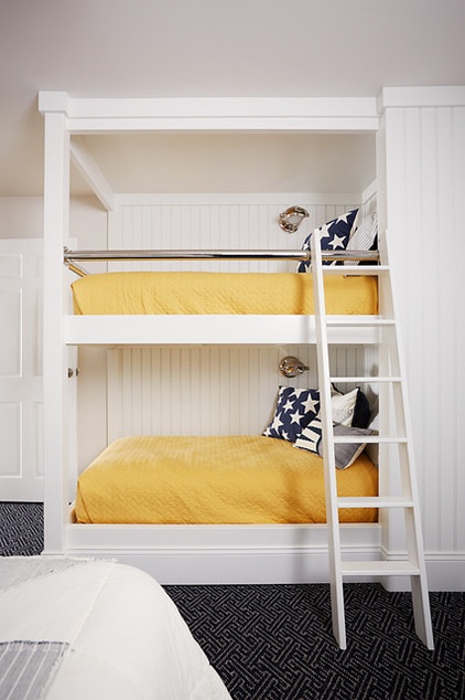
In the same room, McMullin removed a closet to make room for a bunk nook. Now the bedroom can sleep one whole family. Solid colors on the bedding and white wall make it feel bigger.
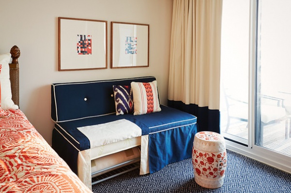
In another guest bedroom, a custom bench is a clever storage solution. Originally two cots were hidden inside two ottomans, but they weren’t really working in any of the rooms. McMullin decided to stash them in this bedroom so that they could be moved anywhere when there were extra guests.
New blackout curtains were sorely needed. “The sun is bright at 6 a.m., and it heats up the room very quickly,” McMullin says. “You cannot imagine how hard the air conditioner had to work when they didn’t have window treatments.”
She whipped the art together for the photo shoot herself, printing out color blocks, cutting them into strips and weaving them together. The clients loved them so much that they kept them. “It’s so important to wait to find the right pieces for places,” McMullin says. “If you can find a placeholder like this, you can wait to come across that just-right thing rather than going on a big panicked hunt.”
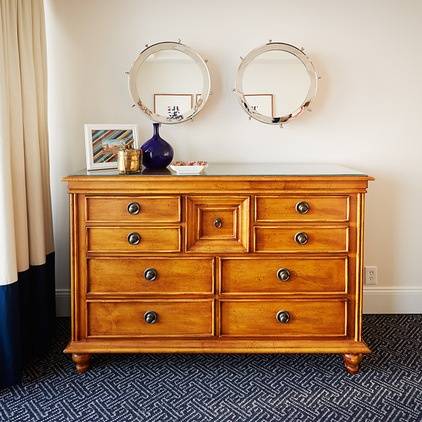
The homeowners already had this wooden chest; McMullin simply accessorized it with two porthole-shaped mirrors and a few thrift shop finds.
She used this Greek key carpeting in several rooms. “It is so forgiving,” she says. “And because it’s wool, it’s very durable, and the dark color hides stains.”
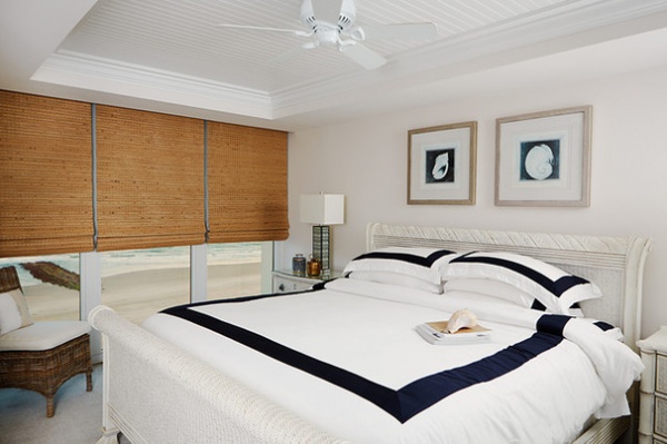
Like the guest room, the master bedroom didn’t have anything covering its floor-to-ceiling windows. “It would be boiling hot and bright in here first thing in the morning,” McMullin says. New wooden slat shades keep the room cool and dark while adding texture. The furniture is all the homeowners’, while the bedding, lamps and accessories are new.
Most of the bedding choices were made by the homeowner. “To get a starting point for a bedroom design, I often tell clients to find bedding that they like, and then we’ll work from there,” McMullin says.

BEFORE: The master bathroom was cramped.
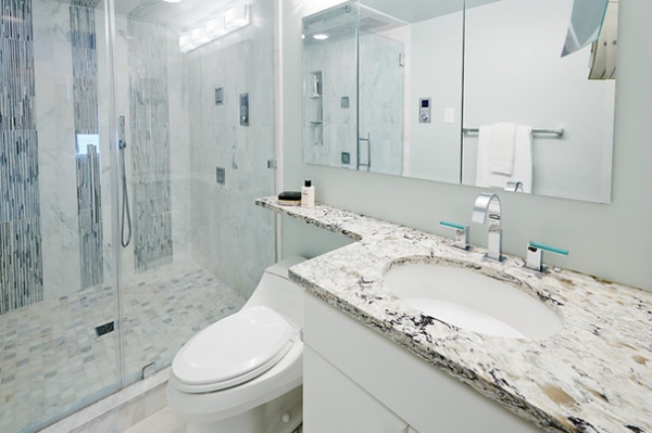
AFTER: McMullin added Cambria marble on the countertops and Arabescato marble mixed with a blue mosaic in the shower. “Using classic white gives a bathroom longevity,” she says. She also used the same space-saving tricks we saw in the guest bathroom.
Working together for so many years, the couple and the designer forged a strong friendship. “The clients really are the key to the whole design experience; they really drive the way it goes,” McMullin says. “My favorite part of the whole process is seeing them enjoy the design when it’s done.”
More:
Guest Rooms That Work
Guest Room Touches Anyone Can Do
Related Articles Recommended


