Room of the Day: A Small Bath With Big Ideas and a Bold Look
http://decor-ideas.org 06/17/2015 21:13 Decor Ideas
Before the remodel of this home, this small, basement bathroom seemed to be an afterthought. “Previous owners had done the bare minimum for this room,” says interior designer Rachel Seldin of Seldin Design Studios. “And it was a watered-down brown color, so it was pretty grim and uninspiring.” Since the bath is adjacent to a playroom, it would obviously be kid territory, so Seldin knew uninspiring wouldn’t do. She transformed the awkward space with strong doses of color and pattern.
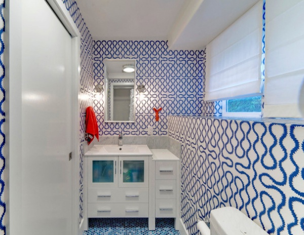
Room at a Glance
Who uses this room: A boy and a girl
Location: Mill Valley, California
Size: 40 square feet (3.7 square meters)
This room is shoehorned in the basement, and Seldin was charged with giving it a cosmetic makeover. Besides the small size and the muddy color palette, the first things she noticed were the room’s angles. The foundation had created a ledge that ran across the room from the floor to the bottom of the windows, and a soffit made for a unique angular ceiling plane. The designer decided a highly patterned, brightly colored wallpaper could take care of the major problems.
“I couldn’t disagree more with designers who think patterned wallpapers or dark wall colors make a room feel too busy or smaller,” she says. “In this room I think the pattern blurs the boundaries of the room and hides the angles.”
She made the wallpaper bathroom-ready by having it coated with a polyurethane sealer to protect it from steam and spills.
Wallpaper: Squiggle by Vivienne Westwood, Cole & Son
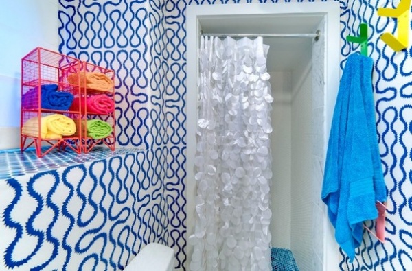
Kids use this room, and where you have children, you generally have colorful accessories like toothbrushes, barrettes and hair elastics. To keep the room from looking too cluttered when these elements were introduced, Seldin accented it with pops of bright colors: orange, yellow, green and pink.
Towel rack: Cost Plus World Market; towel hooks: Room & Board
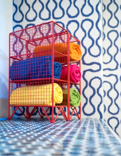
A storage cubby is orange-red, and the hooks around the room are an array of colors.
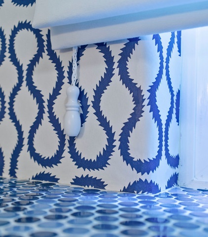
By tiling the ledge created by the foundation, the designer provided something of a secondary countertop. “I have never liked putting things on a painted surface,” she says. “The tile makes it no problem to put bottles or damp towels here.”
Tile: Ceramic Tile Design
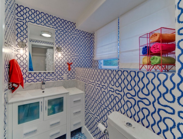
Put together, the new elements bring fluid movement and a whimsical nature to the room. “I think it fits the personality of the kids who use it,” Seldin says.
See more Rooms of the Day
Related Articles Recommended


