Family Kitchen Smartens Up With a New Ecofriendly Renovation
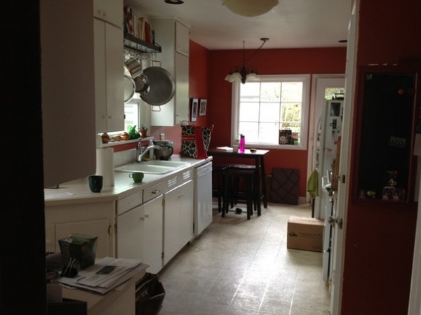
This family’s kitchen was not living up to their style, their lifestyle or their ethos. Basically a wide galley, it was dark and dated, and because it wasn’t laid out in the most efficient way, it lacked storage and counter space. As one of the homeowners is the CEO of a company that helps homeowners find and finance sustainable solutions for their homes, making sure the kitchen was ecofriendlier and healthier was a priority.
Also a priority was finding space so the homeowners’ two elementary school-aged children could spend time in the kitchen with them. They enlisted the professionals at Encircle Design and Build to help them make the most of the space and create a stronger connection to the adjacent dining room. Now the family has a smart, healthy and sustainable design that will last for years to come.
Photos by Michelle Ruber
Kitchen at a Glance
Who lives here: A couple and their 2 young children. She works for The Chalkboard Project, a nonprofit educational foundation, and he is the CEO of Clean Energy Works
Location: Portland, Oregon
Size: 350 square feet (32 square meters)
BEFORE: the kitchen was dated and didn’t flow very well with the rest of the house. The goals were to make it family friendlier, to use local and sustainable materials, to give it a stronger connection to the dining room (this photo was taken from the dining room) and to give it a stronger connection to the backyard.
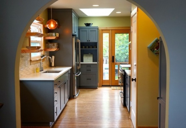
AFTER: The designers took note of an existing beautiful arch between the living room and the dining room, and repeated the architecture in a new opening between the dining room and the kitchen. This created a wider opening and a more cohesive flow through the house, forging a strong connection between the two spaces while at the same time defining them as separate rooms.
They also ripped up the existing linoleum on the kitchen floor and replaced it with oak floors, stained with a water-based finish to match the oak flooring in the other rooms on the first floor. “The floors are very durable and will last a long time,” says Michelle Ruber, a partner at Encircle Design and Build. Finding long-lasting materials that won’t need to be replaced was part of making the design sustainable. The recessed lights are LEDs. The designers also added lots of insulation to the walls during the remodel to create a tighter envelope.
Another important green building move was taking care of the construction waste responsibly. “We donated the appliances, lights, sink and faucet to a local nonprofit homeless shelter,” Ruber says. “Some of the salvageable wood trim pieces we donated to another nonprofit, and the other items that couldn’t be reused were recycled.”
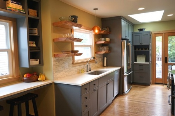
For the new layout, they didn’t have to shuffle too much around, but made some smart moves that created more work and storage space. By moving the refrigerator across the room, they were able to make the countertops on either side of the range 30 inches wide instead of the original 12. The new stove is an induction range that won’t burn little fingers.
By replacing the window on the back with a new glass door with a sidelight, they were able to add the corner cabinets and a countertop that wraps around the corner. There is a tall lazy Susan in the corner cabinet there. They also added a skylight to brighten the room.
The children had always hung out in the kitchen at the tall table seen in the “before” photo, and the couple wanted to make sure their kids still had a space in the room. The counter in the foreground is a homework and drawing station. There are USB plugs in the first shelves on either side for charging stations, and there’s a plug up top for the family’s Sonos system. The plastic bin you see on the shelves is full of crayons.
Wall paint: Leaf 01, Colorhouse; cabinet paint: Amherst Gray, Benjamin Moore
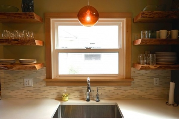
Gorgeous local live-edge Douglas fir shelves flank the walls on either side of the sink, keeping the room lighter and more open. They came from a local reclaimed-wood company called Salvage Works. To make the floating shelves secure, the team drilled holes into them and then slipped them over rebar attached to the wall’s studs. “It’s a very precise process, but they are super stable and will never tilt,” Ruber says.
A local company, Cement Elegance, crafted the concrete countertops. The makers create a custom template and pour the concrete at their facility, then bring it to the site. “I love these guys; they do concrete best,” Ruber says. “Their work never chips or cracks or gets discolored, and it’s so lovely; it’s smooth and looks leathery.”
Pendant light: Isla Amber, LBL Lighting
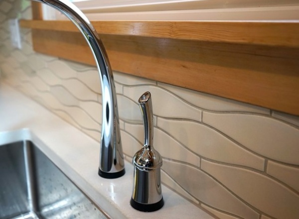
Fir trim around the room picks up on the live-edge shelves.
Backsplash tile: PF-EOSM Small Elongated Ogee, Pratt and Larson; faucet: Delta Touch20
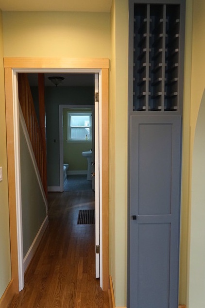
The designers made the most of this narrow space by adding a tall broom closet and wine rack.
Cabinet hardware: Top Knobs
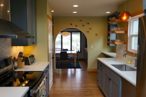
“We always give our clients a thank-you gift that fits their style when we’re done,” Ruber says. “We usually make something or find something handmade locally.” During an open-house party to celebrate the new space, she and her husband and business partner, Klaas de Jonge, attached the red and orange hand-cast porcelain discs you see dotting the wall around the arch. “They are kind of like half eggshells — we put some air plants in them, and when we’ve been back to visit we’ll see that the kids have stuck little toy figures in them,” she says.
Disks: via local shop Digs Inside and Out
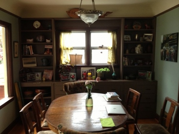
BEFORE: The dining room did not have a strong connection to the kitchen. They wanted to blend a formal dining room with a more casual-feeling eat-in kitchen.
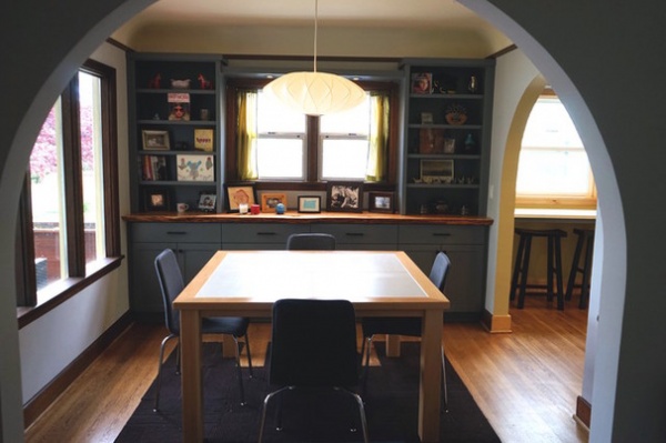
AFTER: A new table custom designed and built by Ruber and her husband has the right proportions for when it’s just the family of four eating together, and fits eight people comfortably at dinner parties. The table is Douglas fir with a porcelain tile top that’s very durable and can take abuse from children.
Light fixture: George Nelson Saucer Criss Cross
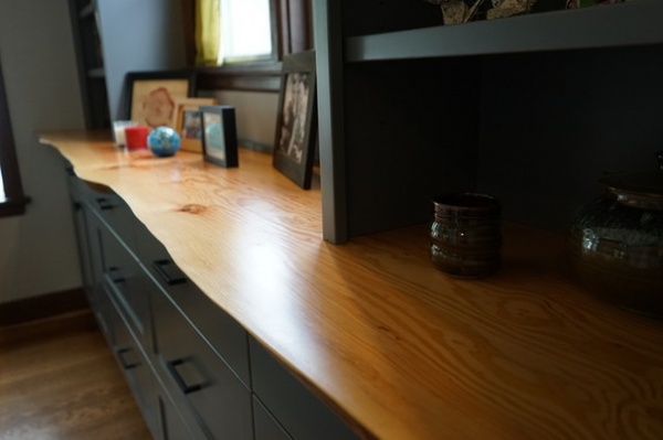
New built-ins keep all of the storage and offer up all of the display space of the old ones, but have a more streamlined look that connects the design to the cabinets in the kitchen. Another live-edge piece of wood is a stunning detail. The beautiful remodel is designed to function well for many years.
See Houzz guides to ecofriendly kitchen design


