My Houzz: An Animated Home for Kids — and Kids at Heart
http://decor-ideas.org 06/16/2015 00:13 Decor Ideas
This is a home of ordered objects, happy inhabitants and an emporium of comic collections and tiny toys. The instant you walk into the two-bedroom apartment in Five Dock, a suburb of Sydney, Australia, you can feel the love. Rochelle and Wojciech Wawrzyniak live here with their two sons, Roman and Adrian, and have used their design expertise and shared love of comic books to bring their abode to life. Rochelle is an art director, and Wojciech is an industrial designer. Together they have used their skills to create unique decor that is both wonderfully technical and beautiful.
Houzz at a Glance
Who lives here: Rochelle and Wojciech Wawrzyniak and their sons, Roman, 5, and Adrian, 2
Location: Five Dock, Sydney, Australia
Size: 1,098 square feet (102 square meters); 2 bedrooms, 1 bathroom
The couple stumbled across their home five years ago when Rochelle was pregnant with their first child. They were renters at the time and wanted to buy. So when this property in Five Dock came on the market, the couple jumped at it. Wojciech had grown up in the suburb and knew it well; they also liked the feel of the space. “It’s on the quiet side of the building. There’s only one common wall with our neighbor and lots of natural light,” Rochelle says.
Rochelle and Wojciech are responsible for the clever decor. “We’re designers, so as for the design team, you’re looking at them,” she says. The two met at university while Rochelle was studying visual communications and Wojciech was finishing his degree in industrial design.
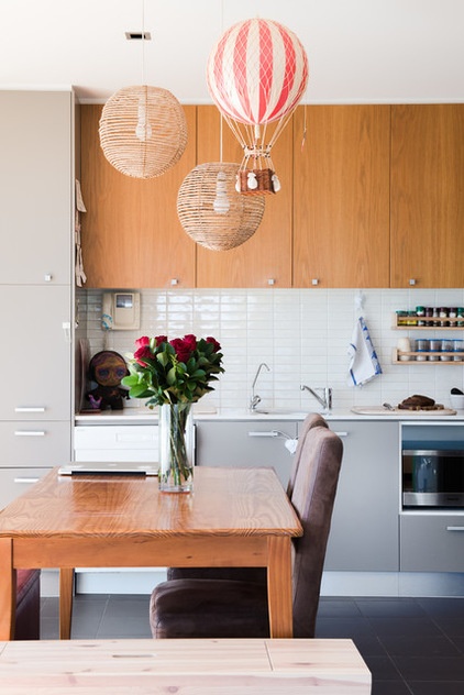
One of Rochelle’s favorite features is the recurring circular motif. You can see some examples in the kitchen via the hot-air balloon and round pendant lights, and throughout the home in artwork.
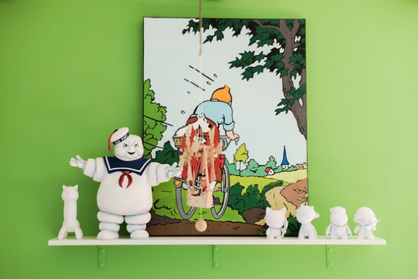
Rochelle and Wojciech share a love of bold colors, comics and vinyl toys, and these are found around the home. “I think a place will always be happy with bold colors,” she says.
Rochelle painted this Tintin scene for Wojciech as a birthday present. “We both love Tintin, so when we got married, our collection doubled!” she says.
Wall paint: Fluoro Green, Dulux
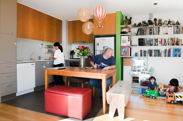
With two little boys running around, potential accidents lurk around every corner. To avoid them, Rochelle and Wojciech keep all of their intricate decorations above waist level, so they are out of reach of their sons. Below the waist, the furnishings are simple and sturdy.
Rochelle notes that this design plan allows the kids to be kids without the risk of breaking anything. “I would want them to remember their first home as something fun and free, without having to tiptoe around Mum and Dad’s stuff,” she says.
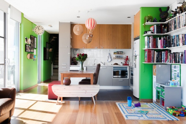
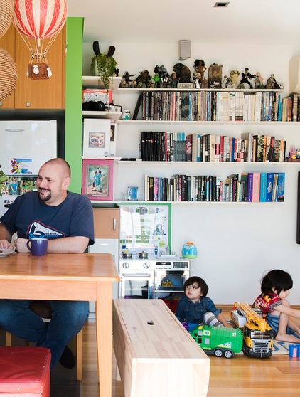
The open-plan living and dining area is spacious and makes the most of the natural light that streams through the windows. With two energetic boys exploring the house, it makes it easy for the couple to keep an eye on what they’re up to.
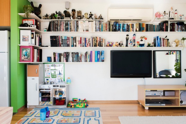
Rochelle says it’s also where most of the fun takes place: “The boys love helping in the kitchen as well as pretending in their own kitchen.”
The secondhand toy kitchen is a project the couple worked on together as a gift to the boys. It was previously owned and loved by two little girls, and Rochelle and Wojciech customized it to be a model of their own kitchen. They matched paint swatches and even designed the chrome details with Adobe Illustrator and laser-cut them into dual-layered acrylic.
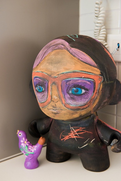
The parents also share toys with their boys. Wojciech made this chalkboard Munny for Rochelle as a present, and the four of them regularly erase and draw new designs on it.
At the time, the cost of purchasing and shipping the figure from the U.S. was too expensive, so Wojciech used his resources to make one. He downloaded the file, 3D-printed the figure, and then sanded and painted it with chalkboard paint. “Being able to wash off the designs to start again makes it a gift that keeps on giving,” Rochelle says. “I often use it for seasonal celebrations — for instance, last Christmas I drew Santa on it.”
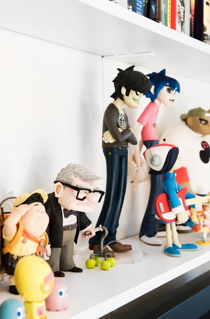
The figurines that line the bookshelves are mementos from a trip to Los Angeles, where the family visited Kidrobot. “We were taking photos in there like it was a tourist destination,” Rochelle says. “The staff were really friendly; they gave my 1-year-old a free toy just for being cute!”
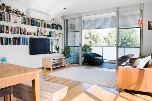
While there’s no denying the two are collectors, Rochelle says it’s important to them that their home is organized, as apartment living can be tightly packed. They had to adopt minimalist tendencies to make room for their growing family.
To do this, they gave away their two-seater couch after the arrival of Roman, and their large ottoman when Adrian was born. This created more room in the living area. “My sons can see climbing and self-launching potential in any piece of furniture. Also, having to store less makes tidying up so much easier,” Rochelle says.
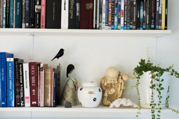
Everything has its place in the home, and the process of elimination comes down to one simple rule: “If it doesn’t have much function, we’d better love the way it looks,” Rochelle says.
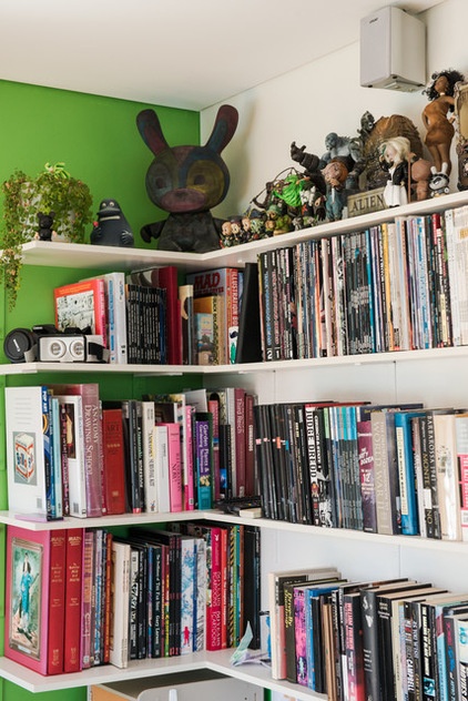
Rochelle uses the example of her sons’ toy collection to explain this rule of thumb. “If they get a new toy, they have to reevaluate what to do with an old toy,” she says. “It teaches them compassion and self-control when selecting which of their toys go and which stay.” She adds that explaining the role of charities helps them to understand that they are helping someone as opposed to losing a toy.
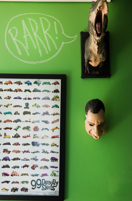
As an art director, Rochelle uses her critical eye to direct her own home’s aesthetic. “Sometimes wars are waged over small things, like hanging wall art,” she says.
Rochelle says the wall art is a compromise between Wojciech’s movie mania and their shared love of comic books. The eye is always drawn to some detail in the room, and the line is blurred between where the kids’ toys end and the couple’s begins.
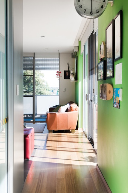
The home has undergone minor renovations, but with the help of Wojciech’s dad, who’s a builder, the couple have managed to keep costs down.
The original gunmetal carpet was replaced with floorboards. They also installed new pendant lights, and replaced the glass in the shower and the showerhead. The wall colors were also changed from light gray to Antique White USA, fluorescent green and deep purple.
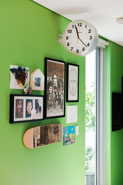
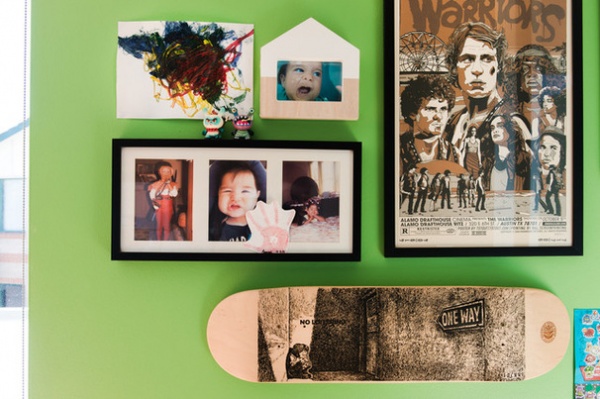
The couple surround themselves with creativity and are regularly spoiled with gifts of beautiful artwork from their artistic friends. The laser-etched skateboard here is by their friend Ron Cobb.
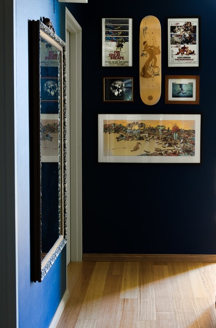
A similar collection of graphic artwork can also be seen in the home’s entryway.
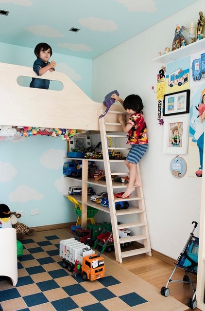
The fun continues in the boys’ bedroom. The bright color scheme and loft bed make it the ideal place for them to play and sleep. It’s one of Rochelle’s favorite spaces. “It’s small with a lot going on, but I think it has a good balance of stuff and space,” she says.
Wojciech made the loft bed with the help of his dad and a friend. They incorporated shelving space underneath the bed instead of buying freestanding bookshelves and storage, which Rochelle says really helped make the space feel larger.
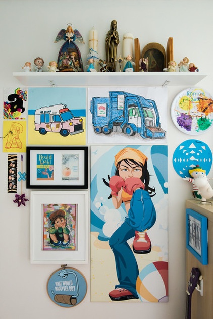
The wall art in the bedroom has sentimental value to Rochelle. She drew the boxing girl for a magazine several years ago and had it enlarged for a canvas. Roman also added to the gallery with a melamine plate that he painted at daycare.
“For us, it’s important to encourage the boys’ creativity by displaying their work in the home,” she says.
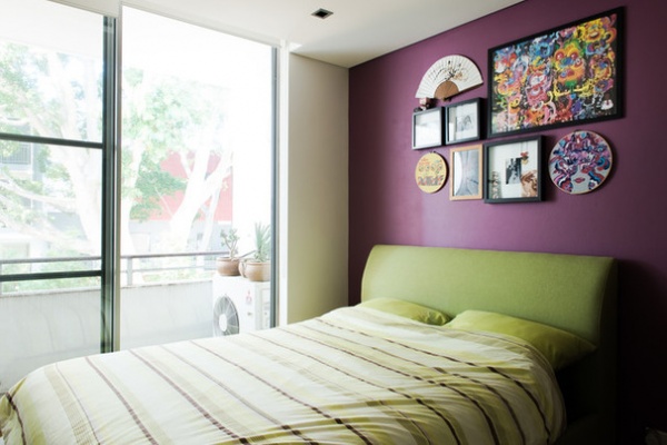
Rochelle says that when they first moved into the apartment, their bedroom didn’t get nearly as much light as the living and dining areas. She thought that painting it a happy yellow would be the answer but quickly regretted her decision. “The result was less than chirpy. I endured the sadness of looking at that wall for two years because I didn’t want to admit I chose the wrong color,” she says.
She got it right the second time with Private Tone by Dulux. The wall color in here is her favorite in the whole apartment and works well with the limited natural light.
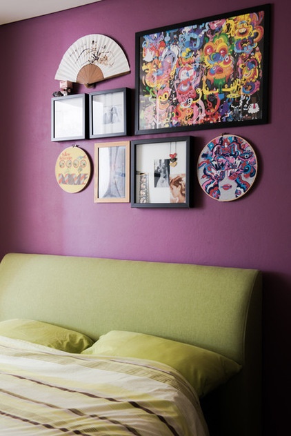
The artwork above the bed is a myriad of things the couple collected before they had children. The embroidery hoop, bottom right, features the design of a T-shirt Rochelle had many adventures in while wearing. The paper fan was given to Rochelle by her mother, who was completing a scholarship in Japan at the time, and the comic book in the wooden frame was signed by Shihad, a New Zealand rock band, around midnight on a carefree night at Sydney’s Metro Theatre.
My Houzz is a series in which we visit and photograph creative, personality-filled homes and the people who inhabit them. Share your home with us and see more projects.
Browse more homes by style:
Small Homes | Colorful Homes | Eclectic Homes | Modern Homes | Contemporary Homes | Midcentury Homes | Ranch Homes | Traditional Homes | Barn Homes | Townhouses | Apartments | Lofts | Vacation Homes
Related Articles Recommended


