Kitchen Rehab: Don’t Nix It, Fix It
http://decor-ideas.org 06/14/2015 23:13 Decor Ideas
Designer Robin LaMonte says that when new clients talk to her about a kitchen project, one of the first things they usually want to do is rip out the entire kitchen and start over. But LaMonte recommends patience before calling in the demolition crew. If a client is satisfied with the layout and if the materials are of good quality, a whole lot of rehabbing rather than replacing can take place at a fraction of the cost. A recent kitchen makeover for a family in Atlanta is a prime example of what can happen when you keep the good and transform the rest.
Kitchen at a Glance
Location: Atlanta
Size: About 500 square feet (46.5 square meters)
Designer: Robin LaMonte, Rooms Revamped
Budget: $20,000
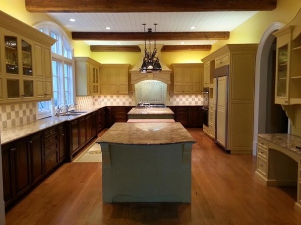
BEFORE: The original kitchen was built in the 1990s and included upper wood cabinets painted yellow, lower cabinets in a dark stain and a checkerboard-patterned tile backsplash.
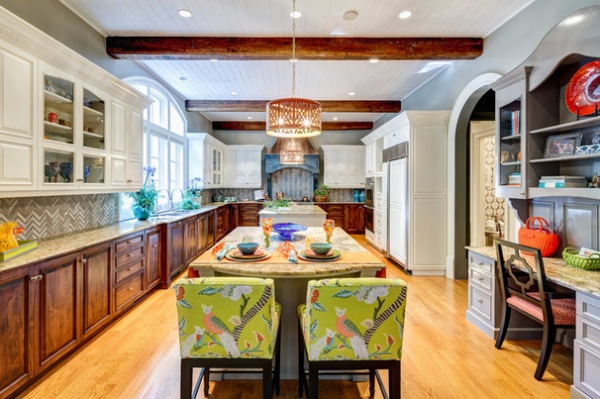
AFTER: LaMonte says since the kitchen cabinets were constructed from a nice cherrywood, it would have been expensive and wasteful to replace them. “A lot of people want an all-white kitchen today and are willing to replace wood cabinets with white MDF,” LaMonte says. “But if the cabinets are in good condition, the less expensive and more environmentally wise decision is to spray-paint them white.”
Stools: Hudson, Thibaut; stool fabric: Jantaa Bazar, Thibaut; wall paint: Northern Cliffs, Benjamin Moore; faucets: Kohler
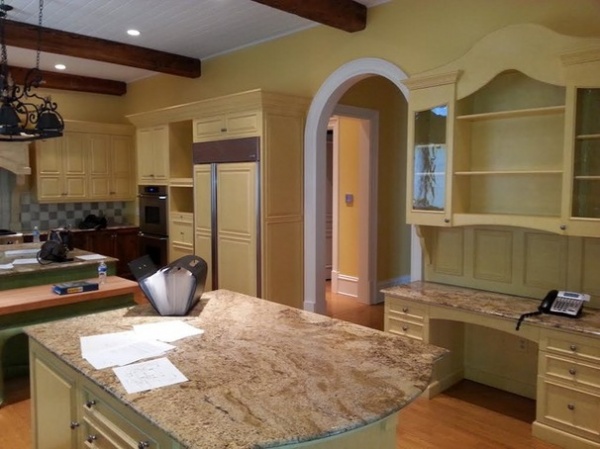
BEFORE: The original kitchen included honed granite countertops, a pot rack hanging from the ceiling and a built-in desk.
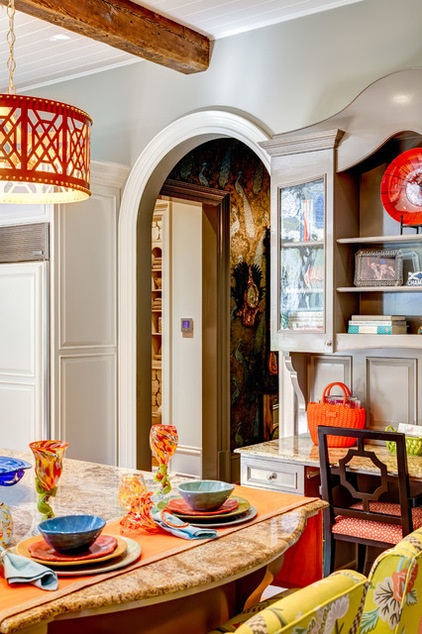
AFTER: “There was nothing wrong with the granite countertops, and it would have been expensive to replace them. Instead we chose colors for the other materials that would better complement them,” LaMonte says.
The built-in desk was given a fresh coat of Galveston Gray paint from Benjamin Moore and a stylish new desk chair. The heavy iron pot rack was removed in favor of two new pendant lights over each of the islands to help add light and balance to the space.
Desk chair: Beekman, Thibaut; desk fabric: Pongo, Thibaut; pendant: Don’t Fret, Taylor Burke Home; dinnerware: R. Wood Studio; glassware: Nate Nardi, Decatur Glassblowing
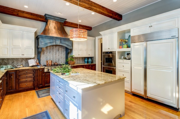
All of the home’s appliances other than the faucets remained. The doors concealing the Sub-Zero and Wolf refrigerator were also spray-painted white.
Two oilcloth rugs were glued to the wood floor and couldn’t be removed without having to refinish the entire floors. Instead, LaMonte painted them an antique blue to match the range’s hood.
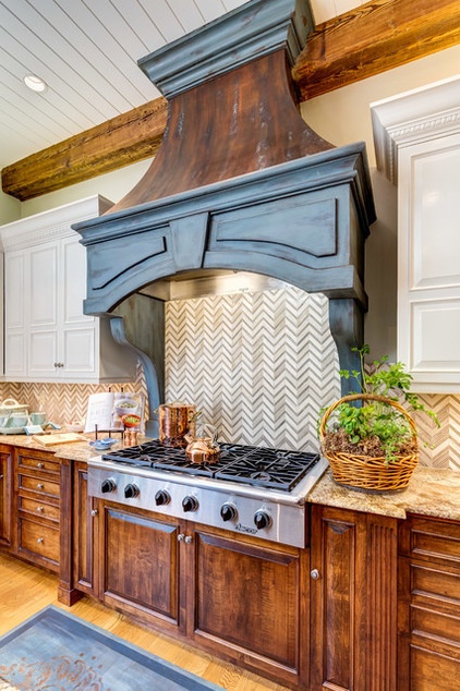
LaMonte chose a chevron-patterned marble tile for the kitchen backsplash for a more contemporary look. Rather than a pure white marble, the marble she chose has more earth tones to better connect to the granite countertops.
The range’s hood was given an antique blue and faux copper finish. “I love the look of antique blue in a kitchen, but one has to use it sparingly, or it will overpower the room,” LaMonte says.
Range: Dacor; backsplash tile: Monarch beige and Athens gray marble, Tilebar
More:
Learn 3 steps for choosing kitchen finishes wisely
Take our quiz: Which kitchen countertop is right for you?
Related Articles Recommended


