Houzz Tour: Careful Renovation of a 17th-Century English Cottage
Custom design was key to the renovation of this 17th-century Historic England Grade II listed cottage in Sandwich, Kent. “There are no straight lines here,” says designer Holly Christian, who headed up the project. “The floors slope, and the ceilings bow. That’s why renovating it became a labor of love and took as long as it did.”
It took a year of painstaking work to renovate and reconfigure the cottage, and care was taken to restore original features and show off the property’s beautiful bones. Today it still feels like a cottage — cozy, welcoming and outfitted with gorgeous custom furniture — but it also has elements that are decidedly of the now, such as flowing space and a contemporary glass addition. “We have restored and highlighted original features and improved the functionality of the space,” Christian says, “but we have also preserved its unique charm.”
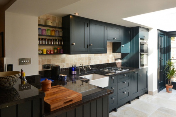
Houzz at a Glance
Who lives here: A professional couple
Location: Sandwich, Kent, England
Property: Grade II listed cottage built in the 17th century
Size: 2 bedrooms, 1 bathroom
Designer: Holly Christian of MillChris Developments
That’s interesting: At one time in its long life, the cottage was a candy shop.
Christian says the cottage was well lived in when she was asked to redesign it. “It was very outdated and needed a huge overhaul,” she says. “It’s compact, but the available space was not being well used, and it felt claustrophobic.” The abundant original features were rather lost, too, and the owners and Christian were determined to highlight them.
The cottage was rewired, the walls were stripped back so new insulation could be added, a new heating system was put in, all the rooms were reconfigured, and original features were repaired. “Adding the kitchen extension was a big change, too,” Christian says. “It’s bright and surprisingly spacious.”
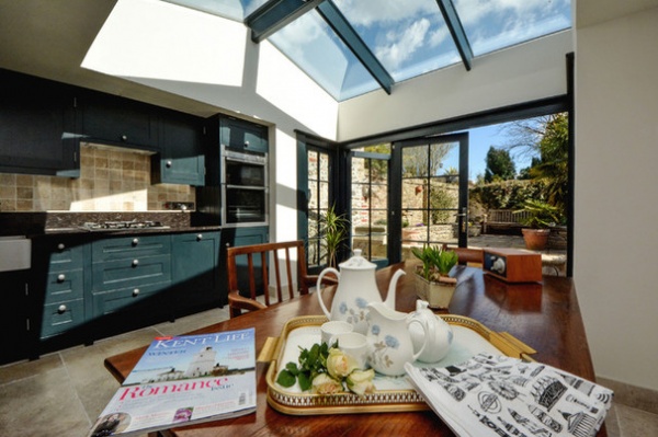
The addition is home to a custom kitchen with oak cabinetry, designed and made by Christian’s team. “I suggested the dark shade, as it’s slightly contemporary but also ties in with the other deep, warm tones in the house,” Christian says.
“Modern rustic was the look the owners were after for the property,” she says, “but we wanted to steer away from the claustrophobic feel some cottages have. The kitchen extension, with glass bifolding doors and a glazed roof, really opens up the ground floor and allows lots of light into the rest of the house.“
Cabinet paint: Black Blue in estate eggshell finish, Farrow & Ball; sink fixtures: Mayan, Perrin & Rowe
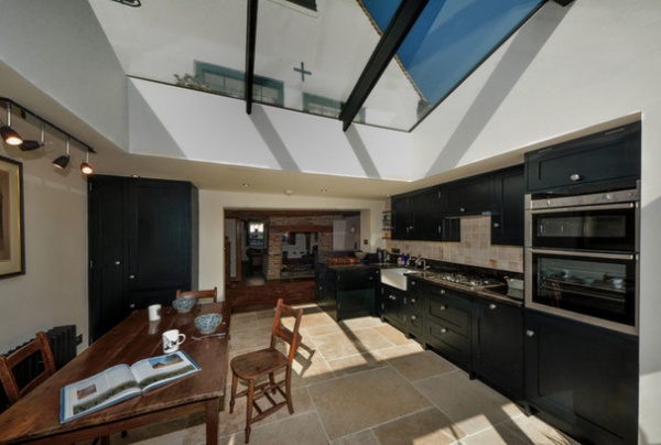
“The owners didn’t want a big, shiny, contemporary kitchen,” Christian says. “We wanted to balance the original features with the new, and it needed to nestle in and look as if it belonged in the cottage.”
The cabinets were designed and manufactured for this space — based on traditional Shaker style but without beading — to update the feel and minimize fuss. The work surfaces are antique brown granite, and the floor is limestone flagstone. “The light is fabulous in the kitchen,” Christian says. “When it catches the units, they become a really intense color, and the granite has iridescent patches, which are just beautiful.”
Flooring: Classic Jerusalem white gold tumbled limestone, Mandarin Stone
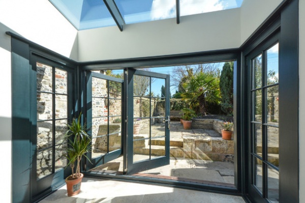
The wood folding doors are double paned and lead out to the courtyard garden.
Door frame paint: Black Blue in estate eggshell, Farrow & Ball
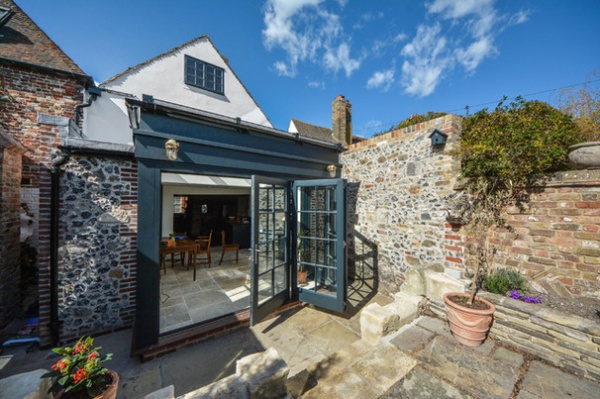
On warm days the owners can push the doors to the courtyard garden back to create one open, flowing area stretching from the front of the house to the back of the garden. The paving is reclaimed York stone.
External door timber paint: Black Blue in external eggshell, Farrow & Ball
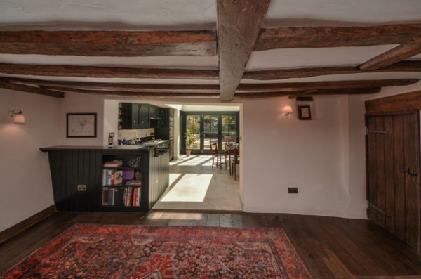
Christian sought out materials that would complement the cottage and suit its heritage. “We didn’t want any obtrusive elements that would outshine the original features,” she says. “We have used antique limestone, oak doors and smoked and oiled oak flooring.”
Even tiny details, such as the sockets and switches, were carefully considered. “They are handmade in pewter,” she says. “This helps them blend into the background. They don’t punctuate the rooms, but add to the handcrafted feel.”
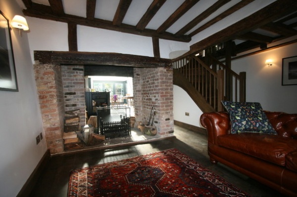
The original configuration of the cottage made it feel claustrophobic. “It was important to the owner that we open it all up,” Christian says. “He wanted to be able to sit in the living room and see right through to the garden.”
Now the entire ground floor is open plan, and light from the kitchen extension spills through the space. A double-sided fireplace is the centerpiece for the whole ground floor.
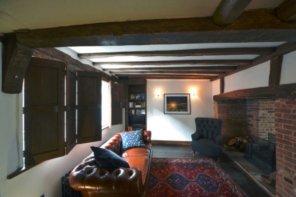
“We wanted to keep the cozy, rustic, cottage vibe, so we used jewel colors and luxurious textures, such as velvet and tweed, too, to give the space a sumptuous feel,” Christian says.
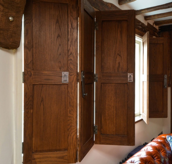
Due to its age, the cottage lacks the clean lines and neat dimensions of a more contemporary home. It meant that many elements and most of the furniture had to be custom made to fit, including these beautiful oak shutters.
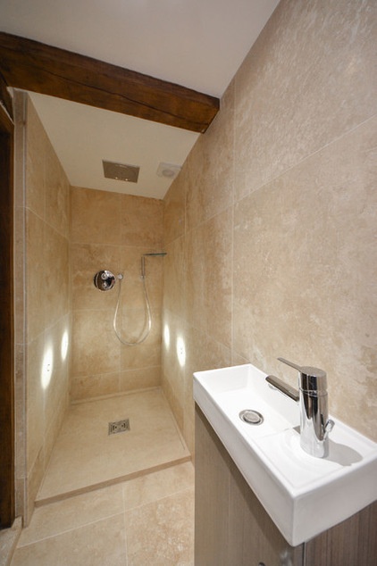
The entrance hallway downstairs was removed to make a bathroom. “It’s a wet-room style, to make the most of the space, with large-format travertine tiles on the walls and floor,” Christian says.
Travertine tiles: Kremna, Tile Giant; honed travertine in shower tray: Sparta, Mandarin Stone; rainfall showerhead: Grohe
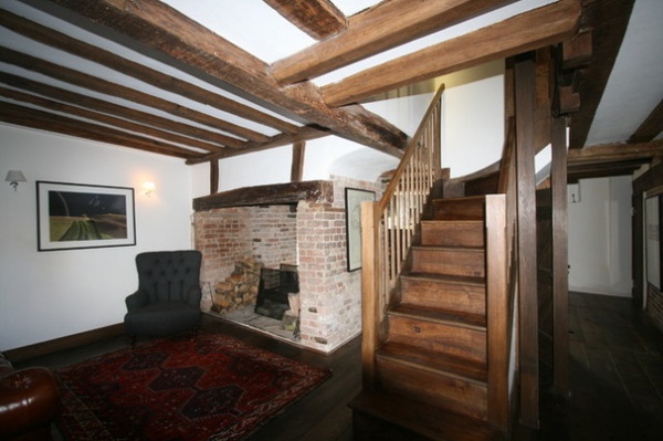
Preserving, repairing and making the most of the original features were essential elements of the renovation for Christian and the owners. A new oak staircase was designed for the space and the original brickwork and fireplace mantel restored.
“We completely redesigned and rebuilt the staircase,” Christian says. “We manufactured it in our workshop.” The newel posts got pewter tops. “We thought they would be a smart finishing touch that tied the staircase in with other features in the room,” Christian says. “It also gives the stairs a sense of age and character, helping them look as if they’ve always been there.”
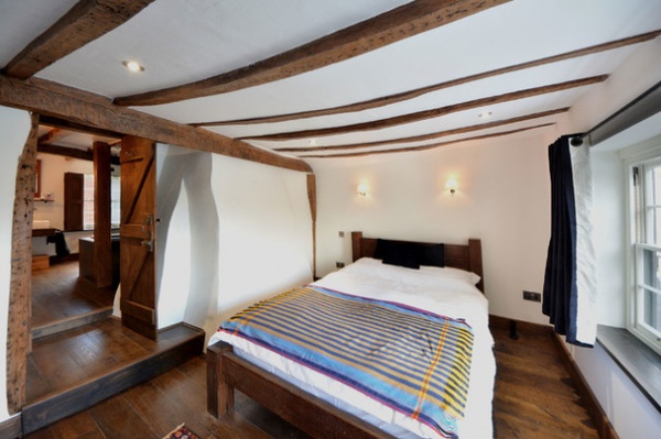
“With period properties like this, and especially in Sandwich, nothing is ever square,” Christian says. “It means that everything has to be made [custom] to fit, including the wardrobes, beds, bookcases and kitchen cabinetry.”
The bed is handmade, but one leg had to be cut down so it didn’t wobble on the uneven floor. “When you walk from the study to the bedroom, it feels as if you’re going up a ramp,” Christian says with a laugh. “And just look at how the ceiling beams bow!”
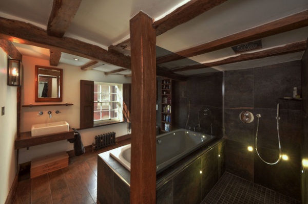
The luxurious bathroom is full of warm tones. “The colors in the tiles are great,” Christian says. “They have an almost rusty tone in them, which really picks up the richness of the oak flooring and beams.”
All the furniture and cabinetry were custom made for the room. “We made the oak shutters with two opening internal panels,” Christian says. “They let in light but still allow complete privacy.”
Syncro Acero large-format porcelain tiles (on walls and bath surround): Tile Giant; Victorian black porcelain mosaic tiles (on shower floor): Topps Tiles; rainfall showerhead: Grohe; shower controls and wall-mounted fixtures: Vado; basin: Duravit
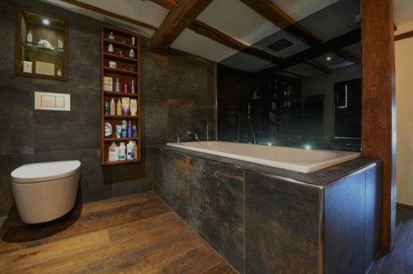
The bathroom was cleverly designed with a smoked-glass screen fitted along the side of the bath surround to act as an enclosure for the shower on the other side.
Antique tumbled double smoked oak flooring: Fine Oak Flooring; toilet: Roca, with a wall-hung concealed system by Geberit; wall-mounted tub fixtures, Vado
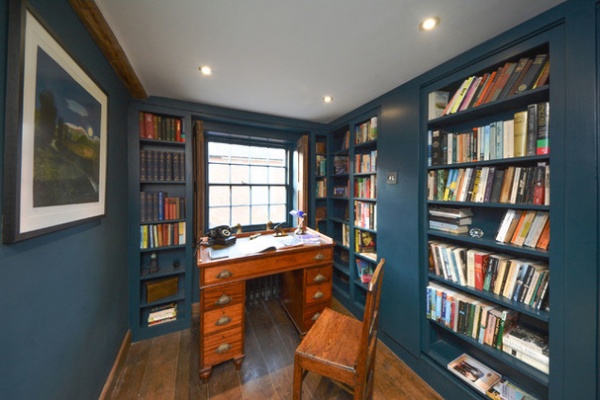
The study is lined with shelves made to fit its unique dimensions. Painting the shelves and the walls in the same shade helped them feel unobtrusive.
Paint: Hague Blue in estate eggshell (shelves and window frames) and estate emulsion (walls), Farrow & Ball
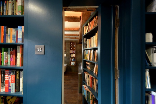
A secret door concealed in the study bookcase gives access to the bathroom. “It’s functional and fun,” Christian says. “It means any guests staying can access the bathroom without going through the master bedroom, but it’s a playful addition as well as a practical one.” It’s activated by a button hidden inside one of the books.
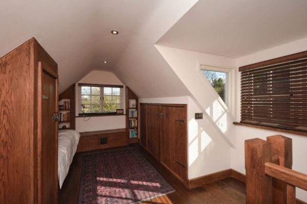
The attic has been converted to house a single cabin bed at one end and a double bed at the other. “It means although only technically a two-bedroom cottage, it can sleep five,” Christian says.
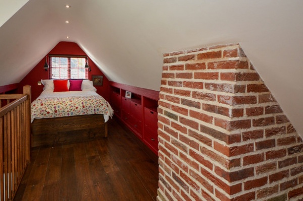
A run of cupboards has been tucked into the eaves to provide useful storage in the attic. This end of the space is home to a double bed for guests.
Cabinet paint: Ruby Starlet Extra Deep, Dulux
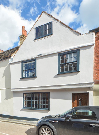
At one time in its long history, the cottage was a candy shop, but its renovation means it’s now a much-loved home. The cottage was originally 1,076 square feet (100 square meters) with a 538-square-foot (50-square-meter) courtyard garden. In adding the kitchen, they increased the size of the house to 1,292 square feet (120 square meters). "The configuration works so much better now, so it looks a lot bigger!” Christian says.
Browse more homes by style:
Small Homes | Colorful Homes | Eclectic Homes | Modern Homes | Contemporary Homes | Midcentury Homes | Ranch Homes | Traditional Homes | Barn Homes | Townhouses | Apartments | Lofts | Vacation Homes


