Houzz Tour: A Victorian Update Plays by the Rules
http://decor-ideas.org 06/13/2015 20:13 Decor Ideas
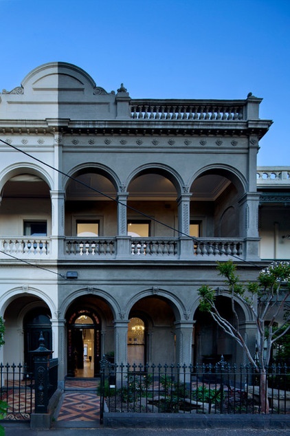
One of Melbourne’s oldest suburbs, East Melbourne, is rich in history, with many significant terrace houses, or row houses, from the Victorian period. This home is no exception, and this wonderful renovation brought some interesting challenges for Nic Owen Architects. With the 1877 building protected by the area’s heritage restrictions, as well as being on the Victorian register, no change to the exterior or to the footprint was allowed. So the renovation took place only on the inside — save for a carport, a built-in barbecue and rejuvenation of the exterior.
Houzz at a Glance
Who lives here: A professional couple and their 3 daughters
Location: East Melbourne, Victoria, Australia
Size: 3,617 square feet (336 square meters); 4 bedrooms, 2 bathrooms plus a powder room
Designer: Nic Owen Architects
That’s interesting: This is part of a special heritage registry known as Canterbury Terrace, a group of 16 residences built in 1877 and the longest known group of terrace houses in Victoria.
The Victorian home is on two levels at the front of the building but slopes slightly toward the rear, providing a third floor on a lower level. This was originally a bluestone cellar and now is a storage area, with rumpus and study area.
The exterior had been painted over and over for years. The current owners used a specialist contractor to rejuvenate the facade of the house in consultation with a conservation heritage advisor.
The properties on this street are on the Victorian register for a number of reasons: They form a beautiful streetscape, people of historic interest have lived here, and many of the houses are great examples of high Victorian architecture, Nic Owen says.
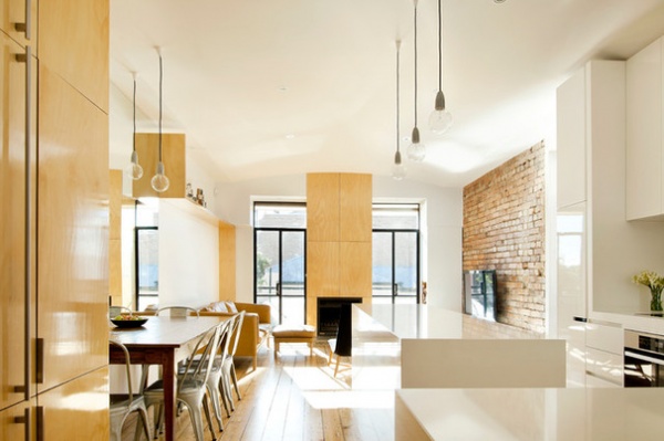
The owners’ directive for the architects was to make the Victorian house more suitable for relaxed and open family living, with more usable space within the existing walls. Previous renovations had closed up the house with small internal rooms at the rear. It now opens up to an informal dining, kitchen and lounge area. The architects created a feeling of space here with the clever use of mirrors. It may not be immediately apparent, but looking closely at this photograph, you will see that the dining room table is positioned against a large mirror that reaches up to the ceiling, providing light and the illusion of space in this narrow area.
Chairs: Tolix “Chaise A,” Thonet; pendant lights: Richmond Lighting; wall paint throughout: Antique White USA, Dulux
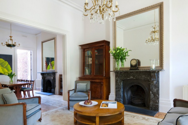
The front part of the ground floor has retained original features. “It’s a fairly standard approach we take in that we like to respect and retain the historical aspects of the house as it stands, which is usually the front of the house,” Owen says. “The front couple of rooms were beautiful and quite majestic in their scale and proportion, so we embraced that. And the clients had purchased beautiful furniture to go with that, but the back of the house had been modernized over time.”
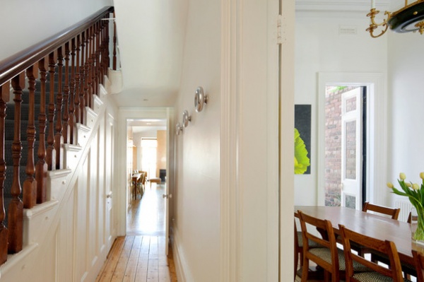
Here, as you enter through the front door, you can see the original part of the house on the right. This is the more formal dining area, and beyond that, down the corridor, is the informal dining area, known as the “meals room.”
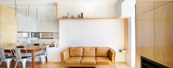
The new informal living area is light, bright and spacious. The team restored the original Baltic pine floors, the existence of which was quite a stroke of luck, according to Owen, in that they are particularly thick. They are almost 40 millimeters (about 1½ inches), which is very unusual for floorboards, he says, and they just happen to be very beautiful.
Sofa: Jardan
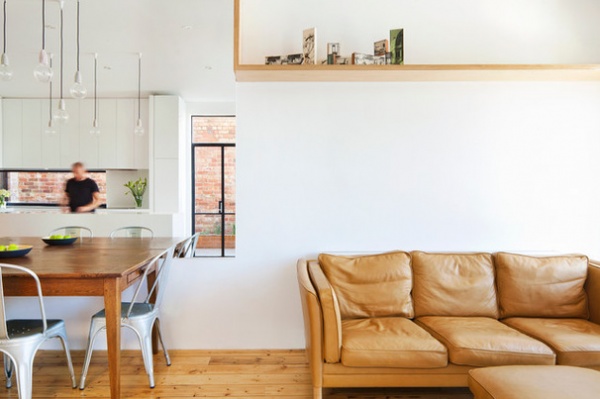
To complement the original flooring, Owen selected hoop pine plywood for woodwork around the house. It’s a product the architects love to work with on many of their projects, and here it “provides a simple and beautiful palette to simplify the house visually and focus on just a few materials,” Owen says.
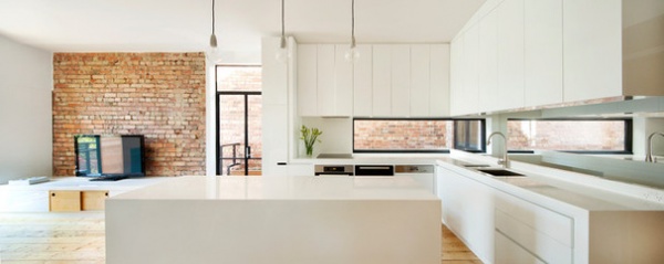
This palette is found throughout this rear area, including in the kitchen. The white kitchen cabinetry is custom made. Look closely at this photograph. It’s not immediately apparent, but at the right in this image, behind the sink, is a stairwell that leads down to the basement living area.
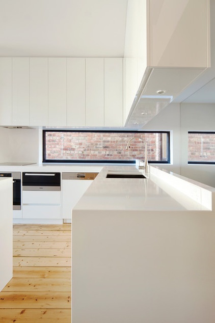
To the right of that stairwell is another mirror, again creating that feeling of spaciousness.
Appliances: Miele; range hood: Quasair; sink: Franke Planar; faucet: KWC Eve sink mixer with retractable
gooseneck
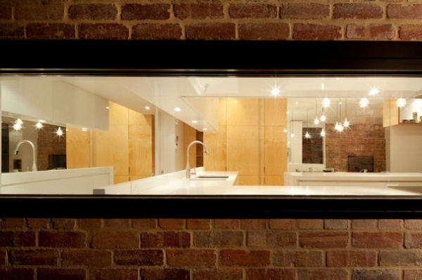
“When we had a consultation meeting with Heritage Victoria, we learned quickly that they were very strict on what you could and couldn’t do,” Owen says. “One of the only external things we did was the horizontal window in the kitchen.”
Heritage Victoria initially “hadn’t been keen on it,” he says, but this back window in the kitchen can be seen only from the home’s courtyard, and it was allowed. Owen thinks that this leniency might have arisen after a temporary ladder fixed to the building was mistaken by Heritage Victoria for a window going all the way up the building. “They were so shocked and then relieved that the small window didn’t seem so bad, and it was let through,” he says.
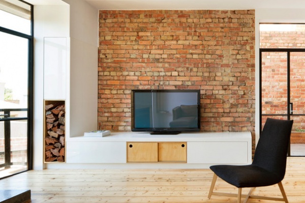
The client kept the exposed brick walls. They beautifully complement the brick wall you can see through the glass doors.
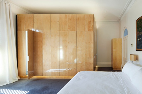
Upstairs there is a large master bedroom. As with many period homes, the bedrooms don’t have en suite baths or walk-in wardrobes, even though the owners wanted them. The architects found the perfect solution, allowing any future owners to go back to the original if desired: a plywood pod that contains the en suite.
“The pod containing en suite and storage [closet] is a rectangular cube floating within the historic environment,” Owen says. “The pod demonstrates a deliberate attempt to respect the past while offering a new design approach.”
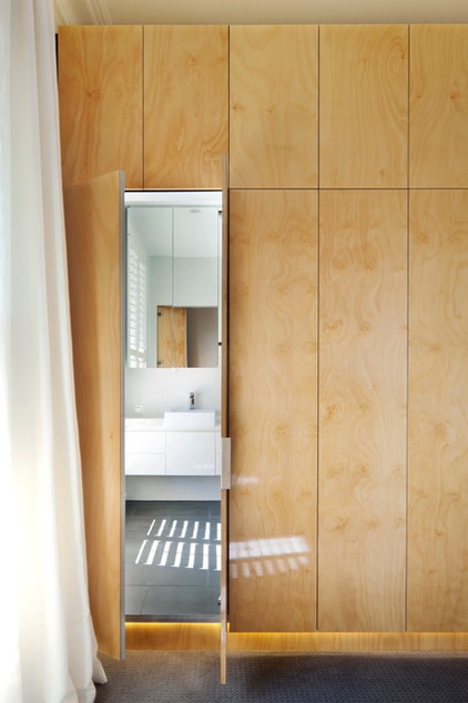
“It sits separately from the very large room. It’s almost like a bit of furniture; it’s built in but it is reversible,” Owen says. “You could take it out and have the old, full-size room back. So that’s how we treated it from a historical point of view.”
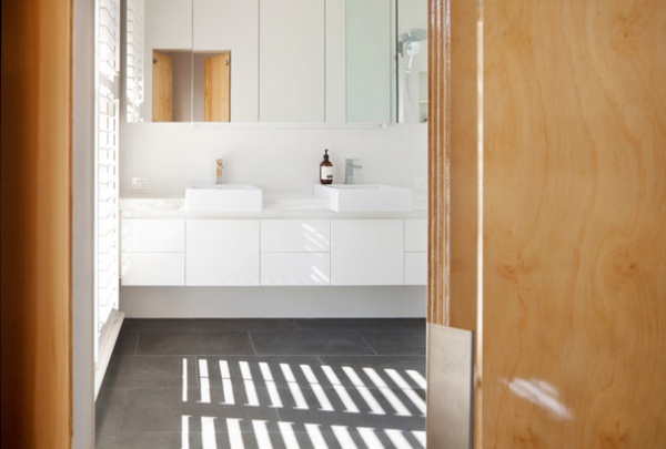
The pod structure is one of the things Owen loves best about this renovation. “Every project we do, we find there is something we would like to do that the client isn’t quite sure about; they have to take a leap of faith, and there’s a bit of a risk element for them,” he says. “We found that in this project it was that pod element. We usually find that it’s those things that a client is nervous about that can be the best thing.”
Torquay semi-recessed basin: Parisi; vanity: custom; tiles: Bluestone
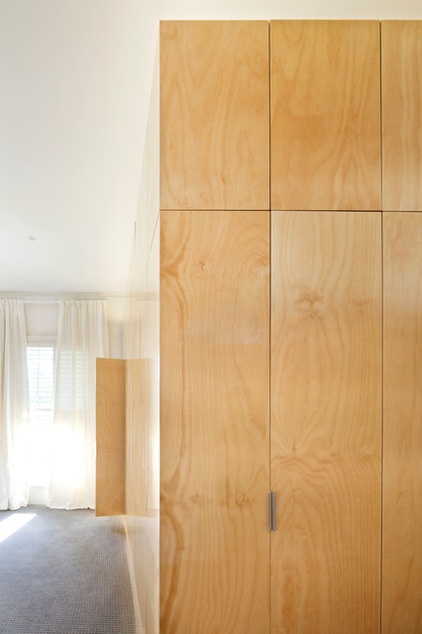
This view of the pod shows the useful closet space it provides. The woodwork elements throughout the house, “which we see as little bits of architecture in their own right, break up the spaces,” Owen says. “They define the spaces, and they pretty much create all the spaces within the existing shell, as we couldn’t do much outside the house.”
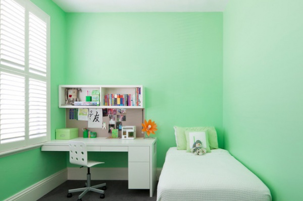
Three other bedrooms — the children’s rooms — have been fitted out with a customized closets, study desks and bookshelves. Each room incorporates a special feature designed with the child, “allowing the smallest client to customize their bedroom,” Owen says.
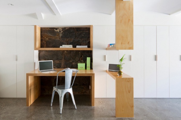
Moving down to the basement, we see there are more custom-made pieces in the same hoop pine plywood, for a consistent overall look. Here the table to the right defines the study area from the play area. The background of the desk shows the exposed bluestone of the original building. The original concrete floor has been polished.
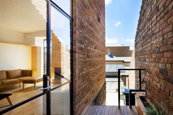
At the side of the building is a wood courtyard, and from here you can see into the rear courtyard and the few exterior additions — the carport and barbecue.
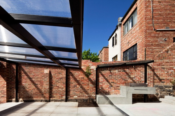
The carport is made from a thick steel frame with a clear polycarbonate roofing. The cantilevered barbecue is concrete.
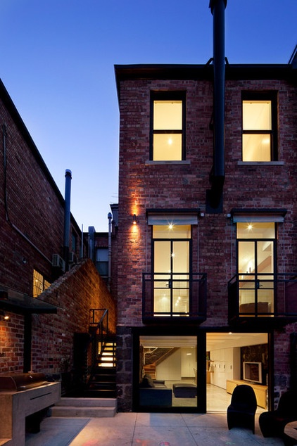
The family room in the basement spills into a rear courtyard. “Everything on this rear facade was existing except for the large sliding doors that get that inside-outside flow working,” Owen says.
The small balconies, seen on the middle level, are not original but are an earlier addition that would not be permitted today. This is the only house on the street with this feature to overlook the courtyard. In this renovation the balconies have simply been rejuvenated and painted.
The area at the rear of the house had been previously “modernized” with small spaces and interior walls. This was addressed by removing the walls.
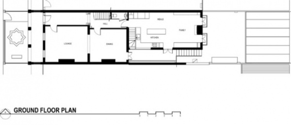
The ground-floor plan shows how the long, narrow spaces are configured toward the rear (the entrance is at the right-hand side in the diagram).
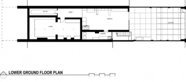
Above, the floor plan for the basement level (called the lower ground floor in Australia).
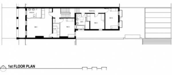
Above, the floor plan for the top level (called the first floor in Australia).
Browse more homes by style:
Small Homes | Colorful Homes |Eclectic Homes | Modern Homes| Contemporary Homes |Midcentury Homes | Ranch Homes | Traditional Homes |Barn Homes | Townhouses |Apartments | Lofts | Vacation Homes
Related Articles Recommended


