Kitchen of the Week: Good Flow for a Well-Detailed Chicago Kitchen
Newlyweds Chris and Amanda Dobrez were excited to create their first home together in a three-story Chicago gray stone located in the city’s Old Town neighborhood. Since the couple have a big extended family and love to entertain, they wanted an open kitchen with lots of storage, space for casual meals and good flow that would help the space seamlessly blend with an adjacent mudroom and family room with deck outside.
The challenge of the 300-square-foot kitchen was making the long and narrow space feel as comfortable and inviting as possible. Working with designer Tom Spanier, the couple chose durable quartzite counters, a glazed ceramic subway tile backsplash, white painted maple cabinets, a custom stained white oak floor, oil-rubbed bronze faucets and fixtures, and customized storage solutions. Now they have a timeless kitchen that is very functional but also attractive enough to be on display in this well-detailed home.
Kitchen at a Glance
Who lives here: Chris Dobrez, part owner of a family chemical and software business, and Amanda Dobrez, a labor and delivery nurse
Location: Chicago
Size: 300 square feet (27.8 square meters)
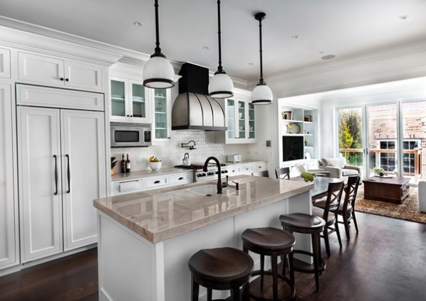
A long center island helps define the kitchen and serves as the main social hub of the space. Polished Hastia quartzite was chosen for the top of the island. “We went with the thicker top to add a little more interest and make it look substantial,” says Spanier, of TZS Design. “Everyone loves marble, but it’s porous and will stain. This quartzite has a nice, controlled veining that gives you a marble kind of look but better durability.”
The island also features a double bowl sink, a paneled dishwasher, a dual pullout trash bin, a built-in soap dispenser and storage drawers (including a designated “junk drawer”). Three oil-rubbed bronze pendants with glass shades above the island provide illumination. “With a heavy island like that, you need relatively substantial fixtures above,” Spanier says. “It’s about having the right scale. These ones are easy to clean, in a classic design with a timeless shape.”
White painted maple cabinets with classic detailing provide lots of storage. A few upper glass-front cabinets provide relief from all the white and add dimension to the room. The white glazed ceramic subway tiles on the backsplash keep with the classic feel of the kitchen.
Island top: Marble & Granite Supply of Illinois; island stools: Woodbridge Furniture; sink in island: Franke; sink faucet: Grohe; above island: Sloane Single Pendant with Glass Shade, Circa Lighting; cabinetry: custom, Hyland Design; cabinet hardware: Creations by Alno
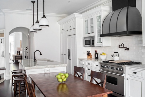
A freestanding medium-toned oak dining table with a distressed finish was added to one end of the island. The table was chosen because Chris and Amanda wanted a piece that could withstand daily use for meals and working at the computer. “Where to put this family dining table was the big challenge we had with this kitchen,” says Chris. “Ultimately the best decision was to have the table as an add-on to the island. We’re really happy we did it this way. It’s a natural extension of the island, and we don’t bump into each other.”
A built-in outlet and USB port on the island give the couple an easy way to plug in laptops and charge their electronic gadgets.
A large stainless steel and black metal range hood similar to one Chris saw on Houzz — “I found inspiration for this kitchen and the whole house on Houzz,” he notes — sits prominently over the cooking area and creates a focal point for the kitchen.
Spanier points out that the hood provides much-needed contrast for the white kitchen and adds another layer of visual interest. “A white kitchen can sometimes be too white, and you need a balance,” he says.
The kitchen also includes a convection and microwave combo and a paneled Sub-Zero and Wolf refrigerator that maintains the quietness of the space.
Valley View oak vintage dining table in custom size: Walter E. Smithe Furniture; dining chairs: Blake Side Chair, Ethan Allen; range and microwave: Viking; range hood: custom, Vent-A-Hood
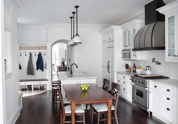
A mudroom adjacent to the kitchen marks the garage entrance, which is the one most used by the homeowners. A solid oak seat with cushion has drawers below for gloves and hats, and offers the couple a place to change shoes when they enter the home.
Limestone tile in a curved design designates the mudroom entry from the kitchen proper. The kitchen’s custom-stained white oak floor with deep tones of black and brown provides an anchor for the space and a rich contrast for the lighter finishes in the room.
Paint on walls, trim and ceiling: Chantilly Lace OC-65, Benjamin Moore
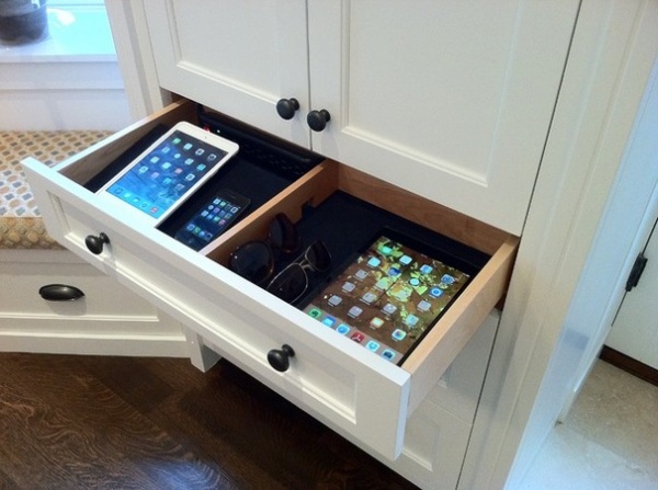
Here’s a close-up shot of the built-in charging station to the left of the mudroom by the kitchen’s pantry cabinets. It has a black power strip, and black felt on the bottom of the drawer to prevent scratching. The couple also use the drawer to store their sunglasses, which they can grab as they head out the door.
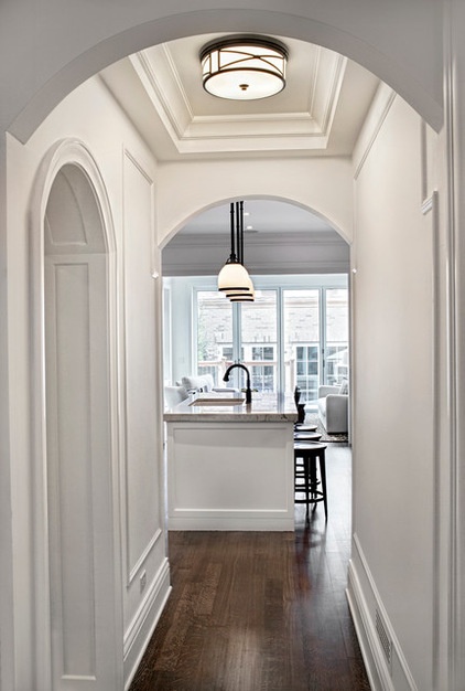
This photo shows the view from the hallway that connects the kitchen to the main living area in front of the home. The arched opening seen at the left of this photo leads to a powder room.
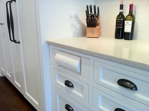
Chris saw this clever paper towel storage solution in another kitchen on Houzz. “We were just looking for the extra little bit of counter space it would give, and it puts the paper towels down in an easy-to-use location,” he says.
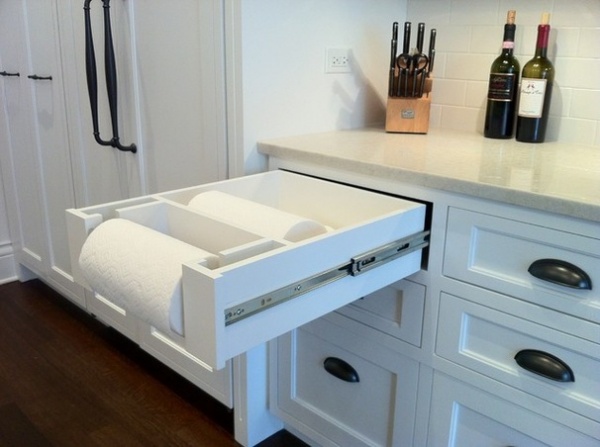
The cabinetmaker had the idea to customize the drawer so more than one roll of paper towels could be stored there.
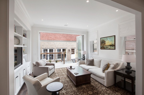
The adjacent family room was designed to be an extension of the kitchen. “We wanted a strong connection between the cooking, eating and entertaining areas,” Spanier says. “But since we also wanted some definition between the two spaces, we have a wood-cased opening that gives a bit of privacy but still offers that openness with lots of natural light.”
Family room sofa: Verano, Crate & Barrel; club chairs: Alex chair and Elliot chair, Mitchell Gold + Bob Williams; side table: Romano, Ethan Allen; area rug: custom, Peerless Rugs; art above sofa: homeowners’ own; sheer linen fabric for Roman shades: Kravet
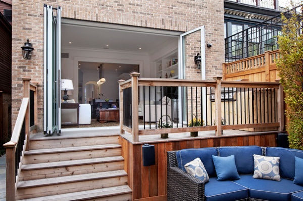
The good flow continues from the kitchen and family room inside to the deck out back. “The NanaWall helped us create a free-flowing, inside-outside entertaining space,” Chris says. “The kitchen, family room and the outside is one continuous space.”
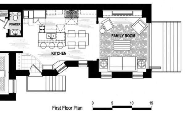
The floor plan illustrates the good flow the kitchen enjoys with the rest of the home’s first floor.
Taking the time to consider both the look and function of the kitchen and surrounding spaces was vital to the success of this project, Spanier says. “We literally discussed an inch here and an inch there,” he says. “Clearance is very important. Knowing how big to make things and what proportion you use for design elements is really key.”
Team:
Architect: Space Architects + Planners
Contractor: T&T Construction
See more Kitchens of the Week


