Houzz Tour: The Making of a Mediterranean House
http://decor-ideas.org 06/08/2015 05:13 Decor Ideas
When this home was built a decade ago for a renowned hockey player, its style lay in what Holly Ogden deems a gray area. In other words, its architecture was a mixed bag. When it was purchased by the current owners as a vacation retreat, they hired Ogden and Patty Burdick of Wiseman & Gale Interiors to move the needle on the aesthetic meter solidly to Mediterranean.
Photos by Laura Moss

Houzz at a Glance
Who lives here: This is a second home for a couple with a university-aged son and daughter.
Location: Arcadia district of Phoenix
Size: 5,600 square feet (520 square meters); 3 bedrooms, 3½ baths
Designers: Ogden and Patty Burdick of Wiseman & Gale Interiors
“Before the remodel, the house was a little vanilla,” says Ogden. “And stylistically, it was going in all different directions.”
To get all the rooms heading the same way, the designers gutted many of them and started from scratch. “We wanted it to seem like a Northern California Mediterranean home,” Ogden says. “Because we are working with the amazing light in Arizona, we embraced bright colors. The intensity of the light here allows this. If you tried the same thing in a foggy, gray environment, the colors would be too intense.”
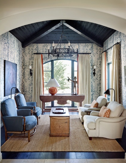
Before the remodel, this room that’s just off the kitchen served as a breakfast room. After the remodel, it’s called the morning room, and it’s as much about relaxing with the newspaper or laptop as eating a bowl of cereal.
“We moved a table into the living room, and it seemed redundant to have another table here. We made it a really lovely spot to sit and relax with the newspaper or a cup of coffee,” says Ogden. “I believe it’s become the favorite room in the house.”
The color palette in this room runs throughout the house: white, blue, red and orange. “The whites have a gray base, and the blues skew to indigo,” says Ogden. “The colors are complex, because with reds and blues, it’s easy to go sports team.”
Wall fabric: Rose Cumming; white armchairs: custom; striped armchairs: Charles Miller Furniture; cocktail table: Rose Tarlow; console and floor lamps: Paul Ferrante
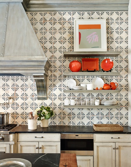
The client came to the initial design meetings with photos of a Mediterranean-style tile. The designers took the concept and worked with a tile company that would allow them to modify the scale and finish of the pattern. “We made sure the surface looked a little worn, as we wanted the tile to look old and this interior to feel as if it had been assembled over time,” Ogden says.
Tile: custom pattern by Wiseman & Gale, made by Craftsman Court Ceramics
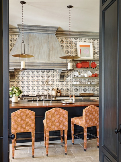
The blue and orange on the tile are amplified by the deep blue kitchen island and orange and coral bar stools. Of the florals in the tile and the stool upholstery, Ogden says: “It’s fun to play prints off each other. I think, sometimes, if you think about things too much, the design becomes rigid. As I said, we wanted to make it feel like the house had evolved over time, even though we did it all at once. Mixing prints makes it seem like that’s how it came together.”
Bar stools: Lockhart Collection with Queen’s Creek fabric in Marigold, Robert Allen; light fixture: Rose Tarlow; hood and shelves: custom
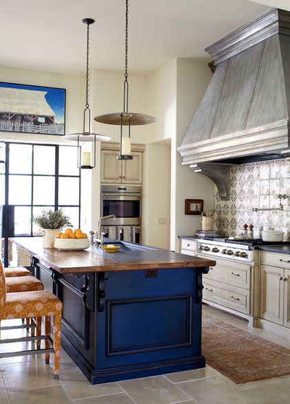
Another trick to making the interior seem more ageless than just-installed involved layering details such as the curvaceous corbels on the island counter, the beefy hood over the cooktop and the lantern-like light fixtures hanging from the ceiling. “That last 10 percent of the design process, the one where the small details are worked out, that is the crucial part,” says Ogden. “That’s where the most interesting things happen.”
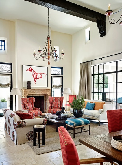
Many doors and windows were replaced with metal, factory-like panes (such as the bank of windows behind the white sofa), while other wooden windows remain in place with frames painted black (such as those that bookend the fireplace).
Paint also transformed the chandeliers hanging in this room. Before the remodel, they were done in shades of taupe, brown and yellow. The designers remade them with the vibrant colors found in the room.
White sofa: Dennis & Leen; patterned sofa, ottoman and coffee table: custom; lounge chairs: Ironies; artwork: September Vhay, Altamira Fine Art
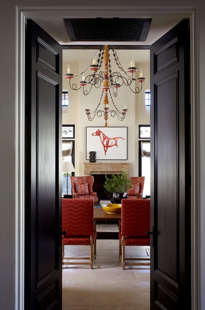
A view from the kitchen shows how the formerly nondescript lighting fixtures give the room a vibrant atmosphere.
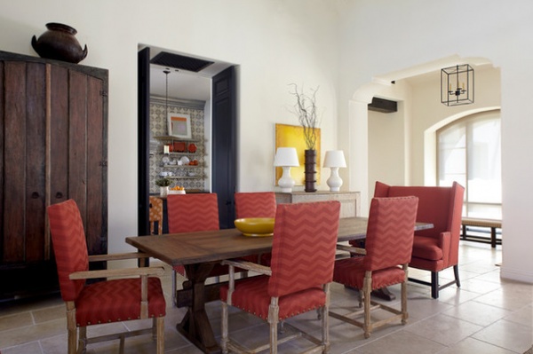
The room contains a dining area. One of the designers’ favorite moves is to put a small bench-style seat at the end of a table. “It’s more informal, and it allows you to fit more people around the table,” says Ogden.
Table: custom; chairs: Ironies
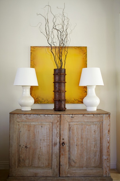
An antique map chest in the dining room fits the family in more than one way. “One of the owners had a grandfather that was into sailing and maps, so it was fun to find a piece like this for them,” says Ogden.
Lamps: Rose Tarlow
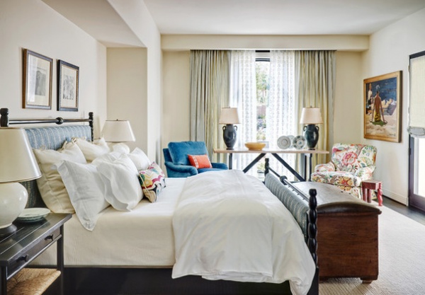
Another kind of antique chest has a home at the foot of the bed in the master bedroom. The designers note that this room is a sanctuary, and like any good relaxing space, it has easy chairs. The decision to cover them in two different upholsteries was made to, as Ogden says, “mix it up a bit.”
Bobbin bed: Aesthetic; armchairs: custom
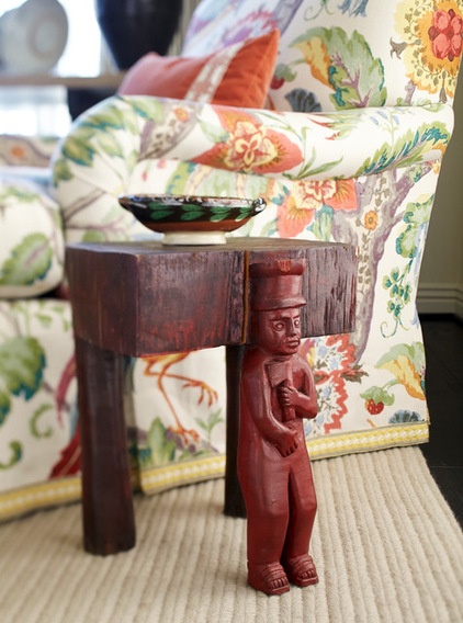
Throughout the house there are handcrafted, sometimes quirky, accessories — such as this little side table by the armchair in the master bedroom. One of its legs appears to be a man wearing a tall hat and carrying a hatchet. “Sprinkling these kinds of things around the house adds a layer of depth,” says Ogden.
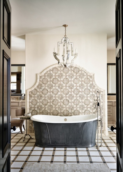
The pre-remodel master bathroom had a confusing layout but was a healthy size. The reconfigured bath allows the residents to walk in from the bedroom and be greeted by a showstopping focal-point pewter bathtub backed by an elegant tile wall.
Tub: Camelot, Devon & Devon; chandelier: Niermann Weeks; wall tile: Craftsman Court Ceramics
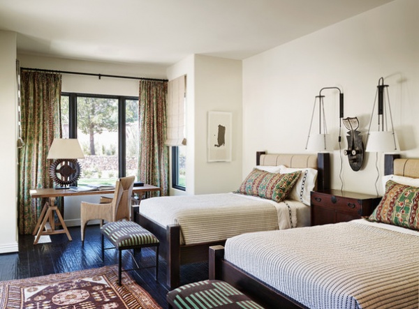
The couple’s son’s room doubles as a guest room (he is in college and not always in residence). A collection of black and white photography is a permanent resident in this room, and the designers decided that ethnic prints complemented the collection perfectly.
“We put two double beds in this room,” says Ogden. “Anytime you have a guest room that will accommodate that, it makes arrangements more flexible.”
Beds: custom; wall lamps: Urban Electric
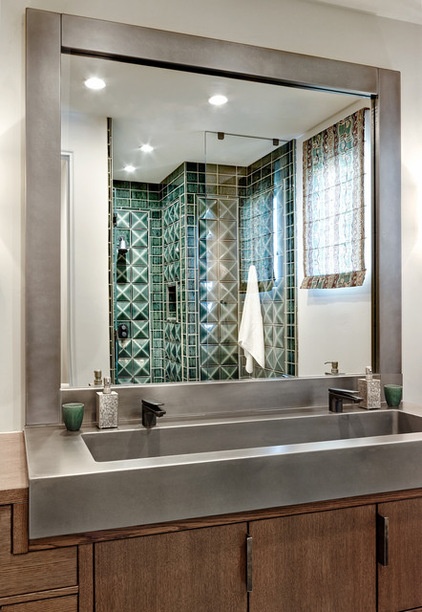
The bedroom features a custom concrete sink and three-dimensional tile. “It has a raised diamond pattern on it,” says the designer. “I think it adds more dimension to the room.”
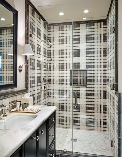
The bathroom off the daughter’s room also features an extraordinary tile, but this one relies on pattern rather than shape for a wow moment.
Wall tile: Craftsman Court Ceramics
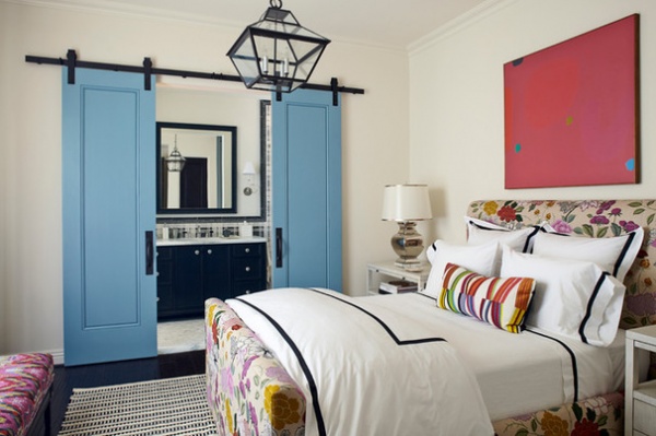
You enter that bathroom from the bedroom through blue barn-style doors. “The daughter has a vibrant personality, and this room fits her,” says Ogden. The space is outfitted with a bed whose headboard and footboard are blooming with flowers.
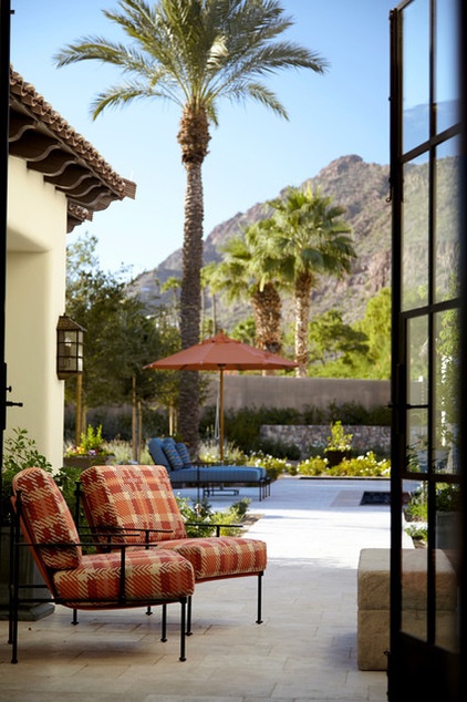
In fact, inside and out, the home is alive with colorful accents. “Before, the house was very neutral, very beige,” says Ogden. “Now it’s more vivid and playful, the perfect spot to get away.”
Browse more homes by style:
Small Homes | Colorful Homes | Eclectic Homes | Modern Homes | Contemporary Homes | Midcentury Homes | Ranch Homes | Traditional Homes | Barn Homes | Townhouses | Apartments | Lofts | Vacation Homes
Related Articles Recommended


